White Label POS Comparison Landing Page Template
Terminal is a white label POS comparison landing page built for fintech founders, franchise operators, and vertical SaaS companies. It combines an animated brand-swap hero, hard market data, and a competitive comparison table to turn complex infrastructure decisions into a clear, confident yes. Visitors see live brand transformations before ever entering their phone number.
by Rocket studio
Quick summary
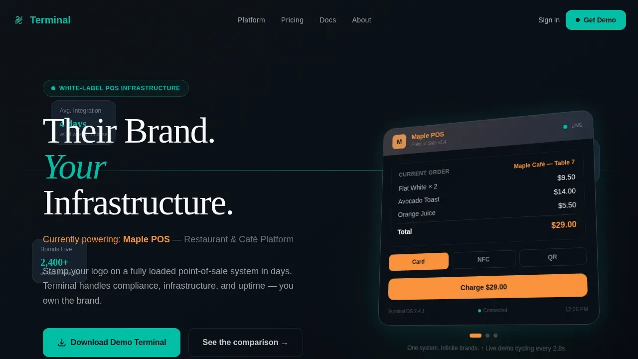
Terminal is a single-page, section-led landing page template designed for white label POS platforms. It opens with an isometric POS terminal cycling through three fictional brand identities, moves through embedded payments market data and animated comparison tables, and closes with a demo app download form. The page makes the business case before it makes the ask.
Who this template is for
This landing page is built for B2B decision-makers who need to communicate the value of a white label point of sale system quickly and credibly. It speaks directly to founders and operators who are evaluating a branded pos solution against building in-house or buying from a competitor.
- Fintech founders building merchant ecosystems who need a persuasive pos landing page that leads with ROI and integration speed.
- Franchise operators managing multiple stores who want to see how a single system handles branded checkout across every location.
- Vertical SaaS companies bolting payment acceptance onto an existing platform and comparing white label pos solutions against custom software development timelines.
What problem this template solves
Selling a white label pos system is a complex ask. Buyers want proof before they commit. They arrive skeptical, comparing your platform against in-house builds and several named competitors. A generic website page cannot carry that conversation. A dedicated pos landing page built around hard data and live demonstration can.
The common pain points this template directly addresses:
- Credibility gap: Visitors to a white label pos landing need to see the product work before they trust the pitch. The animated brand-swap hero shows the system in action, removing doubt early.
- Comparison fatigue: Buyers are doing market research across multiple tools. The embedded comparison table gives them the data they need in one place, structured as a narrative that builds row by row.
- Long sales cycles: When a pos landing page earns trust fast, decision-makers move faster. Showing market size data, integration timelines, and a live demo app shortens the evaluation window.
What you get with this template
You get a fully structured, single-page layout that guides visitors from first impression to download form without a detour. Every section earns the next. The page uses a storytelling approach anchored in real market data, so visitors feel informed rather than sold to.
Here is what is included:
- Six distinct page sections: Hero with brand-cycling animation, market data panel, animated comparison table, use-case bento grid, demo download form, and a minimal linear footer.
- Teal Catalyst color system: Deep register black, catalyst teal, cool slate, and receipt white applied consistently across every interactive element and surface.
- DM Sans and Fraunces typography pairing: DM Sans for interface text and body copy; Fraunces for bold display headings that carry the narrative weight.
Feature list
This template is built around a specific set of capabilities drawn directly from the design brief. Each feature serves the page's core goal: convert a skeptical buyer into a confident platform client.
Isometric Brand-Cycling Hero
The header renders an isometric pos terminal mid-transaction. Every two seconds, the merchant logo placeholder rotates through three fictional brand identities. The product name swaps, the accent color shifts, and the receipt preview reformats. Cursor movement triggers subtle parallax on the dashboard elements. The headline "Their Brand. Your Infrastructure." floats above. Visitors understand the white label proposition in under five seconds, without reading a single word of body copy.
Animated Market Data Panel
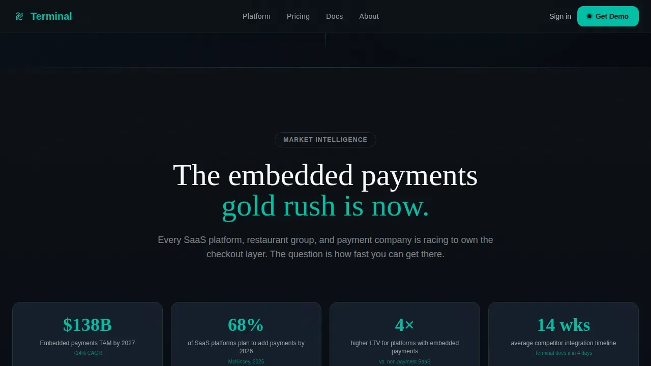
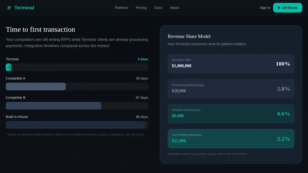
After the hero, the page presents hard numbers: embedded payments market size projections and integration timeline comparisons visualized as animated bar charts. Count-up animations trigger on scroll via GSAP ScrollTrigger, turning static figures into a live data story. This section gives fintech founders and franchise operators the market context they need to justify the platform decision internally. It reinforces that choosing a white label pos solution is a strategically sound move backed by real market signals.
Sticky Comparison Table with Row Reveals
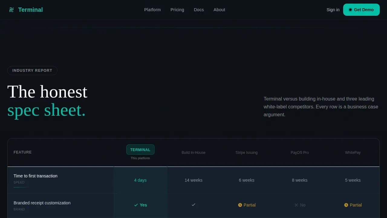
The comparison table is the structural centerpiece of the landing page. It pits the white label pos platform against building in-house and against three named competitors. Rows cover criteria including time to first transaction, branded receipt customization, PCI compliance ownership, and integration timelines. Each row animates in with a teal underline on scroll, turning a spec sheet into a narrative. Sticky column headers keep context visible as visitors scan down. This is where the business case is built, row by row, without requiring a sales call.
Use-Case Bento Grid
An asymmetric bento grid presents three audience-specific use cases: fintech founders building merchant ecosystems, franchise operators standardizing branded pos across multiple stores, and vertical SaaS companies adding payment acceptance to an existing platform. Each card speaks to a specific set of business needs. The layout lets visitors self-identify and see their own scenario reflected in the page, which improves relevance and keeps users engaged longer.
Demo App Download Form
The call to action section includes a phone-number input that sends an SMS link to the demo app, plus a QR code as a secondary path. A device mockup beside the form shows the demo app running a sample transaction in real time. Visitors arrive at this form having already watched three live brand transformations. The form earns its conversion because the product has already demonstrated value. The lead capture form can be connected to CRM or email marketing tools for automated follow-up.
Linear Single-Row Footer
The footer follows a minimal, linear single-row pattern. It keeps the page focused and avoids visual clutter after the call to action. Pricing links, security disclosures, and brand assets can be placed here without disrupting the page flow above.
Page sections overview
| Section | Purpose |
|---|---|
| Isometric Hero | Show brand cycling live and anchor the white label proposition immediately |
| Market Data Panel | Present embedded payments market size and integration timeline comparisons |
| Comparison Table | Pit white label pos against in-house builds and competitors across eight rows |
| Use-Case Bento Grid | Let fintech, franchise, and SaaS visitors self-identify in asymmetric cards |
| Demo Download Form | Capture phone numbers via SMS and QR code beside a live transaction mockup |
| Linear Footer | Close the page cleanly with minimal links and brand assets |
Design & branding system
The visual identity follows a Dynamic Motion theme built on the Teal Catalyst color system. The palette is intentional: it evokes the glow of a countertop pos terminal in a dim restaurant. One bright screen cutting through ambient noise. Clinical but alive. The clean design avoids decoration for its own sake. Every color choice serves a functional role.
- Color palette: Register black (#0D1117) for backgrounds; catalyst teal (#00BFA6) for all interactive elements and animated underlines; cool slate (#1E293B) for card surfaces and table rows; receipt white (#F8FAFC) for typography and negative space.
- Typography: DM Sans handles body copy and interface text for high readability at small sizes. Fraunces provides bold, high-contrast display headings that carry the page's narrative moments.
- Motion system: GSAP ScrollTrigger drives table row stagger reveals, bar chart count-up animations, and scroll-triggered section entrances. The brand-cycling interval and cursor parallax run as Client Components for smooth experience across the hero.
Mobile & speed optimization
The template is designed desktop-first, reflecting the reality that B2B decision-makers evaluate platforms on laptop and desktop screens. The layout uses Server Components for all static sections to keep initial load fast. Interactive sections, including the hero animation and comparison table, are isolated as Client Components.
- Desktop-first layout: Primary breakpoints are optimized for widescreen viewing, where the comparison table and bento grid have room to breathe. Mobile-responsive fallback ensures the page remains functional and readable on smaller screens.
- Performance architecture: Static sections use Server Components. The hero animation and interactive table load as Client Components, preventing heavy JavaScript from blocking the initial page render.
- Form and QR code: The demo download form is lightweight. The QR code renders client-side and degrades gracefully on devices where scanning is not the primary interaction path.
How this template helps you convert
A polished, professional landing page can improve your conversion rates meaningfully. This template is built around a specific conversion logic: show the product working, build the business case with data, then ask for the download. Landing pages with embedded video or interactive demos can increase conversions by up to 86%. The page earns each step before taking it.
- Demonstration before ask: Visitors see three live white label brand transformations in the hero before any form appears. This removes the credibility barrier that kills pos landing page conversions when buyers feel they are being pitched a product they cannot yet trust.
- Data-driven persuasion: The market data panel and comparison table give visitors the information they need to make data driven decisions and present the business case to internal stakeholders. This reduces the length of the sales cycle and improves conversion rates for high-consideration B2B purchases.
- Low-friction download path: The demo download form offers two paths: SMS link and QR code. Both are fast and require minimal commitment. Matching the call-to-action to the visitor's prior experience on the page provides a smooth experience and a seamless transition that reduces drop-off at the final step.
Other information about this template
This section covers additional context for agencies, resellers, and platform teams evaluating this template for client work or their own white label pos landing page deployment.
- Template style: Comparison Table. The page is structured around an Industry Report creative direction, following a storytelling approach that moves from market context to competitive analysis to product demo. This approach mirrors how buyers actually research white label pos solutions.
- Analytics readiness: The page structure supports analytics tracking integration. Support for tools like Google Analytics 4 and tracking pixels is recommended for measuring marketing campaign return on investment. Google Analytics event tracking can be connected to form submissions and QR code interactions. Google Analytics goals can be configured around SMS opt-ins to track conversion rates end to end.
- White label agency use: A true white label template allows complete ownership of the visual identity to create a bespoke solution. This template allows full custom branding: logos, colors, and fonts can all be replaced. Branded domains and SSL support are essential for any white label pos deployment, and the template is built with that hosting context in mind. Templates designed for agency or reseller use should support custom domains for each client, and this page design accommodates that workflow.
- Vertical coverage: The use-case grid explicitly covers restaurant pos scenarios (kitchen display systems, inventory tracking), retail pos scenarios, and SaaS payment embedding. Template scenarios targeting specific industries include inventory tracking and kitchen display systems to surface specific business needs. Inventory management and sales reporting are surfaced as comparison criteria in the table, giving restaurant pos and retail buyers the row-level detail they need.
- Audience signals: The page uses user centric design principles throughout. Fintech founders are ROI-driven and respond to market data. Franchise operators need to see multiple stores managed from a single system. Vertical SaaS buyers need clarity on how a white label pos solution fits alongside their existing platform without requiring custom code or a full software development engagement.
- Revenue model fit: White label pos systems support recurring revenue through subscription-based pricing models. The comparison table can highlight lower upfront costs versus in-house development, revenue-share models, and ongoing updates managed by the platform vendor. Cloud based white label pos systems offer remote access and regular software updates, which the comparison table rows are structured to communicate.
- Scalability context: White label pos solutions are designed to scale from small single-location deployments to large multi-location franchise systems. A single system managing multiple stores with centralized inventory management and customer data reporting is a key selling point the page is built to communicate. Cloud based architecture supports continuous updates and advanced analytics without additional software development overhead.
- User roles and access: The platform supports user roles and permission structures appropriate for enterprise clients. Access controls for multiple stores and user management are part of the pos system's feature set that the comparison table rows can surface.
- Loyalty programs and CRM: White label pos solutions can include loyalty programs and customer relationship management features. These are available as comparison criteria in the table and can be highlighted in the use-case cards for restaurant pos and retail scenarios. Customer data flows through the cloud based pos system, supporting data driven decisions at the operator level.
- Process sales and checkout flow: The page demonstrates how the platform can process sales across any branded merchant interface without requiring the operator to write custom code. The demo app shows a live transaction, so visitors see the process sales flow in action before downloading.
- Pricing transparency: Pricing links can be placed in the footer or surfaced in the comparison table. Clear pricing structures help agencies and resellers confidently present the service to their own clients. The template accommodates a pricing row in the comparison table for direct cost comparisons between white label pos and in-house builds.
- Ongoing updates and security: Cloud based white label pos platforms deliver ongoing updates and regular software updates without operator intervention. Security is handled at the platform level, keeping the branded pos product current and compliant. The comparison table can include a security row to highlight this distinction versus in-house development.
Theme
Dynamic Motion
Creative direction
Industry Report
Color system
Teal Catalyst
Style
Comparison Table
Direction
App Download
Page Sections
Isometric Brand-cycling Hero Animation
Animated Market Data Panel
Sticky Comparison Table with Scroll Reveals
Use-case Asymmetric Bento Grid
Demo App Download Form with SMS and QR Code
Dynamic Motion Design System
Related questions
Who is this landing page template designed for?
Does the template include the brand-cycling animation out of the box?
Can I connect the demo download form to a CRM or email marketing tool?
What makes this different from a standard pos landing page template?
Does the comparison table support custom rows and competitor names?



