Mobile App Professional Website Template
Testbed is a split-screen landing page template built for mobile app testing platforms. It pairs industry fragmentation data on the left with platform capabilities on the right, guiding QA leads, mobile engineers, and CTOs from cold awareness to qualified lead. The Tech Glass visual system, dark glass panels, and progressive lead-capture form make every scroll feel deliberate and data-driven.
by Rocket studio
Quick summary
Testbed is a 50/50 split-screen landing page template for B2B app testing platforms. It leads with hard mobile ecosystem data, then matches each statistic to a platform capability. The design runs a Tech Glass visual system over a void-black canvas. A persistent, anchored call-to-action form captures leads without interrupting the scroll.
Who this template is for
This template is built for teams selling or marketing a mobile app testing platform to a technical, skeptical audience. It speaks the language of people who have been burned by bad releases and are looking for proof before they commit.
- QA leads managing heavy regression ticket backlogs and tight release windows
- Mobile engineers shipping to iOS and Android on weekly or near-weekly cycles
- CTOs who experienced a post-release review collapse and need a credible solution fast
What problem this template solves
Generic landing pages fail technical buyers. A CTO or QA lead arriving from a search or ad expects evidence, not marketing copy. This template solves the trust gap by leading with real mobile ecosystem data before introducing the product.
- Mobile fragmentation is hard to explain; this layout shows the numbers first, then maps each one to a capability
- Visitors who are not ready to talk still need a reason to stay, so a secondary PDF benchmark gate captures that intent
- The typical single-column landing page buries the call to action; the anchored right-panel form keeps it visible throughout the scroll
What you get with this template
You get a fully structured, single-page layout with every section pre-built for a technical B2B audience. The page is ready to adapt to your platform's data and branding without rebuilding from scratch.
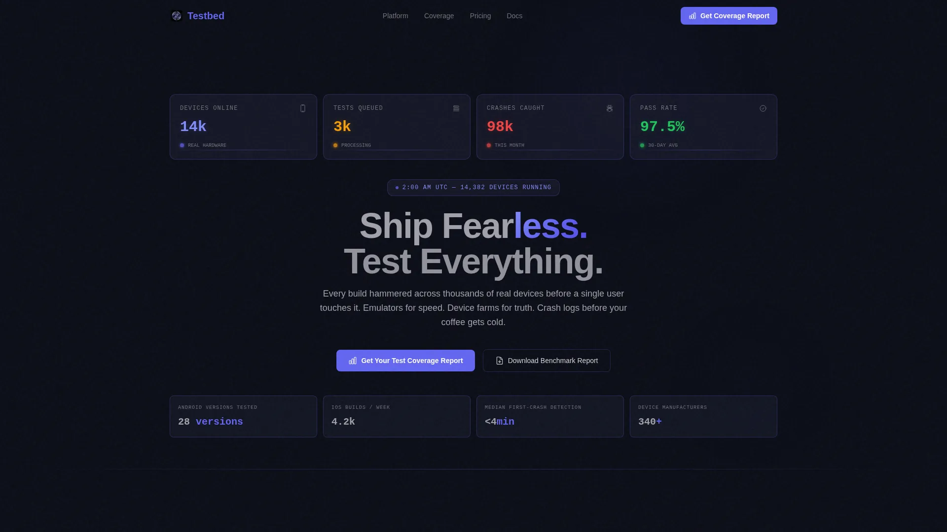
- A hero section built from dark glass metric panels, a ticking live-data aesthetic, and a centered headline above the fold
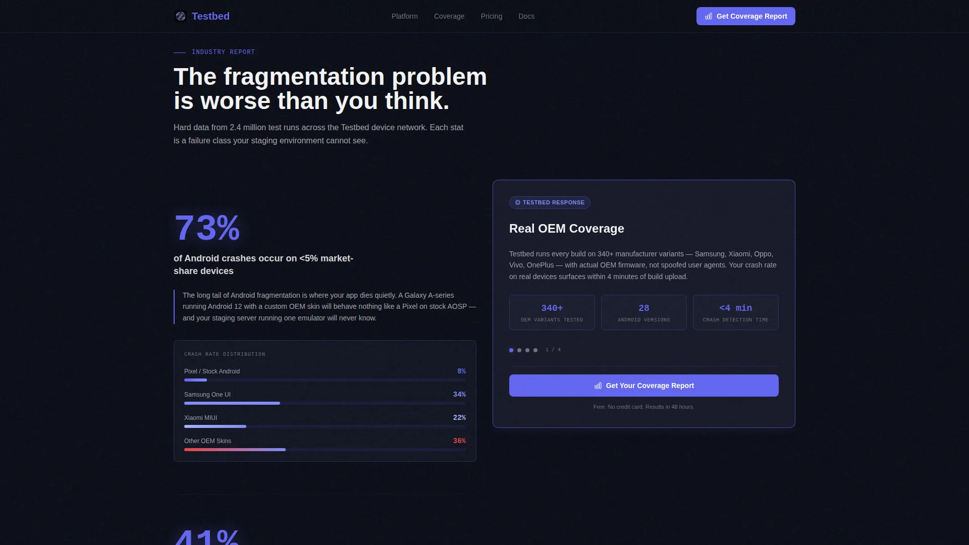
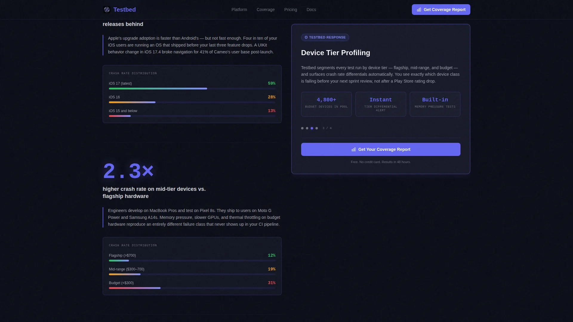
- A split-scroll body that pairs industry statistics on the left with platform capabilities on the right across three escalating stakes sections
- A lead-generation block with a three-step progressive form and a secondary PDF benchmark report gate
Feature list
A short paragraph introduces the feature set below. Each capability listed here is grounded directly in the template brief and reflects what the layout delivers as a finished design system.
Dark Glass Panel Hero
The hero section uses a tight grid of semi-transparent cards styled as live metric displays. Each card surfaces a key performance number, devices online, tests queued, crashes caught, and pass rate. A slow indigo pulse gradient animates behind the glass to create the sense of a system actively working.
Split-Screen Scroll Layout
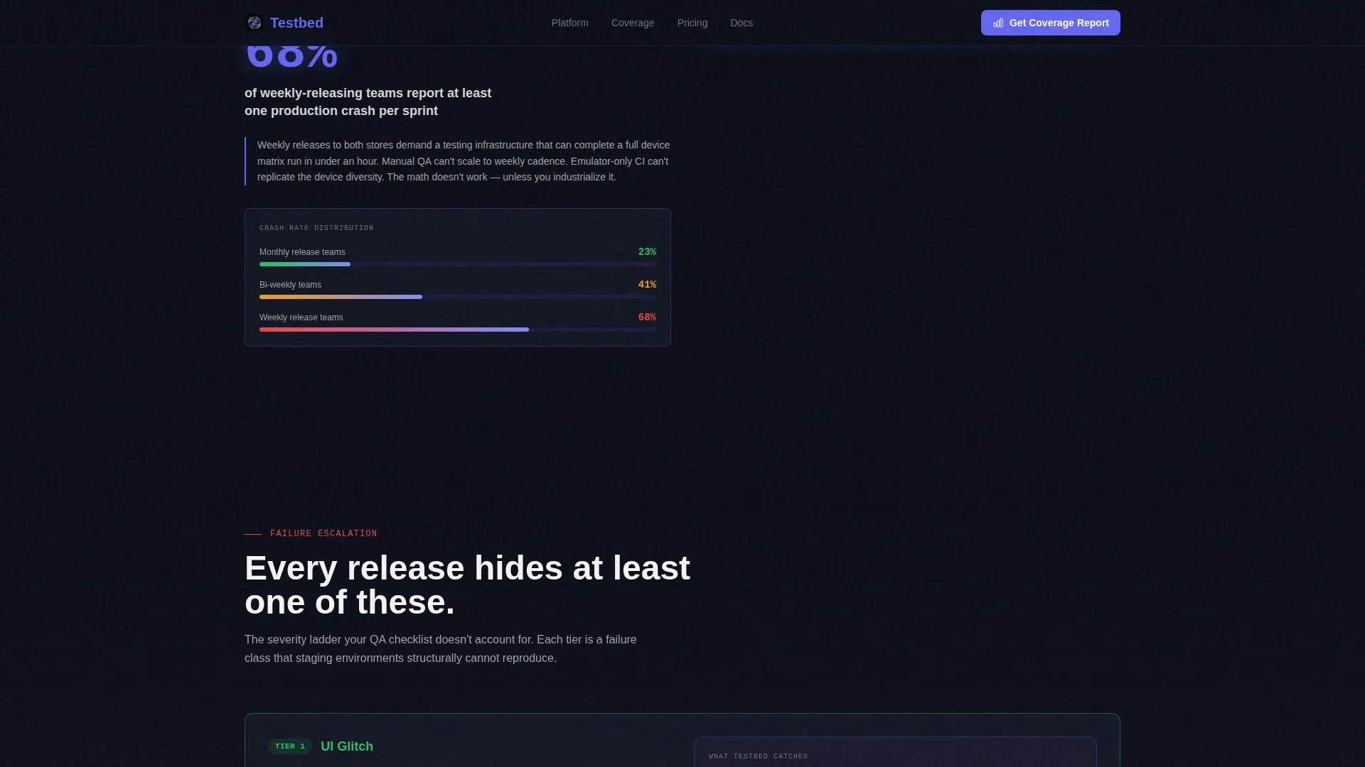
The 50/50 layout places industry fragmentation data on the left and platform capabilities on the right. Each left-panel statistic is paired with the corresponding product answer on the right. The structure escalates across three tiers: minor user interface glitches, data-loss crashes, and security vulnerabilities caught in pre-release.
Anchored Lead-Capture Form
A persistent call-to-action panel stays fixed on the right side while the left panel scrolls. The primary form expands progressively across three steps: platform selection, usage and cadence details, and work email. This keeps the conversion path visible at every stage of the scroll without forcing an interruption.
PDF Benchmark Report Gate
A secondary conversion path offers a downloadable benchmark report gated behind email only. This captures visitors who are not yet ready for a sales conversation but are engaged with the data. It gives the platform a second touchpoint with prospects at an earlier stage of their decision.
Stakes Escalation Sections
Three content tiers increase the severity of the problem being solved with each scroll. The sequence moves from common user interface glitches to data-loss scenarios to security vulnerabilities caught before release. This structure keeps technical readers engaged and raises the perceived cost of skipping proper device testing.
Social Proof Block
Named testimonials with job titles and specific performance metrics are built into the layout. Figures such as regression ticket reduction percentages and release confidence scores are formatted to stand out visually. This section is designed for QA leads, mobile engineers, and CTOs to see outcomes from people in roles identical to their own.
Page sections overview
| Section | Purpose |
|---|---|
| Dark Glass Hero | Display live-feeling metrics and headline above the fold |
| Split Scroll Body | Pair fragmentation data with platform capabilities side by side |
| Stakes Escalation | Escalate failure severity across three tiers to raise urgency |
| Social Proof Block | Show role-specific outcomes with named testimonials and real metrics |
| Progressive Lead Form | Capture qualified leads through a three-step anchored form |
| PDF Benchmark Gate | Convert research-stage visitors with a gated downloadable report |
| Linear Footer | Close the page with a single-row footer layout |
Design & branding system
The visual identity follows a Tech Glass theme built on a deep-space palette. Every surface is either void black or frosted glass, with electric indigo lighting every interactive edge and data highlight.
- Core colors: void black (#0B0D17) for backgrounds, frosted glass panels (#1A1D2E at 60% opacity with a 1-pixel luminous border), electric indigo (#6366F1) for interactive surfaces and data accents, and cool zinc (#A1A1AA) for body text
- Typography: DM Sans for headings, JetBrains Mono for data and numerical displays, Manrope for body copy
- Animation: ticking counter effects on hero metrics, a slow indigo pulse heartbeat behind the glass panels, scroll-linked panel reveals, and staggered card entrance sequences
Mobile & speed optimization
The template is designed desktop-first, reflecting the primary audience of CTOs and engineers reviewing at a workstation. The layout is built to remain responsive and readable on smaller screens.
- Desktop-first structure with a responsive layout that adapts the split-screen columns for narrower viewports
- Static sections use server-rendered components; animated counters and the interactive form use client-side components to keep the page performant where it matters
- High-interactivity elements including hover glass effects and progressive form expansion are scoped to components that do not block the initial page render
How this template helps you convert
The page is engineered around a single conversion insight: technical buyers trust data before they trust product claims. Every layout decision reinforces that principle.
- The hero greets visitors with live-feeling metrics rather than a hero image, immediately signaling that this platform speaks their language and understands the testing environment they live in
- The split-scroll body earns attention by showing industry fragmentation statistics first, making the product capability that follows feel like a logical answer rather than a sales pitch
- The anchored form and secondary PDF gate offer two distinct conversion paths, one for buyers ready to talk and one for researchers still building their case, so the page captures leads at both stages of intent
Other information about this template
This template is categorized under Technology and sits within the Mobile App subcategory, targeting the app testing platform niche. It is built for a single-page, lead-generation flow and is not a multi-page site structure.
- The creative direction follows an Industry Report style, where scrolling the page feels like reading proprietary research data
- The header concept is Dark Glass Panels, a grid of metric cards with no hero illustration or photography
- The lead-generation direction is primary throughout the page, with two capture paths: a progressive three-step form and a PDF benchmark report download gate
- The template uses the Electric Indigo color system and the Tech Glass theme as defined in the design brief
- Localization defaults are set to English, United States dollar currency, and the MM/DD/YYYY date format
- Footer follows a linear single-row pattern to keep the close of the page clean and minimal
Theme
Tech Glass
Creative direction
Industry Report
Color system
Electric Indigo
Style
Split Screen (50/50)
Direction
Lead Generation
Page Sections
Dark Glass Panel Hero Section
50/50 Split-screen Scroll Layout
Anchored Progressive Lead Form
PDF Benchmark Report Gate
Stakes Escalation Content Structure
Social Proof with Named Metrics
Related questions
Who is the primary audience for this template?
Can I replace the industry statistics in the split-scroll sections?
What are the two lead-capture paths built into this template?
Does the template support platforms that test only iOS or only Android?
Do I need a developer to customize this template?



