Therapy - Premium & Landing Page Template
Nexus is a modular card-grid landing page built for therapy and counseling knowledge bases. It organizes clinical frameworks, intervention scripts, and session blueprints by modality and presenting issue. Designed for counselors, practice owners, and graduate students, it pairs a deep navy visual identity with a focused lead-generation flow that turns visitors into subscribers.
by Rocket studio
Quick summary
Nexus is a single-page, card-grid landing page template built for a therapy and counseling knowledge base. It showcases clinical tools organized by modality, drives sign-ups through a primary call-to-action and a secondary downloadable offer, and wraps everything in a dark, productivity-focused visual system that feels purpose-built for late-night clinical prep.
Who this template is for
This template is designed for people who build or sell structured clinical resources online. It speaks directly to the mental health professional audience and the platform operators who serve them.
- Newly licensed counselors navigating their first year of private practice who need fast, organized access to clinical protocols
- Group practice owners onboarding junior clinicians who want a credible resource hub to point staff toward
- Graduate students and pre-licensed therapists bridging the gap between academic theory and real session work
What problem this template solves
Therapists and counseling students often piece together session materials from scattered sources. A well-organized knowledge base solves that problem, but it needs a landing page that communicates its depth quickly and earns the sign-up before a visitor bounces.
- Visitors cannot evaluate a resource library without seeing its scope, so hovering card previews surface just enough content to prove depth
- Clinicians working late need a page that loads their trust fast, so the scrolling logo bar establishes credibility before a word of copy is read
- Potential subscribers hesitate at a full sign-up form, so a secondary free download path removes the barrier for visitors not yet ready to commit
What you get with this template
You get a complete, ready-to-customize landing page structured around a modular card grid that showcases your clinical content library. Every section is purpose-built to guide a mental health professional from first glance to sign-up.
- A scrolling logo bar header, a multi-row feature matrix card grid with hover-flip previews, and a focused sign-up module with a lead capture form
- A primary floating call-to-action button and a secondary email-gated PDF download path to capture leads at different commitment levels
- A Midnight Blue color system with teal accent states, applied consistently across cards, buttons, and typography for a cohesive clinical-productivity aesthetic
Feature list
This template bundles several carefully designed components that work together to present a knowledge base with authority and convert curious visitors into committed users.
Scrolling Logo Bar Header
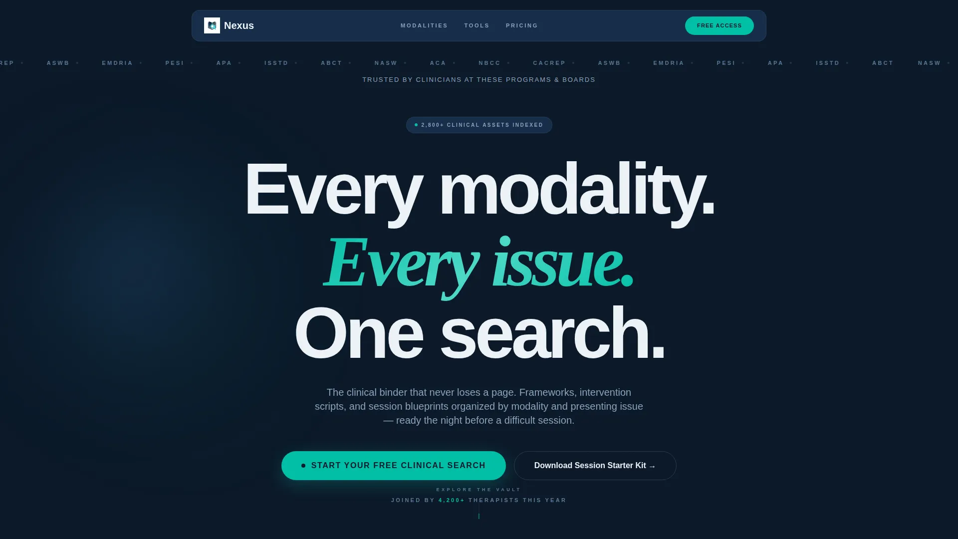
A slim horizontal ribbon displays logos of graduate programs, licensing boards, and continuing education platforms. The logos scroll automatically and slowly, functioning as a quiet credentialing signal before any marketing copy appears. A single oversized headline sits beneath: "Every modality. Every presenting issue. One search."
Modular Card Grid with Hover-Flip Previews
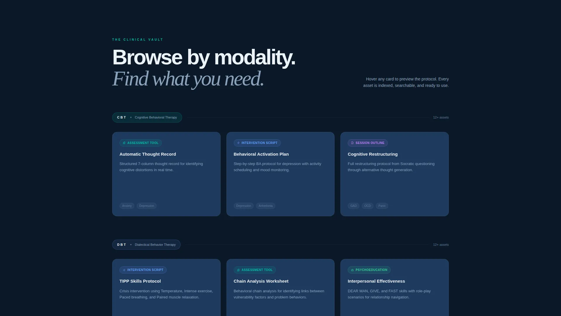
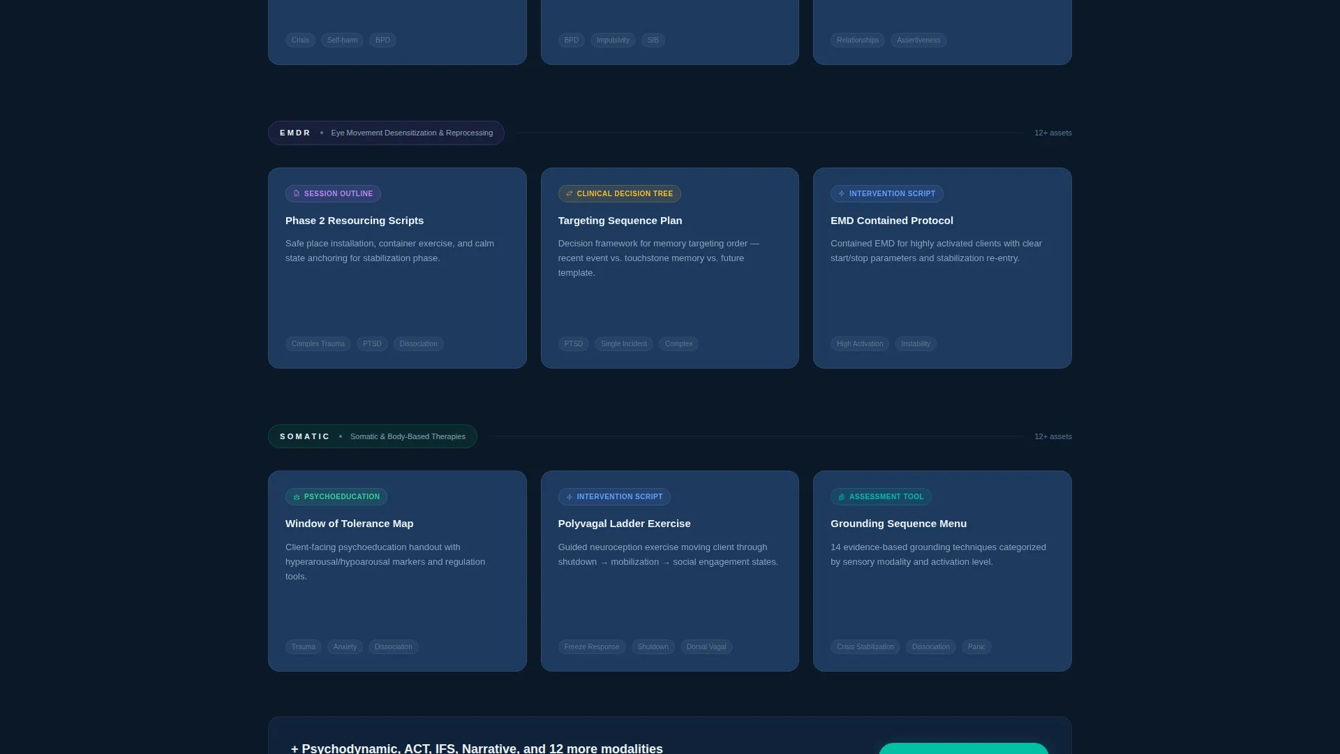
Cards are organized in rows by clinical modality, including Cognitive Behavioral Therapy (CBT), Dialectical Behavior Therapy (DBT), Eye Movement Desensitization and Reprocessing (EMDR), somatic approaches, and psychodynamic frameworks. Each card previews a specific asset type on the front. Hovering flips the card to reveal a content snapshot, proving depth without giving the full resource away.
Floating Primary Call-to-Action Button
A "Start Your Free Clinical Search" button pins itself after the first card row and stays visible as the visitor scrolls. This persistent placement reduces friction by keeping the sign-up action within reach at every point in the page journey.
Lead Capture Sign-Up Module
A focused sign-up form at the bottom of the page collects first name, professional role via a dropdown menu, primary modality interest, and email address. The role options include student, pre-licensed clinician, licensed clinician, and practice owner, allowing the platform to segment its audience from day one.
Secondary PDF Download Path
A free "Session Starter Kit" PDF is offered as a gated secondary conversion. Visitors provide only their email address to access it. This path captures leads from visitors who are interested but not yet ready to create a full account.
Narrowing Grid Scroll Structure
The card grid is structured so that content moves from broad modality overviews at the top to granular clinical tools as the visitor scrolls further down. This mirrors the clinical process of moving from intake assessment to specific intervention selection, making the content structure feel intuitive to a therapy professional.
Page sections overview
| Section | Purpose |
|---|---|
| Logo Bar Header | Establish credibility through institutional logos and a single anchoring headline |
| Primary Hero Copy | Communicate the core value proposition immediately below the logo ribbon |
| Modality Card Rows | Showcase clinical categories and specific asset types in a browsable grid |
| Hover-Flip Previews | Surface content snapshots on card interaction to demonstrate library depth |
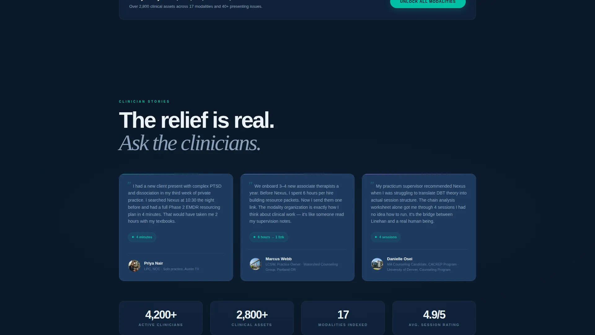
| Floating call to action Button | Keep the primary sign-up action visible throughout the scroll journey |
| Sign-Up Form Module | Capture segmented lead data with a focused, low-friction form |
| PDF Download Offer | Convert hesitant visitors with an email-only gated free resource |
Design & branding system
The visual identity follows a Startup Velocity theme expressed through a Midnight Blue color system. Every color choice serves a practical purpose for a clinician working late at a screen.
- Deep terminal navy (#0B1929) as the primary background, muted clinical slate (#1E3A5F) on card surfaces, and crisp intake-form white (#EDF2F7) for text and spacing create a dark, low-strain reading environment
- A confident teal accent (#00BFA6) applied to buttons and hover states adds forward-motion energy without overwhelming the calm, professional atmosphere
- Typography leans on clean, oversized white headline type and readable body text that maintains contrast across the dark palette
Mobile & speed optimization
The modular card-grid layout is built with responsive behavior in mind. Each component is designed to reflow cleanly across screen sizes, keeping the clinical resource browsing experience usable on any device a therapist picks up between sessions.
- The card grid collapses from multi-column desktop rows to single or two-column stacks on smaller screens, preserving the browsing structure
- The floating call-to-action button and the sign-up form module maintain their visual prominence and usability at mobile viewport widths
How this template helps you convert
Every structural decision in this template is oriented toward turning a curious visitor into a signed-up user. The page earns trust first, then asks for commitment.
- The scrolling logo bar establishes institutional credibility in the first seconds, so visitors arrive at the card grid already primed to trust the resource depth they are about to see
- The hover-flip card previews create just enough clinical curiosity that signing up feels like unlocking the rest of a binder the visitor already wants, making the primary call-to-action feel like a logical next step rather than a cold ask
- The secondary PDF download path ensures that even visitors who do not sign up for a full account leave an email address, keeping them in reach for follow-up outreach
Other information about this template
This template is part of the broader Therapy and Counseling Digital Presence subcategory within the Technology template collection. It is a strong fit for knowledge base products targeting mental health professionals at any stage of their career.
- The Nexus template is built as a single-page, section-led landing page, not a multi-page website, keeping the entire visitor journey contained and focused
- The template style is Card Grid (Modular), making it straightforward to add, remove, or reorder card rows as your content library grows or shifts in focus
- The lead-generation direction means every section is sequenced to move visitors toward a sign-up action, with two distinct conversion paths accommodating different levels of visitor readiness
- The Startup Velocity theme and Midnight Blue color system position the page closer to a productivity or software-as-a-service aesthetic than a traditional clinical website, which helps it stand out in the mental health platform space
Theme
Startup Velocity
Creative direction
Feature Matrix
Color system
Midnight Blue
Style
Card Grid (Modular)
Direction
Lead Generation
Page Sections
Scrolling Logo Bar Header
Hover-flip Modular Card Grid
Floating Primary Call to Action Button
Segmented Lead Capture Form
Secondary PDF Download Path
Narrowing Grid Scroll Structure
Related questions
Can I customize the card categories for different clinical modalities?
What does the sign-up form collect from visitors?
Is there a way to capture leads from visitors not ready to sign up?
Who is this landing page template best suited for?
Can the color system be changed to match a different brand?



