Grunge Bag Brand Landing Page Template
Thrash is an overlap/layered landing page template built for a grunge bag brand. It uses a collage/scrapbook header, seasonal scroll storytelling, and a Ruby and Chrome color system to move visitors from a single product view toward a multi-bag bundle. The sticky bottom bar and tiered unlock mechanic make the upsell feel earned, not pushed.
by Rocket studio
Quick summary
Thrash is a single-page landing page template designed for an edgy, grunge-aesthetic bag brand. It layers overlapping sections, scrapbook-style visuals, and a seasonal narrative to guide visitors toward a bundle purchase. The Ruby and Chrome color system keeps everything bold and legible, while the "Build Your Rotation" call to action drives multi-bag upsells through a tiered reward structure.
Who this template is for
This template is built for independent bag brands and fashion-forward product sellers who want a landing page that matches the personality of what they sell. If your product lives in the grunge, streetwear, or DIY fashion space, Thrash speaks your language.
- Bag and accessories brands targeting art students, musicians, and style-conscious young adults
- Independent fashion labels wanting a landing page that doubles as a visual statement
- Product sellers running upsell campaigns who need a page built around bundle discovery
What problem this template solves
Most product pages present one item and stop there. Thrash solves the single-product ceiling by building a seasonal story that makes owning just one bag feel incomplete. It turns a browsing session into a bundle decision.
- Visitors arriving from a product page already know the item; this page convinces them they need the full rotation
- Standard templates lack the visual grit and layered energy that grunge fashion buyers respond to
- Generic upsell pages feel pushy; Thrash earns the upgrade by showing the bag living across real moments and seasons
What you get with this template
You get a fully structured landing page layout with every section already designed and positioned. The visual system, scroll logic, and conversion mechanics are baked in from the first load.
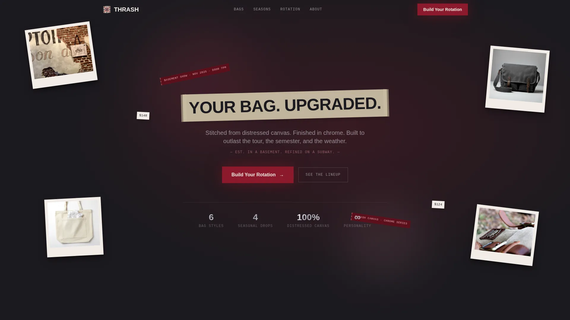
- A collage/scrapbook header with overlapping Polaroid-style product shots, torn ticket stubs, handwritten price tags, and chrome zipper details
- Four seasonal content panels that overlap like scrapbook pages, each introducing a new product tier
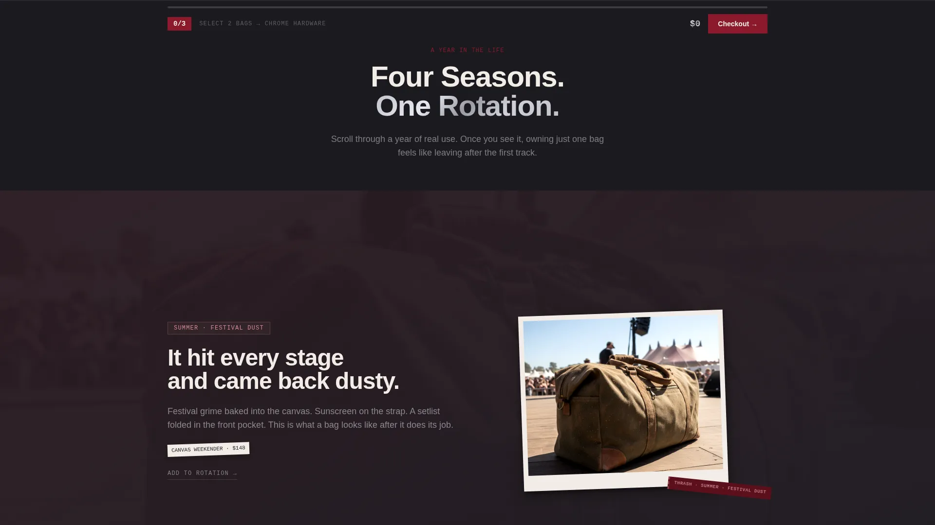
- A sticky bottom bar showing the current bundle, a running price total, and a progress indicator toward the next unlock tier
Feature list
This section covers the core built-in capabilities that make Thrash work as a conversion-focused landing page for a grunge bag brand.
Collage Scrapbook Header
The header drops visitors straight into the brand world. Polaroid-style product shots, torn ticket stubs, handwritten price tags, and chrome zipper pulls are scattered across the viewport with intentional misalignment. A ripped masking-tape strip anchors the headline: "YOUR BAG. UPGRADED."
Seasonal Scroll Narrative
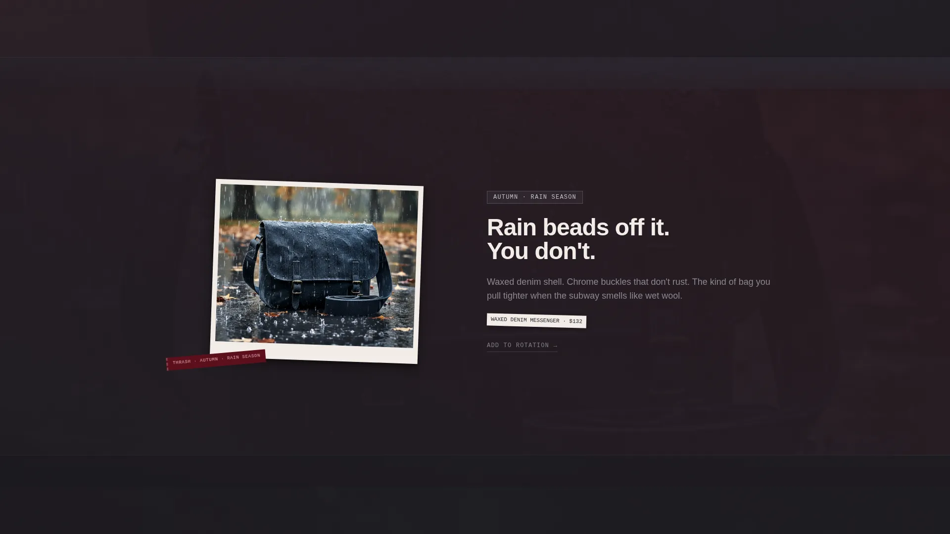
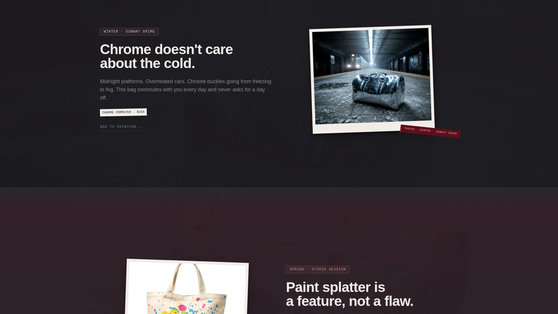
Four overlapping content panels take the visitor through a year with a Thrash bag. Summer festival dust, autumn rain on waxed denim, winter subway grime on chrome buckles, and spring paint splatter from a studio session each introduce a new product tier. The panels layer on top of each other like pages in a scrapbook.
Tiered Bundle Unlock Mechanic
The page is structured around a "Build Your Rotation" call to action. Selecting two bags unlocks chrome-edition hardware. Selecting three adds a limited seasonal patch kit. Each tier feels like a reward, not a sales tactic.
Sticky Bundle Progress Bar
A sticky bottom bar stays visible throughout the scroll. It shows the current bundle selection, a running price total, and a visual progress indicator that nudges visitors toward the next unlock tier without interrupting the reading experience.
Overlap and Layered Layout
Sections are built to overlap, not stack cleanly. Panels slide over each other as the visitor scrolls, reinforcing the worn, layered aesthetic of the brand and keeping the page feeling dynamic from top to bottom.
Ruby and Chrome Color System
Deep crushed ruby bleeds into faded rose, polished chrome silver highlights edges and price text, and near-black charcoal grounds navigation and body copy. Ruby gradient overlays sit behind product shots. Chrome accents mark interactive elements and price displays.
Page sections overview
| Section | Purpose |
|---|---|
| Collage Header | Introduces brand identity and headline |
| Summer Festival Panel | Opens seasonal narrative with first product tier |
| Autumn Rain Panel | Deepens story and layers second product tier |
| Winter Subway Panel | Continues scroll arc with third product tier |
| Spring Studio Panel | Closes seasonal loop and completes the rotation case |
| Bundle Builder call to action | Drives the "Build Your Rotation" conversion action |
| Sticky Bundle Bar | Tracks selection progress and running total throughout scroll |
Design & branding system
The visual identity is built on a Soft Gradient theme running through a Ruby and Chrome color system. Every color has a specific role, and nothing is decorative for its own sake.
- Deep crushed ruby (#8B1A2B) and faded rose (#D48B94) appear as gradient overlays behind product shots, with rose softening section transitions
- Polished chrome silver (#C0C0C8) highlights edges, price text, and interactive elements, while near-black charcoal (#1C1A1F) anchors all typography and navigation
- The overall palette reads like a lipstick smear on a chrome bathroom mirror: glamorous and gritty together, never one without the other
Mobile & speed optimization
The overlapping layout and layered visual system are designed to translate across screen sizes without losing the scrapbook energy that defines the brand.
- Overlapping panels and collage elements are composed to remain readable and visually intentional on smaller screens
- The sticky bottom bar is built to stay accessible during scroll on both desktop and mobile viewports
- Typography and charcoal anchoring keep legibility intact even when ruby gradient overlays are active behind product imagery
How this template helps you convert
Thrash does not just display products. It builds a case across every section that one bag is the beginning, not the end.
- The seasonal scroll narrative gives each product tier its own moment, so by the time visitors reach the bundle builder, they have already seen four reasons to buy more than one bag.
- The tiered unlock mechanic (chrome hardware at two bags, patch kit at three) makes the bundle feel like a discovery rather than an upsell, and the sticky progress bar keeps the reward visible throughout the entire page.
Other information about this template
Thrash is part of a broader set of overlap/layered landing page templates suited to fashion and lifestyle brands with strong visual identities. A few additional details worth knowing before you use this template:
- The template style is classified as Overlap/Layered, which means sections are intentionally designed to bleed into each other rather than sit in clean rows
- The creative direction is Seasonal/Moment, so the scroll structure is tied to the four-season narrative arc and works best when product photography reflects real-world use and wear
- The header concept is Collage/Scrapbook, which requires product images that work well in a non-aligned, mid-tumble, or detail-cropped format
- The landing page direction is Upsell/Upgrade, meaning the page is optimized for visitors who already know the brand or product and are ready to be shown more
Theme
Soft Gradient
Creative direction
Seasonal/Moment
Color system
Ruby & Chrome
Style
Overlap/Layered
Direction
Upsell/Upgrade
Page Sections
Collage Scrapbook Header Layout
Four-season Scroll Narrative
Tiered Bundle Unlock Mechanic
Sticky Bundle Progress Bar
Overlap and Layered Section Design
Ruby and Chrome Visual System
Related questions
Who is the target audience for this landing page template?
Can I use this template if I only sell one bag model?
How does the bundle unlock mechanic work?
What kind of product photography works best with this template?



