Punk Resale Landing Page Template | Dark Immersive
Thrash is a dark immersive landing page template built for punk resale platforms. It pairs full-viewport texture photography with zine-style storytelling to showcase sellers, their stories, and rare inventory. A pulsing upgrade prompt earns its ask by proving depth first. The result feels physical, defiant, and convincing.
by Rocket studio
Quick summary
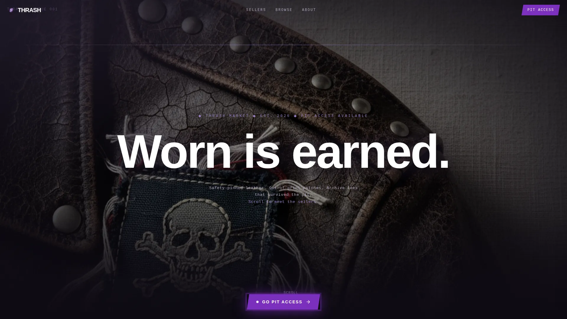
Thrash is a storybook landing page template designed for a punk fashion resale platform. It opens on a macro close-up of cracked leather, then drives visitors through full-bleed creator spotlights before presenting a clear upgrade offer. The layout feels like a hand-stapled zine, not a polished e-commerce grid.
Who this template is for
This template is built for operators who need to sell the culture of their platform before they sell the product. It works best when inventory has a story worth telling.
- Independent resale platform founders focused on punk, underground, or subculture fashion
- Community-led marketplaces where seller identity and curation are the core value proposition
- Creative entrepreneurs launching a niche fashion resale site who want to stand apart from generic storefronts
What problem this template solves
Generic marketplace templates fail niche resale platforms. They flatten the personality of the inventory and make every listing feel interchangeable. Thrash solves the trust gap that prevents first-time visitors from committing to an account.
- Visitors need to feel the depth of the inventory before they trust the platform enough to sign up
- Sellers need to be humanized, not just listed, so buyers believe the pieces are authentic
- The upgrade ask needs to feel earned, not forced, or visitors will ignore it
What you get with this template
You get a single full-page layout structured around immersive storytelling and a clear conversion path. Every section has a defined role in moving the visitor from curiosity to commitment.
- A macro close-up header section with a full-viewport texture image and a single punchy headline
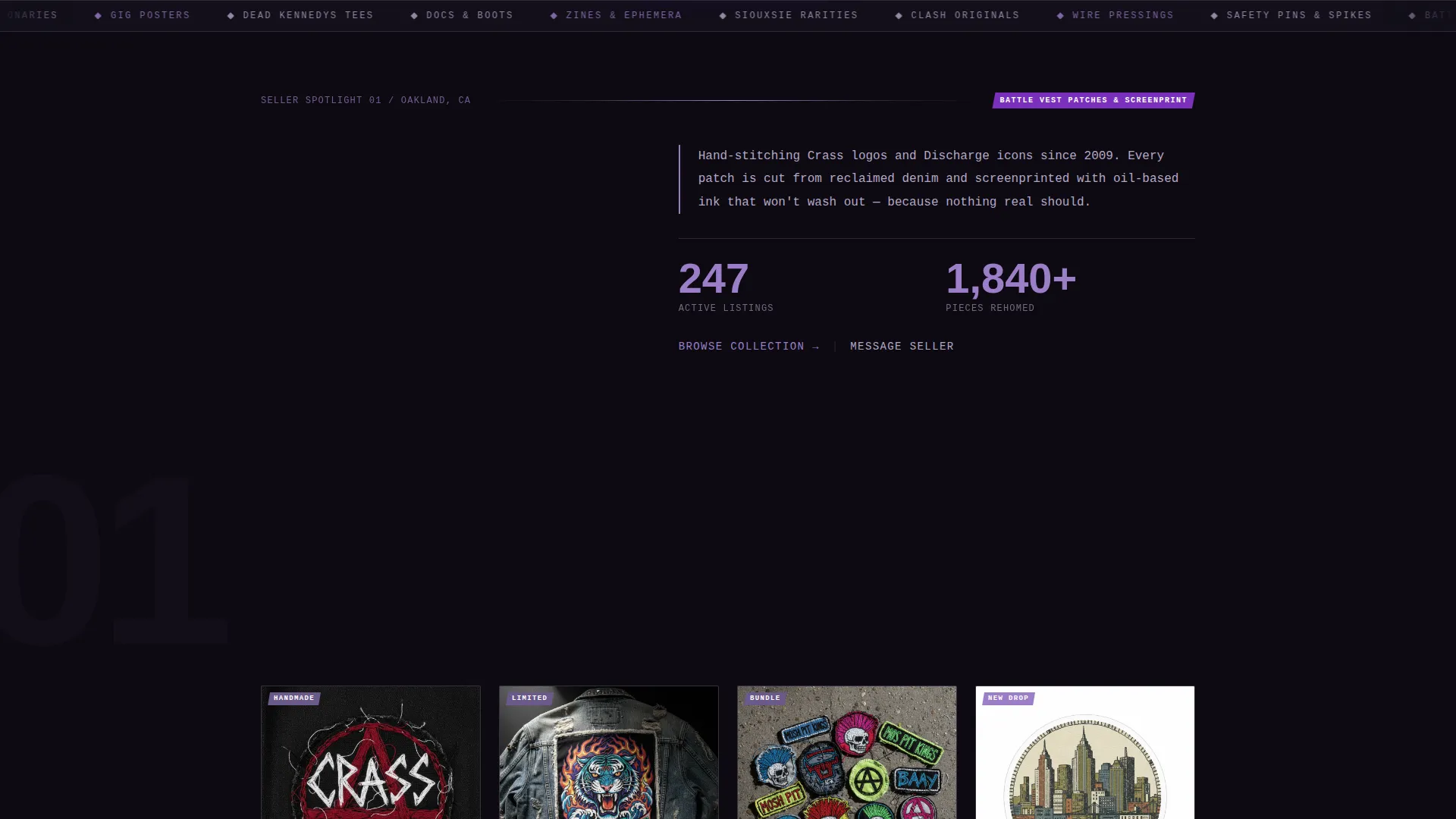
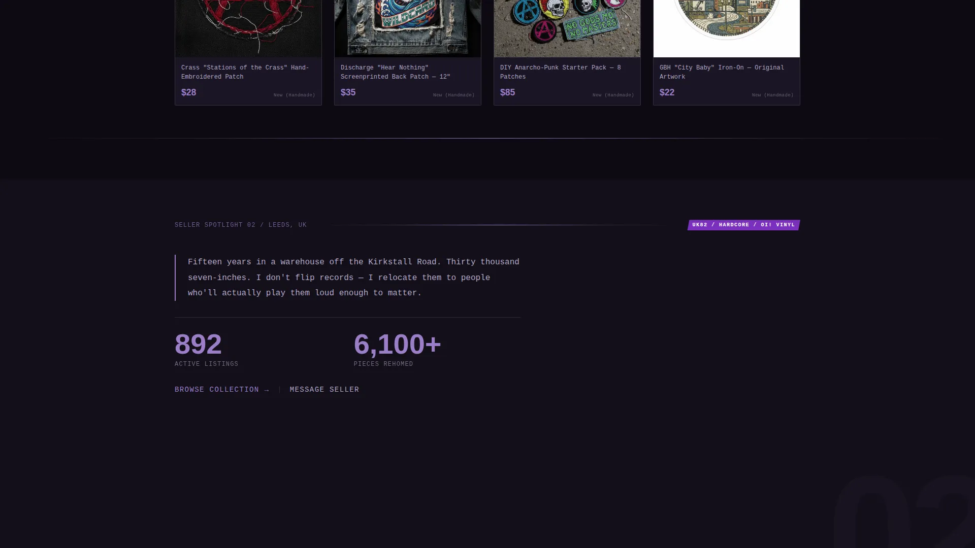
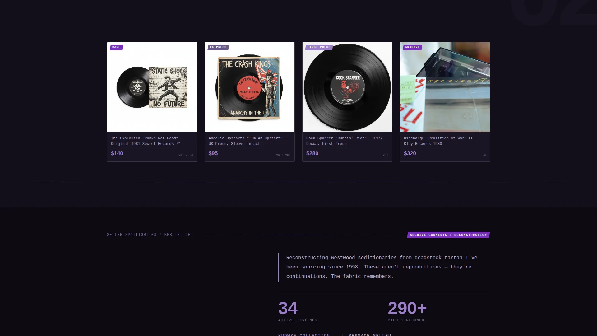
- Three full-bleed creator spotlight spreads, each pairing a seller portrait with their listed pieces
- A fixed upgrade call-to-action button, a Free versus. Pit Access comparison strip, and a secondary sell path
Feature list
This template ships with a carefully sequenced set of layout sections and interaction patterns drawn directly from the brief.
Full-Viewport Macro Header
The opening section fills the entire screen with an extreme close-up of weathered leather. A single line of xerox-rough type appears after a beat. There is no navigation and no logo, only raw texture and the tagline "Worn is earned."
Hard Page-Turn Creator Spreads
Each creator spotlight occupies a full page. The transition between spreads is designed to feel like a hard wipe rather than a smooth scroll, giving the layout an analog, printed quality. Three spreads escalate in stakes from accessories to archive garments.
Earned Upgrade Prompt
The "Go Pit Access" button is fixed at the bottom of the viewport but only appears after the visitor has scrolled through at least two creator spreads. This sequencing ensures the upgrade ask follows proof of inventory depth, not the other way around.
Free versus. Pit Access Comparison Strip
After the third creator spread, a torn-paper styled comparison strip slides in. It clearly contrasts the free browsing tier against the Pit Access tier, which unlocks early drops, direct seller messaging, and authentication reports on vintage pieces.
Secondary Seller Conversion Path
A distinct secondary call-to-action invites visitors who recognize the value of their own collection to list it. The "Sell Your Collection" path runs alongside the buyer upgrade prompt without competing with it visually.
Zine-Style Visual Language
Typography, layout seams, and texture overlays are styled to evoke a hand-produced fanzine. The design system uses photocopied edges, rough type treatments, and a dark color palette to keep every section feeling tactile and specific to the punk resale context.
Page sections overview
| Section | Purpose |
|---|---|
| Macro Close-Up Header | Opens on full-viewport leather texture with a single reveal headline |
| Creator Spotlight One | Introduces the first seller, their story, and their listed pieces |
| Creator Spotlight Two | Escalates to mid-tier rare garments with a second seller portrait spread |
| Creator Spotlight Three | Peaks with archive and one-of-a-kind pieces from a third seller |
| Upgrade call to action Button | Fixed prompt appearing after two spreads to convert engaged visitors |
| Comparison Strip | Torn-paper Free versus. Pit Access breakdown that slides in after spread three |
| Sell Your Collection | Secondary path for potential sellers who arrive as buyers |
Design & branding system
The visual identity runs on the Lavender Dream color system, which pairs deep gutter black with bruised purple tones to evoke a rain-soaked photocopied flyer. Every color decision reinforces the underground aesthetic.
- Background is deep gutter black (#0D0A12), with bruised lavender (#9B7EC8) on headlines and hover states, faded xerox gray (#B4A7C7) for body text, and hot safety-pin silver (#D6CEE3) for dividers and interactive borders
- Electric violet (#7B2FBE) fires on the upgrade call-to-action button and notification badges, making it the single highest-contrast element on every spread
- Typography and texture overlays are styled after xerox-degraded zine printing, with rough edges, tight leading, and a deliberately imperfect feel throughout
Mobile & speed optimization
The full-bleed, image-heavy layout is structured to remain legible and impactful at smaller screen sizes. Creator spreads reflow into single-column stacks without losing the portrait-plus-listing relationship.
- Fixed-position elements such as the upgrade button are designed to occupy minimal screen real estate on mobile viewports
- Hard wipe transitions between creator spreads are built to adapt gracefully when scroll behavior differs across touch and pointer devices
How this template helps you convert
The conversion architecture is sequenced deliberately. Visitors are not asked for anything until the template has demonstrated value through immersive content.
- The macro header stops the scroll immediately, creating a sensory first impression that keeps visitors on the page long enough to reach the creator spreads.
- Three escalating creator spotlights build credibility and desire, showing the platform's depth before the upgrade prompt appears, which means the ask lands at peak engagement rather than before it.
Other information about this template
Thrash is categorized under Fashion and Lifestyle, with a specific focus on punk fashion and resale. It is a strong fit for any underground or subculture marketplace that needs to lead with identity before conversion.
- The template style is Storybook and Full-Page, meaning the entire visitor journey happens within one continuous scroll rather than across multiple linked pages
- The Dark Immersive theme and Lavender Dream color system are paired specifically to serve high-texture, culture-led fashion niches
- The Creator Spotlight creative direction makes this template a natural choice for platforms where the people selling are as important as the items they list
Theme
Dark Immersive
Creative direction
Creator Spotlight
Color system
Lavender Dream
Style
Storybook/Full-Page
Direction
Upsell/Upgrade
Page Sections
Full-viewport Macro Header
Hard Page-turn Creator Spreads
Earned Upgrade Prompt
Free Versus. Pit Access Comparison Strip
Secondary Seller Conversion Path
Zine-style Visual Language
Related questions
Is Thrash a single-page or multi-page template?
Can I adjust the number of creator spotlight sections?
What does the Pit Access comparison strip show?
Who is this landing page template designed for?
When does the upgrade call-to-action button appear?



