Fashion Rental & Resale Blog Website Template
Thrift is a dark, immersive landing page template built for vintage clothing marketplaces. It uses a Ruby and Chrome color system, a full-bleed editorial header, and a scrolling curated-collection layout to build urgency and trust. The page guides visitors toward a paid membership tier through sold-out signals, countdown timers, and a persistent sticky upgrade banner.
by Rocket studio
Quick summary
Thrift is a storybook landing page template designed for vintage clothing resale brands. It pairs a near-black, ruby-accented visual identity with an editorial scroll experience that mimics flipping through a high-end lookbook. Sold-out badges, countdown timers, and a tiered membership upsell make every section feel like the find of a lifetime is one click away.
Who this template is for
This template is built for founders and creators running curated vintage clothing marketplaces. It suits anyone who needs to sell the story of rare, hand-picked inventory before they sell the pieces themselves.
- Vintage resellers and archivists launching drop-based storefronts
- Costume designers and stylists looking to showcase era-accurate, sourced pieces
- Membership-based fashion communities offering early access to exclusive drops
What problem this template solves
Most vintage resale pages look like plain product catalogues. They fail to communicate scarcity, provenance, or the thrill of the find. Buyers leave without a sense of urgency, and the cost of upgrading to a premium tier never feels real.
- A flat page layout cannot recreate the atmosphere of a basement vintage shop
- Generic templates do not support urgency signals like sold-out badges or countdown timers
- There is no built-in path to convert a casual browser into a paying member
What you get with this template
This template delivers a complete single-page layout structured around curated collection reveals, editorial copy blocks, and a layered membership upsell system. Every section is designed to deepen atmosphere and build purchasing pressure as the visitor scrolls.
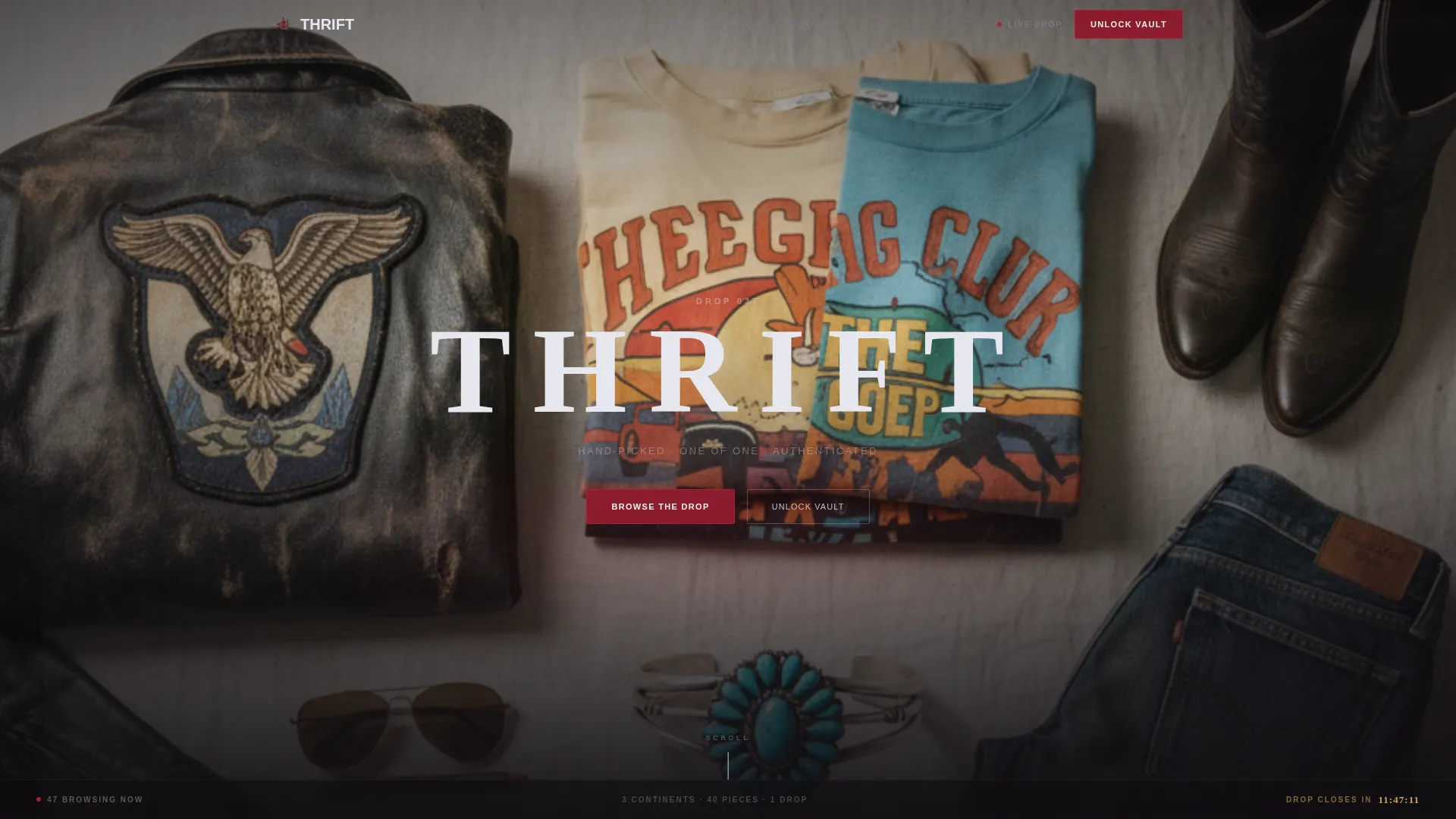
- A full-bleed viewport header with a moody flat-lay photo and a delayed fade-in drop title
- Multiple full-page collection sections, each with editorial sourcing notes and a styled product grid
- A sticky bottom upgrade banner and a primary mid-page call to action for paid membership sign-up
Feature list
This template is built around six core capabilities, each grounded in the source brief and the Dark Immersive design direction.
Full-Bleed Editorial Header
The opening section fills the viewport edge to edge with a single overhead flat-lay photograph. A drop title fades in at center after two seconds in chrome-silver condensed type, setting an immediate tone of quiet exclusivity before the visitor scrolls a single pixel.
Scroll-Driven Collection Reveal
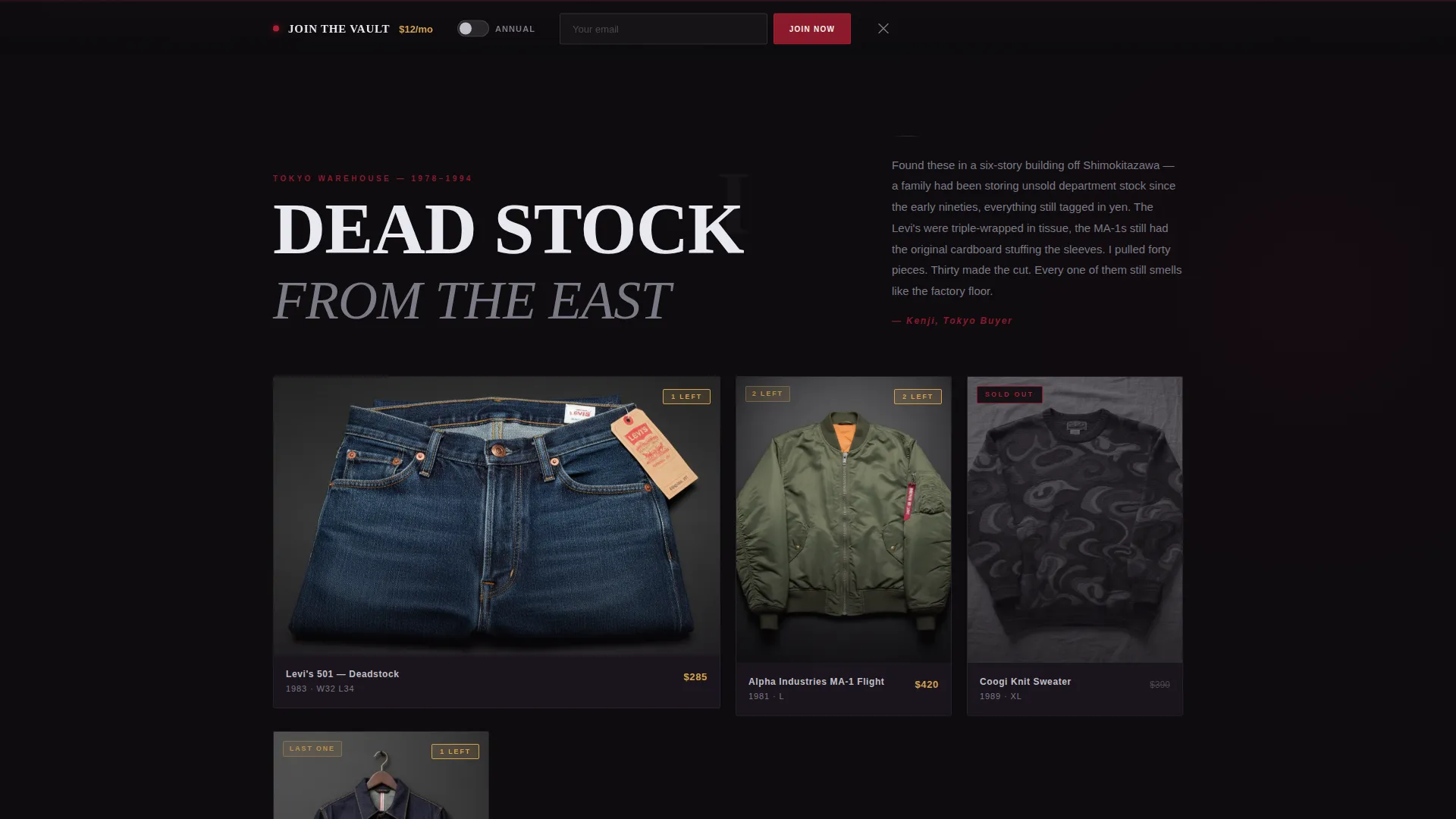
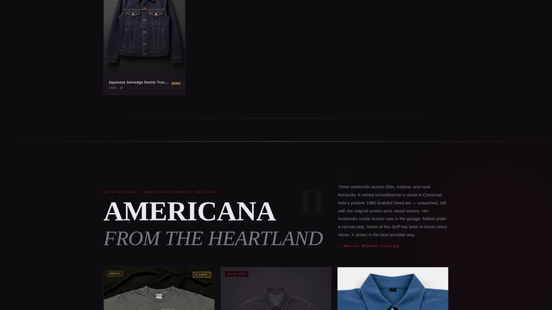
Each full-page section introduces one collection or era. A short editorial paragraph written in the voice of the sourcing buyer precedes a tight three-to-five-piece grid styled on invisible mannequins against black. Scroll depth determines how much of the story the visitor has earned.
Ruby Intensity Progression
The ruby accent color builds in visual weight as the visitor scrolls deeper. Early sections feel restrained and editorial. Later sections pulse with sold-out badges and countdown timers, creating a real-time sense that inventory is thinning out with every passing second.
Urgency and Scarcity Signals
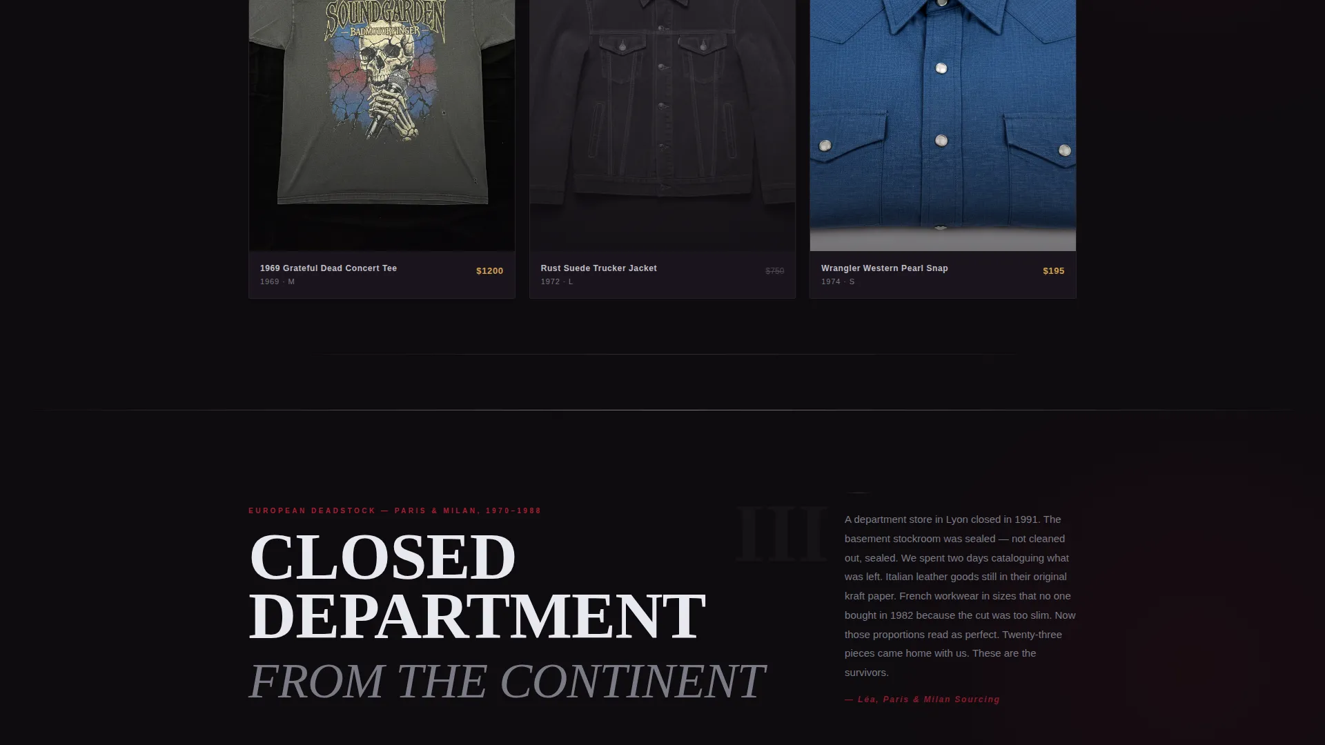
Sold-out badges, countdown timers, and "Vault Members Only" grail callouts appear across the lower collection sections. These signals work together to make the cost of not upgrading feel tangible and immediate to any visitor who has been browsing for more than a few minutes.
Mid-Page Membership Upsell
After the third collection reveal, the primary call-to-action block invites visitors to unlock early access. The pitch includes 48-hour priority on new drops, exclusive archive pieces, and free authentication, all framed visually with three sold-out pieces the visitor cannot reach without a membership.
Sticky Upgrade Banner
A persistent bottom banner reads "Join the Vault" with a single email field and a toggle for annual billing at a discounted rate. The banner stays visible throughout the scroll without interrupting the editorial experience, keeping the upgrade path accessible at all times.
Page sections overview
| Section | Purpose |
|---|---|
| Full-Bleed Header | Opens with a flat-lay drop reveal and delayed title fade-in |
| Collection One | First era reveal with editorial sourcing note and product grid |
| Collection Two | Second era reveal, ruby accent begins to intensify |
| Collection Three | Third era reveal leading into the primary membership upsell |
| Unlock Early Access | Primary mid-page call to action for paid membership sign-up |
| Sold-Out Grail Callouts | Three Vault-only pieces showing the cost of not upgrading |
| Join the Vault Banner | Sticky bottom banner with email field and billing toggle |
Design & branding system
The visual identity follows a Dark Immersive theme built entirely around the Ruby and Chrome color system. Every palette decision reinforces the feeling of a vintage garment photographed under studio strobes on black seamless.
- Near-black velvet (#0E0B0F) as the base canvas, deep ruby (#8B1A2B) for highlights and hover states, polished chrome silver (#C0C0C8) on typography and divider lines
- Warm flashbulb amber (#D4A24E) reserved exclusively for price tags and urgency badges, making them feel like physical labels under a single overhead bulb
- Condensed chrome-silver type for headlines and editorial drop titles, keeping the typographic voice tight and cinematic
Mobile & speed optimization
The layout is structured for vertical scroll on any screen size. The full-bleed header, full-page collection sections, and sticky banner are each designed to work clearly at mobile viewport widths without losing atmosphere.
- Product grids scale from three-to-five columns on desktop to a clean stacked layout on smaller screens
- The sticky upgrade banner remains accessible at the bottom of the viewport on both mobile and desktop without obscuring primary content
- Countdown timers and sold-out badges remain legible at all responsive breakpoints, preserving the urgency effect on every device
How this template helps you convert
The conversion architecture of this template is built into its scroll structure. Every design and copy decision pushes the visitor toward the membership upsell by the time they reach the third collection.
- The delayed drop title and moody editorial photography establish trust and atmosphere before any selling begins, so the visitor arrives at the upsell already invested in the world of the brand.
- The ruby intensity progression and real-time scarcity signals make the inventory feel genuinely finite, so the upgrade from free browsing to paid early access feels like a practical decision, not a sales pitch.
- The sticky banner and mid-page call-to-action block work in parallel, keeping the upgrade path visible without forcing a single high-pressure moment on the visitor.
Other information about this template
This template is purpose-built for the vintage clothing resale niche and the Fashion Rental and Resale subcategory within Fashion and Lifestyle. It is designed as a storybook, full-page landing page, meaning all content lives in a single scrollable experience with no navigation to separate pages.
- The Curated Collection creative direction means each section functions as a standalone editorial chapter, suitable for drop-based or archival inventory models
- The Upsell and Upgrade landing-page direction is built into the information architecture, not bolted on as an afterthought
- The template works well for vintage clothing marketplaces that use drop culture mechanics, including numbered drops, limited runs, and time-sensitive release windows
- The warm amber price-tag accent and the "Vault Members Only" badge system are visual components that can be adapted to any membership pricing structure described in the brief
- This template is categorized under the Fashion and Lifestyle category with a strong intersection match for vintage clothing resale brands operating in a premium or collector-focused market segment
Theme
Dark Immersive
Creative direction
Curated Collection
Color system
Ruby & Chrome
Style
Storybook/Full-Page
Direction
Upsell/Upgrade
Page Sections
Full-bleed Editorial Header
Scroll-driven Collection Sections
Ruby Intensity Progression
Membership Upsell Architecture
Sticky Upgrade Banner
Urgency and Scarcity Signals
Related questions
Who is this landing page template best suited for?
Can I adapt the membership pricing shown in the template?
Does the template support a numbered drop format?
How does the scarcity system work visually?
Is this a single-page layout or a multi-page template?



