Agriculture Software Specialist Cost Calculator Website Template
Yield is a split-screen agriculture quality management landing page template built for platforms that turn soil samples, moisture readings, and harvest data into real-time quality scorecards. With a Data Command visual identity, an interactive quality-loss estimator in the header, and a Stats-First scroll journey, it converts quality managers, compliance officers, and agronomists into trial users.
by Rocket studio
Quick summary
Yield is a single-page landing page template designed for agriculture quality management platforms. It pairs a live quality-loss estimator with a stats-driven scroll narrative and a Freemium/Trial conversion path. The dark Data Command aesthetic makes numbers the focal point, giving grain elevator managers and export compliance teams an immediate sense of operational control.
Who this template is for
This template is built for agriculture software companies and platforms that help production teams catch quality problems before harvest loads leave the farm gate. It speaks directly to operations where data accuracy and compliance speed are business-critical.
- Quality managers at grain elevators running high-volume harvest days with hundreds of trucks
- Compliance officers at export cooperatives managing Food Safety Modernization Act (FSMA) and Global Food Safety Initiative (GFSI) audits
- Agronomists advising row-crop operations who need documented proof that their field protocols improved outcomes
What problem this template solves
Manual grading logs, disconnected spreadsheets, and reactive quality checks create costly blind spots during peak harvest. By the time a contamination issue or grade drift is spotted, entire loads may already be flagged for rejection. This template gives agriculture software platforms a landing page that communicates the cost of that problem instantly.
- Harvest teams lose revenue to rejected loads that better real-time monitoring would have caught earlier
- Compliance gaps in audit-ready documentation create last-minute scrambles before FSMA or GFSI reviews
- Quality protocols go unproven because agronomists lack the data summaries that demonstrate measurable improvement
What you get with this template
You get a fully structured, single-page layout that leads visitors from a hands-on estimator experience through evidence-backed sections to a clear trial signup. Every section is designed to build conviction before asking for anything.
- A split-screen (50/50) header with an interactive quality-loss estimator on the left and animated result outputs on the right
- A Stats-First scroll narrative featuring a before/after comparison section and animated customer benchmark counters
- A Freemium/Trial conversion path with a sticky call-to-action bar, a three-step progressive signup form, and a secondary live demo link
Feature list
This template covers the structural and interactive components described in the source brief. Each section below reflects a specific, prompt-backed capability.
Interactive Quality-Loss Estimator
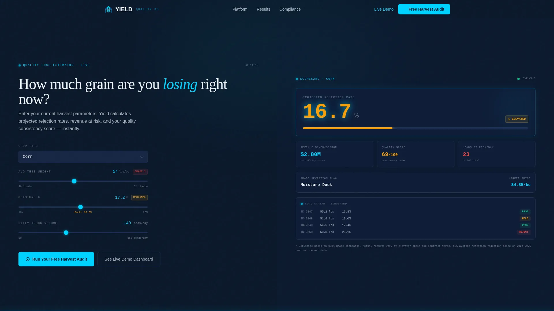
The header splits 50/50. The left panel lets visitors select crop type, enter test weight and moisture percentage, and input daily truck volume. The right panel renders projected rejection rates, estimated revenue saved per season, and a quality consistency score. All output values animate in real time as inputs change, displayed in cyan on navy in large dashboard-style numerals.
Before/After Comparison Section
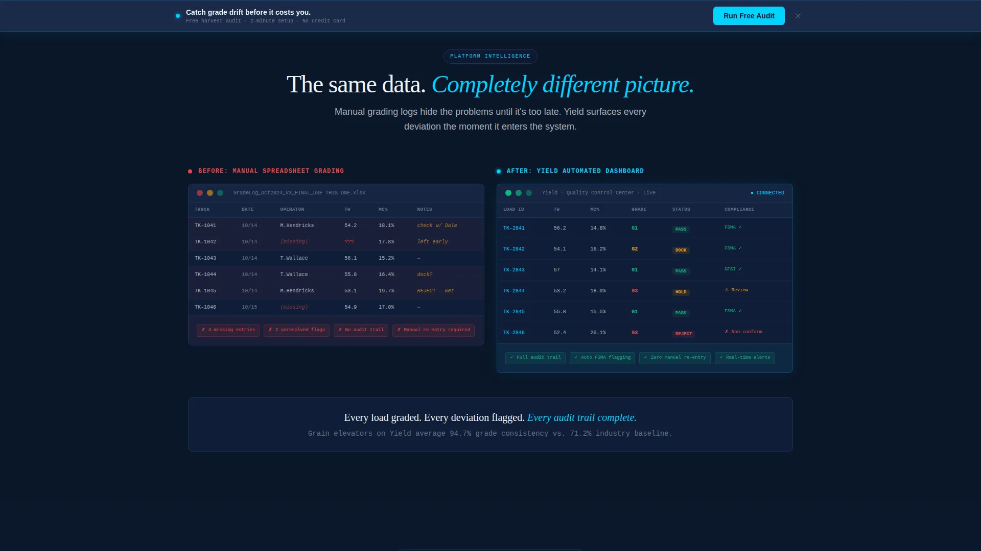
Section two presents a side-by-side visual contrast. The left side shows a screenshot of manual, spreadsheet-based grading logs. The right side shows the same data flowing through clean automated dashboards. This section communicates the platform's value without requiring the visitor to read a single paragraph of explanation.
Animated Customer Benchmark Counters
Section three delivers hard performance numbers as animated counters that tick upward on scroll. Stats such as "62% fewer rejected loads in first harvest season" appear as the visitor enters the section, creating a moment of high credibility at the point of peak engagement.
Freemium Trial Conversion Path
The primary call-to-action, "Run Your Free Harvest Audit," sits directly below the estimator results and repeats in a sticky bar after the second scroll. Clicking opens a three-step progressive form that collects operation type, current testing method, and contact details in sequence, keeping the process low-friction.
Secondary Live Demo Path
Visitors not ready to enter their own data can follow an alternative route: "See the Live Demo Dashboard." This links to a read-only interactive demo pre-loaded with anonymized cooperative data, giving skeptical visitors a no-commitment way to experience the platform's output.
Stats-First Scroll Architecture
The page is engineered so every new scroll delivers a harder number before any explanatory copy. The narrative escalates from individual farm impact to enterprise-scale compliance, building a progressive evidence case that moves the visitor from curiosity to action.
Page sections overview
| Section | Purpose |
|---|---|
| Estimator Header | Interactive quality-loss calculator with live result outputs |
| Before/After Comparison | Visual contrast of manual logs versus automated dashboards |
| Customer Benchmark Stats | Animated counters showcasing real harvest performance gains |
| Sticky call to action Bar | Persistent trial prompt triggered after second scroll |
| Progressive Signup Form | Three-step form collecting operation type, pain point, and contact |
| Live Demo Link | Secondary path to a read-only demo seeded with cooperative data |
Design & branding system
The visual identity follows a Data Command theme built around a Midnight Blue color system. The palette is designed to evoke the atmosphere of a grain moisture analyzer glowing in a dim testing bay, authoritative, precise, and always-on.
- Core colors: deep terminal navy (#0A1628) for backgrounds, instrument-panel blue (#1B2A4A) for card surfaces, live-data cyan (#00D2FF) for active metrics and hover states, and clean silo white (#EDF2F7) for typography
- Typography is sized for distance readability, with estimator output numbers large enough to read from across a desk, formatted as live dashboard readouts
- The overall atmosphere mirrors a darkened control room at peak harvest, screens glowing, numbers ticking, nothing slipping through
Mobile & speed optimization
The template is structured for a responsive layout that maintains the split-screen logic on larger screens while stacking cleanly on smaller devices. The design choices support fast visual scanning without heavy content loads.
- The 50/50 split-screen header is designed to reflow into a single-column layout on mobile, keeping the estimator inputs and result outputs accessible without horizontal scrolling
- Animated counter sections use scroll-triggered entry patterns that preserve the stats-first impact experience on touch devices
How this template helps you convert
The page is designed to create conviction early and reduce friction at every decision point. The conversion strategy is built into the section order itself.
- The interactive estimator in the header gives visitors a personalized number before any marketing copy appears, creating immediate relevance and reducing bounce at the top of the page.
- The sticky "Run Your Free Harvest Audit" bar ensures the primary call-to-action remains visible throughout the scroll journey, while the three-step progressive form prevents drop-off by asking only for what is needed at each step.
Other information about this template
This template is part of a broader family of agriculture software landing page designs built for high-stakes, data-intensive verticals. It is suited to platforms operating at the intersection of agronomy, food safety compliance, and enterprise grain management.
- The template supports the visual and structural needs of platforms seeking to present quality management data in a format that resonates with both field-level agronomists and boardroom compliance officers
- The Data Command theme and Midnight Blue palette are transferable to related verticals such as food processing quality control, seed testing platforms, and cooperative export compliance tools
- The progressive form structure and secondary demo path are designed to serve both high-intent visitors ready to start a trial and early-stage visitors who need more evidence before committing

Theme
Data Command
Creative direction
Stats-First Impact
Color system
Midnight Blue
Style
Split Screen (50/50)
Direction
Freemium/Trial
Page Sections
Interactive Quality-loss Estimator Header
Before/after Data Comparison Section
Animated Benchmark Counter Section
Sticky Freemium Trial Call-to-action
Three-step Progressive Signup Form
Secondary Live Demo Dashboard Link
Related questions
Who is the ideal user for this landing page template?
Can I customize the estimator inputs for my specific crop types?
Does the template include the three-step signup form layout?
What does the secondary live demo path look like for visitors?
Is the dark Midnight Blue color scheme adjustable for a different brand palette?



