Financial Services Digital Presence Reviews Website Template
Ticker is a high-performance client portal landing page built for financial services firms. It combines a live-looking dashboard preview header, a twelve-row comparison table, and an app download call-to-action into one compelling single-page flow. The Midnight Blue color system and Industry Report creative direction give every section the authority of a proprietary research document.
by Rocket studio
Quick summary
Ticker is a single-page client portal landing page template designed for financial services firms. It opens with an isometric dashboard preview, moves through a data-driven comparison table, and closes with app download calls-to-action. The Startup Velocity theme and Midnight Blue palette make the page feel precise, trustworthy, and ready to convert.
Who this template is for
This template is built for financial services teams that need to attract and onboard clients through a polished digital experience. It suits firms whose clients range from high-net-worth individuals to first-time investors who want a professional portal over a spreadsheet.
- Wealth management firms and registered investment advisors launching or refreshing a client portal
- Fintech startups positioning a new portfolio app against legacy platforms
- Financial planning practices serving both retired clients and younger investors building early wealth
What problem this template solves
Most financial service landing pages feel generic. They fail to build the immediate trust that clients need before downloading an app or signing into a portal. Ticker solves this by leading with specific, recognizable data and a structured proof-then-compare rhythm.
- Visitors arrive skeptical; the comparison table answers objections row by row before they scroll away
- The lack of a clear app download path on competitor pages costs conversions; Ticker keeps the primary call-to-action persistently visible
- Generic design erodes trust in financial contexts; this template uses purposeful color, real-feeling numbers, and credentialing badges to earn it
What you get with this template
You get a fully structured, single-page landing page that guides a visitor from first impression to app download without a single moment of confusion. Every section has a defined role in the conversion journey.
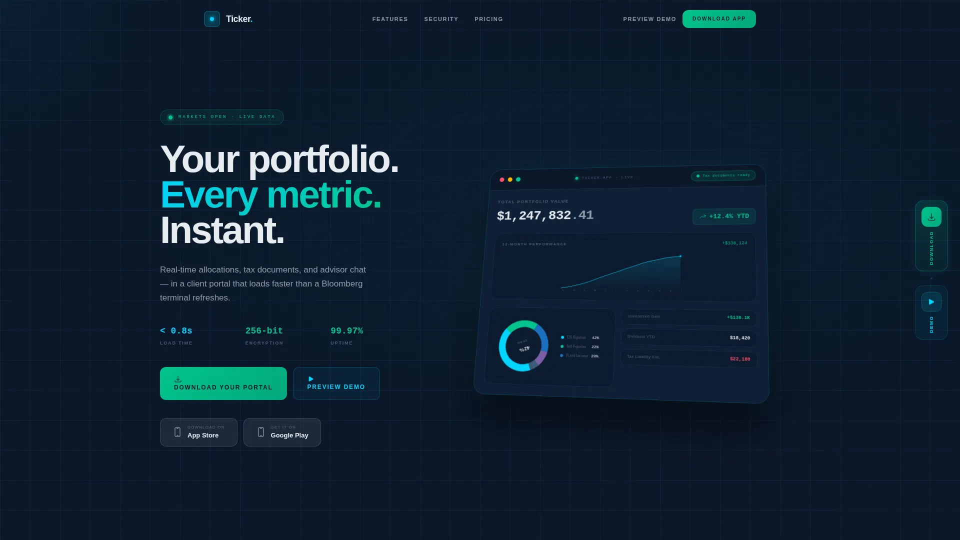
- An isometric dashboard preview header with a live-looking equity curve, asset allocation chart, and portfolio figures
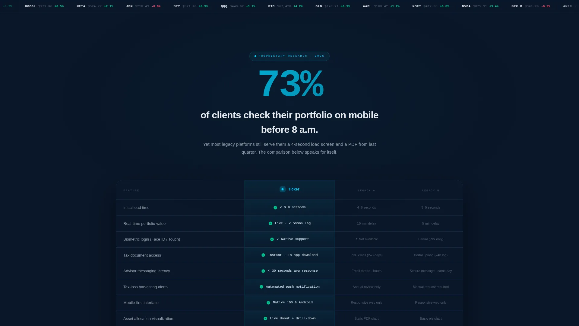
- A twelve-row comparison table that stacks your portal's advantages against legacy platforms using cyan checkmarks and competitor dashes
- Sticky and fixed app download calls-to-action paired with App Store and Google Play buttons, plus a secondary demo sandbox path
Feature list
This template delivers six core capabilities, each grounded in the brief and designed to carry real weight in the page experience.
Isometric Dashboard Header
The header renders a pixel-perfect portal home screen at a slight isometric tilt against a deep navy background. It shows a climbing twelve-month equity curve, a spinning asset allocation donut chart, and a "Tax documents ready" notification badge. A subtle parallax drift follows the cursor, making the interface feel live before anyone interacts with it.
Twelve-Row Comparison Table
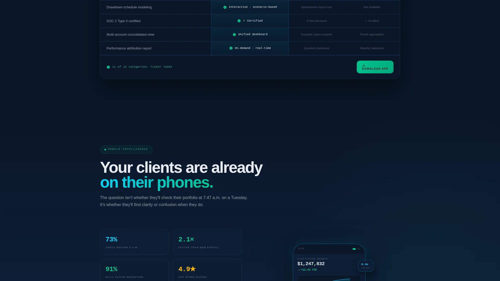
The comparison table sits at the center of the page and pits the portal against legacy platforms across twelve decision-relevant rows. Rows cover load time, document access, biometric login, advisor chat latency, and tax-loss harvesting alerts, among others. Cyan checkmarks stack in the portal column while competitors receive dashes and asterisks, making the advantage undeniable by row eight.
Data Callout Section Headers
Each major section opens with a bold statistical callout styled like a line from a proprietary research report. The callout frames the feature or comparison content that follows it, lending credibility and keeping the scroll rhythm engaging. This pattern repeats the claim-prove-compare structure throughout the page.
Analyst-Style Testimonial Cards
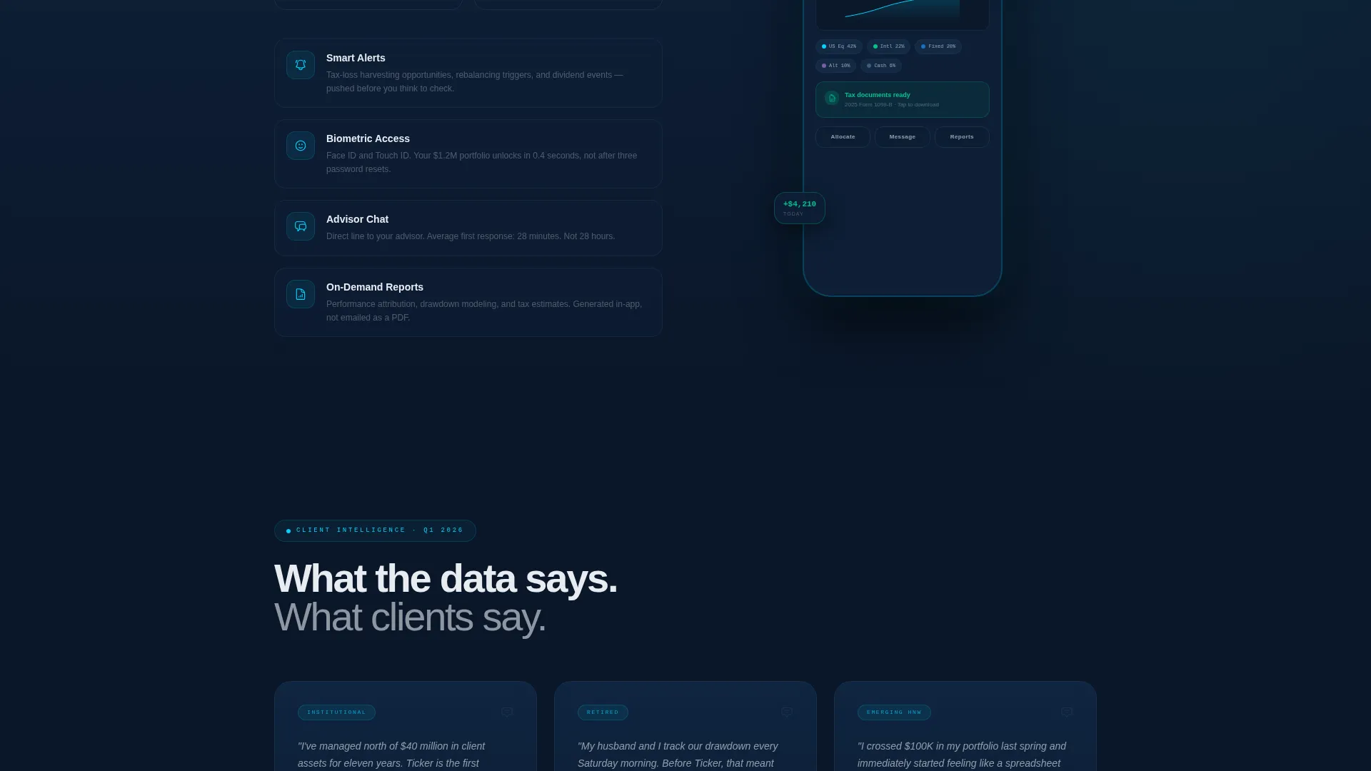
Below the comparison table, testimonial cards appear styled as analyst quotes with attribution lines. This format borrows authority from the financial research aesthetic and makes social proof feel earned rather than decorative.
Security Credentials Band
A dedicated credentials band displays SOC 2 compliance, 256-bit encryption, and SIPC badge references. This section gives cautious visitors the reassurance they need before committing to a download or demo.
Persistent App Download Call-to-Action
The primary call-to-action, "Download Your Portal," appears as a sticky bottom bar on mobile and a fixed sidebar badge on desktop. Both placements carry paired App Store and Google Play buttons. A secondary "Preview Demo Account" path opens an interactive sandbox for visitors not yet ready to commit.
Page sections overview
| Section | Purpose |
|---|---|
| Dashboard Preview Header | Hook visitors with a live-feeling portal interface and specific portfolio figures |
| Data Callout opener | Frame each feature section with a bold research-style statistic |
| Comparison Table | Prove portal superiority across twelve rows against legacy competitors |
| Testimonial Cards | Build social proof using analyst-style quote formatting with attribution |
| Security Credentials Band | Reinforce trust with SOC 2, encryption, and SIPC credential badges |
| App Download Call-to-Action | Drive conversions with persistent, dual-platform download and demo paths |
Design & branding system
The Midnight Blue color system creates a trading-floor aesthetic built on calm precision rather than noise. Every color has a specific role, and none are used decoratively without purpose.
- Deep terminal navy (#0A1628) dominates backgrounds and card surfaces; signal white (#E8ECF1) carries body text and table headers
- Live-data cyan (#00D4FF) traces interactive borders, hover states, and comparison table checkmarks to direct the eye
- Confirmation green (#00C48C) appears only for positive returns, completed actions, and call-to-action pulses, keeping its meaning unambiguous
Mobile & speed optimization
The template is structured to perform across every device a financial services client might use. The mobile layout is treated as a primary experience, not a secondary adaptation.
- The sticky bottom bar on mobile keeps the app download call-to-action visible without interrupting the scroll
- The comparison table is formatted to remain readable on smaller screens without horizontal overflow
- The parallax header and interactive hover states are designed to feel responsive and immediate on both desktop and mobile
How this template helps you convert
The page is built around a deliberate persuasion sequence. Each scroll moves the visitor closer to a download decision with no dead zones.
- The isometric dashboard header creates instant recognition for anyone who already checks a portfolio, establishing credibility in the first three seconds of the visit
- The comparison table removes the most common objections one row at a time, so by row eight the download feels like the only logical next step
- The persistent call-to-action placement ensures the download path is always one tap or click away, regardless of where a visitor pauses in the page
Other information about this template
This template is part of a Startup Velocity theme collection and is designed to work within a Midnight Blue color system out of the box. It is built specifically for the financial services client portal niche, where first impressions carry outsized weight.
- The Industry Report creative direction makes this template distinctive compared to standard fintech marketing pages
- The template style is a Comparison Table landing page, making it well suited for competitive positioning against established platforms
- The header concept is a Dashboard Preview, which is a proven format for portal and app landing pages in the financial technology space
- The landing page direction is App Download, aligning every section hierarchy and call-to-action placement toward that single conversion goal
Theme
Startup Velocity
Creative direction
Industry Report
Color system
Midnight Blue
Style
Comparison Table
Direction
App Download
Page Sections
Isometric Dashboard Preview Header
Twelve-row Comparison Table
Data Callout Section Headers
Analyst-style Testimonial Cards
Security Credentials Band
Persistent App Download Call-to-action
Related questions
Can I change the portfolio numbers and chart data shown in the header?
Does the comparison table support more or fewer than twelve rows?
What are the two conversion paths available in this template?
Is this template suitable for firms that serve both older and younger client segments?
What trust signals are built into the template?



