AI & Machine Learning Privacy Policy & Terms Website Template
Ticker is a split-screen landing page template built for AI-for-finance directories. It pairs a dark glass panel header grid with a staggered tool-card feed, compliance-tag badges, analyst ratings, and two distinct conversion paths. The result is a dense, high-signal page that earns explorer trust before asking for a single click.
by Rocket studio
Quick summary
Ticker is a single-page, split-screen landing page template for directories that catalogue AI tools used in trading, risk management, and financial compliance. It opens with a full-viewport glass panel grid, transitions into a locked navigation rail with cascading tool cards, and closes with two conversion paths built to capture visitors at different stages of readiness.
Who this template is for
This template is designed for teams and founders launching a curated directory of AI tools aimed at the finance and risk industry. It suits builders who need to demonstrate depth and credibility from the very first scroll.
- Fintech product teams publishing an AI tool intelligence platform for quantitative analysts and risk managers
- Directory founders indexing solutions across credit scoring, fraud detection, algorithmic trading, and regulatory compliance
- Fintech CTOs or research leads building a benchmarking hub for proprietary and commercial AI models
What problem this template solves
Finance professionals distrust directories that look thin. A sparse layout signals a sparse catalogue, and visitors leave before they find value. Ticker solves this by making the density of indexed tools visible before the first interaction.
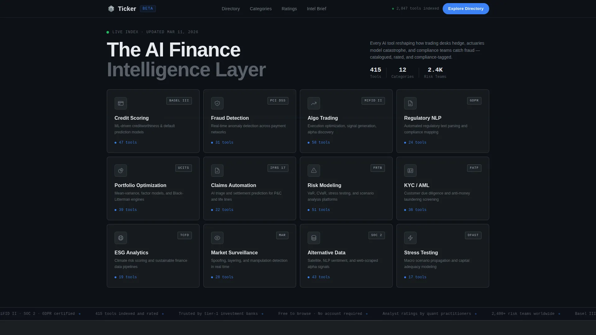
- The glass panel header grid shows every major category at once, proving breadth immediately
- Live tool counters beneath each category label replace vague promises with specific, scannable proof
- Staggered card animations and social proof banners sustain scroll momentum so visitors stay long enough to convert
What you get with this template
You get a fully structured split-screen landing page layout built specifically for a finance-focused AI tool directory. Every section is designed around discovery, trust, and conversion.
- A dark glass panel header with six category cards, ambient cursor-reactive light gradients, and animated signal-blue hover borders
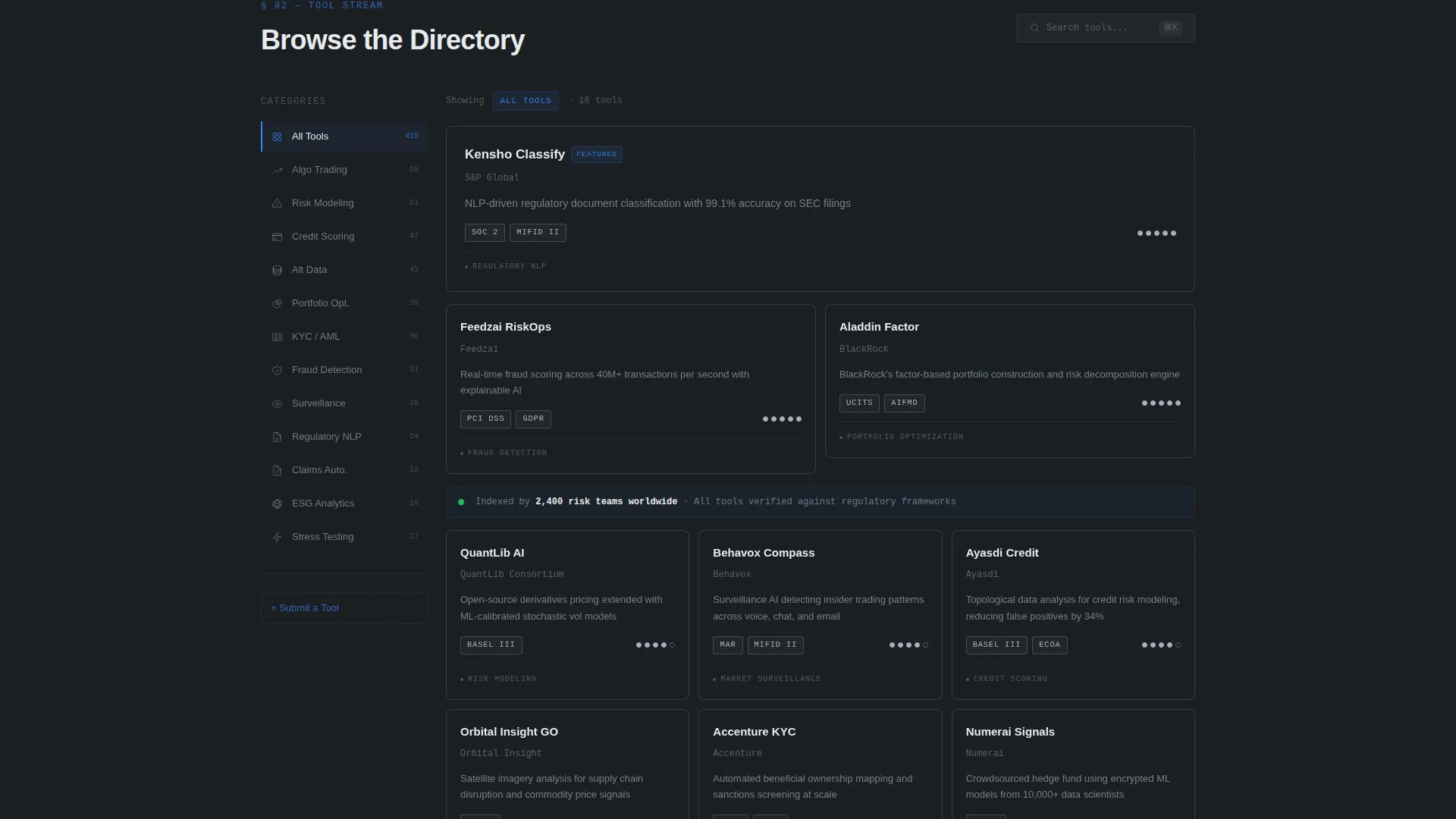
- A split-screen scroll zone with a locked left navigation rail and a right-side tool card feed using staggered fade-and-rise animations
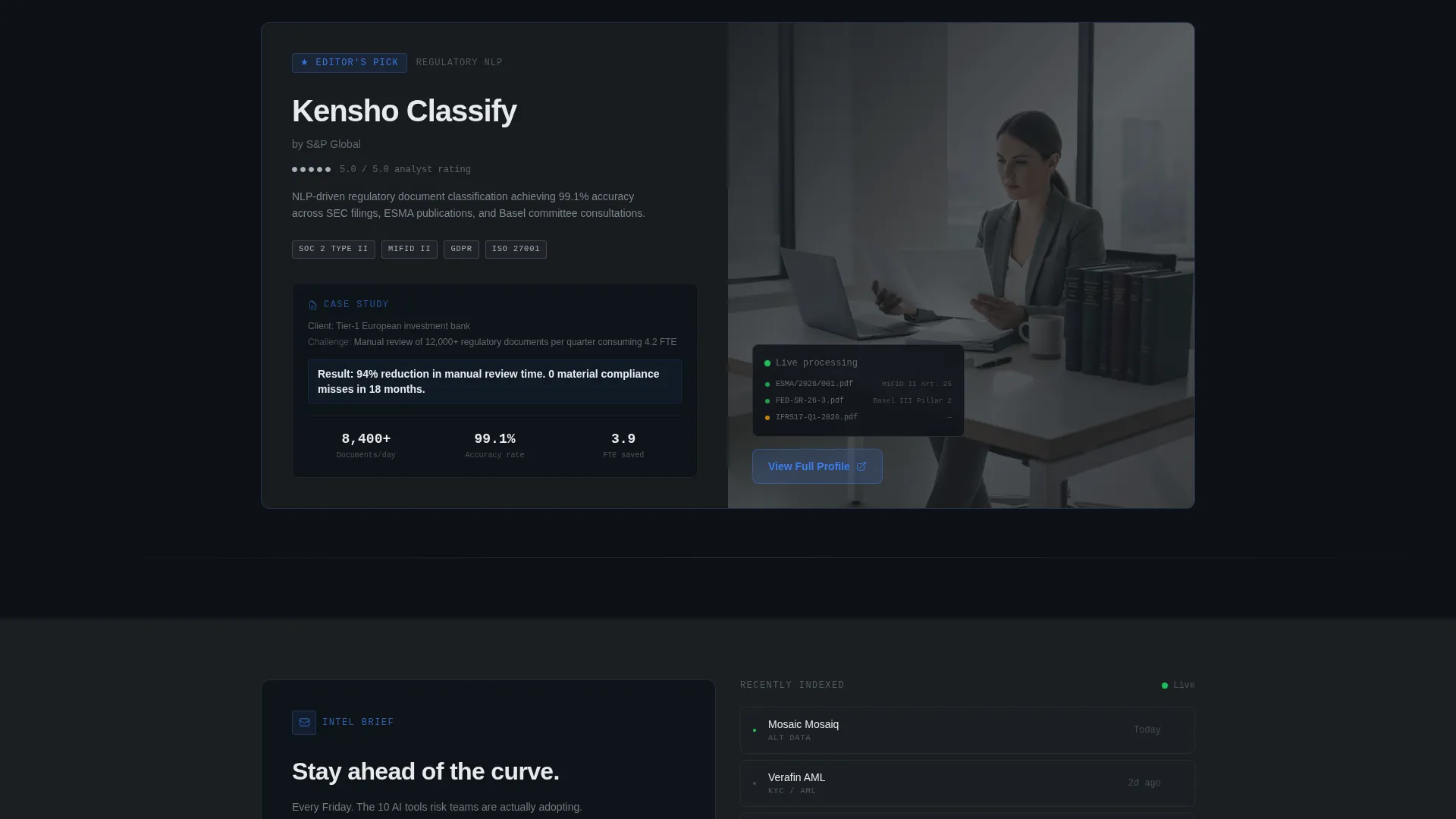
- Two conversion paths: a fixed primary call-to-action pill button and a secondary email capture with a weekly intelligence brief offer
Feature list
This template ships with a tightly integrated set of layout and interaction features, each designed to serve a finance-and-risk directory audience.
Dark Glass Panel Category Grid
The header fills the full viewport with a grid of translucent, reflective category panels. Each panel holds a category label and a live tool count. A signal-blue animated pulse traces the border on hover, giving visitors an immediate, tactile sense of the directory's structure and depth.
Split-Screen Scroll Layout
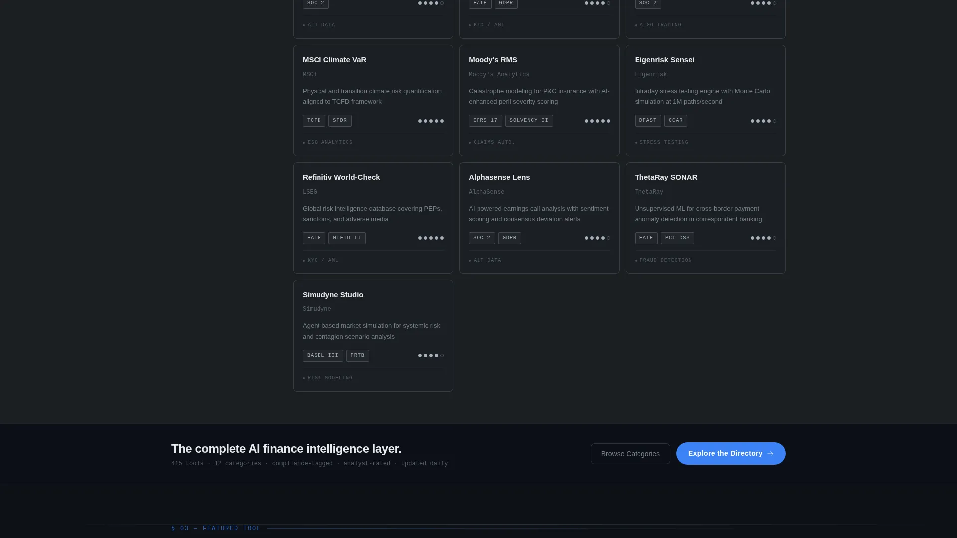
Below the header, the page locks into a 50/50 split. The left half displays a vertical navigation rail with category icons. The right half streams tool cards in a cascading rhythm: one featured card with a mini case study, then pairs, then a rapid twelve-card grid. This crescendo mirrors the energy of a high-stakes product discovery moment.
Compliance-Tag Badge System
Every tool card carries a compliance-tag badge showing relevant regulatory standards such as SOC 2, GDPR (General Data Protection Regulation), and MiFID II (Markets in Financial Instruments Directive). These tags allow risk managers to filter relevance at a glance without opening individual profiles.
Five-Point Analyst Rating Display
Each tool card includes a five-point analyst rating rendered as small steel dots. The visual system is minimal but immediately readable, letting quantitative analysts compare tools across the feed without slowing down.
Fixed and Inline Call-to-Action System
The primary "Explore the Directory" call-to-action appears as a fixed signal-blue pill button in the bottom-right corner. It also reappears as a full-width bar after the third scroll section. This dual placement ensures the conversion surface is always within reach without interrupting the browsing experience.
Weekly Intel Brief Email Capture
A secondary conversion path offers visitors a weekly email brief. A single email field and a focused micro-copy line explain exactly what subscribers receive and when. This path captures high-intent visitors who are not yet ready to browse the full directory.
Page sections overview
| Section | Purpose |
|---|---|
| Glass Panel Grid | Introduce all tool categories with live counts and hover interactions |
| Navigation Rail | Anchor the left half with persistent category icons during scroll |
| Featured Tool Card | Lead the right-side feed with a single tool and a mini case study |
| Paired Tool Cards | Continue the feed with side-by-side tool card pairs |
| Rapid Grid Block | Accelerate discovery with a twelve-card tool grid |
| Social Proof Banners | Reinforce credibility between scroll sections with indexed-team counts |
| Primary call to action Bar | Convert active browsers with a full-width directory entry point |
| Email Capture Section | Retain undecided visitors with a weekly intelligence brief signup |
| Fixed call to action Pill | Keep the primary conversion action visible throughout the entire page |
Design & branding system
The visual identity follows a Monochrome Steel palette built to feel like professional trading infrastructure. Every color and texture choice reinforces authority and precision.
- The four-color system uses deep gunmetal (#1B1F23), brushed chromium (#A8B2BD), terminal-screen off-white (#E8EAED), and signal-blue (#3B82F6) reserved exclusively for interactive states, hover glows, and the primary call-to-action
- Backgrounds alternate between gunmetal and near-black; cards and panels carry a 1-pixel steel border at 20% opacity to create a frosted glass effect floating above the surface
- Text renders in chromium and off-white with zero decorative ornamentation, keeping every typographic element functional and data-forward
Mobile & speed optimization
The template is structured with a lean, content-first layout that supports clean rendering across screen sizes. Animation and interaction layers are scoped to enhance rather than slow the experience.
- The staggered fade-and-rise card animations are designed to sequence progressively, keeping the page feeling responsive even as content loads into view
- The fixed call-to-action pill and the split-screen scroll zone are built to adapt gracefully when viewport constraints shift on smaller screens
- The sparse ornamental footprint of the Monochrome Steel design system naturally reduces visual payload, keeping the page light and fast to paint
How this template helps you convert
The page is engineered as a conversion surface from the first pixel, not just at the bottom. Every design decision builds toward one of two outcomes: an active directory click or an email subscription.
- The glass panel grid and live tool counters create immediate proof of depth, removing the hesitation that kills directory conversion before it starts
- The cascading card rhythm builds momentum through the scroll, making continued exploration feel natural and rewarding rather than effortful
- The dual call-to-action placement ensures that whether a visitor is ready to explore now or wants to return later, a clear path is always visible
Other information about this template
Ticker is purpose-built for the intersection of AI discovery and financial services, a niche where credibility and information density matter more than visual spectacle.
- The template's Directory and Discovery theme makes it adaptable for adjacent niches such as regulatory technology, insurtech model catalogues, or quantitative research tool indexes
- The compliance-tag badge system is a structural design feature, not a live data integration; directory operators populate and maintain tag data for each listed tool
- The social proof banner slots ("Indexed by 2,400 risk teams worldwide") are editable placeholder components that builders replace with their own verified figures
Theme
Directory & Discovery
Creative direction
Launch Energy
Color system
Monochrome Steel
Style
Split Screen (50/50)
Direction
Click-Through
Page Sections
Dark Glass Panel Category Grid
Split-screen Cascading Card Feed
Compliance-tag Badge System
Five-point Analyst Rating Display
Dual Call-to-action Conversion System
Related questions
Who is this landing page template designed for?
Can I customize the tool categories shown in the glass panel grid?
What do the compliance-tag badges represent?
How does the dual call-to-action system work?
Is this template suitable for a single-topic AI tool directory?



