Online Skill Courses Complete Professional Website Template
Ticker is a trading course landing page template built for educators who teach retail investors real market skills. It pairs a Stats/Metrics header, a Problem-to-Solution scroll arc, and a side-by-side comparison table to show visitors exactly why structured learning beats YouTube advice. The freemium call to action lets students start free with one full candlestick lesson before committing to the full course.
by Rocket studio
Quick summary
Ticker is a single-page landing page template designed for self-paced stock trading and investing courses. It opens with a live-style trading dashboard, walks visitors through a sharp problem-and-solution narrative, and closes with a low-friction freemium sign-up. Every section is built to move a skeptical retail investor from doubt to enrollment.
Who this template is for
This template suits course creators and educators who sell structured trading knowledge to everyday investors. It works best when the offer is a self-paced curriculum with a free entry point and a clear upgrade path.
- Trading educators launching a candlestick charts, position sizing, or risk management course
- Finance content creators converting their YouTube or social audience into paying students
- Independent coaches offering a freemium trial before a full course purchase
What problem this template solves
Most trading course pages either look too salesy or too plain to earn trust. Retail investors have been burned by hype before. They need a page that feels credible and organized, not another promise of overnight profits.
- Visitors arrive skeptical after seeing too many get-rich-quick pitches online
- The gap between free YouTube content and structured, sequenced learning is invisible without a clear comparison
- Low-commitment sign-up flows are hard to design without a template that already handles the layout
What you get with this template
You get a complete, single-page landing page layout that handles every stage of the visitor journey. From the first scroll to the final sign-up, every section has a defined role and a clear visual hierarchy.
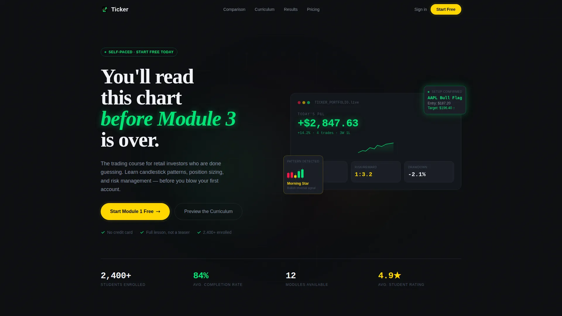
- A Stats/Metrics hero section showing a stylized trading screen with live-feel performance numbers
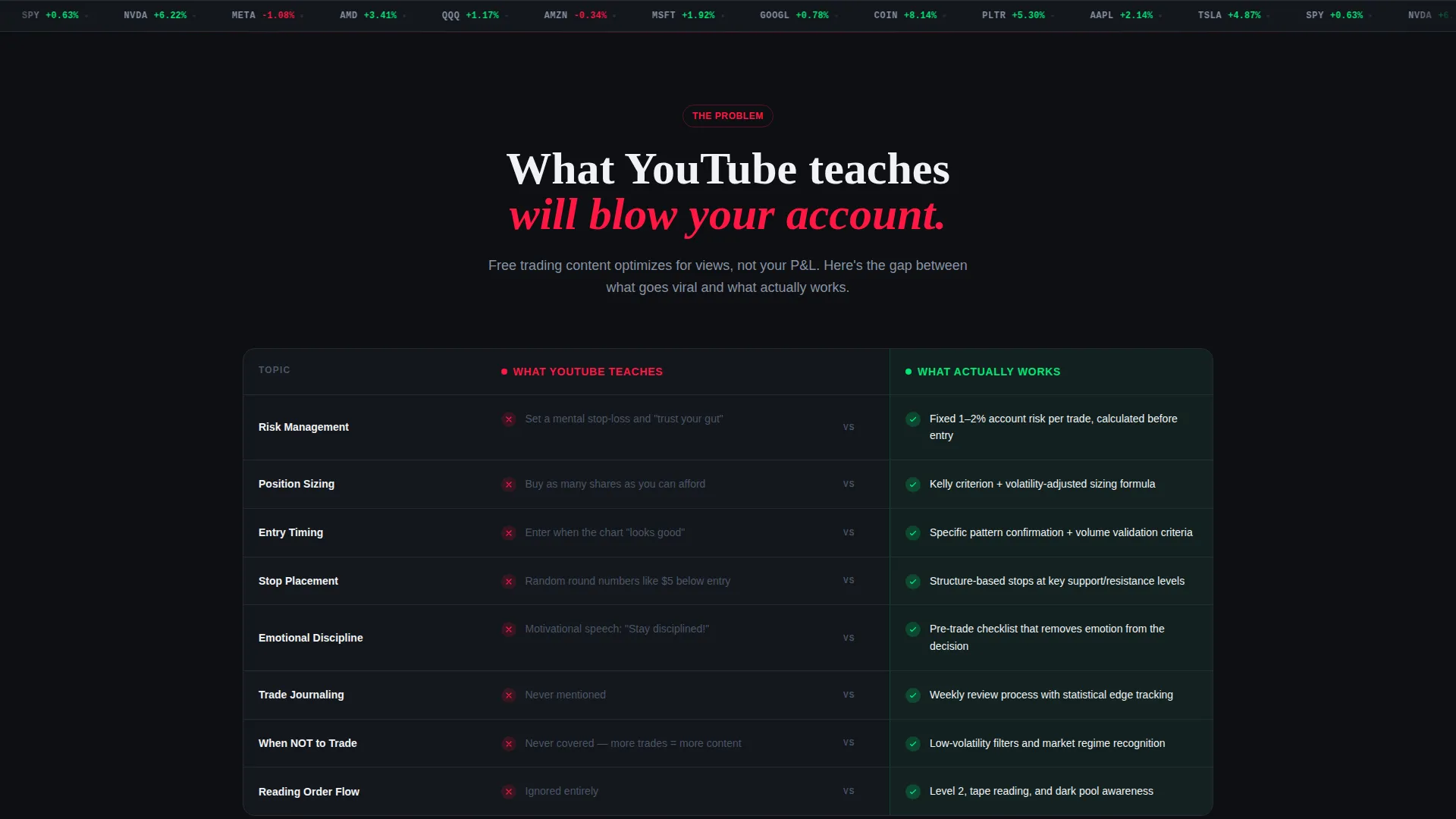
- A comparison table section stacking "What YouTube Teaches" against "What Actually Works" row by row
- Sequenced module cards, a freemium call-to-action section, and a sticky mobile sign-up bar
Feature list
This template ships with purpose-built sections and visual components drawn directly from the source brief. Each feature below maps to a specific part of the page design.
Stats/Metrics Hero Dashboard
The header opens with a stylized trading screen frozen mid-session. It displays a profit-and-loss figure of +$2,847.63 in electric green, a win rate badge reading 68%, and a risk/reward ratio of 1:3.2, all on a dark canvas with a soft scanline texture. A headline fades in beneath the numbers: "You'll read this chart before Module 3 is over."
Problem-to-Solution Scroll Arc
The first scroll panel surfaces the pain point through a chaotic mosaic of Reddit screenshots and blown-account confessions. As the visitor scrolls, the layout resolves into clean, sequenced module cards. The arc moves deliberately from overwhelm to clarity, so the curriculum feels like the natural answer.
Side-by-Side Comparison Table
A structured table stacks "What YouTube Teaches" against "What Actually Works" across rows covering risk management, position sizing, and emotional discipline. Each row uses a red cross mark for the YouTube column and a green check mark for the course column. The contrast lands the value gap without a single word of sales copy.
Sequenced Module Card Layout
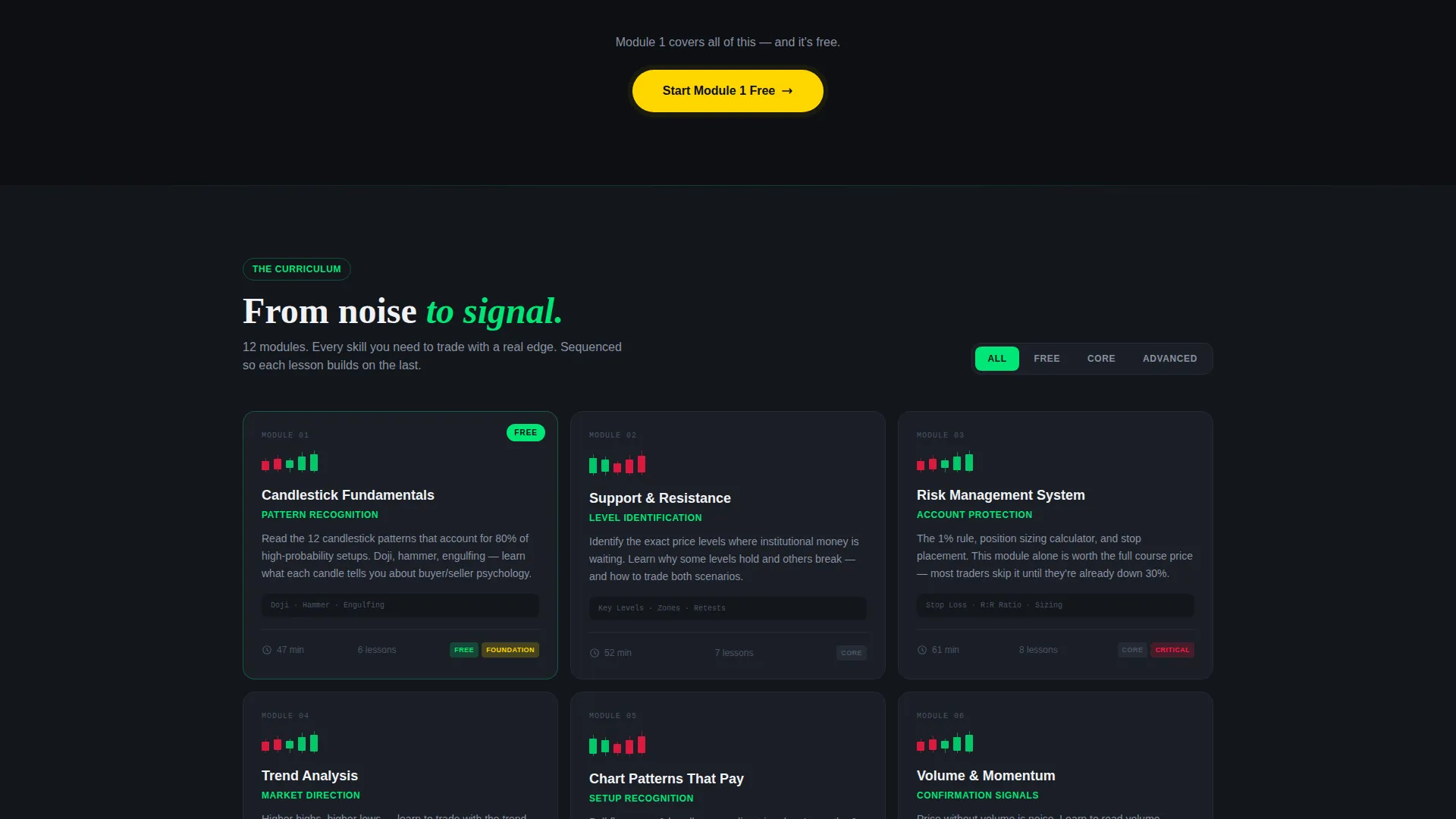
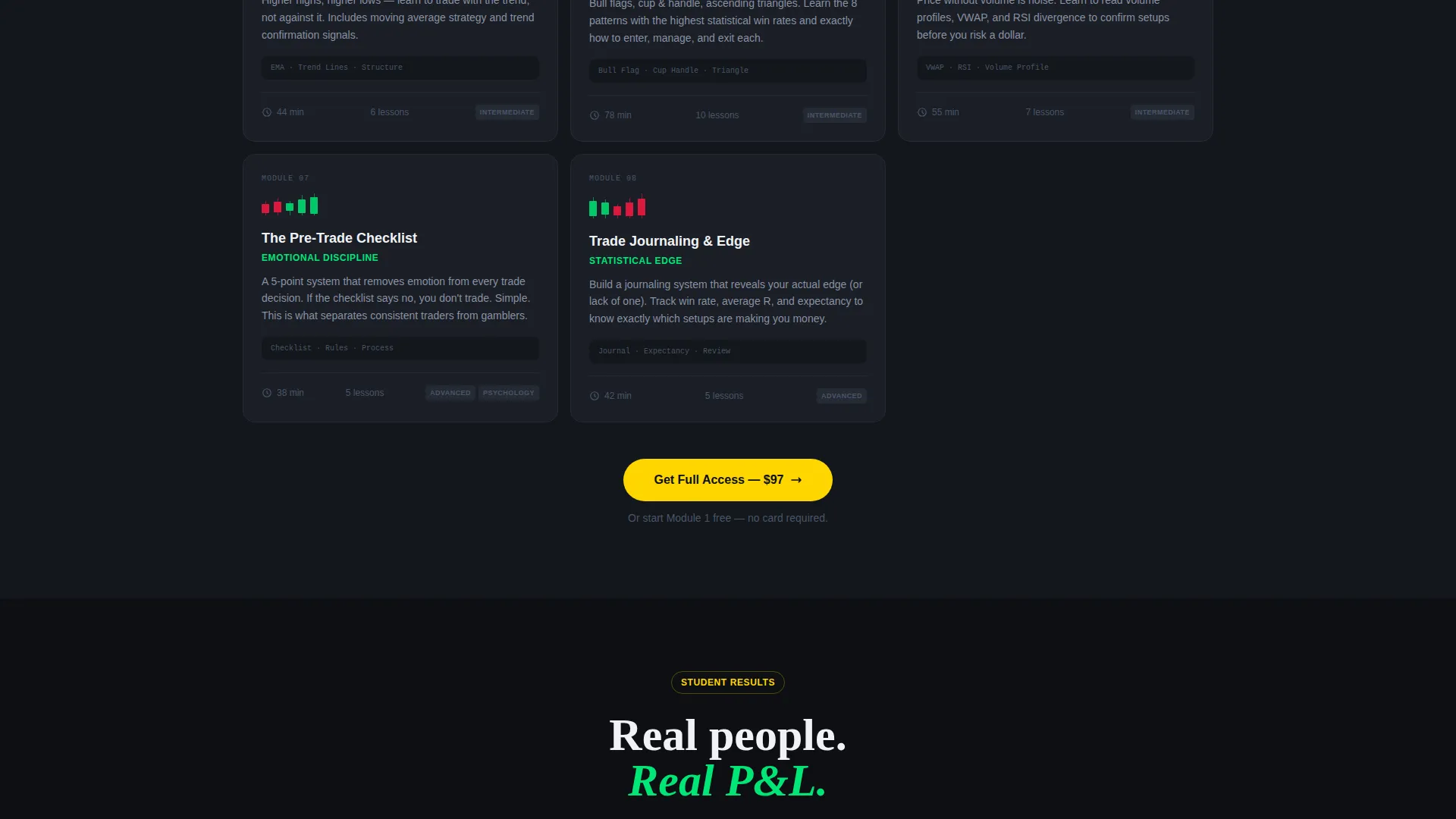
Module breakdowns appear as clean, ordered cards. Each card shows a specific trading skill, a chart example image slot, and an estimated completion time. The format makes the full curriculum feel achievable and well-paced rather than overwhelming.
Freemium Sign-Up Flow
The primary call to action reads "Start Module 1 Free" in signal yellow on terminal black. The sign-up form asks only for an email address and trading experience level, with three options: beginner, some experience, and active trader. A secondary ghost-button link labeled "Preview the Curriculum" scrolls the visitor down to the module map.
Sticky Mobile Call-to-Action Bar
On mobile, a persistent bottom bar repeats the primary "Start Module 1 Free" call to action. It keeps the conversion path visible throughout the entire scroll without interrupting the content experience on larger screens.
Page sections overview
| Section | Purpose |
|---|---|
| Stats/Metrics Hero | Establish credibility with live-feel trading data and a bold headline |
| Problem Mosaic Panel | Surface the pain of unstructured, YouTube-led trading education |
| Comparison Table | Contrast informal learning against the structured course curriculum |
| Module Card Map | Break the full curriculum into sequenced, time-stamped skill cards |
| Freemium Sign-Up | Capture email and experience level with minimal friction |
| Sticky Mobile Bar | Keep the primary call to action visible on all mobile scroll depths |
Design & branding system
The visual identity follows an Educational Guide theme expressed through a Dopamine Pop color system. The palette pairs the seriousness of financial data with the reward-loop energy of a well-timed trade.
- Core colors: deep terminal black (#0D0F12), electric gain green (#00E676), alert red (#FF1744), and signal yellow (#FFD600)
- Texture and motion: a soft scanline overlay on the hero canvas, hover states that pulse on cards and badges, and progress indicators that reinforce the sense of forward momentum
- Typography and layout: a dark-canvas foundation with high-contrast color accents across badges, table rows, and module cards for fast visual scanning
Mobile & speed optimization
The template is designed for the mobile-first reality of its target audience. Twenty-something investors browsing between shifts or at midnight need a page that performs at thumb-scroll speed.
- The sticky bottom bar keeps the "Start Module 1 Free" call to action reachable without scrolling back up
- Module cards and the comparison table reflow cleanly for narrow screens without losing visual hierarchy
- The sign-up form is minimal by design, asking for only two inputs to reduce drop-off on small keyboards
How this template helps you convert
The page is structured around the freemium model, where demonstrated value does the selling. Every layout decision supports a low-friction path from first impression to sign-up.
- The Stats/Metrics hero stops the scroll with credible, clinical numbers before a single feature is listed, earning attention before making any ask.
- The comparison table creates an "aha" moment by showing visitors exactly what structured learning solves that free content cannot, making the free module feel like the obvious next step.
- The minimal two-field sign-up form and the sticky mobile bar together reduce the decision cost, so the visitor converts at the moment of peak interest rather than losing momentum.
Other information about this template
This template is a strong fit for course builders working in the stock trading and investing online course space. It is built as a single landing page, not a multi-page site, so it is best paired with a separate checkout or course-hosting platform for post-enrollment flows.
- The free Module 1 delivery model is designed so that one complete candlestick lesson proves course quality, letting the upgrade sell through competence rather than pressure
- The template style is a Comparison Table layout, meaning the side-by-side table is a structural centerpiece and should be customized with your course's specific curriculum differentiators
- The Dopamine Pop color system is intentionally distinct from typical finance-page palettes; it signals a modern, reward-focused learning environment rather than a traditional brokerage aesthetic
- Course creators targeting audiences already using self-directed investing platforms will find the tone and visual language of this template well-matched to that familiarity with trading interfaces
Theme
Educational Guide
Creative direction
Problem→Solution Arc
Color system
Dopamine Pop
Style
Comparison Table
Direction
Freemium/Trial
Page Sections
Stats/metrics Hero Dashboard
Problem-to-solution Scroll Arc
Side-by-side Comparison Table
Sequenced Module Card Layout
Freemium Sign-up Flow
Sticky Mobile Call-to-action Bar
Related questions
Who is this landing page template designed for?
Can I customize the comparison table with my own course content?
What does the free module offer include?
Does this template work well on mobile devices?
How does the sign-up form work?



