Premium Software & SaaS Comparison Website Template
Ticket is a restaurant point-of-sale landing page template built for operators who measure success in ticket times and table turns. It uses an interactive dashboard header, a live-simulated floor plan, and a side-by-side comparison engine to show visitors exactly how fast modern POS software can move. Built for independent owners, general managers, and multi-unit operators.
by Rocket studio
Quick summary
Ticket is a single-page restaurant POS landing page template designed around operational speed and hands-on proof. Visitors land on a live-simulated dinner service, work through real POS tasks inside embedded interactive comparisons, and feel the friction gap before they read a single sales claim. The template earns trust by making the visitor the demonstration.
Who this template is for
This template is purpose-built for restaurant technology companies and POS software teams targeting operators who live inside their systems every shift. It speaks the language of covers, labor percentages, and modifier counts rather than generic software benefits.
- Independent restaurant owners running 40 to 120 covers per night
- Operations-minded general managers tracking labor-to-revenue ratios in real time
- Multi-unit operators who need one unified dashboard view across multiple kitchens
What problem this template solves
Most restaurant POS landing pages describe speed without proving it. Operators are skeptical, time-poor, and already locked into a system they half-tolerate. A static screenshot and a bullet list of features will not move them. This template removes that credibility gap entirely.
- Visitors feel slow click paths and deep screen navigation in a live comparison, not just read about them
- The interactive floor plan and ticket rail simulate a real dinner rush, making the product tangible before any sales copy appears
- The progressive comparison structure escalates from simple tasks to complex multi-location reporting, making switching friction impossible to ignore
What you get with this template
You get a fully structured landing page built around interactive proof rather than passive marketing copy. Every section is designed to generate direct engagement with the POS interface concept, moving visitors from curiosity to conviction through their own hands.
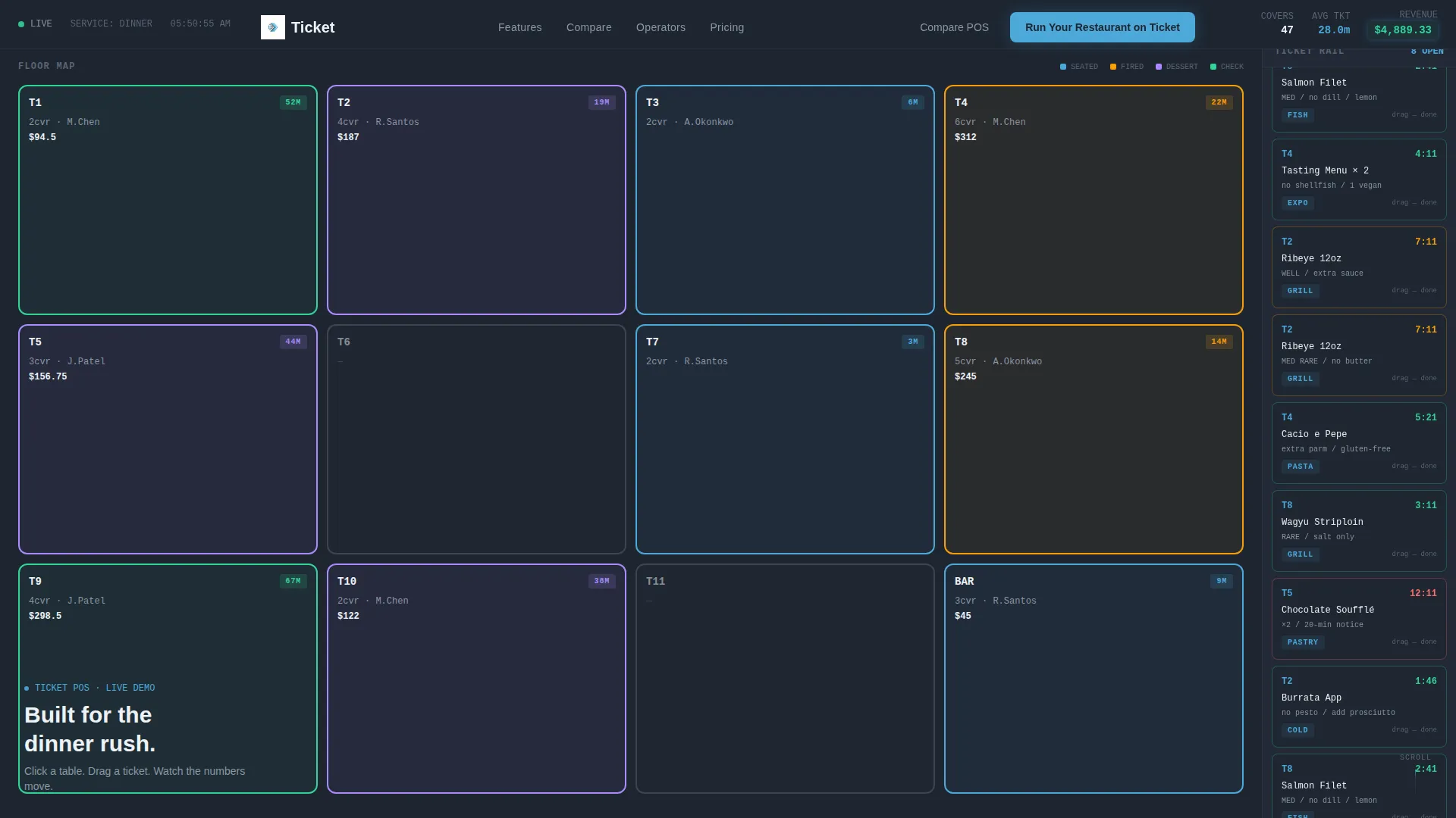
- A live-simulated POS dashboard header with twelve color-coded tables, a scrolling ticket rail, a revenue ticker, and clickable order detail panels
- A multi-section interactive comparison engine pitting your current POS against Ticket across real operational scenarios
- A sticky bottom bar tracking a running "Clicks Saved" counter, a primary call-to-action after the third comparison, and a secondary personalized comparison PDF generator
Feature list
This template ships with a focused set of interactive and structural components drawn directly from the brief. Each one serves a specific moment in the visitor's journey from skeptical operator to confident buyer.
Live-Simulated POS Dashboard Header
The header fills the full viewport with a functional mock dashboard showing a restaurant mid-service. Twelve tables display color-coded statuses including seated, entrées fired, dessert, and check dropped. A ticket rail scrolls orders in real time and a revenue ticker climbs in the corner, demonstrating the product before a word of copy is read.
Clickable Table and Ticket Interactions
Visitors can click any table to expand its full order detail. They can drag a ticket to mark it complete and watch the average ticket time recalculate instantly. This hands-on behavior turns the header into a product demonstration rather than a visual decoration.
Interactive "You versus. Your Current POS" Comparison Engine
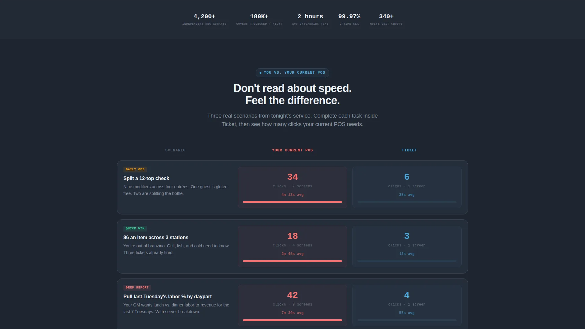
Each scroll section frames a specific operational scenario such as splitting a 12-top check with nine modifiers or running an 86'd item across three stations. The left column shows a competitor's click count and screen depth. The right column lets visitors complete the same task inside a Ticket interface and see their own click count in real time.
Escalating Scenario Progression
The comparison sections are ordered by complexity. They begin with simple transactions and escalate to multi-location reporting tasks like pulling last Tuesday's labor percentage by daypart. Each step widens the friction gap and makes the cost of staying on an older system more concrete.
Sticky "Clicks Saved" Counter Bar
A persistent bottom bar tracks a cumulative clicks-saved total based on every interaction the visitor completes on the page. It makes the value proposition visible and quantifiable at every scroll position without requiring the visitor to do any mental math.
Personalized Comparison PDF Generator
The secondary conversion path asks visitors for their current POS provider name and generates an instant personalized comparison document. This single-field input lowers commitment friction while producing a take-away asset that continues the sales conversation after the session ends.
Page sections overview
| Section | Purpose |
|---|---|
| Interactive Dashboard Header | Simulates a live dinner service across twelve color-coded tables with a ticket rail and revenue ticker |
| Table Order Detail Panel | Expands individual table order data when a visitor clicks any table on the floor plan |
| Ticket Rail Interaction | Lets visitors drag tickets to complete status and triggers a live recalculation of average ticket time |
| Comparison Section One | Covers a simple transaction scenario and introduces the click-count comparison format |
| Comparison Section Two | Escalates to splitting a 12-top check with nine modifiers and expands the friction gap |
| Comparison Section Three | Simulates running an 86'd item across three stations with full station-level detail |
| Primary call to action Block | Presents "Run Your Restaurant on Ticket" after the third comparison has been completed |
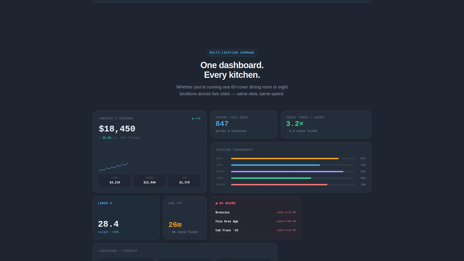
| Multi-Location Reporting Scenario | Demonstrates pulling labor percentage by daypart across multiple locations |
| PDF Generator Field | Accepts a current POS provider name and generates a personalized comparison document |
| Sticky Clicks Saved Bar | Persists across all scroll positions and tracks cumulative clicks saved from every interaction |
Design & branding system
The visual identity follows a Data Command theme built on the Slate and Sky color system. It feels like a chef's office at the end of a busy night: dark screens glowing with precise blue metrics, the kitchen finally quiet, and the numbers telling the whole story.
- Deep charcoal slate (#1E2530) backgrounds, mid-tone graphite (#3A4250) card surfaces, and crisp sky blue (#4DA8DA) highlights that pulse on live data points and interactive elements
- Clean cloud white (#EDF2F7) typography ensures strong legibility against every dark surface throughout the page
- The overall visual tone projects calm authority over organized velocity, matching the mental state of an experienced operator reviewing end-of-night numbers
Mobile & speed optimization
The template is designed with the understanding that operators and GMs will encounter this page on various devices. The interactive components and data grid layouts are structured to remain functional and legible at smaller viewport sizes.
- The dashboard header and comparison grids are built to reflow cleanly across screen widths without losing their interactive behavior
- Card surfaces and table color-coding maintain sufficient visual contrast on mobile screens so status indicators remain readable at a glance
How this template helps you convert
This template is structured as a Comparison and Versus engine. Every design and copy decision is calibrated to turn passive readers into active participants who arrive at the call-to-action already convinced by their own experience.
- The live-simulated header creates immediate product familiarity before any sales copy is encountered, reducing the cognitive distance between "visiting a page" and "using the product."
- The interactive comparison sections produce a personal, measurable data point for each visitor: their own click count versus a competitor's, making the case for switching feel self-evident rather than argued.
- The sticky clicks-saved counter and post-comparison primary call-to-action appear at the exact moment the visitor's conviction is highest, minimizing the gap between felt insight and conversion action.
Other information about this template
This template is built specifically for the restaurant point-of-sale software category. It is suited for teams marketing a modern POS system to operators who evaluate tools on operational efficiency rather than feature lists alone.
- The template style is a Dashboard and Data Grid layout, making it a strong fit for any restaurant software product where live operational data is a core selling point
- The creative direction follows the Interactive Explorer model, meaning scroll progression is driven by challenge-and-proof moments rather than passive content sections
- The header concept is an Interactive Preview, a full-viewport functional mock that replaces a static hero image entirely
- The landing page direction is a Comparison and Versus structure, purpose-built to convert visitors who arrive with an existing POS relationship and healthy skepticism
Theme
Data Command
Creative direction
Interactive Explorer
Color system
Slate & Sky
Style
Dashboard/Data Grid
Direction
Comparison/Versus
Page Sections
Live-simulated POS Dashboard Header
Clickable Table and Ticket Interactions
Interactive Comparison Engine
Escalating Scenario Complexity
Sticky Clicks Saved Counter
Personalized Comparison PDF Path
Related questions
What kind of business is this template designed for?
Can I customize the comparison scenarios for my own product?
Does the interactive dashboard header require live data?
How does the personalized comparison PDF feature work?
Is this template a good fit for marketing to multi-unit operators?



