Ticket - Powerful Invoicing Landing Page Template
Ticket is a food and beverage billing and invoicing landing page template built for restaurant managers, food truck operators, and taproom leads. It centers on a comparison table layout, a speed demo section, and a direct app download flow. The design uses a teal and coral color system to keep every section sharp, fast, and action-ready.
by Rocket studio
Quick summary
Ticket is a single-page comparison table landing page template for a food and beverage invoicing app. It is designed to convert busy hospitality operators into app downloads with no form walls or signup friction. The visual system is crisp and high-contrast, and every section moves the reader toward one tap: downloading the app.
Who this template is for
This template is built for makers and marketers in the food and beverage software space who need to communicate speed and simplicity fast. It speaks directly to the people closing out a dinner service with a pile of unreconciled tickets.
- Restaurant managers handling high-volume Saturday night cover counts
- Food truck operators juggling multiple point-of-sale readers across several weekly markets
- Craft brewery taproom leads who still send spreadsheets to their accountant every Monday
What problem this template solves
Hospitality billing is chaotic. Bar tabs get missed, split checks slow down closing, and kitchen ticket queues rarely translate cleanly into a client invoice. Operators need a tool that feels as fast as the rush itself.
- There is no clear, side-by-side proof that the app outperforms manual methods or general-purpose accounting tools
- Visitors cannot see the product working before they are asked to commit to a download
- Mobile visitors on the floor have no frictionless path from seeing the page to opening the app
What you get with this template
This template gives you a fully structured, single-page layout built around conversion for an app download audience. Every section is designed to earn trust quickly, then move the visitor toward the tap.
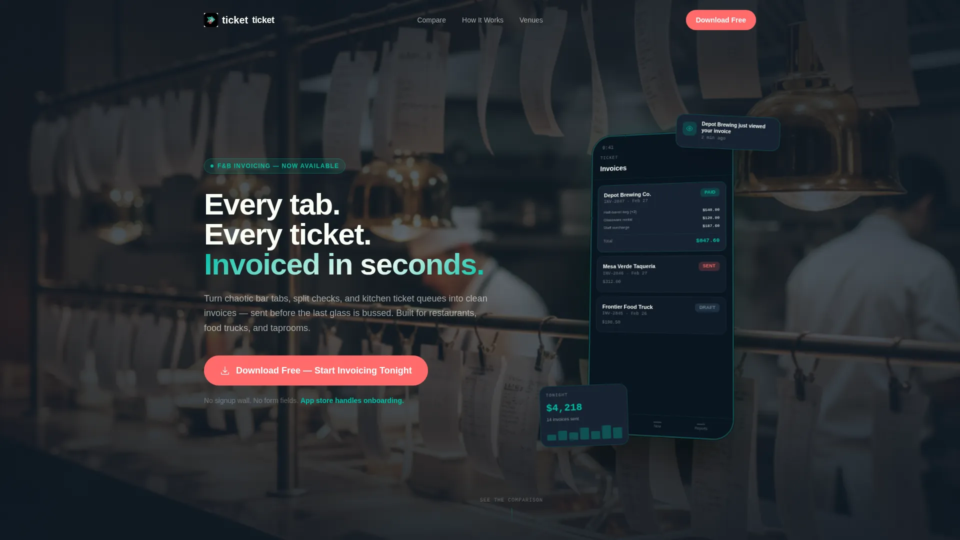
- A full-width product screenshot header showing the app invoice dashboard in action, anchored by a real kitchen environment
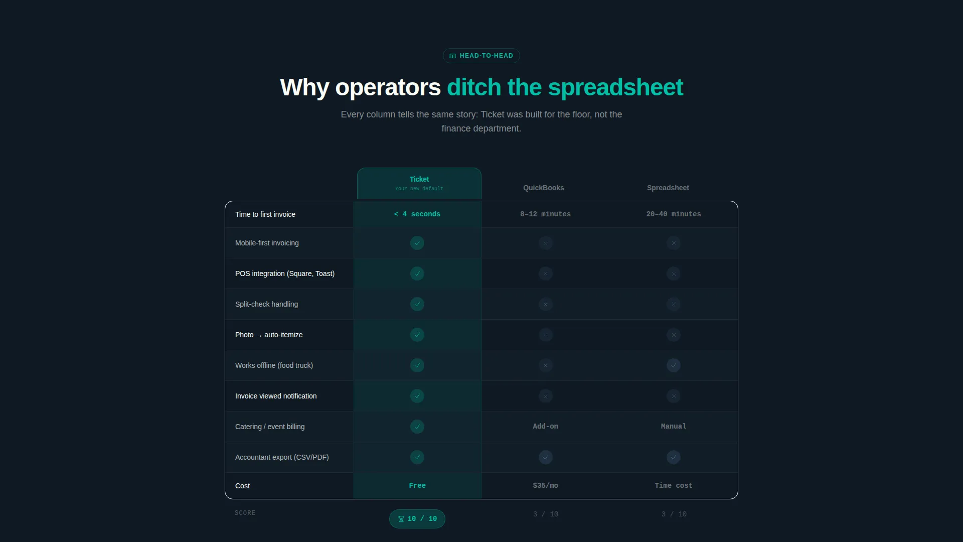
- A centerpiece comparison table scoring the app against manual spreadsheets across key billing criteria
- A three-panel speed demo with animated counters, a social proof ticker, and a floating coral call to action bar pinned on mobile
Feature list
This template packages several purpose-built components into one fast-moving layout. Each feature is grounded in the brief and reflects the needs of food and beverage billing workflows.
Edge-to-Edge Product Screenshot Header
The header fills the viewport with an angled phone screen showing a live catering invoice marked paid, a push notification, and three itemized line items. A soft-focus kitchen pass background anchors the product in its real working environment. A single animated headline fades in over the device.
Centerpiece Comparison Table
The comparison table sits at the heart of the page and scores the invoicing app against manual spreadsheets across four billing criteria: speed to invoice, point-of-sale integration, split-check handling, and mobile access. Teal checkmarks stack visibly in the app's column to make the advantage immediately readable.
Three-Panel Speed Demo
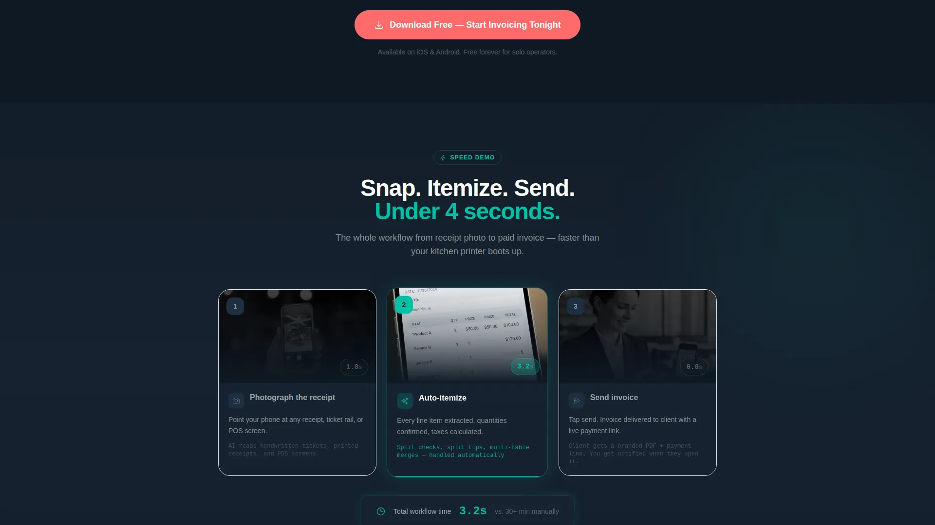
A sequential three-step visual walks the visitor through the invoicing flow: photograph the receipt, auto-itemize, send the invoice. Each step displays an animated counter showing elapsed seconds, reinforcing the app's core speed promise in a format that feels live.
Social Proof Ticker
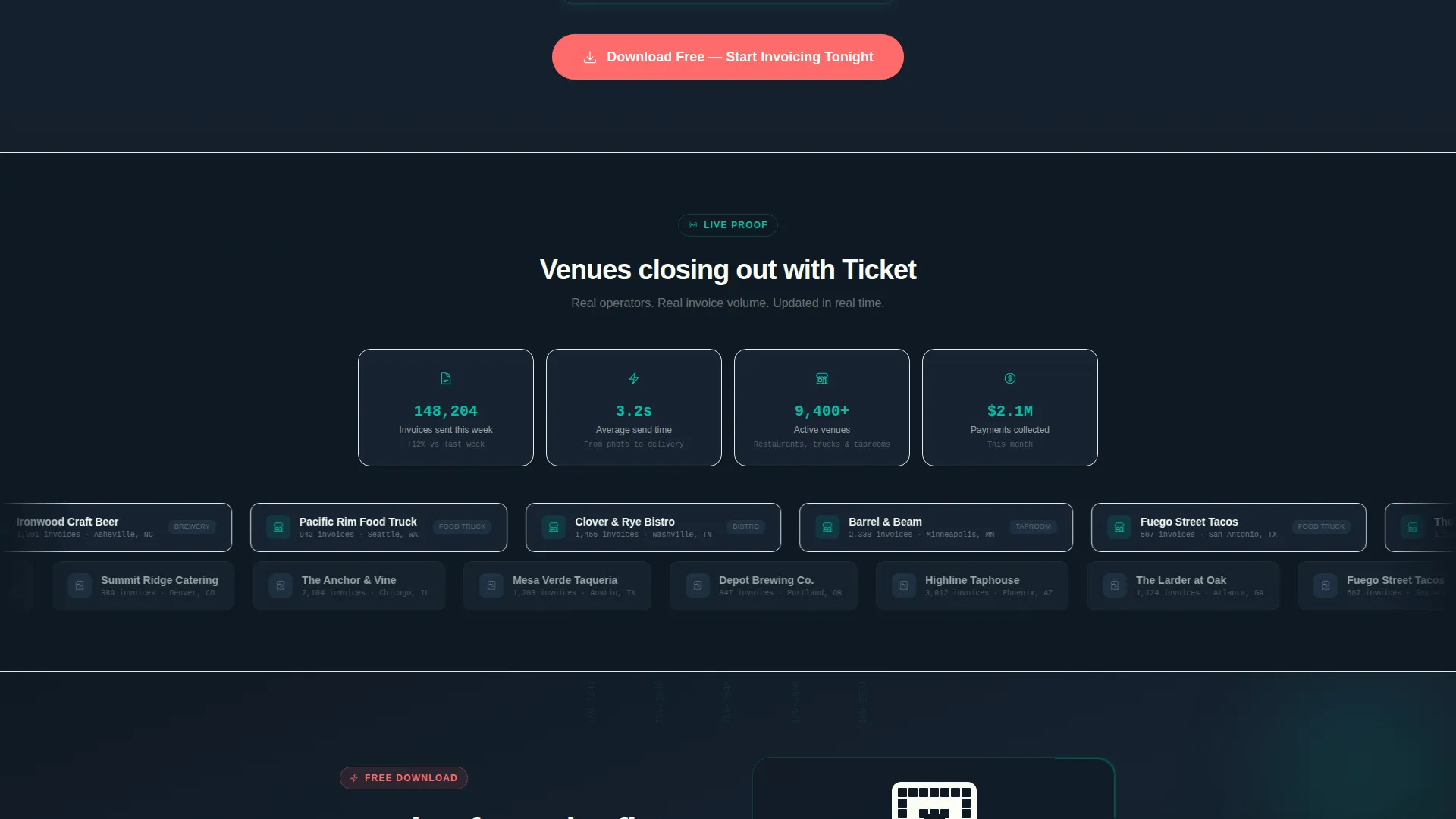
A ticker-tape scroll of real venue names and invoice counts runs below the speed demo. It communicates volume and velocity without requiring the visitor to read a wall of testimonials. The motion keeps the page feeling active and high-trust.
Floating Mobile call to action Bar
The primary call to action reads "Download Free, Start Invoicing Tonight" in coral and is pinned as a floating bar at the bottom of the screen on mobile devices. It is also repeated after the comparison table and the speed demo to catch visitors at every decision point.
Desktop QR Code Path
A secondary conversion path targets desktop visitors who are not yet on their phone. A QR code sits alongside the line "Scan with your phone, invoice from the floor," removing the barrier between a desktop browser session and a live app install.
Page sections overview
| Section | Purpose |
|---|---|
| Full-width header | Introduce the product with a live invoice screenshot and a single animated headline |
| Comparison table | Show the app's advantage over manual spreadsheets across four key billing criteria |
| Speed demo panels | Walk through the three-step invoicing flow with animated elapsed-time counters |
| Social proof ticker | Scroll real venue names and invoice counts to build volume credibility |
| App download call to action | Drive the primary conversion with a coral button and a desktop QR code path |
Design & branding system
The visual identity channels a Startup Velocity energy through a Teal Catalyst color system. The palette reads like a freshly printed receipt under kitchen fluorescent light: crisp, immediate, and high-contrast.
- Deep register black (#0F1923) grounds background panels, catalyst teal (#00BFA6) dominates section headers and interactive table highlights, and ticket-paper white (#FAFDF6) breathes through card surfaces
- Hot coral (#FF6B6B) is reserved exclusively for calls to action and urgency badges, so every coral element on the page signals a tap point
- Transitions follow a Launch Energy creative direction, with each section landing fast to mirror the pace of a kitchen ticket firing
Mobile & speed optimization
The template is built with mobile-first hospitality users in mind. Operators check their phone between service moments, not at a desk, so the layout responds to that reality.
- The floating coral call to action bar is pinned at the bottom of the mobile viewport so the download tap is always one thumb movement away
- The comparison table and speed demo panels are structured to remain readable and scannable on small screens without requiring horizontal scrolling
How this template helps you convert
This template removes every barrier between a skeptical hospitality operator and a confident app download. Trust is built by showing the product working before any commitment is requested.
- The edge-to-edge product screenshot header puts a real, paid invoice on screen in the first second of the visit, making the app's value concrete before any headline is read
- The comparison table delivers a clear, visual case for switching away from manual methods, with teal checkmarks doing the persuasion work so copy does not have to
- The floating call to action bar and the desktop QR code path mean there is always a frictionless next step available, regardless of how or where the visitor is viewing the page
Other information about this template
This template is part of the Technology category, specifically within the Food and Beverage Software and SaaS subcategory. It is positioned for the food and beverage billing and invoicing niche with an Intersection Match Score of 13.
- The template style is a Comparison Table layout, making it well suited for any invoicing or billing app that needs to demonstrate a clear advantage over existing tools like manual spreadsheets
- The app download landing page direction means there are no form fields and no signup wall; the app store handles onboarding entirely
- The header concept is a Product Screenshot, which means the first thing a visitor sees is the product in use, not a generic illustration or abstract background
Theme
Startup Velocity
Creative direction
Launch Energy
Color system
Teal Catalyst
Style
Comparison Table
Direction
App Download
Page Sections
Edge-to-edge Product Screenshot Header
Centerpiece Comparison Table
Three-panel Speed Demo with Animated Counters
Social Proof Ticker Scroll
Floating Mobile Call to Action Bar
Desktop QR Code Conversion Path
Related questions
Does this template include any signup forms or lead capture fields?
Can this template be adapted for a billing app outside the food and beverage industry?
What devices does the floating call to action bar appear on?
How does the comparison table work visually?
Is this template suitable for marketing a billing tool to hospitality businesses?



