Open-Source Enterprise Software Directory Website Template
Ticket is a bold brutalist landing page template built for open-source IT service management platforms. It pairs a dark glass panel header with a centerpiece comparison table, industry-report-style sections, and a cost-of-ownership narrative designed to convert sysadmins, IT directors, and DevOps leads who are ready to stop paying per-agent fees.
by Rocket studio
Quick summary
Ticket is a single-page landing page template for open-source IT service management (ITSM) platforms. It uses a bold brutalist visual style, a monochrome steel color system, and an industry-report content structure to make the cost gap between proprietary tools and open-source alternatives impossible to ignore.
Who this template is for
This template is built for teams and businesses promoting an open-source ITSM platform to a technically fluent audience. The design and copy structure speak directly to people who evaluate software on merit and total cost, not on marketing language.
- Sysadmins and IT managers looking to escape per-agent pricing from enterprise help desk vendors
- IT directors at mid-market companies who need serious incident and change management without a six-figure contract
- DevOps leads who want their incident pipeline version-controlled and self-hosted alongside their infrastructure
What problem this template solves
Most ITSM landing pages either oversell features or bury the real value in dense product copy. Technical buyers stop reading fast. This template solves that by leading with data, structuring content like an analyst report, and making the cost comparison visually undeniable before a single call to action appears.
- Teams promoting open-source tools struggle to compete visually against polished enterprise software marketing
- Buyers need side-by-side feature evidence, not just feature lists, to justify switching platforms
- Standard landing page templates feel mismatched for the raw, infrastructure-first audience this platform serves
What you get with this template
You get a complete, single-page landing page structure built around a comparison table and an industry-report scroll experience. Every section is designed to move a skeptical technical buyer from awareness to a deployment click.
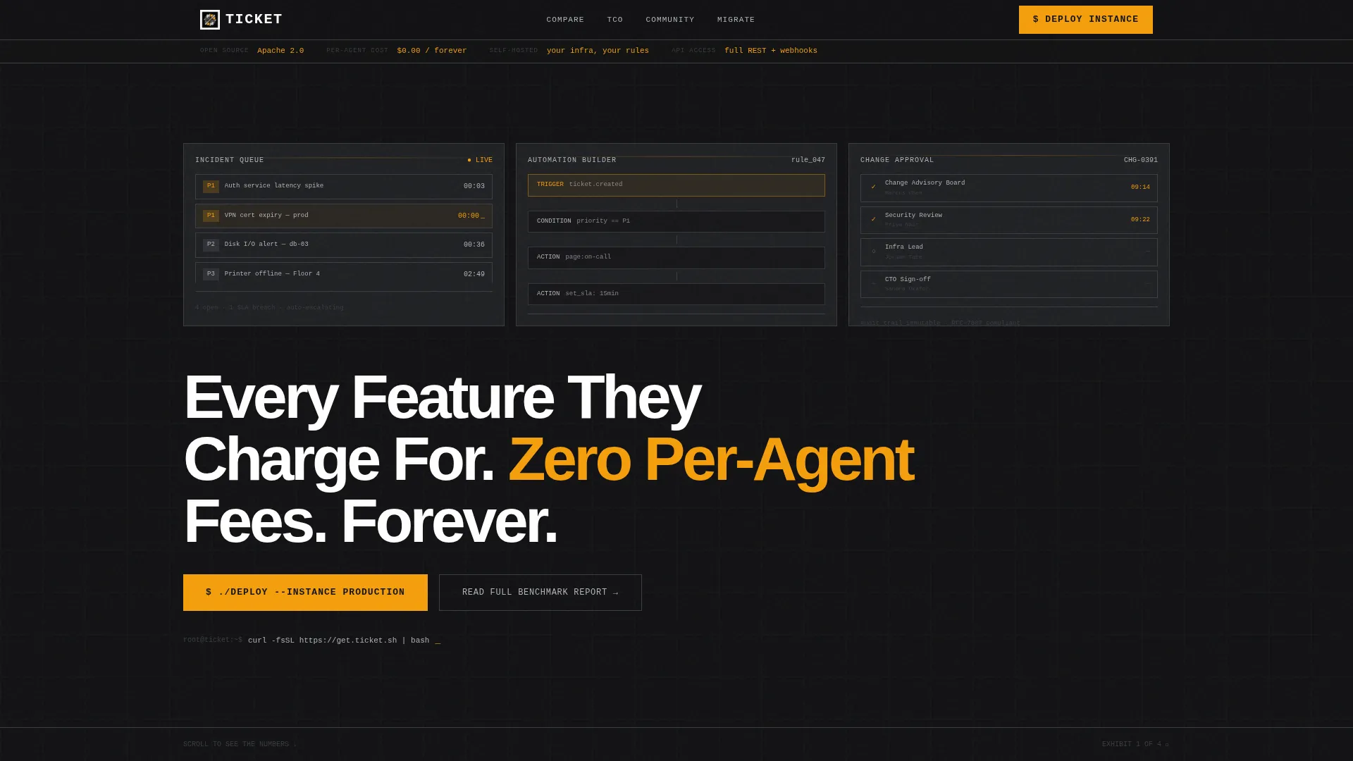
- A dark glass panel header with three live user interface fragment previews and a bold headline that sets the value proposition immediately
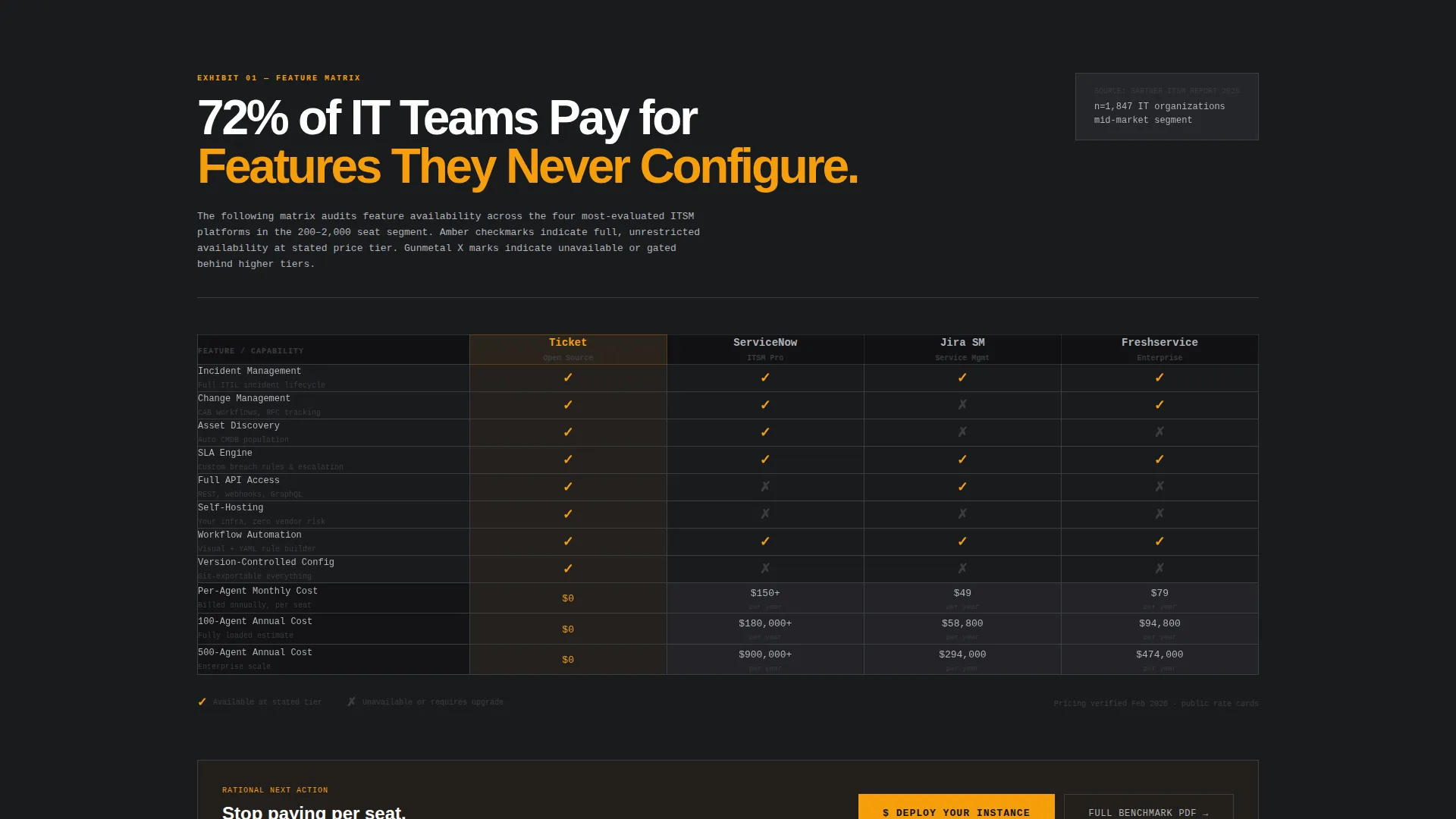
- A brutalist comparison table grid covering incident management, change management, asset discovery, SLA engine, API access, self-hosting, and per-agent cost
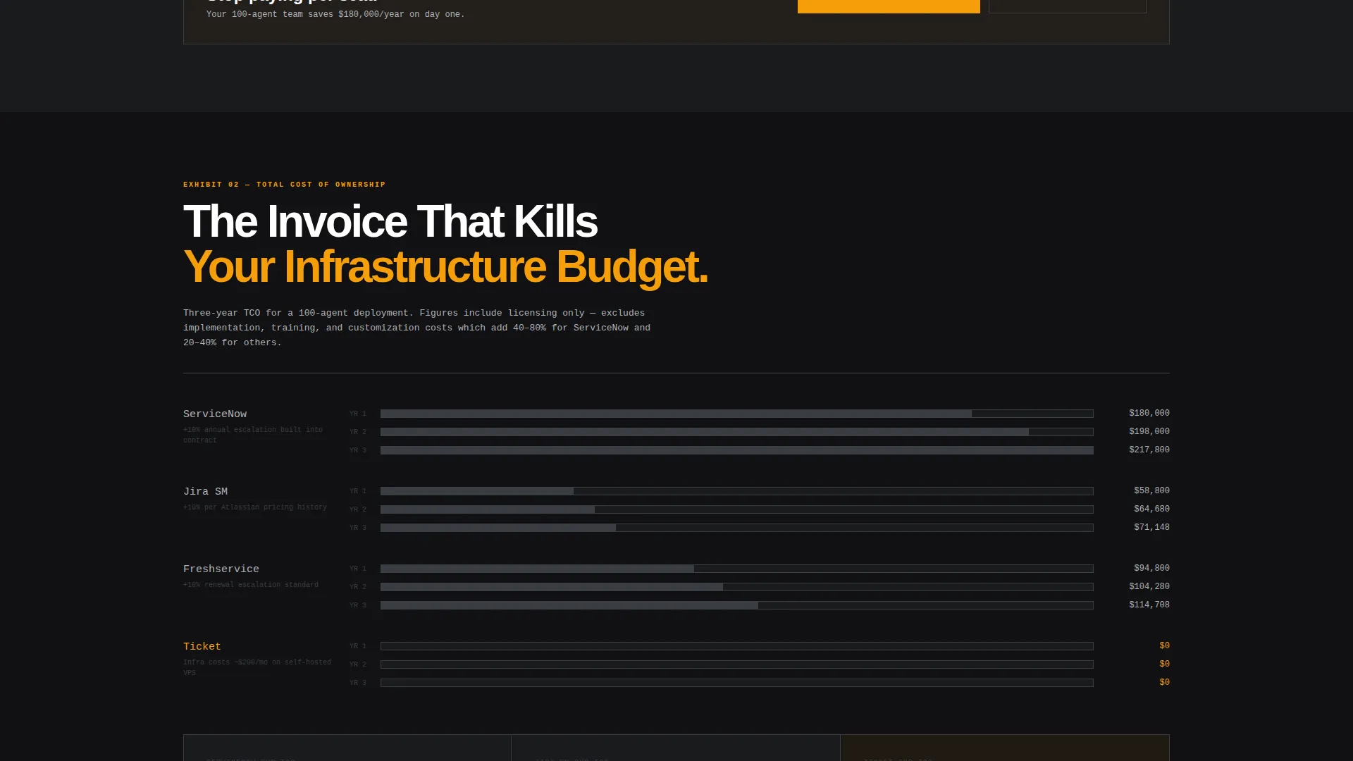
- Staged report-style sections including total-cost-of-ownership calculations and a migration complexity score, each formatted as a numbered exhibit
Feature list
This template includes purpose-built sections and design decisions grounded in the source brief. Every component earns its place on the page.
Dark Glass Panel Header
Three translucent, frosted cards float over a pure black viewport. Each panel shows a different live user interface fragment: a ticket queue with SLA timers, a workflow automation builder mid-configuration, and a change management approval chain. A 1px silver border and a subtle background blur give the panels a server-room observation window feel.
Brutalist Comparison Table
The centerpiece is a raw grid comparing the platform against proprietary alternatives across seven capability categories. Checkmarks appear in caution amber, rejection marks in gunmetal, and pricing cells in the proprietary columns are styled to feel uncomfortable by design. The table is the primary conversion trigger on the page.
Industry Report Scroll Structure
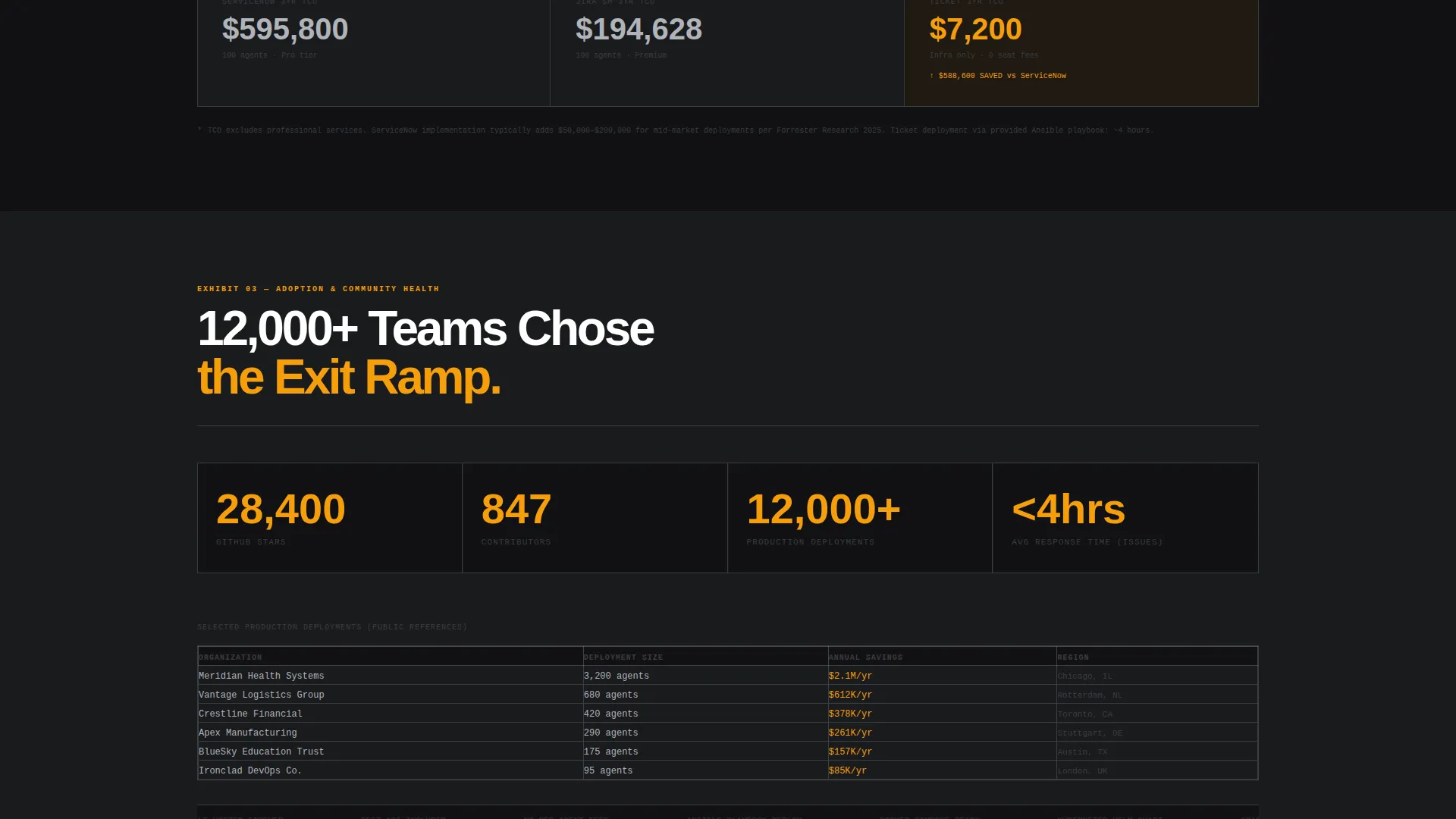
Each section opens with a bold finding or statistic followed by supporting evidence. Sections escalate from feature parity proof to total-cost-of-ownership calculations to a migration complexity score. Each block is formatted like a numbered exhibit in a published analyst brief.
Anchored and Toolbar calls to action
The primary call to action, "Deploy Your Instance," appears first below the header panels, then reappears in a slim black toolbar that slides into view after the comparison table enters the viewport. The secondary text link, "Read the Full Benchmark Report," captures higher-funnel visitors with a gated PDF download.
Monochrome Steel Typography System
Headlines use a heavy grotesque typeface. Data and technical content use a monospaced font. Cold-rolled silver body text sits against forge black and gunmetal alternating backgrounds. No gradients, no soft grays, no box shadows anywhere.
Page sections overview
| Section | Purpose |
|---|---|
| Dark Glass Header | Introduce the platform value proposition with live user interface fragments |
| Headline Block | Deliver the primary value statement in heavy white type |
| Anchored call to action Row | Route visitors directly to the deployment wizard |
| Comparison Table | Show feature and cost parity against proprietary alternatives |
| Feature Parity Proof | Validate capability claims with exhibit-style evidence |
| Cost of Ownership | Present total-cost-of-ownership calculations as a report exhibit |
| Migration Complexity | Score and explain the switching effort for hesitant buyers |
| Benchmark Report call to action | Capture higher-funnel leads with a gated PDF download |
| Sticky Toolbar call to action | Keep the deploy action visible throughout the scroll |
Design & branding system
The visual identity follows a bold brutalist aesthetic built on a monochrome steel palette. The design language is deliberately industrial: raw, load-bearing, and undecorated. Every visual decision reinforces the platform's open, no-vendor-lock-in positioning.
- Color system uses four values: forge black (#111113) for primary backgrounds, gunmetal (#3A3D42) for alternating sections, cold-rolled silver (#B0B3B8) for body text, and caution amber (#F59E0B) reserved exclusively for calls to action and interactive highlights
- Typography pairs heavy grotesque headlines with monospaced data text; all corners are 0px, borders are 1px solid, and no shadows or gradients appear anywhere on the page
- Backgrounds alternate between forge black and gunmetal to create section rhythm without using color variety
Mobile & speed optimization
The layout is structured for vertical readability and direct interaction on smaller screens. The comparison table and report-style sections are designed with stacked, scannable content blocks.
- The slim black toolbar call to action is built to remain visible and tappable across viewport sizes without obscuring content
- Section blocks follow a clean single-column flow that preserves the report-style hierarchy on mobile screens
- Typography sizing and spacing are set to maintain legibility at the weights used by the heavy grotesque and monospaced font pairing
How this template helps you convert
This template is engineered around a single conversion goal: make the cost and capability gap so visible that the next rational action is clicking "Deploy Your Instance." Every structural decision serves that purpose.
- The comparison table places proprietary pricing side by side with open-source costs in a format that lets the numbers make the argument, reducing the need for persuasive copy to do the heavy lifting
- The dual call to action system anchors the deployment action below the header and reintroduces it via a slide-in toolbar after the comparison table, catching buyers at both the awareness and decision moments
- The gated benchmark report link creates a parallel path for visitors who are not ready to deploy, collecting work email and company size for follow-up without losing the higher-funnel segment
Other information about this template
This template is designed specifically for the open-source ITSM niche, where the buying audience is technically literate and skeptical of marketing claims. The content structure mirrors the internal memos and analyst briefs that actually move IT budget decisions.
- The template style is a comparison table layout, suited to platforms competing on documented feature parity and transparent pricing
- The creative direction follows an industry report format, giving the page the authority tone of a published benchmark rather than a product homepage
- The header concept is dark glass panels, a design pattern that references enterprise monitoring dashboards and server-room aesthetics familiar to the sysadmin audience
- The page direction is click-through, with every structural element pointing toward the deployment wizard as the primary next step
- The template fits naturally within the open-source enterprise software category, where buyers evaluate self-hosting, API access, and total cost of ownership as primary criteria
- This template can support positioning against well-known proprietary IT service management platforms, including enterprise and mid-market help desk products, by using the built-in comparison table structure
Theme
Bold Brutalist
Creative direction
Industry Report
Color system
Monochrome Steel
Style
Comparison Table
Direction
Click-Through
Page Sections
Dark Glass Panel Header
Brutalist Comparison Table
Industry Report Scroll Structure
Dual Call to Action System
Gated Report Lead Capture
Monochrome Steel Type System
Related questions
Who is this landing page template designed for?
Can I customize the comparison table categories?
What does the gated benchmark report section do?
Does the template include more than one call-to-action placement?
What visual style does this template use?



