Nonprofit Software Specialist Professional Website Template
Ticket is a hub-and-spoke landing page template built for nonprofit help desk and ticketing platforms. It opens with a trust-building logo bar, delivers impact through stats-first scroll sections, and drives sign-ups with a focused lead-generation form. The Dynamic Motion design uses a Void and Violet color system to create a mission-control feel that feels urgent and purposeful.
by Rocket studio
Quick summary
Ticket is a single-page, anchor-navigated landing page template for nonprofit help desk and ticketing software. It leads with social proof, builds a cumulative case through hard numbers, and closes with a targeted lead-generation form. The Void and Violet visual identity makes every metric feel live and every call to action feel urgent.
Who this template is for
This template is built for teams selling or promoting a shared inbox and ticketing platform to the nonprofit sector. It speaks directly to the operational pain of small, distributed teams who are drowning in disorganized communication.
- Operations directors at mid-size foundations managing part-time staff across multiple time zones
- Information technology committees at community health organizations still routing requests through a shared email inbox
- Program managers at youth mentorship networks who lose hours each week tracking down who replied to what
What problem this template solves
Nonprofit teams rarely have the budget, time, or headcount to justify complex software. Yet they lose enormous hours every week to communication chaos. This template presents a ticketing platform as a practical, immediate solution rather than another tool to learn.
- Visitors arrive skeptical; the stats-first layout answers the "does this actually work?" question before they have to ask it
- The anchor navigation lets busy operations staff jump to the spoke most relevant to them (Shared Inbox, Automation, Reporting, Integrations) without scrolling past irrelevant content
- The lead-generation form appears only after three stat sections have built conviction, reducing friction at the moment of highest intent
What you get with this template
You get a fully structured hub-and-spoke landing page where every section is purpose-built to move a nonprofit operations professional from skepticism to sign-up. The layout is disciplined and the motion system is pre-defined.
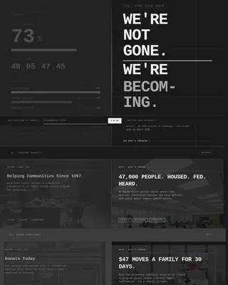
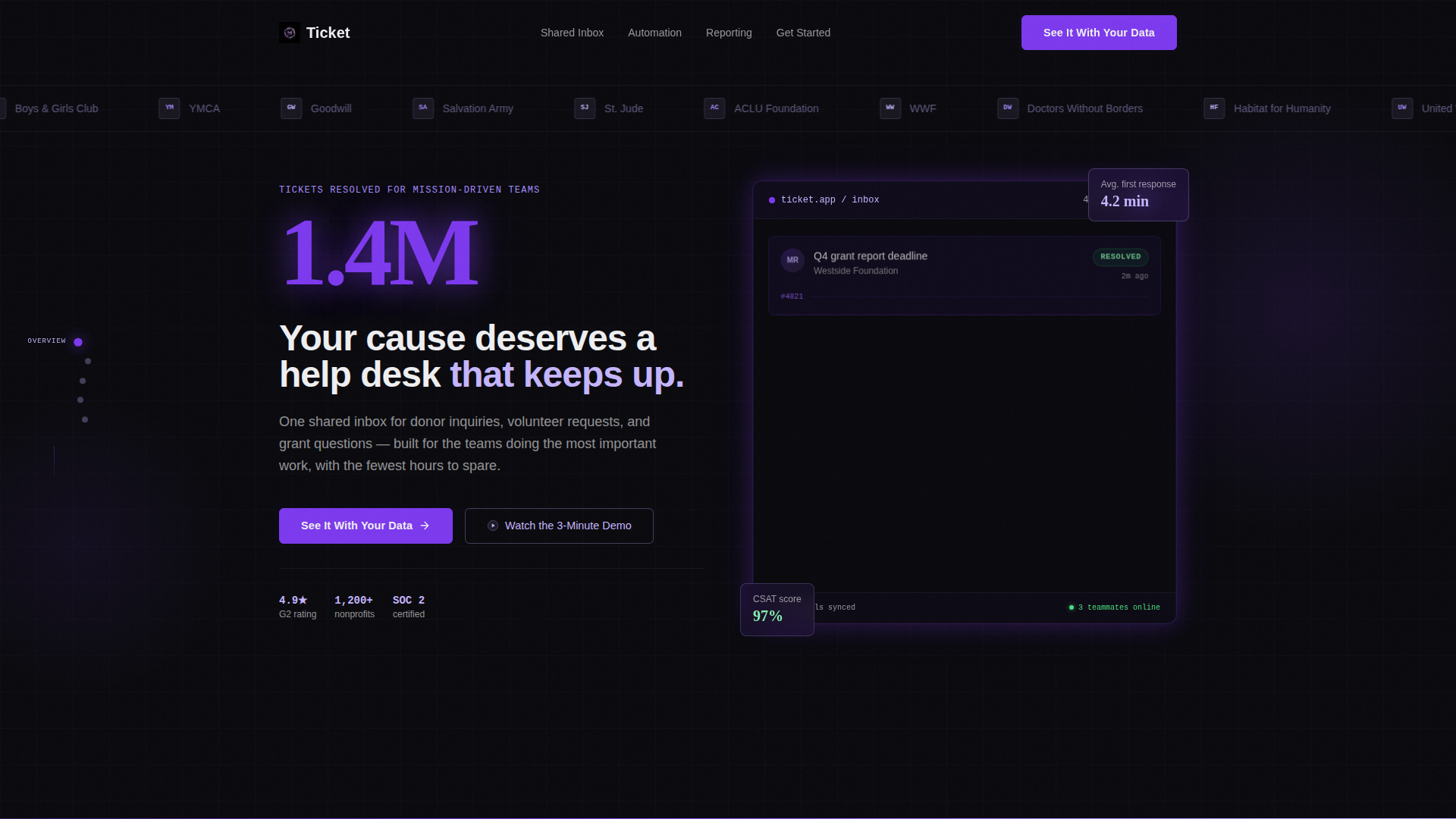
- A header logo bar with a horizontally scrolling strip of nonprofit organization logos rendered in lilac monochrome, establishing credibility before the headline
- Stats-first spoke sections where oversized violet numbers hit first and supporting copy slides in after, each section compounding the case built by the one before it
- A primary lead-generation form asking for organization name, team size, and work email, plus a ghost-button secondary path that opens an inline demo video without leaving the page
Feature list
This template is structured around a clear set of built-in capabilities drawn directly from the brief.
Hub and Spoke Anchor Navigation
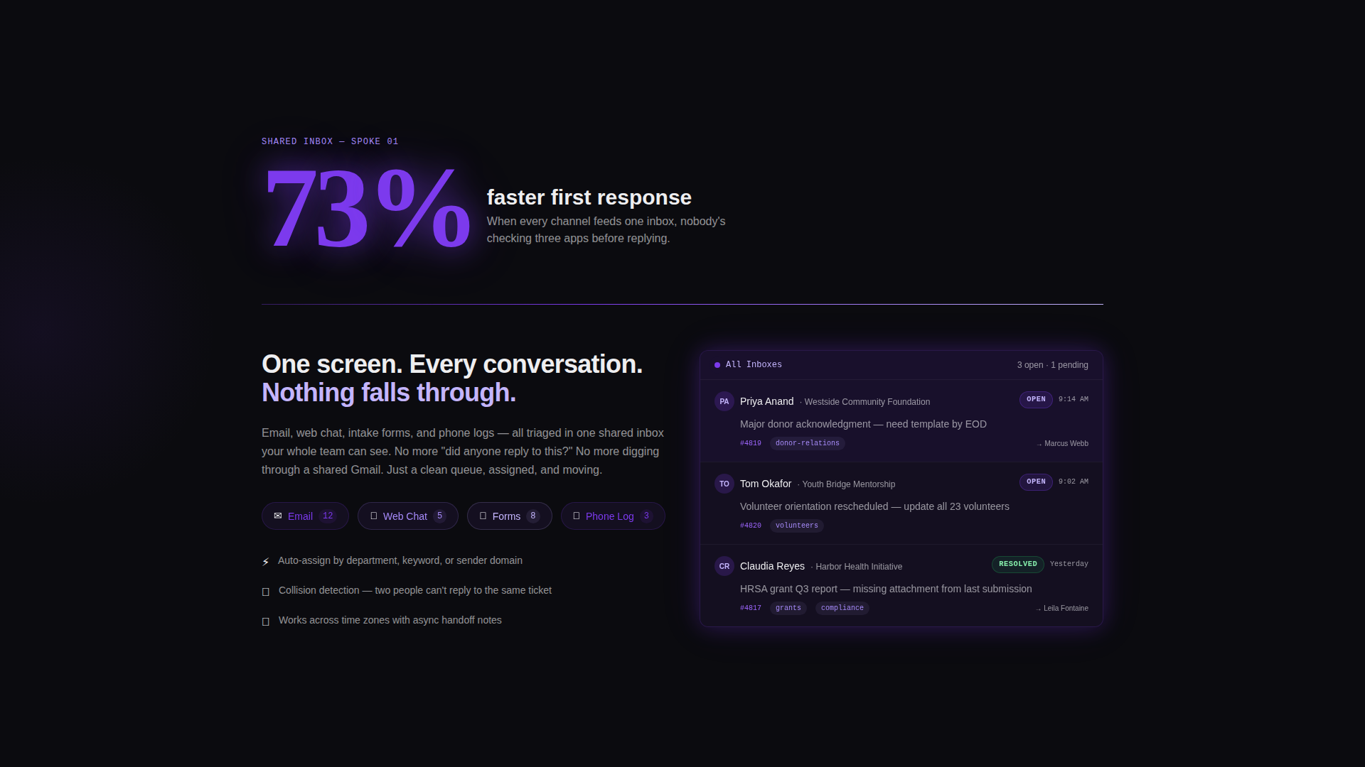
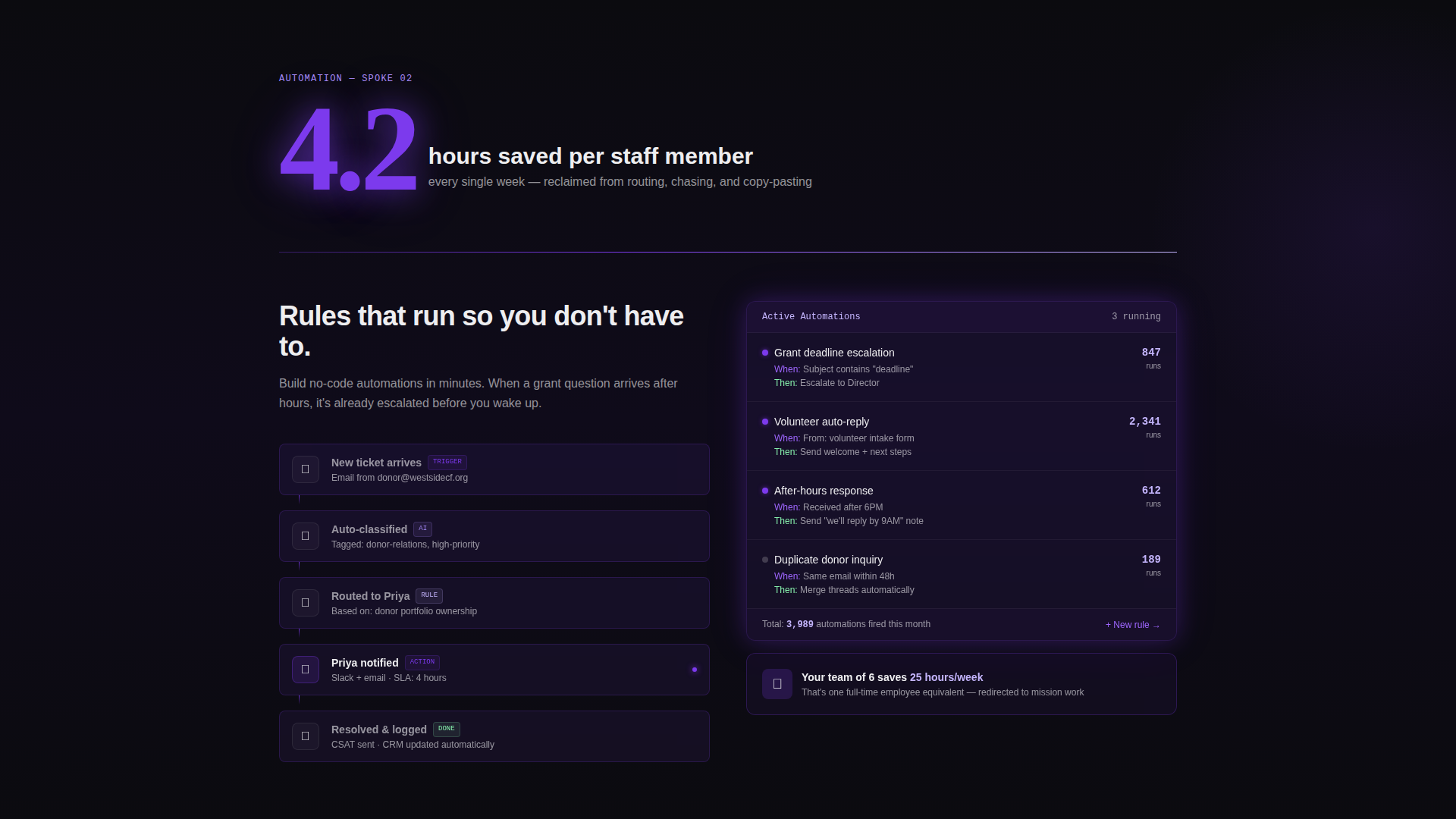
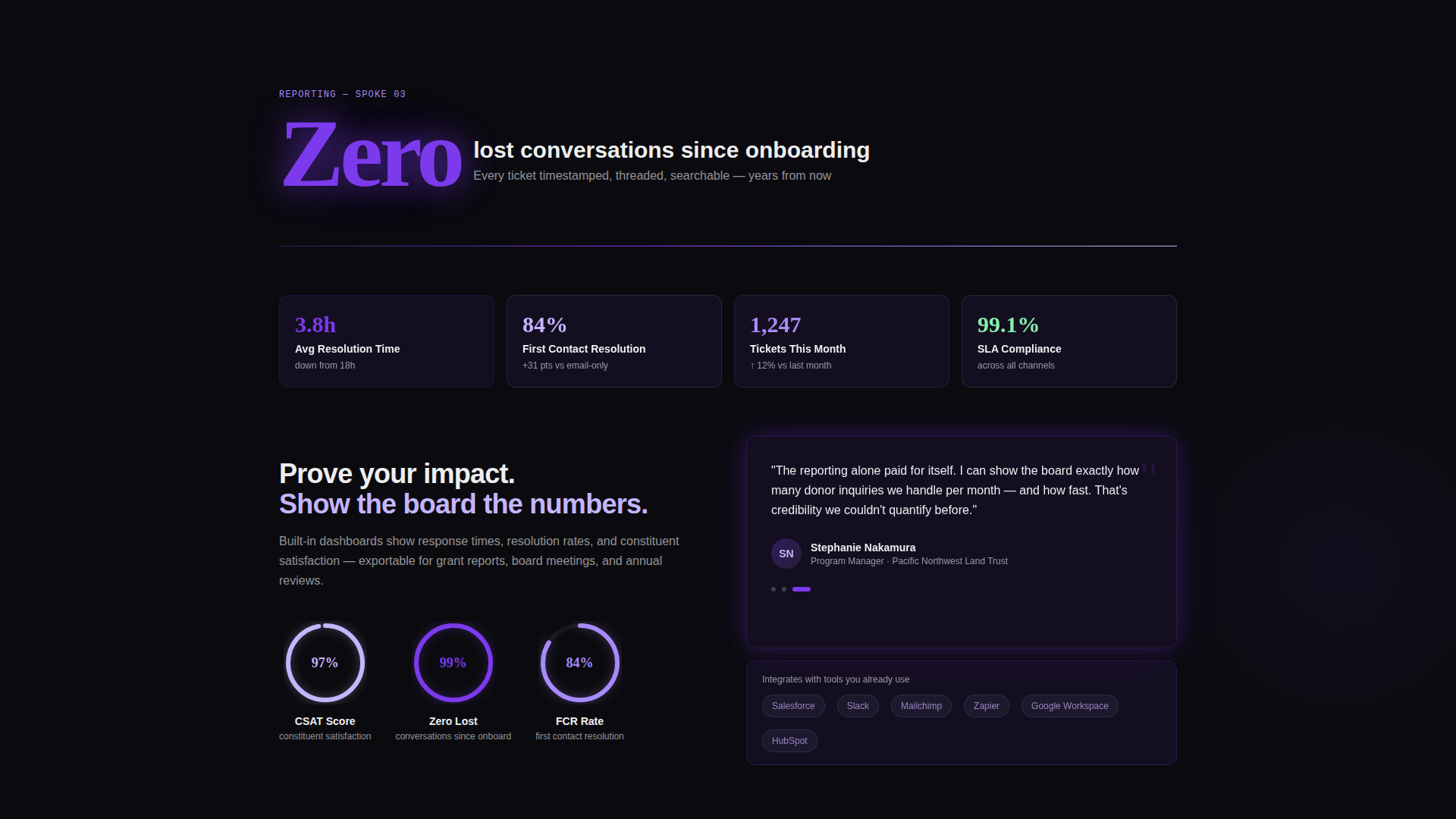
A persistent left-side anchor navigation connects a central hub section to four dedicated spokes: Shared Inbox, Automation, Reporting, and Integrations. Visitors can jump to any spoke directly, or let the natural scroll build the full argument in sequence.
Stats-First Scroll Sections
Each spoke section opens with a hard impact number displayed in oversized electric violet type. The supporting paragraph and interface animation slide in from the spoke after the number registers, so the data does the convincing before the copy has to.
Animated Metric Components
Counters tick up as they enter the viewport. Ticket cards cascade into resolved columns. Satisfaction ratings fill as animated progress rings. Every motion is purposeful and tied to the metric it illustrates.
Trust-Building Logo Bar
The header features a horizontal auto-scroll strip of nonprofit and non-governmental organization logos at varying scales, rendered in soft nebula lilac against void black. The strip establishes sector credibility before a single word of body copy appears.
Dual Conversion Paths
The primary call to action, "See It With Your Data," triggers a short three-field form. A secondary ghost button, "Watch the 3-Minute Demo," opens an inline video and captures email on play. Both paths appear at high-intent scroll positions.
Sticky Lead Capture Bar
After the fold, a sticky bar keeps the primary call to action visible as the visitor continues scrolling. The bar uses electric violet to maintain visual prominence without interrupting the reading experience.
Page sections overview
| Section | Purpose |
|---|---|
| Nonprofit Logo Bar | Establishes sector trust before headline |
| Hero Stat Display | Opens with a single large impact figure |
| Primary Headline | Anchors the core value proposition |
| Shared Inbox Spoke | Illustrates centralized conversation management |
| Automation Spoke | Shows time-saving workflow capabilities |
| Reporting Spoke | Presents team performance and response metrics |
| Integrations Spoke | Connects platform to existing nonprofit tools |
| Mid-Page Lead Form | Captures leads at peak conviction scroll point |
| Inline Demo Video | Secondary path for video-first visitors |
| Sticky call to action Bar | Keeps primary action visible after the fold |
Design & branding system
The Void and Violet color system creates a mission-control atmosphere that feels both urgent and clean. Motion is constant but disciplined, reinforcing data density without overwhelming the visitor.
- Four-color palette: absolute void black (#0B0B0F) for backgrounds, electric violet (#7C3AED) for interactive elements and key numbers, soft nebula lilac (#C4B5FD) for data-dense surfaces and logo treatments, and interface white (#EEEEF0) for body text
- Thin violet gradient dividers animate on scroll between sections, while cards and metric containers use a frosted glass layer over dark surfaces
- Every interactive element, including buttons, toggles, and anchor navigation dots, uses electric violet with a pulsing active state to signal live interactivity
Mobile & speed optimization
The layout is built to maintain the stats-first impact on smaller screens without losing the motion-driven narrative. Animated components are designed to perform within the constraints of mobile viewports.
- The anchor navigation collapses gracefully on smaller screens, keeping spoke access available without consuming screen real estate
- Metric counters and progress ring animations are triggered by viewport entry, so they fire correctly whether the visitor is on a desktop workstation or a phone
- The sticky lead capture bar adapts to the bottom of the screen on mobile, keeping the primary call to action reachable with one thumb
How this template helps you convert
The entire page architecture is built around earning the click before asking for it. Every layout decision reinforces that sequence.
- The logo bar and opening stat answer the credibility question in the first three seconds, so the visitor stays to read the case rather than bouncing immediately.
- Stats-first spoke sections let each hard number do the persuasive work, so by the time the lead form appears after the third stat section, the visitor has already calculated their own wasted hours and is ready to act.
- The dual conversion path means visitors who are not yet ready to fill out a form can still enter the funnel through the inline demo video, capturing intent without forcing a commitment.
Other information about this template
This template is categorized under Technology and Nonprofit Software, making it directly relevant to teams evaluating dedicated nonprofit help desk and ticketing solutions. It is built for the hub-and-spoke anchor navigation pattern with a Dynamic Motion theme.
- The template style is Hub and Spoke with Anchor Nav, meaning the left-side navigation anchors persist throughout the scroll and each spoke section functions as a self-contained argument
- The creative direction is Stats-First Impact, a deliberate choice to address the skepticism common among nonprofit operations buyers who need hard evidence before presenting a new tool to their board
- The header concept is a Logo Bar, designed to mirror the trust signals used by enterprise software landing pages but scaled and styled for the nonprofit and non-governmental organization sector
- The lead-generation direction means every section is sequenced to maximize form completion rate at the moment of highest conviction, not at page load
Theme
Dynamic Motion
Creative direction
Stats-First Impact
Color system
Void & Violet
Style
Hub & Spoke (Anchor Nav)
Direction
Lead Generation
Page Sections
Hub and Spoke Anchor Navigation
Stats-first Spoke Sections
Animated Metric Components
Trust-building Logo Bar
Dual Conversion Paths
Sticky Lead Capture Bar
Related questions
Who is this landing page template designed for?
Can I customize the stats and numbers shown in the template?
What are the four spoke sections in the anchor navigation?
How does the dual conversion path work?
Is the logo bar in the header editable?