Real Estate Help Desk Landing Page Template
Ticket is a bold brutalist landing page template built for real estate help desk and ticketing platforms. It uses a scroll-reveal arc that moves from operational chaos to structured clarity, guiding property managers and leasing teams toward a single action: seeing the queue in motion. The design is raw, purposeful, and built entirely around one glowing artifact doing its job.
by Rocket studio
Quick summary
Ticket is a single-page, scroll-reveal landing page template designed for real estate ticketing and help desk platforms. It opens in controlled darkness, pulls visitors through a chaos-to-clarity narrative, and lands them on a primary call to action backed by visible proof. Every section earns its place. Nothing is decorative.
Who this template is for
This template is purpose-built for software products that manage maintenance requests, tenant complaints, and compliance flags inside property operations. If your platform routes chaos into a structured queue, this page is your front door.
- Regional property management firms handling multi-unit residential portfolios
- Commercial landlords whose tenant communication breaks down across multiple inboxes
- Fast-scaling brokerages where internal operations requests disappear into Slack threads
What problem this template solves
Property operations teams lose time and credibility when requests fall through the cracks. A maintenance email sent to five people, a compliance flag buried in a spreadsheet, a tenant complaint that nobody owns, these are the daily costs of a broken system. This template communicates that pain instantly and then shows the fix.
- Fragmented communication across email, calls, and spreadsheets makes request tracking unreliable
- No single owner per request means resolution times stretch and tenant satisfaction drops
- Platforms solving this problem need a landing page that proves the product before asking for a click
What you get with this template
You get a fully structured, scroll-reveal landing page ready to represent a real estate help desk product. The layout is built section by section, each one stripping away a layer of operational disorder and replacing it with evidence of control.
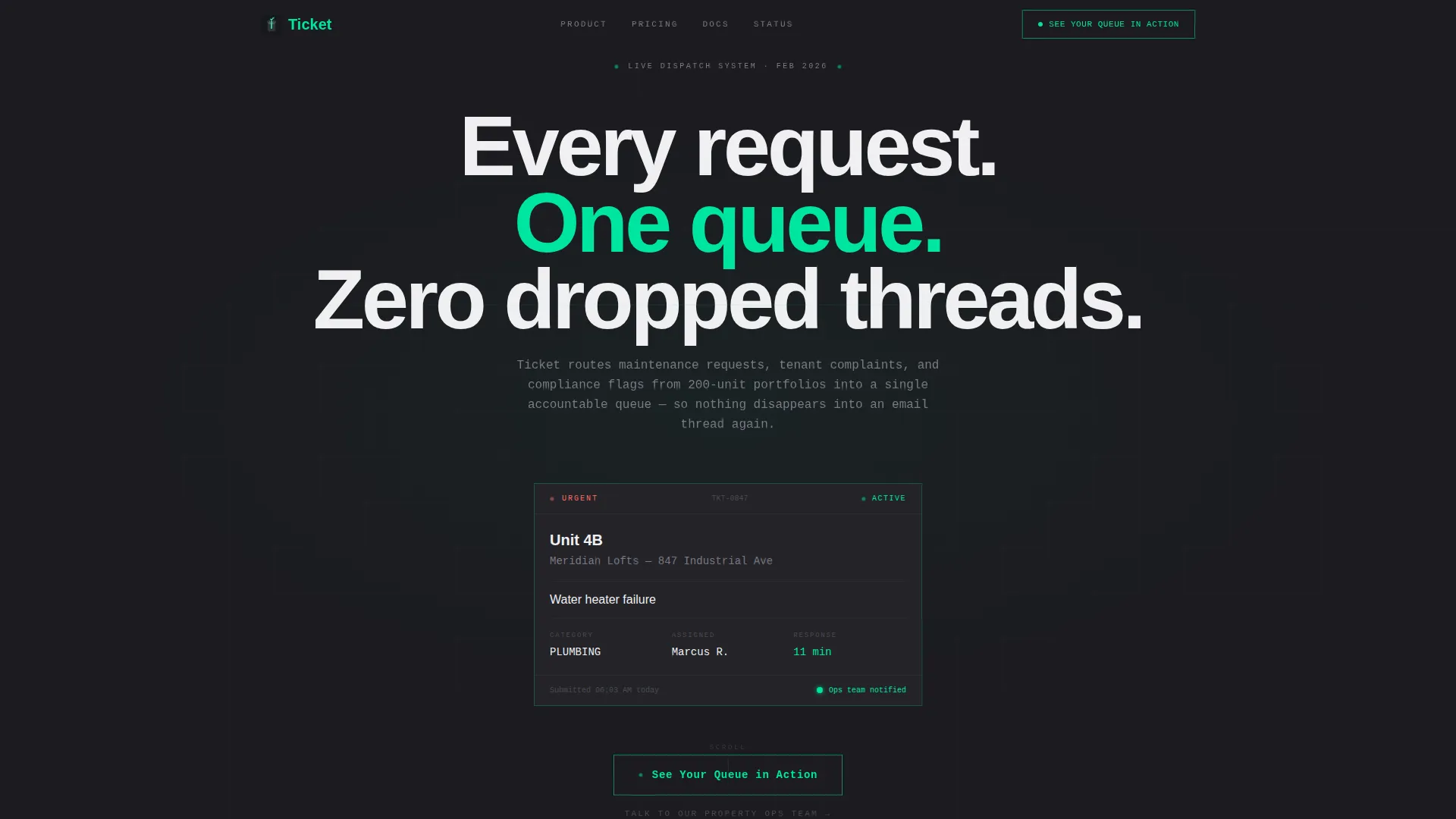
- A dark full-bleed header centered on a single glowing ticket card showing a live maintenance request
- A progressive scroll arc moving from fragmented chaos visuals to a live-status dashboard reveal
- Three strategically placed calls to action, each variant matched to where the visitor is in the scroll
Feature list
This template delivers a focused set of design and structural decisions, each one grounded in the product story it tells.
Glowing Ticket Card Header
The header places a single floating user interface artifact at center frame. It shows a real maintenance request with unit, issue type, priority level, assigned team member, and response time. The electric mint glow is the only light source on the page. No stock photography. No illustration. Just the product doing its job.
Scroll-Reveal Problem-to-Solution Arc
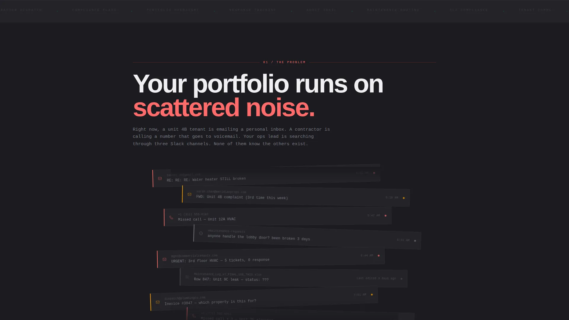
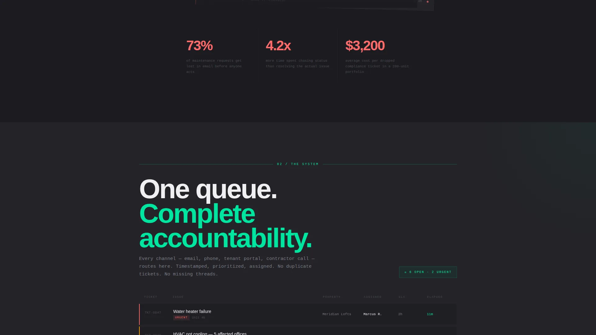
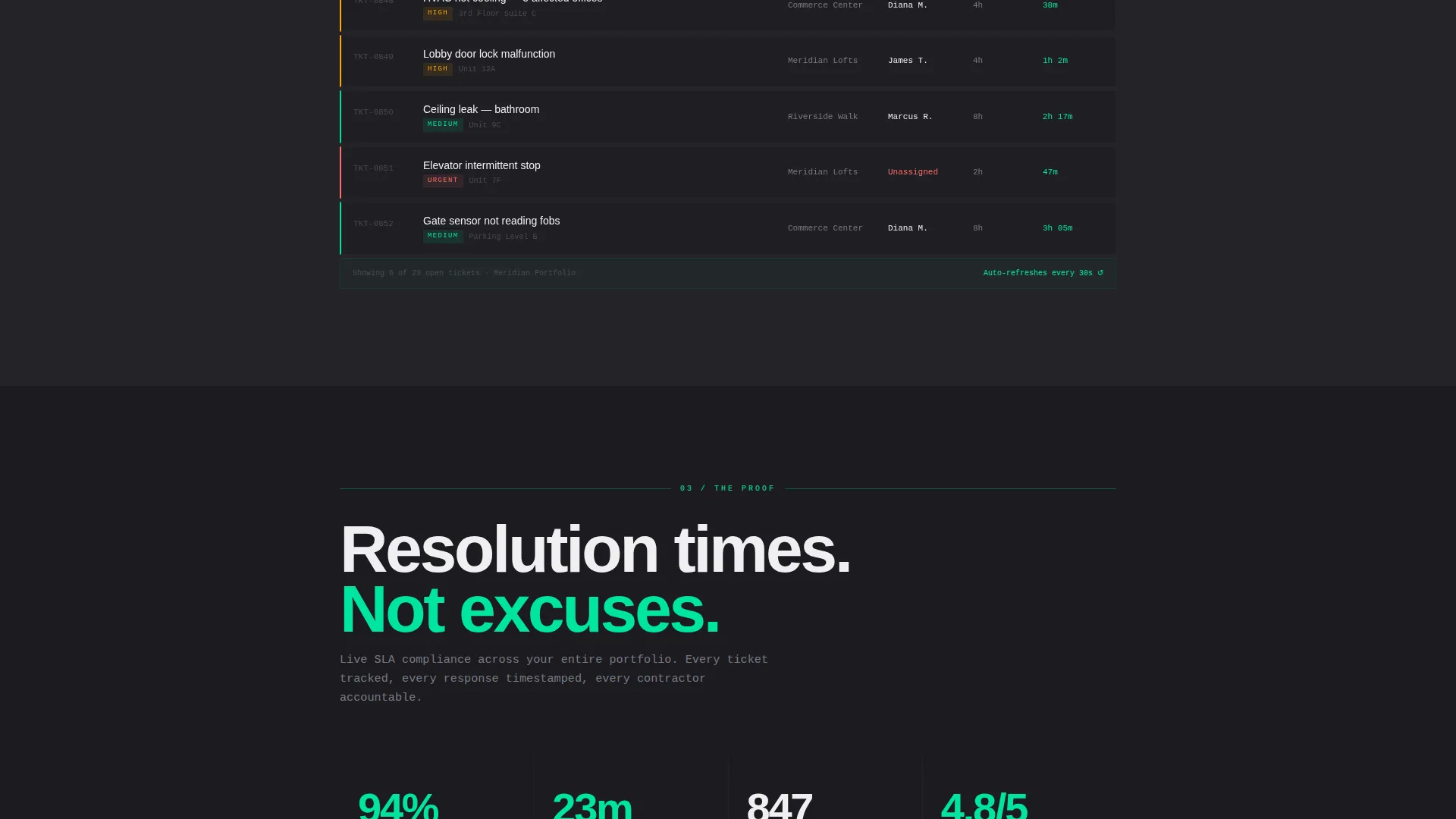
The scroll begins in visible disorder. Fragmented emails, missed calls, and blurring spreadsheet rows fill the first reveal. The second reveal shows those same requests flowing into a color-coded, time-stamped, assigned queue. The third reveal surfaces a live-status dashboard with resolution times and tenant satisfaction scores. Each section removes one layer of chaos.
Three-State Call to Action System
The primary call to action, "See Your Queue in Action," appears three times across the page. It arrives ghost-outlined in the header, solid-filled after the dashboard reveal, and full-width at the page base. A secondary text link, "Talk to Our Property Ops Team," sits beneath each instance for visitors who want a human first.
Live Dashboard Reveal Section
The third scroll reveal shows a working dashboard surface: resolution times, service-level agreement compliance indicators, and tenant satisfaction scores in motion. This section serves as proof of output before any click is requested.
Bold Brutalist Layout System
Every content block is raw and structural. No rounded corners. No soft gradients. Content is arranged in concrete-weight blocks that mirror the product's own philosophy: information architecture as design statement. The layout itself reinforces the message of order over decoration.
No-Form Click-Through Architecture
This page carries no contact form. The single goal is a click to a live interactive demo environment pre-loaded with sample property data. All conversion pressure routes through demonstration, not data collection.
Page sections overview
| Section | Purpose |
|---|---|
| Dark Header | Anchors the visitor with a glowing ticket card and ghost call to action |
| Chaos Reveal | Shows the fragmented state of unmanaged property requests |
| Queue Clarity | Demonstrates requests flowing into a single structured queue |
| Dashboard Proof | Displays live-status resolution metrics and satisfaction scores |
| Full-Width call to action | Closes the scroll with a solid primary action and secondary link |
Design & branding system
The visual identity runs on a Monochrome Steel palette applied with industrial discipline. Every color has a role and stays in it. The result feels like brushed steel under fluorescent light, precise, unapologetic, and impossible to mistake for a generic SaaS template.
- Structural charcoal (#1B1B1F) dominates all backgrounds, giving the page its concrete-room weight
- Exposed-beam gray (#3A3A42) and poured-concrete mid-tone (#7A7A85) carry card surfaces and body text
- Electric mint (#00E5A0) appears only on interactive elements, live status badges, and calls to action, every glow earned, never decorative
Mobile & speed optimization
The scroll-reveal structure is designed to translate cleanly across screen sizes. The single-column scroll arc means the narrative stays intact on smaller viewports without restructuring the story.
- Section-by-section progressive reveal keeps the visual hierarchy readable on mobile without relying on side-by-side layouts
- The absence of heavy media assets like stock photography or hero illustrations reduces visual load across devices
- The full-width call to action at the page base ensures the primary action is reachable on any screen without scrolling back up
How this template helps you convert
This template is built for one conversion event: a click to the live demo. Every structural decision on the page pushes toward that moment.
- The header shows the product working before any explanation is offered, earning attention through the artifact rather than through a headline
- The chaos-to-clarity scroll arc creates a felt experience of the problem and solution, so the visitor arrives at the call to action already convinced rather than still evaluating
- Three call to action placements matched to scroll depth mean the action is available the moment a visitor is ready, whether they convert at the top, mid-page, or bottom
Other information about this template
This template is built specifically for the real estate software category, targeting help desk and ticketing platforms operating inside property management workflows. It is a single landing page, not a multi-page site.
- The template follows a Bold Brutalist visual theme, which suits platforms that want to project operational credibility rather than consumer friendliness
- The click-through architecture routes all conversion through a demo link, making it suitable for product-led growth strategies where showing beats telling
- The secondary call to action, "Talk to Our Property Ops Team," acknowledges that some buyers need a consultative path before committing to a demo
Theme
Bold Brutalist
Creative direction
Problem→Solution Arc
Color system
Monochrome Steel
Style
Scroll Reveal (Progressive)
Direction
Click-Through
Page Sections
Glowing Ticket Card Header
Scroll-reveal Chaos-to-clarity Arc
Three-state Call to Action System
Live Dashboard Reveal Section
No-form Click-through Architecture
Related questions
What type of business is this template designed for?
Does this landing page include a contact form?
Can I adapt the glowing ticket card in the header to reflect my own product data?
Is this a single page or a multi-page template?
What makes the Bold Brutalist theme appropriate for a property management product?



