Local Architecture Firm Software Professional Website Template
Ticket is a dashboard-style landing page template built for architecture firm help desk and ticketing platforms. It uses a dark Void & Violet color system, a live-styled mock data grid, interactive filterable sections, and a sticky app-download bar to show visitors exactly how the product works before asking them to install it.
by Rocket studio
Quick summary
Ticket is a single-page template designed for architecture firm ticketing and help desk software. It opens with a scrolling logo bar, moves into an interactive mock dashboard, and closes with a pinned download call to action. The layout proves the product works before it asks for the install.
Who this template is for
This template is built for software teams and product studios that serve the architecture, engineering, and construction industry. If your platform helps firms manage requests for information (RFIs), punch lists, or consultant coordination, this template speaks directly to your buyers.
- Project architects managing submittals across late-night deadlines
- Office managers triaging hardware conflicts across multiple time zones
- Principals who need one clear view of which projects are consuming the most hours
What problem this template solves
Architecture firms drown in fragmented communication. RFIs scatter across email threads, punch lists live in spreadsheets, and consultant conflicts surface too late. A generic software landing page cannot communicate the relief that a well-organized ticketing platform delivers. This template solves that by putting a working dashboard preview in front of the visitor immediately.
- Visitors cannot picture what "one queue, every discipline" actually means without seeing it
- Standard landing pages explain features in bullet points but never let visitors touch the product
- The template bridges that gap by making the interface itself the demonstration
What you get with this template
You get a fully structured single-page layout built around interactive demonstration. Every section is designed to deepen the visitor's confidence by letting them explore the product rather than just read about it.
- A scrolling logo bar header, live mock data grid, filterable ticket section, ticket timeline view, and metrics panel
- A sticky bottom bar with app download and demo modal call-to-action buttons
- A dark Void & Violet visual identity with violet left-border accents, phosphor white type, and subtle card elevation
Feature list
This template is built around five core design and interaction features, all grounded in the source brief.
Scrolling Logo Bar Header
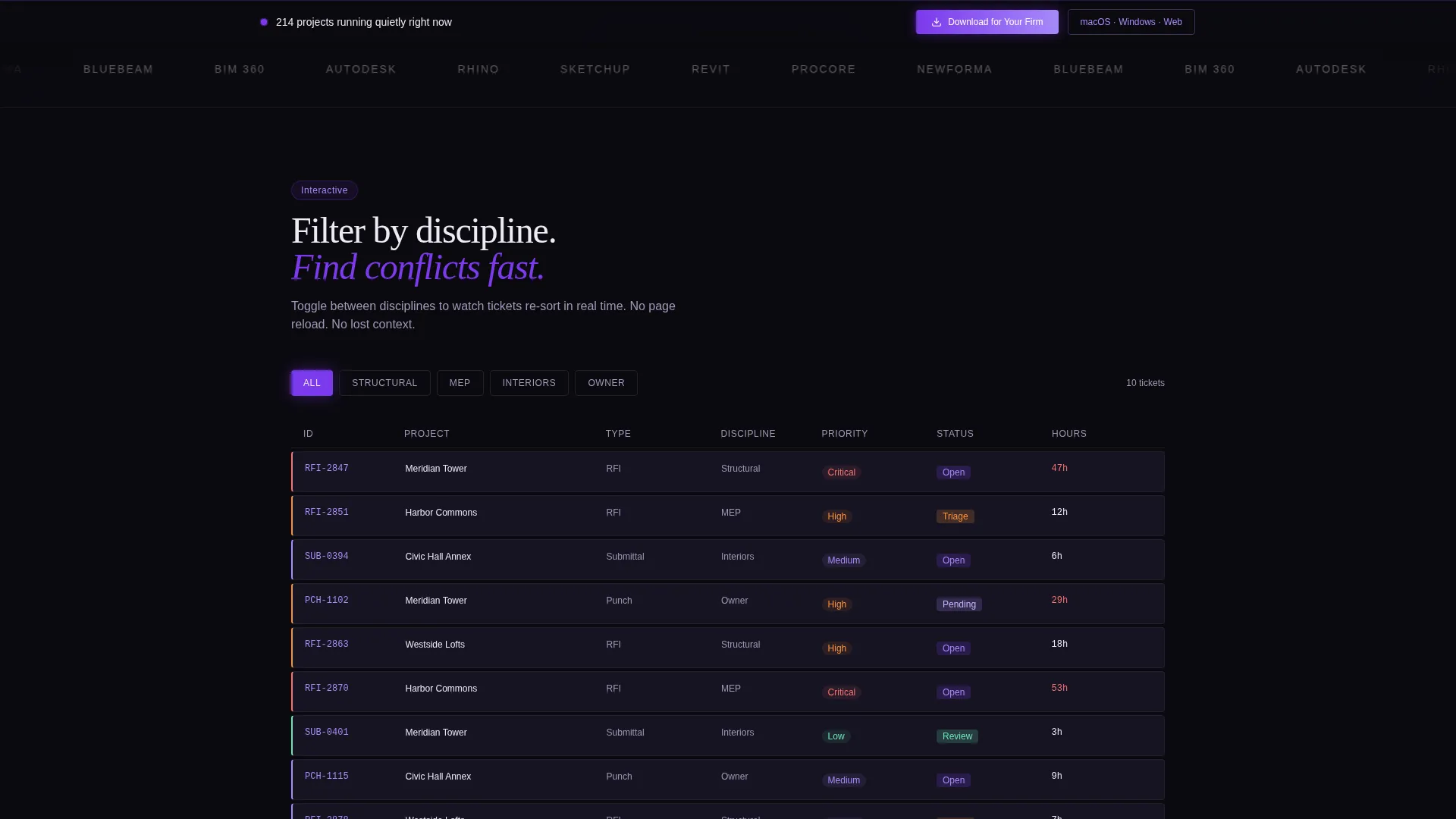
A slim horizontal strip displays recognizable architecture and AEC tool logos in phosphor white monochrome. The logos scroll slowly left, establishing professional credibility before the visitor reads a single word of copy.
Live Mock Data Grid
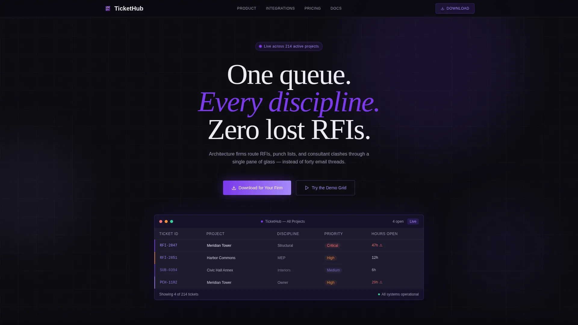
Beneath the header headline, a styled dashboard preview shows four open tickets with columns for Project, Discipline, Priority, and Hours Open. Each row pulses subtly to suggest real-time activity without requiring a live backend.
Filterable Ticket Grid
The second section lets visitors toggle between discipline filters: Structural, MEP (Mechanical, Electrical, and Plumbing), Interiors, and Owner. The ticket list re-sorts with animated transitions, giving visitors a hands-on feel for how the product organizes their work.
Ticket Timeline Scroll View
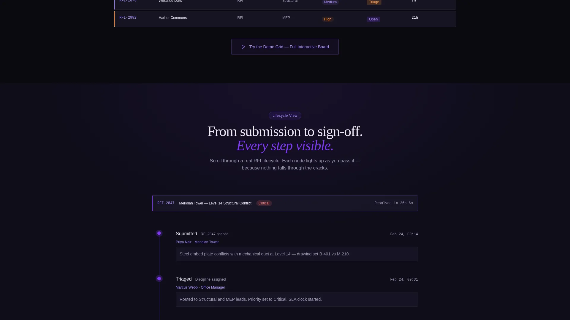
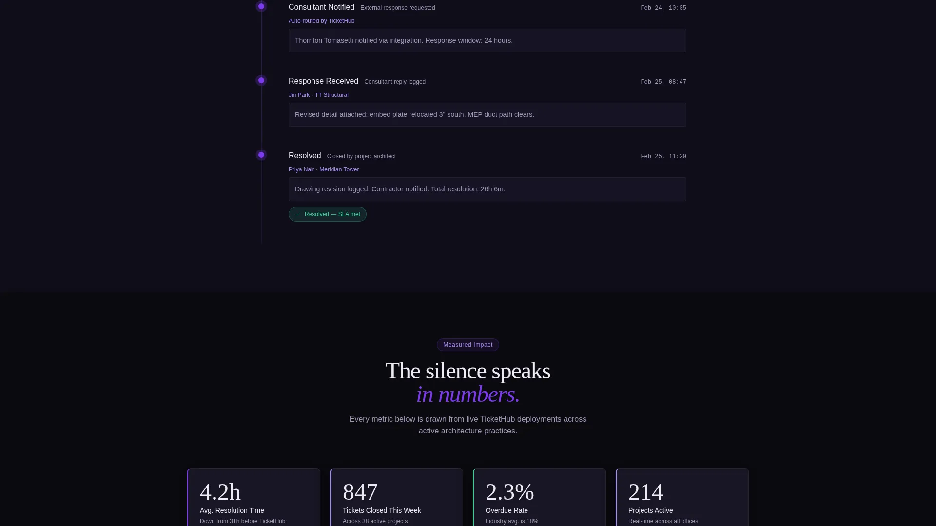
Section three expands a single ticket card into a full lifecycle timeline. Each node, from submission through triage, consultant response, and resolution, lights up in violet as the visitor scrolls past it. This communicates workflow depth without a product tour video.
Viewport Metrics Panel
Section four shows three key performance numbers: average resolution time, tickets closed this week, and overdue percentage. Each number counts up as it enters the viewport, making the metrics feel live and meaningful.
Sticky App Download Bar
After the first interactive section, a slim bottom bar appears and stays pinned. It carries the primary "Download for Your Firm" call to action alongside app store and direct desktop badges, plus a secondary inline "Try the Demo Grid" button that opens a sandboxed modal.
Page sections overview
| Section | Purpose |
|---|---|
| Logo Bar Header | Builds credibility with AEC tool and firm logos |
| Hero Headline | Frames the single-queue value proposition |
| Live Dashboard Preview | Shows a mock ticket grid with pulsing rows |
| Filterable Ticket Grid | Lets visitors sort tickets by discipline |
| Ticket Timeline View | Demonstrates the full ticket lifecycle on scroll |
| Metrics Panel | Counts up resolution and closure stats |
| Sticky Download Bar | Pins the app download call to action |
Design & branding system
The visual identity follows a Directory and Discovery theme using the Void & Violet color system. The palette is built to feel like a terminal screen in a darkened office: every violet glow is a signal, every shadow is eliminated noise.
- Core colors: deep void black (#0B0A10), electric violet (#7C3AED), muted graphite (#1E1B2E), and cool phosphor white (#EDEAF4)
- Accent states and hover glows use softer lavender (#A78BFA); data cards float with subtle elevation and violet left-border accents
- Text is sparse and deliberate: phosphor white appears only where the eye must land, keeping the grid readable without visual clutter
Mobile & speed optimization
The template is structured as a lean single-page layout. Its section-led flow is designed to remain scannable and navigable on smaller screens without sacrificing the interactive explorer experience.
- Each interactive section is self-contained, which keeps the scroll path logical on mobile viewports
- The sticky bottom bar is sized to sit cleanly at the bottom of a phone screen without blocking content
- Card elevation and border accents translate well to smaller displays because they rely on color contrast rather than complex shadow layers
How this template helps you convert
The template earns the download before it asks for it. Every interactive moment functions as a free preview of the product, reducing the skepticism that typically blocks software installs.
- The mock data grid and filterable section let visitors experience the interface immediately, building trust faster than a feature list ever could
- The scroll-triggered timeline and counting metrics create a sense of live product activity, making the platform feel proven and in use
- The sticky download bar appears only after the visitor has engaged with at least one interactive section, so the ask arrives at the right moment
Other information about this template
This template sits at the intersection of the Technology category and the Architecture Firm Software subcategory. It is purpose-built for the Architecture Firm Help Desk and Ticketing niche, which makes it a precise fit for platforms in that space rather than a generic SaaS layout.
- The Dashboard and Data Grid template style is central to the design: the grid is the hero, not a secondary feature
- The Interactive Explorer creative direction means the page is driven by visitor interaction rather than passive reading
- The App Download landing page direction shapes every call-to-action decision, from the sticky bar to the inline demo modal
- The Logo Bar header concept is specifically configured to display AEC tool logos and architecture firm identifiers in a credibility-first strip
Theme
Directory & Discovery
Creative direction
Interactive Explorer
Color system
Void & Violet
Style
Dashboard/Data Grid
Direction
App Download
Page Sections
Scrolling AEC Logo Bar
Live Mock Data Grid
Interactive Filterable Grid
Scroll-triggered Ticket Timeline
Viewport Metrics Panel
Sticky App Download Bar
Related questions
Who is the ideal buyer for this template?
Can I replace the mock data grid with real content?
How does the interactive filtering section work in the template?
Is the sticky download bar always visible?
Can the Void & Violet color system be adapted to a different brand palette?



