Ticket - Streamlined Campus Landing Page Template
Ticket is a bento grid landing page template built for education help desk and ticketing platforms. It uses a glassmorphic visual system layered over deep indigo and slate-violet, with an interactive dashboard preview in the header. The layout guides IT directors and campus administrators from real pain-point data straight to a download call to action.
by Rocket studio
Quick summary
Ticket is a single-page bento grid landing page template designed for campus IT and education help desk platforms. It opens with a live-feeling dashboard preview, then walks visitors through an industry-report-style scroll that pairs real education IT problems with direct product answers. The closing section anchors a prominent app download call to action.
Who this template is for
This template is built for teams that need to present a campus help desk or ticketing product to institutional decision-makers. The design and copy rhythm speak directly to buyers who evaluate tools for large, multi-department educational environments.
- IT directors at mid-size universities looking to move beyond email-based triage
- K-12 technology coordinators managing large device fleets across multiple schools
- Department administrators and registrar offices currently tracking requests in shared spreadsheets
What problem this template solves
Campus IT teams receive requests from every corner of an institution, but most landing pages treat that complexity as invisible. This template makes the chaos legible. It shows prospective buyers exactly how a ticketing platform handles routing, prioritization, and resolution tracking before they ever sign up.
- Visitors leave most help desk landing pages without understanding how routing or triage actually works
- Decision-makers evaluating software need spatial, data-rich layouts rather than flat feature lists
- The person reviewing the tool is rarely the person installing it, so the page must enable sharing
What you get with this template
You get a fully structured bento grid landing page that combines an interactive header preview with a data-driven scroll narrative. Every section is designed to feel like a research report that keeps delivering answers.
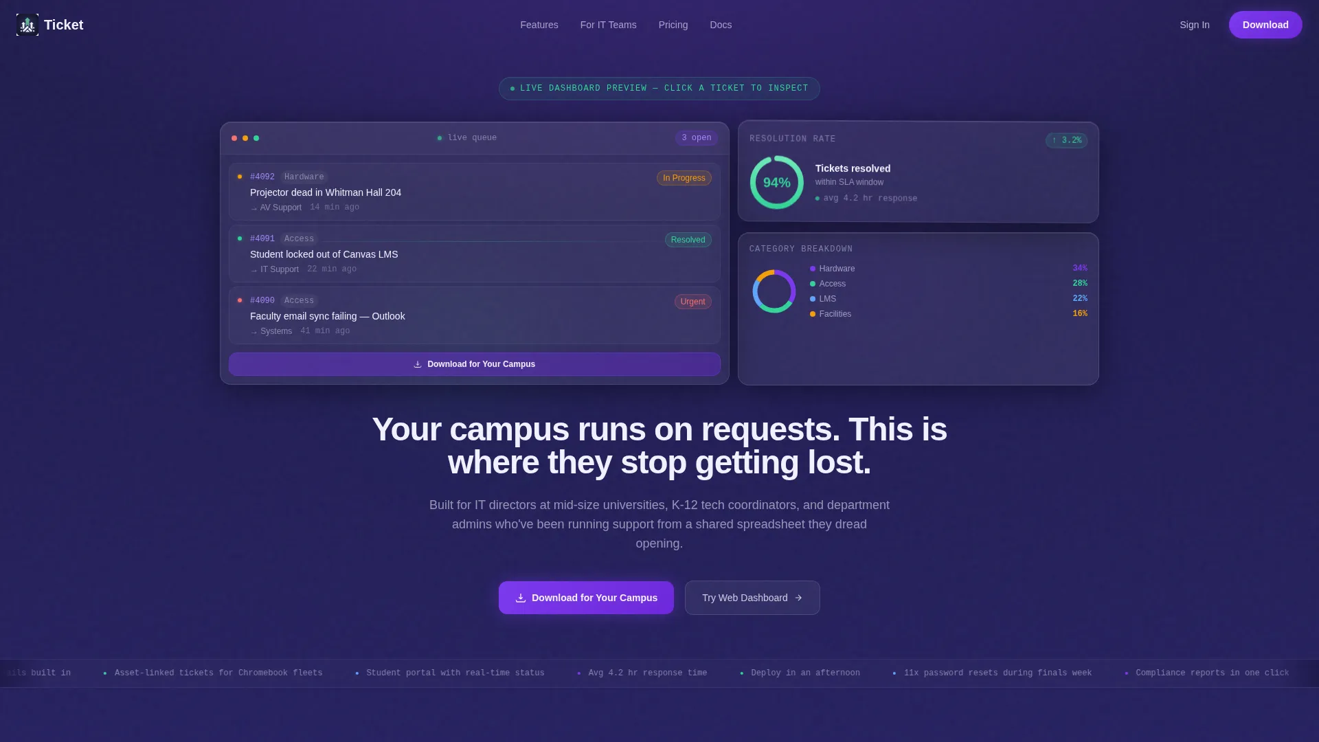
- An interactive header bento panel showing a live ticket queue, a resolution-time radial chart, and a category breakdown donut chart
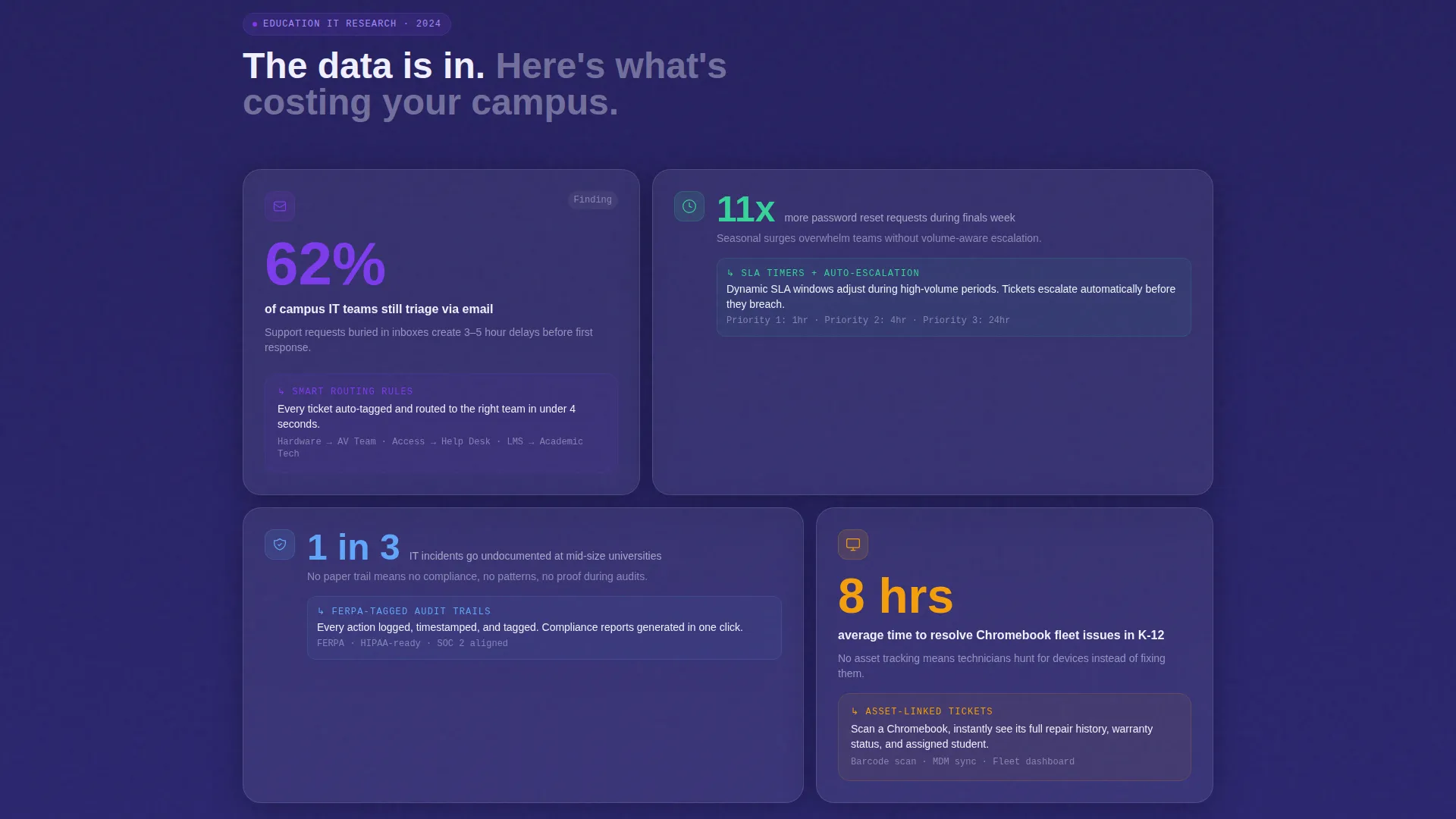
- An industry-report scroll rhythm that pairs education IT statistics with matching product feature cards
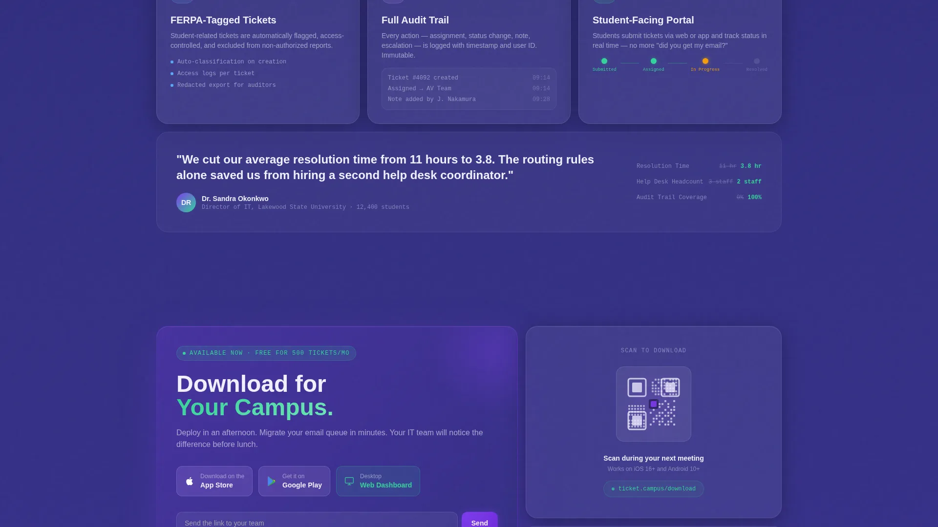
- A multi-placement app download call to action including App Store and Google Play badges, a scannable QR code card, and a team email share field
Feature list
This section covers the key built-in design and structural capabilities included in the template.
Interactive Dashboard Header Preview
The header renders a miniature, functioning version of the app dashboard directly in the viewport. Three glass bento tiles display a live ticket queue entry, a pulsing resolution-time radial chart, and a category breakdown donut. Visitors can click a ticket tile to slide it open and reveal an internal note thread, or hover the chart to see response benchmarks.
Industry Report Scroll Narrative
The page follows a problem-stat, product-answer rhythm as visitors scroll. Each bento section presents a frosted stat callout drawn from education IT research, immediately followed by the product feature that resolves it. The sequence escalates from everyday issues like password resets to institutional concerns like compliance audit trails and tagged ticket records.
Campus Topology Heat Map Panel
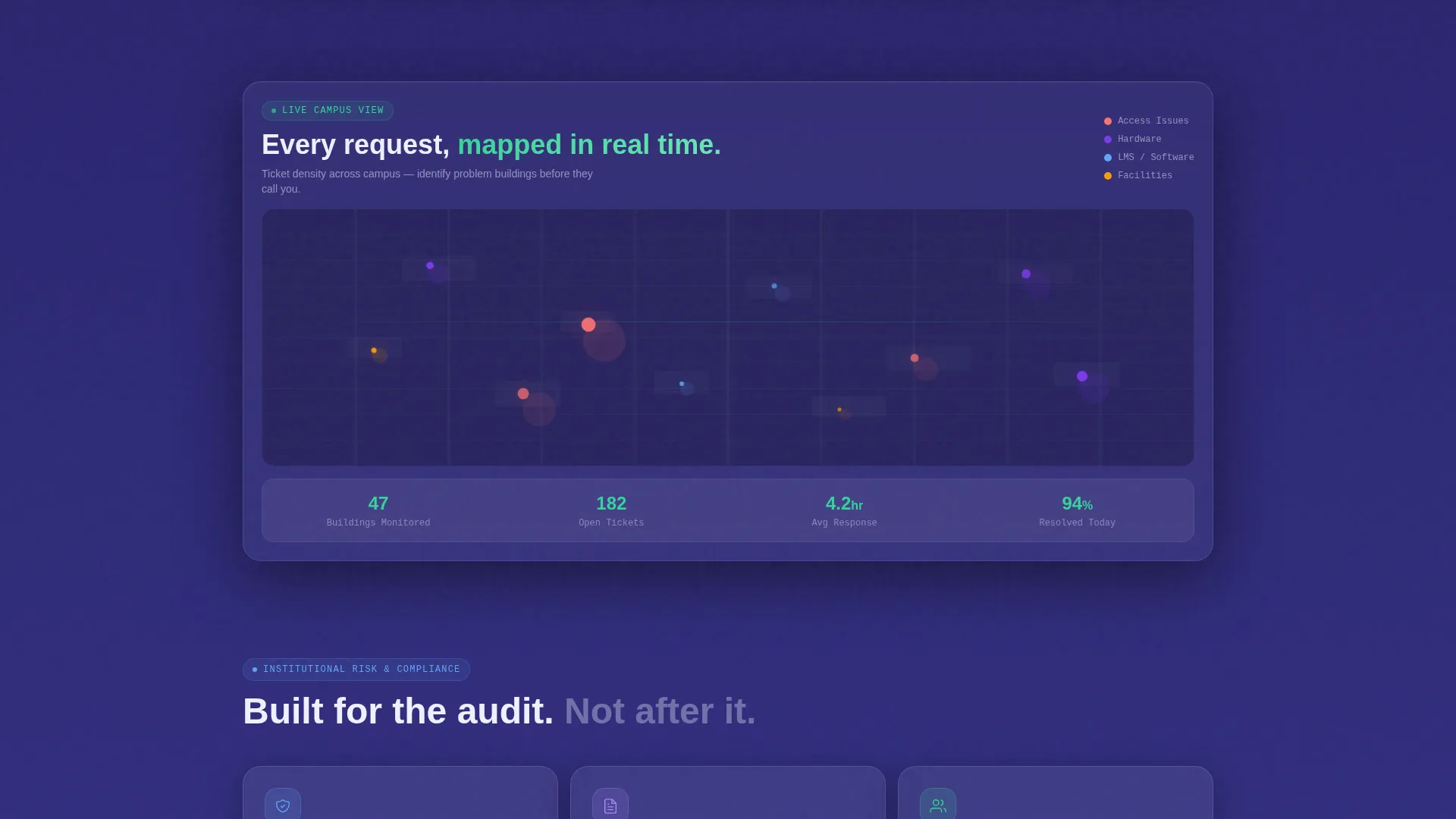
A full-width glassmorphic panel breaks the bento grid at the midpoint to display a campus topology map with ticket density heat dots. This section makes workload data feel spatial and concrete rather than abstract, helping evaluators visualize deployment at scale.
Multi-Placement App Download Call to Action
The primary call to action, "Download for Your Campus," appears in three deliberate locations: as a subtle pill button inside the interactive header, anchored in a sticky bottom bar after the second scroll section, and as the dominant element in the closing bento cell. App Store and Google Play badges sit alongside a frosted glass QR code card for immediate scanning.
Team Share Email Input
The closing bento cell includes a single-field email input labeled "Send the link to your team." This acknowledges the reality that the evaluator and the installer are rarely the same person, and gives the reviewer a direct path to loop in colleagues without leaving the page.
Glassmorphic Bento Grid Layout
Every cell in the grid is rendered as an individual frosted glass panel with a subtle one-pixel luminous border and backdrop-blur halo. The background shifts from deep indigo at the top to slate-violet as the visitor scrolls, increasing contrast behind the frosted cards as the page deepens.
Page sections overview
| Section | Purpose |
|---|---|
| Interactive Header Preview | Shows a live dashboard miniature with a ticket queue, radial chart, and donut chart |
| Headline Type-In Area | Delivers the core value statement below the interactive preview tiles |
| Stat Callout Cards | Presents education IT pain-point statistics as frosted research insight cards |
| Product Feature Answers | Pairs each stat card with the matching platform feature directly beneath it |
| Campus Topology Map | Displays a full-width heat map panel showing ticket density across campus zones |
| App Download Section | Houses App Store badges, Google Play badges, and a frosted QR code card |
| Team Share Closer | Closes the page with an email input field to forward the link to teammates |
Design & branding system
The visual identity follows a Directory and Discovery theme rendered entirely in a glassmorphic color system. Every layer is intentional, from the frosted panel surfaces to the gradient background shift that deepens as the visitor scrolls.
- Color palette: frosted panel white (#FFFFFFB3) over soft indigo (#1E1B4B), translucent lilac (#7C3AEDA6) for active-state cards, chalk-green (#34D399) for confirmation and success accents, and slate-violet (#312E81) as the lower-scroll background
- Surface treatment: individual bento cells use frosted glass panels with one-pixel luminous borders and backdrop-blur halos so each information tile feels weightable and liftable
- Typography and tone: the headline types itself in the viewport to reinforce the live, responsive feel of the platform being promoted
Mobile & speed optimization
The bento grid layout is designed to translate cleanly from a wide desktop canvas to narrower screens. The sticky bottom bar with the download call to action keeps the primary conversion point accessible at every scroll depth on any device.
- Bento cells reflow for mobile viewports so frosted panels stack clearly without losing their glass depth effect
- The sticky bottom bar ensures the app download prompt stays visible throughout the scroll journey on phones and tablets
- The QR code card is sized and positioned for easy scanning directly from a phone screen during a live meeting or evaluation session
How this template helps you convert
The page is structured to move institutional buyers from curiosity to action across multiple decision-making moments. It does not rely on a single call to action at the bottom.
- The interactive header preview creates immediate product credibility. Visitors interact with a working dashboard before they read a single feature bullet, which builds trust faster than static screenshots.
- The industry-report scroll rhythm keeps evaluators engaged because each section resolves a pain point they already feel. By the time they reach the download section, the case has been made in their own professional language.
- Three strategically placed download calls to action, including the team share email field, account for the multi-stakeholder reality of institutional software buying. The page gives every type of visitor a clear next step.
Other information about this template
This template is part of a focused set of education software landing page designs built for technology-category niches. A few additional details worth noting before you use it:
- The template style is Bento Grid, suited for platforms that benefit from a data-rich, card-based visual hierarchy
- The header concept is Interactive Preview, which requires that the dashboard tiles and chart interactions be wired to live or demo-state data when deployed
- The creative direction is Industry Report, meaning placeholder stat callout cards should be replaced with real, sourced figures before the page goes live
- The lp direction is App Download, so the App Store link, Google Play link, and QR code destination must be configured before publishing
- The theme is Directory and Discovery, which informs the organized, labeled, everything-in-its-place visual feeling throughout the layout
Theme
Directory & Discovery
Creative direction
Industry Report
Color system
Glassmorphic
Style
Bento Grid
Direction
App Download
Page Sections
Interactive Dashboard Header Preview
Industry Report Scroll Narrative
Campus Topology Heat Map Panel
Multi-placement App Download Call to Action
Team Share Email Input
Glassmorphic Bento Grid Layout
Related questions
Who is this landing page template designed for?
Does the interactive header require a live data connection?
Can the page support both app downloads and web dashboard sign-ups?
What should I update in the stat callout cards?
Is the bento grid layout adaptable to different screen sizes?



