Coastal Grandmother Subscription Box Landing Page Template
Tide is a Luxe Minimal landing page template built for a coastal grandmother subscription box. It uses a modular card grid layout, a soft Lavender Dream color palette, and a full-viewport header to create an unhurried, editorial feel. The page guides existing subscribers toward an Heirloom tier upgrade while offering a gifting path for those who want to share the experience.
by Rocket studio
Quick summary
Tide is a single-page subscription box landing page template designed around a curated coastal aesthetic. It combines a modular card grid, a cinematic header, and a clear upsell flow into one cohesive layout. The result feels like a well-edited editorial spread rather than a sales page.
Who this template is for
This template is built for subscription box brands that serve a discerning, taste-led audience. It suits operators who want their page to feel as considered as the product inside the box.
- Subscription box founders offering a lifestyle-forward, curated product experience
- Brand owners targeting women in their late forties through seventies who value quality over quantity
- Creators ready to convert existing subscribers into a higher-value membership tier
What problem this template solves
Most subscription box pages try to show everything at once. That approach works for high-volume, impulse-buy products. It fails for brands built on restraint and curation. Tide solves the problem of communicating quiet luxury without resorting to cluttered layouts or aggressive sales tactics.
- Presents a slow-reveal card grid that builds anticipation rather than overwhelming the visitor
- Separates Classic and Heirloom tier offerings clearly so subscribers can compare without confusion
- Provides a gifting path that captures warm referrals from existing subscribers
What you get with this template
The template delivers a complete, ready-to-adapt single-page layout with every section pre-structured for a subscription box upgrade flow. No placeholder grid or bare wireframe, every component reflects the editorial tone of the brand.
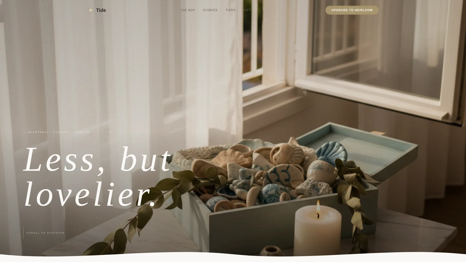
- A full-viewport lifestyle header with a typeset headline overlay reading "Less, but lovelier"
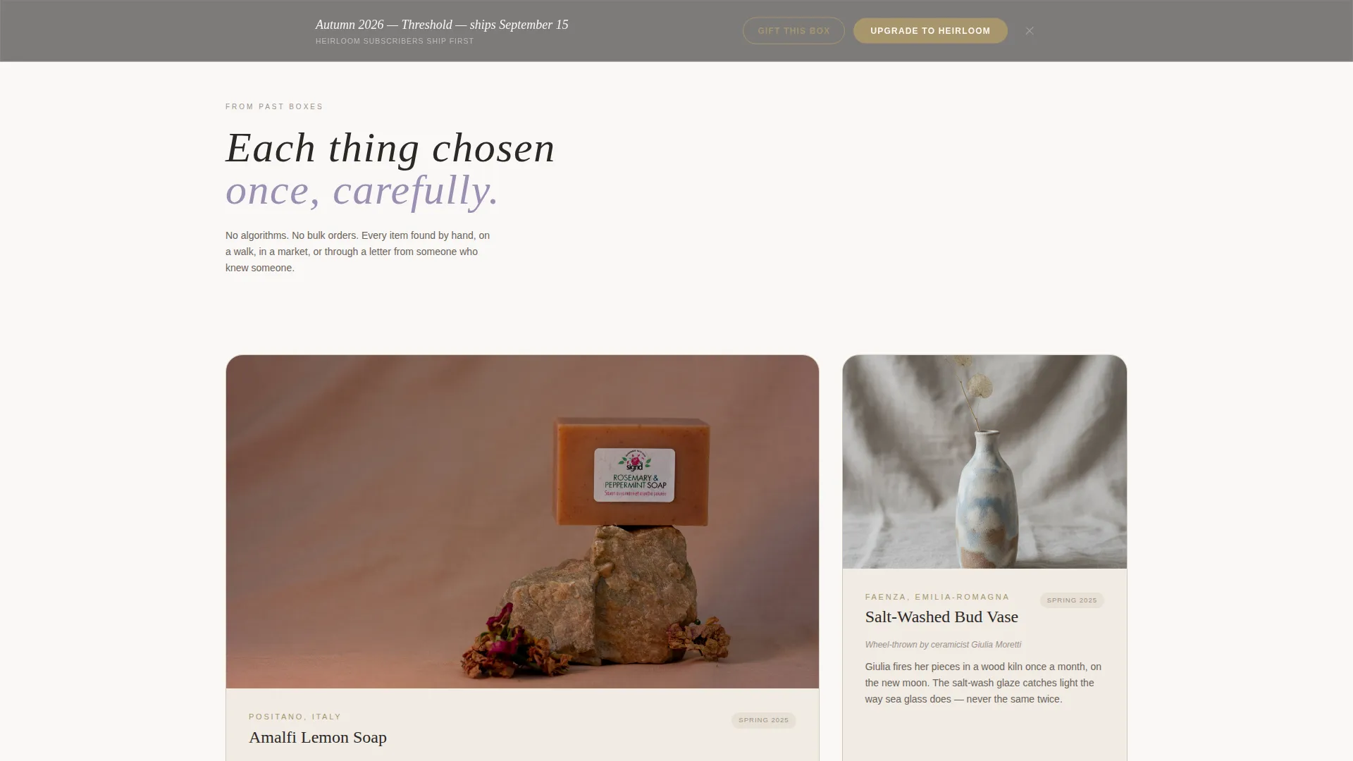
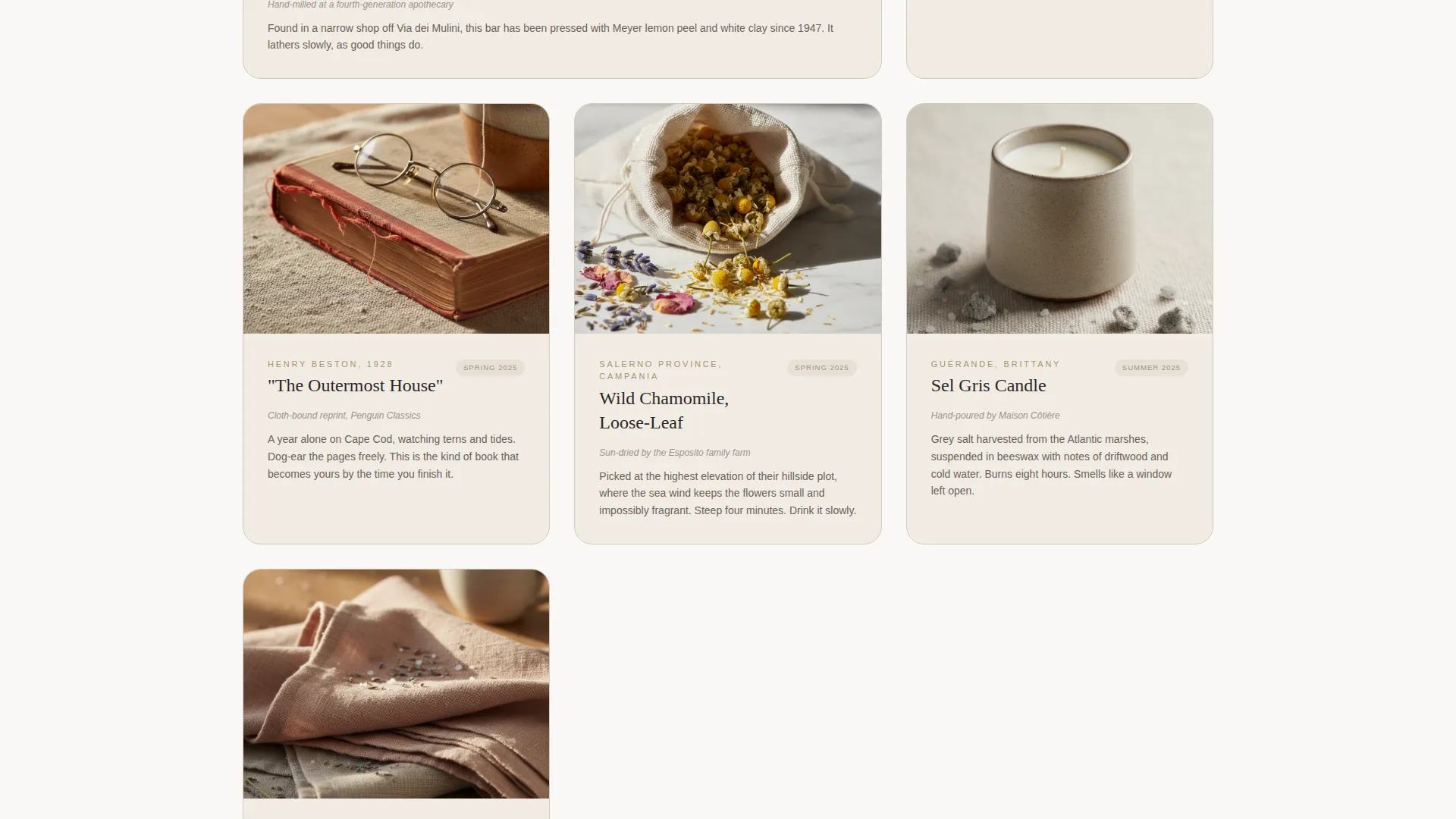
- A modular card grid that reveals individual box items one scroll section at a time, each with a two-sentence origin story
- A tier comparison block with a quarterly/annual price toggle, tarnished brass upgrade call-to-action, and a sticky footer repeat of that call-to-action
- A gifting section with a name-and-address form and an optional handwritten message field
Feature list
This section covers the core functional and visual components built into the Tide template.
Full-Viewport Header With Typeset Overlay
The header uses a lifestyle photograph of a marble-topped side table near an open window, sheer curtains lifting in the breeze, and the current box open with its contents arranged naturally. The headline "Less, but lovelier" is typeset in a thin, wide-tracked serif over the image. No subheading competes with it.
Slow-Reveal Modular Card Grid
Each scroll section surfaces one card at a time. Every card shows a single box item photographed on raw linen, with a brief two-sentence origin story below the image. The grid never shows all items at once, creating a sense of gradual unwrapping as the visitor scrolls.
Subscriber Snapshot Section
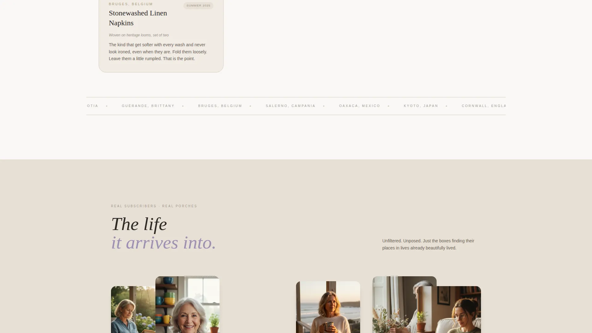
Midway through the grid, the layout shifts from product cards to real subscriber lifestyle photographs. These show actual porches, tables, and women holding mugs in natural settings. The transition adds social warmth and personal credibility before the upgrade prompt appears.
Tier Comparison With Price Toggle
A side-by-side comparison places the Classic tier card alongside the Heirloom tier card. The Heirloom tier highlights the added full-size ceramic piece and a handwritten note from the curator. A toggle lets visitors switch between quarterly and annual pricing without leaving the section.
Sticky Footer Call-to-Action
The "Upgrade to Heirloom" button in tarnished brass appears after the comparison cards and repeats as a persistent sticky footer throughout the page. This keeps the primary conversion action visible at every scroll position without interrupting the editorial reading experience.
Gift This Box Form
A secondary conversion path labeled "Gift This Box" presents a simple name-and-address form. An optional handwritten message field lets the gifting subscriber add a personal note. This section catches warm referrals from existing subscribers who want to share the box with someone they love.
Page sections overview
| Section | Purpose |
|---|---|
| Full-Viewport Header | Sets tone with lifestyle photography and headline |
| Item Card Grid | Reveals curated box contents one card at a time |
| Subscriber Snapshots | Builds trust with real lifestyle photography |
| Next Quarter Reveal | Teases upcoming theme with a word and color swatch |
| Tier Comparison Block | Contrasts Classic and Heirloom subscription tiers |
| Price Toggle | Lets visitors compare quarterly and annual costs |
| Upgrade Call-to-Action | Primary prompt to move to Heirloom tier |
| Gift This Box | Secondary path for sharing via name-and-address form |
| Sticky Footer | Keeps upgrade button accessible throughout scroll |
Design & branding system
The Lavender Dream color system gives this template its quiet, coastal character. Every color choice feels like something found rather than designed, the kind of palette that belongs in a linen closet in a seaside cottage.
- Dried lavender (#9B8FB4), sun-bleached driftwood (#E8E0D5), and coastal fog white (#FAF8F6) form the background and text tones
- Tarnished brass (#A8956D) is used exclusively for buttons and hover states, providing warmth without brightness
- Typography uses a thin, wide-tracked serif throughout, keeping the editorial tone consistent across every section
Mobile & speed optimization
The template is structured to translate its editorial pacing gracefully to smaller screens. The card grid stacks cleanly in a single column on mobile, and the sticky footer call-to-action remains accessible regardless of device.
- Cards reflow into a single-column layout on narrow viewports without losing their linen-background composition
- The sticky footer button scales appropriately for touch targets on mobile devices
- The price toggle and tier comparison block remain legible and functional on smaller screens
How this template helps you convert
Tide is designed for a specific conversion goal: moving a warm, existing subscriber one tier up. Every layout decision supports that goal without pressuring the reader.
- The slow-reveal card grid rebuilds desire before the upgrade prompt appears, reminding subscribers why they love the box in the first place.
- The tier comparison block and price toggle remove hesitation by making the value difference between Classic and Heirloom immediately clear.
- The "Gift This Box" path captures a second conversion opportunity from subscribers who are already sold on the brand but not yet ready to upgrade themselves.
Other information about this template
Tide sits at the intersection of coastal grandmother fashion sensibility and subscription commerce. It is built for a category where emotional resonance matters as much as product specs, and the layout reflects that.
- The template style is Card Grid (Modular), suited for brands that want a structured but editorial browsing experience
- The creative direction is Curated Collection, meaning content reveals gradually rather than presenting everything at once
- The landing page direction is Upsell/Upgrade, targeting warm traffic from existing subscriber email campaigns
- The header concept is Type Over Image, pairing a cinematic photograph with a minimal typeset headline for immediate atmosphere
- The Luxe Minimal theme keeps visual noise low so the product and photography carry the emotional weight of the page
Theme
Luxe Minimal
Creative direction
Curated Collection
Color system
Lavender Dream
Style
Card Grid (Modular)
Direction
Upsell/Upgrade
Page Sections
Full-viewport Header with Typeset Overlay
Slow-reveal Modular Card Grid
Subscriber Snapshot Section
Tier Comparison with Price Toggle
Sticky Footer Call-to-action
Gift This Box Form
Related questions
Who is this template designed for?
Can I use this template for a new subscriber acquisition page?
What does the Heirloom tier comparison section include?
How does the gifting section work?
Is the card grid fully modular?



