AI for Agriculture Pricing Website Template
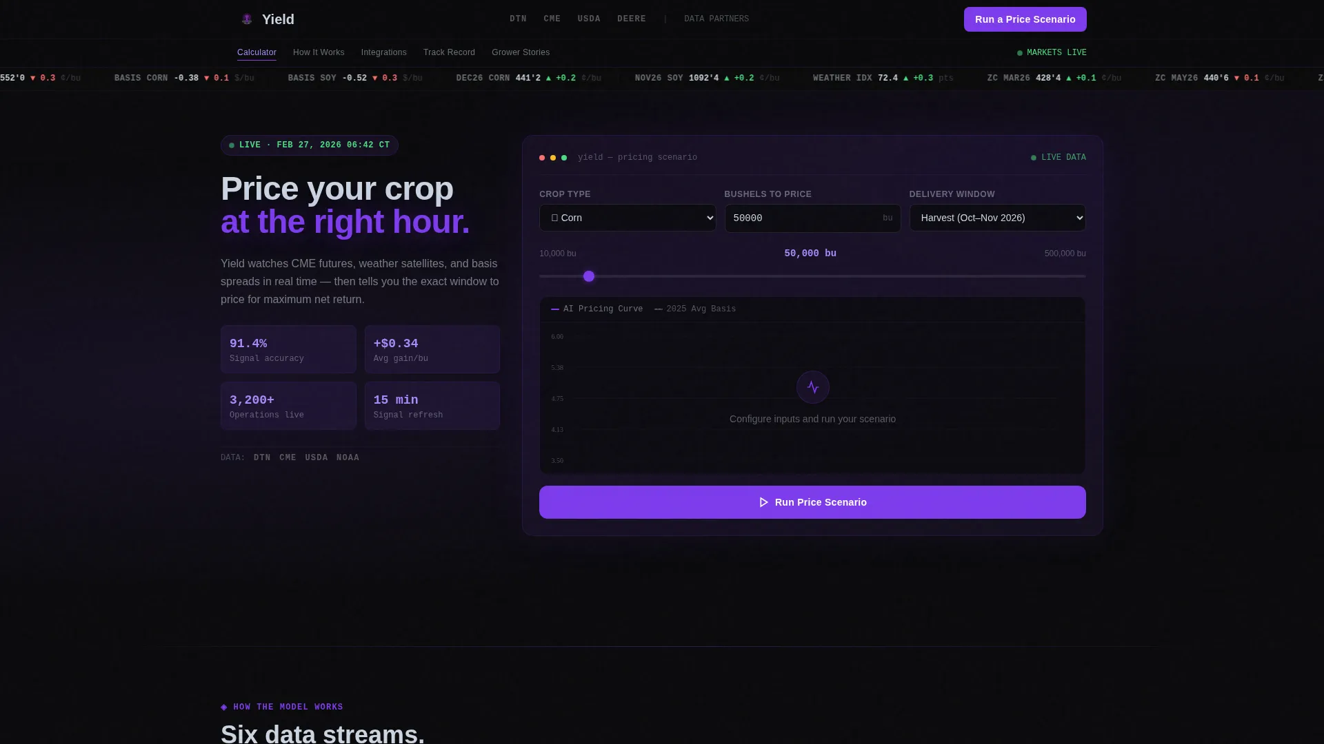
Yield is a hub-and-spoke landing page template built for an agriculture AI price optimization platform. It opens directly inside a working pricing calculator, letting grain farmers and elevator operators see their own numbers before scrolling an inch. The design follows a dark Dashboard Pro aesthetic with a Void and Violet color system, and every spoke section deepens trust built by that first hands-on moment.
by Rocket studio
Quick summary
Yield is a single-page, anchor-nav landing page template for an AI-powered grain pricing platform. Visitors land inside a live pricing calculator immediately. Spoke sections then guide them through how the model works, elevator integration, accuracy history, and grower stories. The page is built to generate leads by proving value before asking for contact details.
Who this template is for
This template is designed for teams building or marketing a grain price optimization platform. It speaks directly to the operators and decision-makers who need to trust a tool before they sign up.
- Fourth-generation corn and soybean producers managing large acreage operations
- Regional grain merchandisers handling basis contracts across multiple elevators
- Agricultural co-op chief financial officers locking margins ahead of harvest delivery
What problem this template solves
Grain pricing decisions carry enormous financial risk. Most farmers and elevator operators rely on instinct, manual tracking, or delayed reports. This template positions an AI pricing platform as the antidote to guesswork.
- Visitors cannot trust a platform they have never touched, so the template leads with the interactive calculator tool itself
- The page structure removes friction by proving value first and only requesting contact details after the visitor has already seen a result
- Spoke sections answer every logical follow-up question in the order a cautious buyer would ask them
What you get with this template
You get a fully structured, single-page landing page built around a hub-and-spoke anchor navigation system. Every section flows from the central calculator outward, layering proof and detail in the right order.
- A sticky Logo Bar header with partner logo row and a right-aligned primary call to action button
- An above-the-fold interactive pricing calculator module with crop type selector, bushel input, delivery window picker, and animated pricing curve chart
- Five anchor-linked spoke sections covering model mechanics, elevator integration, accuracy records, grower stories, and a sticky bottom-bar lead capture gate
Feature list
This template is built around functional components that turn a first-time visitor into an informed lead. Each feature is grounded in the brief and serves a specific role in the conversion flow.
Above-the-Fold Pricing Calculator
The visitor lands directly inside the tool. They select crop type, enter bushels, and choose a delivery window. The AI then plots a recommended pricing curve against historical basis and futures data using animated violet lines on a void-black chart. No scrolling is required to experience the core value.
Hub and Spoke Anchor Navigation
A horizontal anchor nav sits below the calculator and links to each spoke section. This gives experienced buyers a direct path to the detail they care about most, whether that is model accuracy or elevator integration specifics.
Post-Interaction Lead Capture Modal
After a visitor runs one free pricing scenario, a modal appears requesting four fields: name, email, operation size in acres or bushels, and primary crop. Keeping the form to four fields reduces friction and maintains momentum from the calculator interaction.
Secondary PDF Lead Gate
A parallel opt-in path offers a downloadable report of last season's pricing windows. This is gated behind email alone, giving lighter-intent visitors an easy entry point without committing to the full sign-up flow.
Sticky Bottom-Bar Call to Action
Once a visitor interacts with the calculator, a sticky bottom bar appears with the primary "Run a Price Scenario" call to action. This keeps the conversion prompt visible throughout the entire scroll journey without interrupting the reading flow.
Spoke Section Architecture
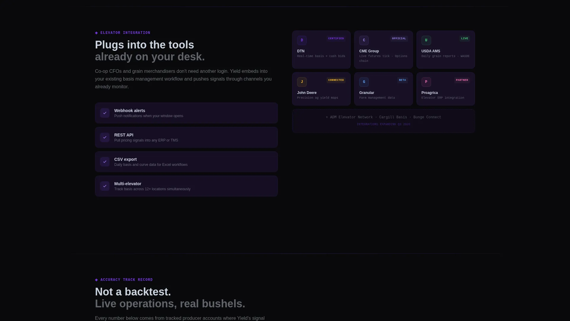
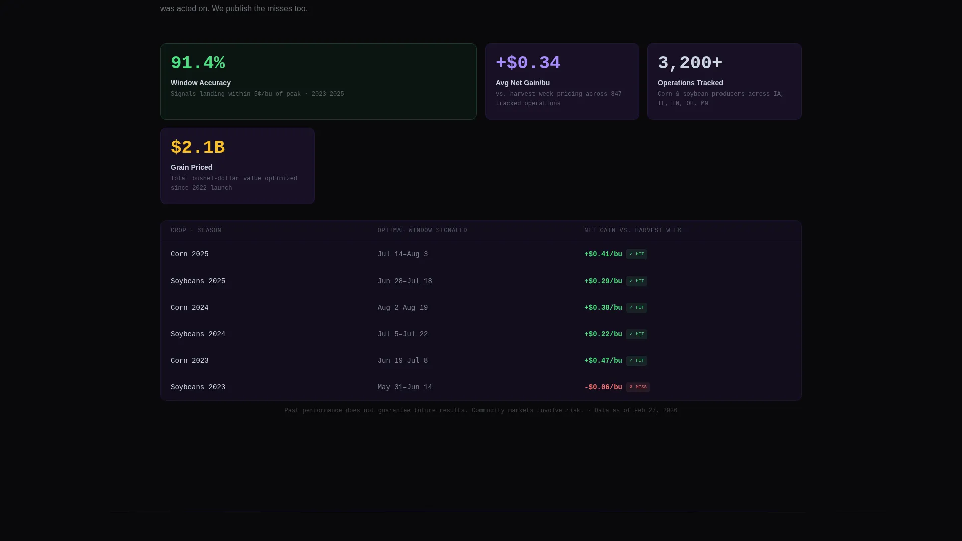
Four dedicated spoke sections radiate from the hub calculator: "How the Model Works," "Elevator Integration," "Accuracy Track Record," and "Grower Stories." Each section functions like a new data panel, answering the next logical buyer question at exactly the right moment.
Page sections overview
| Section | Purpose |
|---|---|
| Logo Bar Header | Anchors brand, partner trust logos, and primary call to action |
| Pricing Calculator Hub | Delivers immediate hands-on value above the fold |
| Anchor Navigation Bar | Links visitors directly to each spoke section |
| How Model Works | Explains the AI logic behind the pricing recommendation |
| Elevator Integration | Addresses basis contract and multi-elevator workflows |
| Accuracy Track Record | Provides historical performance proof for skeptical buyers |
| Grower Stories | Builds peer trust through real operator perspectives |
| Sticky Bottom Bar | Keeps the primary call to action visible after calculator use |
Design & branding system
The visual identity follows a Dashboard Pro theme built on a Void and Violet color system. Every color choice is intentional, designed to make live data feel urgent and trustworthy against a dark background.
- Absolute void black (#09090B) for the primary background, deep plum (#2D1B4E) for card surfaces and section dividers, electric violet (#7C3AED) for live data accents and interactive highlights, and cool silver (#CBD5E1) for body text and axis labels
- Violet pulses on hover states and active anchor navigation links, while silver holds typography steady against the dark surfaces
- The overall palette is described in the brief as a mission control room at midnight, where every glow is deliberate and every dim surface recedes so the numbers can be read clearly
Mobile & speed optimization
The template is structured for fast initial load, which matters when a visitor's first action is running an interactive calculator. The design keeps heavy visual elements purposeful rather than decorative.
- The above-the-fold calculator is the primary content block, so the page loads directly into a functional component rather than a large hero image or video asset
- The slim Logo Bar header uses minimal markup, keeping the top of the page lightweight and fast to render on mobile connections
- The sticky bottom-bar call to action is built to remain usable on smaller screens, keeping the conversion path accessible throughout the scroll experience
How this template helps you convert
This template is built around a single principle: earn the click by proving value first. The structure is designed to move a skeptical grain operator from curiosity to trust to action in a single session.
- The pricing calculator runs before any form appears, giving the visitor a personal result that makes the platform feel real and credible
- The anchor navigation lets a visitor drill into the exact proof point they need, whether that is model mechanics, elevator compatibility, or historical accuracy, without losing their place on the page
- The post-interaction modal and the secondary PDF gate offer two friction-appropriate conversion paths, capturing both high-intent operators and early-stage researchers in the same session
Other information about this template
This template is a strong fit for technology teams in the agriculture AI price optimization space who need a landing page that reflects the seriousness of the financial decisions their users make every day.
- The page tone is calibrated to feel like the elevator office board at 6 a.m.: purposeful, data-forward, and quietly confident rather than promotional
- The template style is Hub and Spoke with anchor navigation, built on a Dashboard Pro theme, making it a practical starting point for any precision agriculture or agri-tech platform that leads with a live data tool
- The Void and Violet color system is ready to be adapted for related precision agriculture products, commodity trading tools, or farm management dashboards that share a data-heavy visual language

Theme
Dashboard Pro
Creative direction
Calculator/Tool First
Color system
Void & Violet
Style
Hub & Spoke (Anchor Nav)
Direction
Lead Generation
Page Sections
Above-the-fold Pricing Calculator
Hub and Spoke Anchor Navigation
Post-interaction Lead Capture Modal
Secondary PDF Lead Gate
Sticky Bottom-bar Call to Action
Spoke Section Architecture
Related questions
Who is this landing page template designed for?
Does the template include the pricing calculator functionality?
How does the lead capture flow work?
Can the spoke sections be reordered or removed?
What makes this template different from a standard agriculture landing page?



