History Education Professional Website Template
Chronicle is a single-column history quiz landing page template built for homeschool families, AP History students, and trivia enthusiasts. It combines an interactive persona selector, an animated sample quiz walkthrough, a family account dashboard mockup, and an embedded mini-quiz with a free trial signup form. The Electric Indigo color system and warm parchment background create a scholarly yet welcoming feel.
by Rocket studio
Quick summary
Chronicle is a focused, one-page history quiz landing page template designed to turn casual visitors into active quiz-takers. It blends warm, editorial design with high-interactivity sections: a persona selector header, an adaptive quiz walkthrough, a family account preview, and an embedded mini-quiz that leads directly into a free trial form. The template is built for EdTech teams and solo developers who want a fast, conversion-ready starting point.
Who this template is for
Chronicle speaks to a specific but wide range of people who care deeply about history knowledge. Whether you are building a quiz app for families, students, or competitive trivia players, this template gives you the right structure to present your offer clearly and engage your audience from the very first scroll.
- Homeschool parents and families who want an easy, fun way to quiz kids at home across different grade level topics, from ancient civilizations to modern events
- AP History students and teachers who need a focused, adaptive assessment tool that identifies weak eras and prioritizes them in future quiz sessions
- Trivia league regulars and online quiz enthusiasts who want to close the gap between "I thought I knew that" and actually knowing it before trivia nights
What problem this template solves
Most history quiz apps struggle to communicate their value before a user ever takes a quiz. A generic landing page template fails to speak to three very different users: the parent helping a child learn, the student grinding through a review course, and the trivia lover sharpening their knowledge for fun. Chronicle solves this with a persona-based entry point that routes each visitor into a relevant path immediately.
- Unclear audience targeting makes visitors bounce before they engage; Chronicle's persona selector lets users self-identify and see content that is directly relevant to their situation
- Low quiz completion rates caused by confusing layouts and weak calls to action; this template presents a structured, step-by-step guide flow that builds confidence before asking for a signup
- Friction-heavy lead capture forms that appear before the user sees any value; Chronicle places the embedded mini-quiz first, so users already feel the benefit before they enter their email
What you get with this template
This template delivers a complete, single-column landing page layout structured around quiz-driven conversion. Every section is designed to carry the visitor forward naturally, from self-identification through the persona selector to the final free trial signup. You get a production-ready page that is easy to edit and customize to match your own quiz app's branding.
- Six fully structured page sections including a persona selector hero, an adaptive quiz animation section, a sample quiz walkthrough, a family account dashboard mockup, an embedded mini-quiz with scoring, and a footer in horizontal flow pattern
- Electric Indigo design system with a complete color palette, paired display and body fonts, and reward accent colors that are applied consistently across every section
- Interactive component blueprints including a persona selector with scroll-linked animations, an animated four-choice quiz demo, a three-question embedded assessment with an instant score card, and a single email field free trial form
Feature list
This template's functionality is drawn directly from the project brief. Each feature below reflects a built section or design decision that is ready for you to customize and deploy.
Persona Selector Hero Section
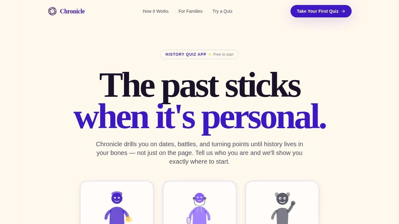
The header introduces three illustrated family figures on a warm parchment background: a parent with a coffee mug, a teenager with earbuds, and a younger child raising a hand. Each figure carries a single label that matches a distinct user intent. Clicking a figure gently enlarges it and scrolls the visitor into a tailored path, with the other two figures softly fading. This approach makes the landing page feel personal from the first thing a visitor sees, reducing bounce and improving engagement by letting users immediately recognize themselves.
Adaptive Quiz Animation Section
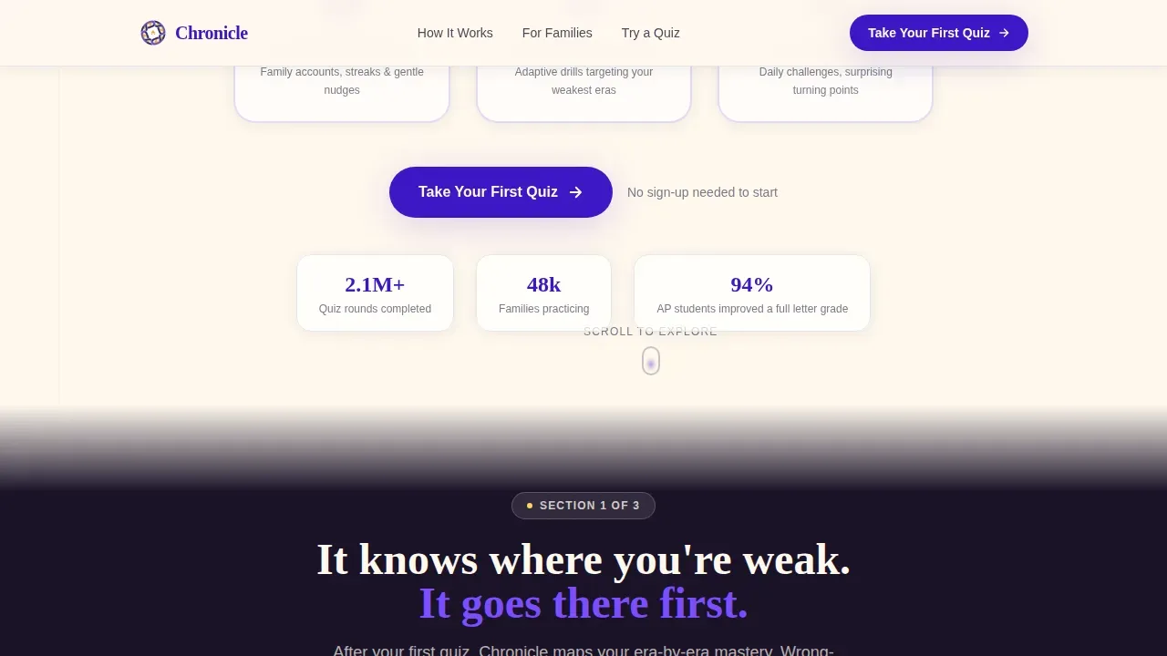
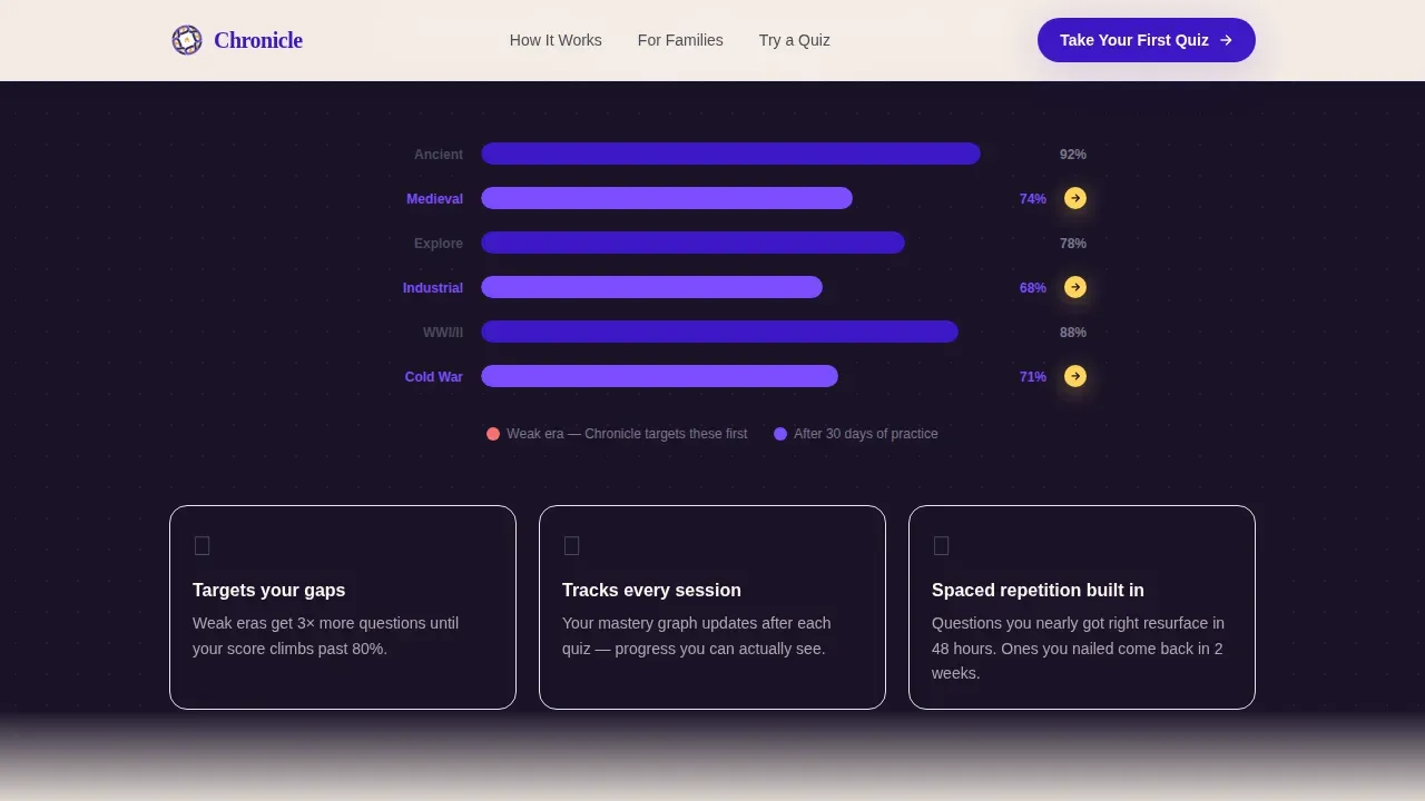
This section shows how the quiz adapts to each user's weakest historical era. A short animated timeline displays wrong-answer periods glowing red and visually shrinking as the user improves. It is one of the most interesting and reassuring things a prospective user can see because it proves the quiz is not static. The animation uses scroll-linked blur and IntersectionObserver triggers, so it activates naturally as the visitor reads down the page, making the experience feel alive without being distracting.
Sample Quiz Walkthrough
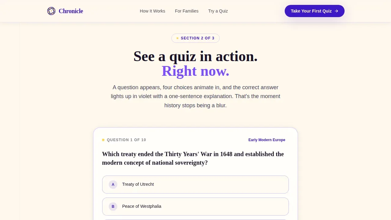
The walkthrough section presents a live example of how the quiz works. A history quiz question appears on screen, then four answer choices animate in one at a time. The correct answer highlights in quiz-correct violet, and a one-sentence explanation slides in beneath it. This process mirrors the feel of turning a page in a workbook. It gives students, parents, and trivia fans a clear, honest preview of what the interactive quiz experience looks like before they commit to signing up.
Family Account Dashboard Mockup
Section four introduces a parent-facing dashboard view. The mockup displays each child's current streak, their weakest topics, and a suggested next quiz recommendation. This section is particularly valuable for homeschool families and for any teacher managing a class of students. It presents the account management side of the app in a way that feels simple and reassuring, removing the worry that the tool will be hard to manage across multiple users.
Embedded Mini-Quiz with Score Card
The embedded mini-quiz is the conversion engine of this landing page. It presents three sequential quiz questions: era preference, difficulty comfort level, and one real history question. After the user answers all three, a score card appears instantly with personalized feedback. Below the score card, a single email field and a "Start Practicing Free" button unlock the full app trial. No credit card is required. The quiz itself proves the value before the form asks for any input.
Electric Indigo Branding System
The full color system uses deep scholarly indigo as the primary brand color, warm parchment cream as the page background, bright quiz-correct violet for interactive feedback, soft pencil graphite for body text, and rewarding gold spark reserved for progress badges and correct answer flashes. Display headings use Fraunces, a warm serif that feels editorial and trustworthy. Body text and user interface elements use DM Sans, a clean and highly readable sans-serif. Together these fonts and colors create branding that feels like a composition notebook opened under a desk lamp.
Page sections overview
| Section | Purpose |
|---|---|
| Persona Selector Hero | Lets visitors self-identify and routes each user type into a relevant page path |
| Adaptive Quiz Animation | Shows how the quiz targets weak historical eras using animated timeline visuals |
| Sample Quiz Walkthrough | Demonstrates a live quiz question with animated answer choices and correct answer reveal |
| Family Account Dashboard | Presents parent-facing streak tracking, topic gaps, and next quiz suggestions |
| Embedded Mini-Quiz | Delivers a three-question assessment and instant score card before the signup form |
| Free Trial Form | Captures visitor email and converts interest into a free app trial with zero friction |
| Footer Pattern | Closes the page in a clean horizontal flow layout |
Design & branding system
Chronicle's visual identity is built around the Electric Indigo color system. The palette is warm and scholarly, designed to feel encouraging rather than clinical. Every color in the system has a defined role, so the page stays visually consistent even after you customize templates with your own content and copy.
- Color palette with role assignments: deep indigo (#3D17C6) for primary branding elements and headings, parchment cream (#FFF8EE) for the page background, quiz-correct violet (#7C4DFF) for interactive feedback and accent moments, soft pencil graphite (#4A4A5A) for body text, and gold spark (#FFD55A) reserved exclusively for progress badges and correct answer flashes
- Typography pairing: Fraunces serif for display headings and hero text, paired with DM Sans for all body copy, form labels, and user interface details, creating a balance between warmth and readability
- Style direction: warm editorial and composition-notebook scholarly, with staggered entrance animations and scroll-linked blur effects that make the page feel alive and engaging without overwhelming the user
Mobile & speed optimization
Chronicle is built mobile-first, which reflects where its users actually are: a parent at the breakfast table, a student studying at midnight, a trivia player reviewing facts on their phone before a match. The template's layout decisions consistently prioritize the smartphone experience while still delivering a polished desktop presentation.
- Mobile-first layout: single-column flow ensures the page reads naturally on small screens, with large easy-to-tap buttons suitable for smartphone users throughout the quiz and form sections
- Interactive component performance: quiz state machine logic uses Client Components only for the interactive sections, while static content areas use Server Components to keep the page light and fast
- Scroll-linked animations: IntersectionObserver-based triggers activate animations only when sections enter the viewport, keeping the page responsive and smooth across different devices and screen sizes
How this template helps you convert
Chronicle is purpose-built as a quiz and assessment conversion landing page. Every design and content decision traces back to one goal: move the visitor from curious to committed. The template achieves this through a sequence of small, low-friction steps that build trust and demonstrate value before asking for anything in return.
- Persona selector reduces drop-off instantly by letting each visitor see a path that speaks directly to their situation, whether they are a parent, a student, or a trivia enthusiast, so the page feels relevant rather than generic from the very first moment
- The embedded mini-quiz acts as a try-before-you-buy demo, delivering real quiz questions and an instant score card that gives visitors a tangible sense of achievement and makes the free trial offer feel like a natural next thing rather than a sales ask
- Social proof and structured feedback reinforce trust throughout the page, with testimonial-style social proof placements, streak and progress visuals in the dashboard mockup, and the score card message "You knew more than you thought. Imagine thirty days of this." converting curiosity into genuine motivation to sign up
Other information about this template
Chronicle is a flexible foundation that goes well beyond a single use case. Whether you are an independent developer launching a history quiz app, a company building an online education platform, or a teacher looking to present a quiz-based course to prospective students, this template can support your goals. The combination of persona-driven routing, interactive quiz walkthroughs, and a minimal email form makes it one of the more practical and interesting quiz landing page templates available for EdTech projects.
- Customization scope: you can edit every text block, swap images and videos in the media sections, adjust fonts and color values, and reorganize section order to match your quiz app's specific offer and audience; the template is structured so that customize templates tasks are straightforward even for teams without deep design experience
- Quiz creation context: quiz creation tools allow users to create interactive quizzes and assessments easily, and many quiz creation tools offer customizable templates for various subjects and topics; Chronicle is designed to sit at the top of that funnel, converting visitors on your landing before they enter the quiz itself; users can fully customize their quiz presentations after selecting a preferred template like this one
- Lead generation and marketing alignment: quizzes and assessments are key tools for lead generation in marketing, and many companies use web forms for lead generation with quizzes being a high-converting tool; Chronicle's embedded mini-quiz plus email form is a direct application of this principle, giving your marketing team a page that captures leads naturally rather than through hard-sell tactics; quizzes can be used for various purposes, including educational assessments and marketing strategies
- History quiz template context: history quiz templates can be customized for various historical topics, from ancient civilizations to modern events; platforms like Mentimeter offer history quiz templates that users can edit and customize, and Canva provides customizable quiz presentation templates suitable for history quizzes; Chronicle operates at the landing page level, giving your quiz a dedicated conversion home rather than living inside a generic quiz builder interface
- Presentation template compatibility: the section layout and visual hierarchy of Chronicle also make it a strong starting point when you need a presentation template feel inside a web format; the step-by-step guide creative direction means each section presents information progressively, which mirrors how effective presentations build an argument across slides; some quiz creation platforms allow users to download their quizzes in various formats such as PPTX, MP4, PDF, or image files, and Chronicle's design language translates cleanly if you want to repurpose section visuals into supporting presentations
- Gamified assessment features: some quiz creation tools allow users to add competitive points systems and exciting transitions; Chronicle's gold spark accent color and score card design reflect this principle, making correct answers feel rewarding and building a sense of forward momentum that keeps users engaged through the full page journey
- Social proof and trust building: using social proof on a quiz landing page can enhance trust and encourage participation; the template includes a social proof section designed for testimonials from students, parents, and teachers, with enough visual hierarchy to make those voices feel credible and prominent without cluttering the page
- Business and company use cases: a business or company in the EdTech space can use Chronicle to target different audience segments by customizing the persona selector labels and tailoring the quiz walkthrough to reflect their own course content, grade level structure, or trivia nights format; multiple quiz landing pages can be effective if they target different audience segments or solve distinct problems, and Chronicle's modular section structure makes it practical to fork the template for different campaigns
- Building quizzes for different types of learners: building quizzes that work across different types of learners requires clear instructions and a well-structured layout; Chronicle's sample quiz walkthrough section directly addresses this by walking every visitor through one complete quiz question with animated feedback, giving users confidence that the experience will be clear and manageable before they start the full assessment
Theme
Family First
Creative direction
Step-by-Step Guide
Color system
Electric Indigo
Style
Single Column Flow
Direction
Quiz/Assessment
Page Sections
Persona Selector Hero with Scroll Routing
Animated Adaptive Quiz Timeline
Live Sample Quiz Walkthrough
Family Account Dashboard Mockup
Embedded Mini-quiz with Instant Score Card
Electric Indigo Branding and Typography System
Related questions
Can I customize the persona selector labels and illustrated figures?
Does this template include the actual quiz engine or just the landing page design?
Is Chronicle suitable for a teacher or school running a history class quiz program?
How does the embedded mini-quiz support lead generation?
Can this template be used for trivia nights or non-academic quiz promotions?



