Church & Religious Software Professional Website Template
Tithe is a split-screen church donor management landing page template built for executive pastors, church administrators, and denominational treasurers. It pairs a live-feel financial dashboard on the left with a pointed headline on the right, then guides visitors through a freemium signup flow. The result is a high-trust, conversion-ready page that replaces spreadsheet dread with real-time giving clarity.
by Rocket studio
Quick summary
Tithe is a single-page, split-screen template designed for church and religious donor management platforms. It opens with a stats-forward hero that puts a live donor dashboard face-to-face with a bold, provocative headline. From there, Launch Energy pacing drives visitors through pain points, animated product moments, and two clear conversion paths, all without asking for a credit card.
Who this template is for
This template speaks directly to the people who manage church finances day to day. It is built for teams running donation tracking on faith, muscle memory, and outdated spreadsheets.
- Executive pastors managing building fund drives and multi-campaign giving goals
- Church administrators reconciling Sunday envelopes against bank deposits every Monday morning
- Denominational treasurers who need to audit dozens of congregations from a single login
What problem this template solves
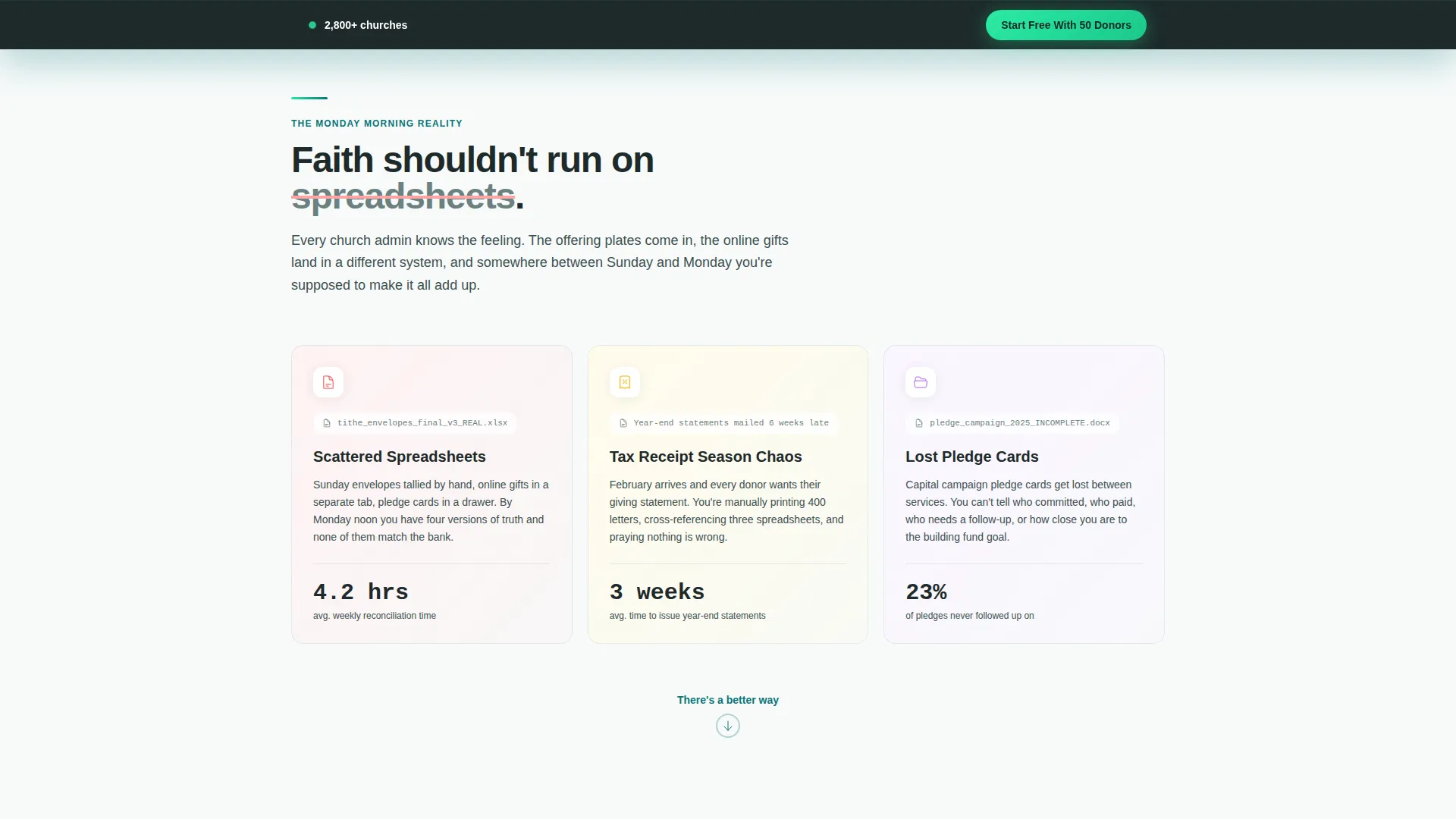
Church finance teams often carry the weight of scattered pledge cards, disconnected giving records, and year-end tax receipt chaos. This template gives a donor management platform the visual language to name those problems clearly and offer a better path forward.
- Lost pledge cards and unmatched envelope donations eroding financial accountability
- Tax receipt season overwhelming small admin teams with manual statement work
- No single view of fund allocation splits, recurring gifts, or giving trends across congregations
What you get with this template
You get a fully structured, single-page landing page that covers every stage of the buyer journey from problem recognition to signup. The layout is purposeful, the visual hierarchy is clear, and both conversion paths are built into the flow from the start.
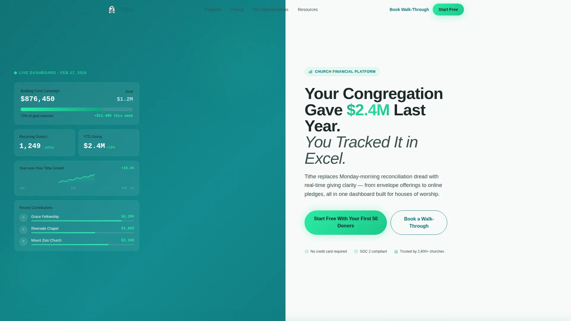
- A 50/50 split-screen hero with a live-feel donor dashboard on the left and a sharp headline with a mint call-to-action button on the right
- Scroll-triggered micro-interactions including counting numbers, filling progress rings, and populating donor segments
- A minimal freemium signup form asking only for church name, weekly attendance range, and email address
Feature list
This template ships with a cohesive set of visual and structural features. Each one is drawn directly from the brief and designed to serve the church finance audience.
Split-Screen Stats Hero
The header divides cleanly into two equal halves. The left panel renders a dark sanctuary teal donor dashboard showing a giving thermometer at 73%, a ticking recurring gift counter, and a year-over-year sparkline. The right panel delivers the headline and a glowing mint call-to-action button. The contrast creates an immediate tension that earns the scroll.
Scroll-Triggered Micro-Interactions
Each section fires a visual response as the visitor scrolls. Numbers count up, progress rings fill, and donor segments populate on cue. This pacing mirrors a product launch keynote, building anticipation feature by feature toward the final conversion moment.
Animated Product Demo Section
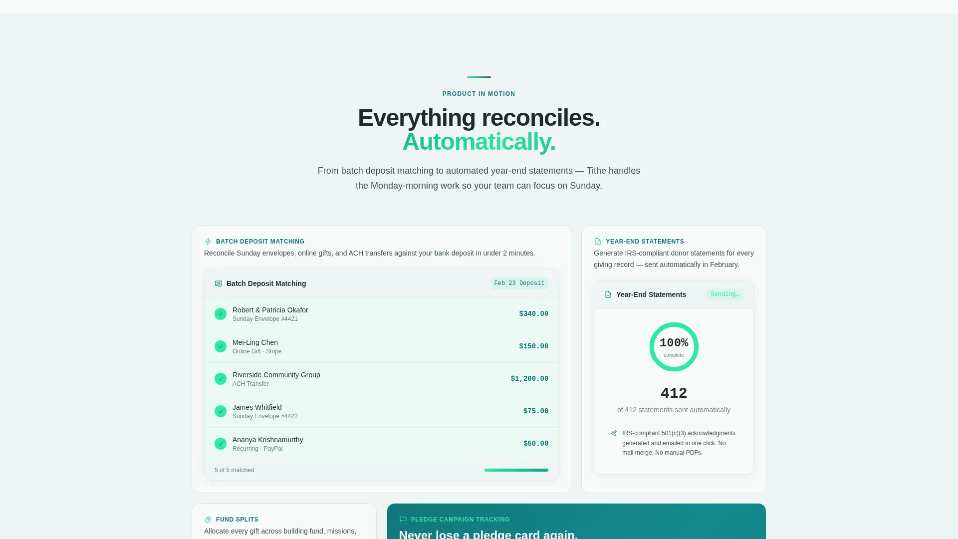
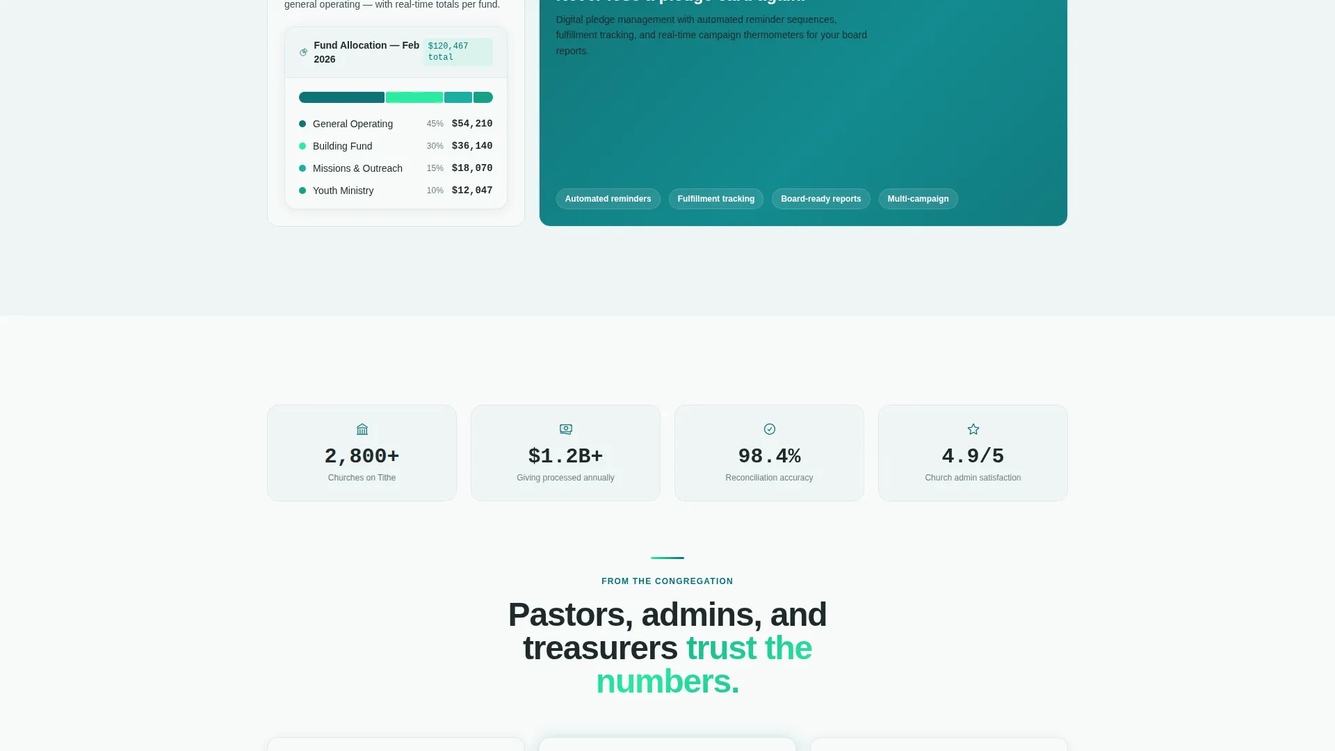
A dedicated mid-page section shows the platform in motion. Animated user interface elements illustrate batch deposit matching, automated year-end statement generation, and fund allocation splits. Visitors see the product doing real work before they ever sign up.
Dual Conversion Path Structure
The template supports two distinct visitor intents. Smaller congregations follow the low-friction freemium path: "Start Free With Your First 50 Donors." Larger congregations can choose "Book a Walk-Through With a Church Specialist" for a guided conversation. Both paths reduce hesitation for their respective audiences.
Repeating Call-to-Action Placement
The primary call-to-action appears at the hero, returns after the demo section, and anchors a final sticky bar. This repetition ensures the signup prompt is always within reach without feeling aggressive or repetitive in tone.
Minimal Freemium Signup Form
The form captures only three fields: church name, estimated weekly attendance (via dropdown with under 100, 100 to 500, and 500 plus options), and email address. No credit card is required. This low-commitment entry point removes the most common friction point for small church sign-ups.
Page sections overview
| Section | Purpose |
|---|---|
| Split-Screen Hero | Pair live dashboard visuals with a pointed headline to create instant scroll momentum |
| Pain Point Section | Name the spreadsheet, pledge card, and tax receipt problems the audience already feels |
| Animated Demo Section | Show batch deposit matching, fund allocation splits, and year-end statement automation in motion |
| Mid-Page call to action | Repeat the freemium signup prompt after the product demo for visitors ready to convert |
| Features Showcase | Stack individual platform capabilities as scroll-triggered reveals in keynote pacing |
| Dual Signup Paths | Present the freemium form alongside the enterprise walk-through booking option |
| Sticky call to action Bar | Keep the primary conversion action visible at all times during final scroll |
Design & branding system
The visual identity runs on the Teal Catalyst color system, described in the brief as a stained-glass window redesigned by a fintech team. It is reverent enough for a vestry meeting and sharp enough for a pitch deck.
- Deep sanctuary teal (#0D7377) anchors the hero background and dark panel surfaces
- Electric mint (#2CEAA3) powers progress bars, live counters, and the primary call-to-action button glow
- Soft altar white (#F7FAFA) fills card backgrounds for clean contrast, with charcoal vestment (#1E2A2A) used for all body text
Mobile & speed optimization
The template is structured with a mobile-aware layout in mind. The 50/50 split-screen hero and scroll-triggered interactions are designed to reflow and remain legible on smaller screens.
- The split-screen hero stacks vertically on mobile so the dashboard and headline each get full-width treatment
- Micro-interaction sections are built to trigger cleanly on scroll without requiring desktop-only behavior
- The sticky call-to-action bar remains fixed at the bottom of the viewport across device sizes for persistent conversion access
How this template helps you convert
This template is engineered around a freemium trial model. Every design and copy decision nudges the visitor toward a low-friction first step.
- The hero creates immediate credibility by showing a working dashboard alongside a headline that names the exact pain the audience already carries, earning attention before asking for anything.
- The dual call-to-action structure qualifies leads by congregation size without adding form fields, routing small churches to self-serve signup and larger congregations to a specialist conversation.
- The repeating call-to-action at three points in the page (hero, mid-scroll, sticky bar) ensures the signup prompt meets visitors at the moment they are ready, without forcing a decision before trust is built.
Other information about this template
This template is part of the Startup Velocity theme family, which pairs high-energy pacing with financial clarity visuals. It is a strong fit for church and religious software platforms looking to move beyond generic non-profit landing page designs.
- The Teal Catalyst color system is reusable and can be adapted to match an existing platform brand with minimal variable changes
- The Launch Energy creative direction means sections accelerate in density and conviction as the page progresses, ending on maximum persuasion just before the final form
- This template is categorized under Church and Religious Software within the Technology category, making it well-suited for product-led growth campaigns targeting faith-based financial teams
- The attendance dropdown (under 100, 100 to 500, 500 plus) doubles as a lightweight lead qualification signal for sales teams following up on walk-through requests
Theme
Startup Velocity
Creative direction
Launch Energy
Color system
Teal Catalyst
Style
Split Screen (50/50)
Direction
Freemium/Trial
Page Sections
Split-screen Stats Hero
Scroll-triggered Micro-interactions
Animated Product Demo Section
Dual Conversion Path Structure
Minimal Freemium Signup Form
Persistent Sticky Call-to-action Bar
Related questions
Who is this landing page template designed for?
Does the signup form require a credit card?
Can this template support both small churches and larger denominations?
What makes the hero section effective for this audience?
Can I customize the color system for my own platform branding?



