Church & Religious Org Pricing Website Template
Tithe is a church management pricing comparison landing page built for ministry decision-makers who need clarity fast. The modular card grid lays out platform features side by side, backed by a stat-led header and quiz-style conversion form. It reads like a research briefing, not a sales pitch, giving executive pastors and church administrators the confidence to choose.
by Rocket studio
Quick summary
Tithe is a single-page pricing comparison template designed for church management software decisions. It opens with animated statistics, moves into a modular feature-comparison card grid, and closes with a lightweight quiz form. The page feels like a pre-filled research document rather than a marketing brochure, making it ideal for ministry teams under board-meeting pressure.
Who this template is for
This template is built for the people inside a church who are responsible for platform decisions. They are detail-oriented, budget-conscious, and already deep in research mode when they land on this page.
- Executive pastors comparing two or three church management platforms at once
- Church administrators tasked with finding a more cost-effective software solution
- Megachurch operations directors evaluating enterprise tiers against real congregation headcount
What problem this template solves
Church and religious organization teams waste weeks switching between browser tabs, gathering pricing screenshots, and building their own comparison spreadsheets. There is no neutral, readable resource that puts every relevant feature in one place. This template solves that confusion directly.
- Consolidates feature-by-feature platform comparisons into a single scannable card grid
- Replaces informal research with a structured, report-style layout that builds trust
- Captures decision-ready visitors at the moment they feel informed enough to act
What you get with this template
You get a fully structured, single-page layout that moves visitors from curiosity to confidence without friction. Every section serves a specific role in the research journey, and the visual design reinforces credibility throughout.
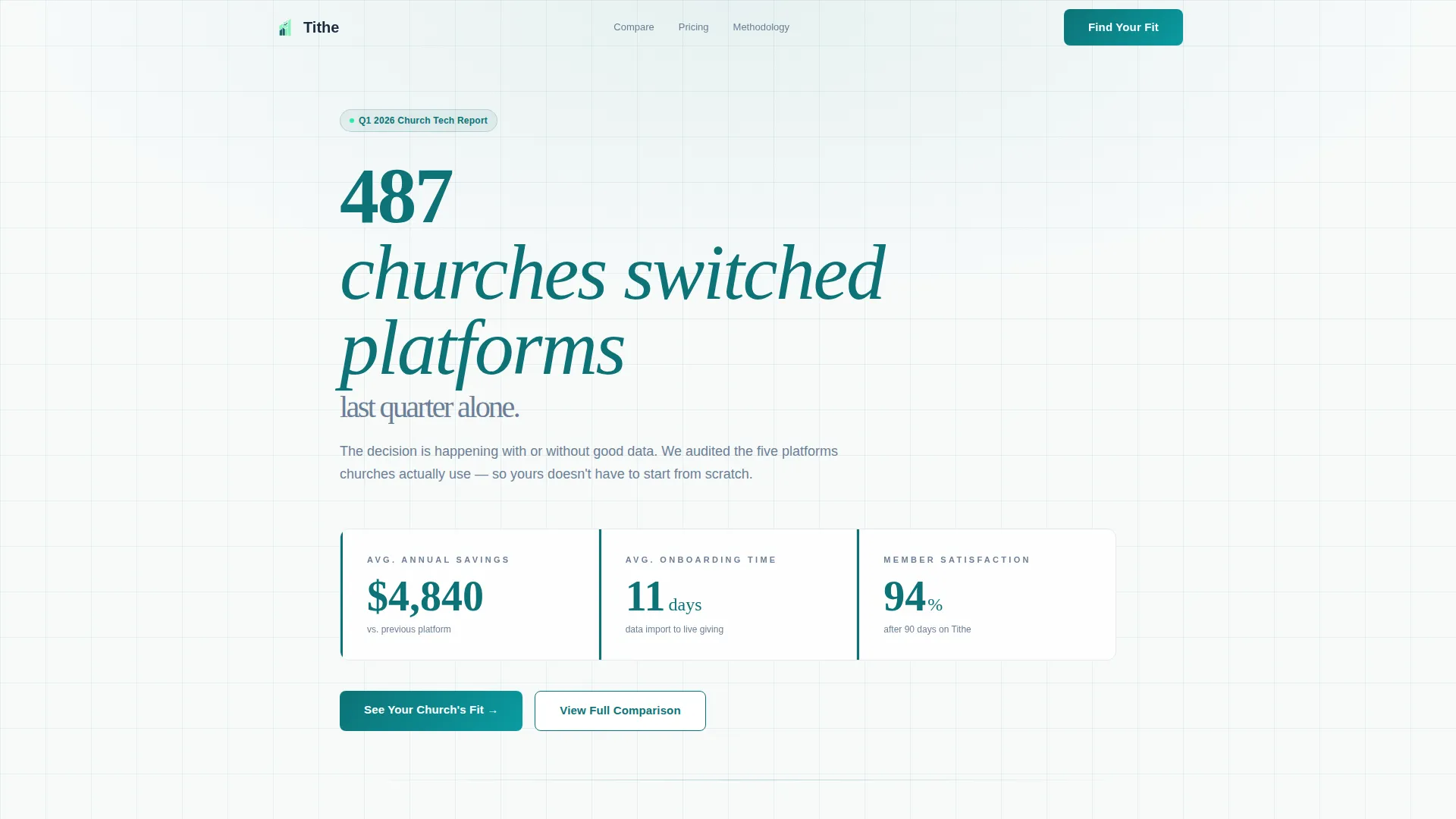
- A stat-driven header with three animated counters and a bold typographic lockup
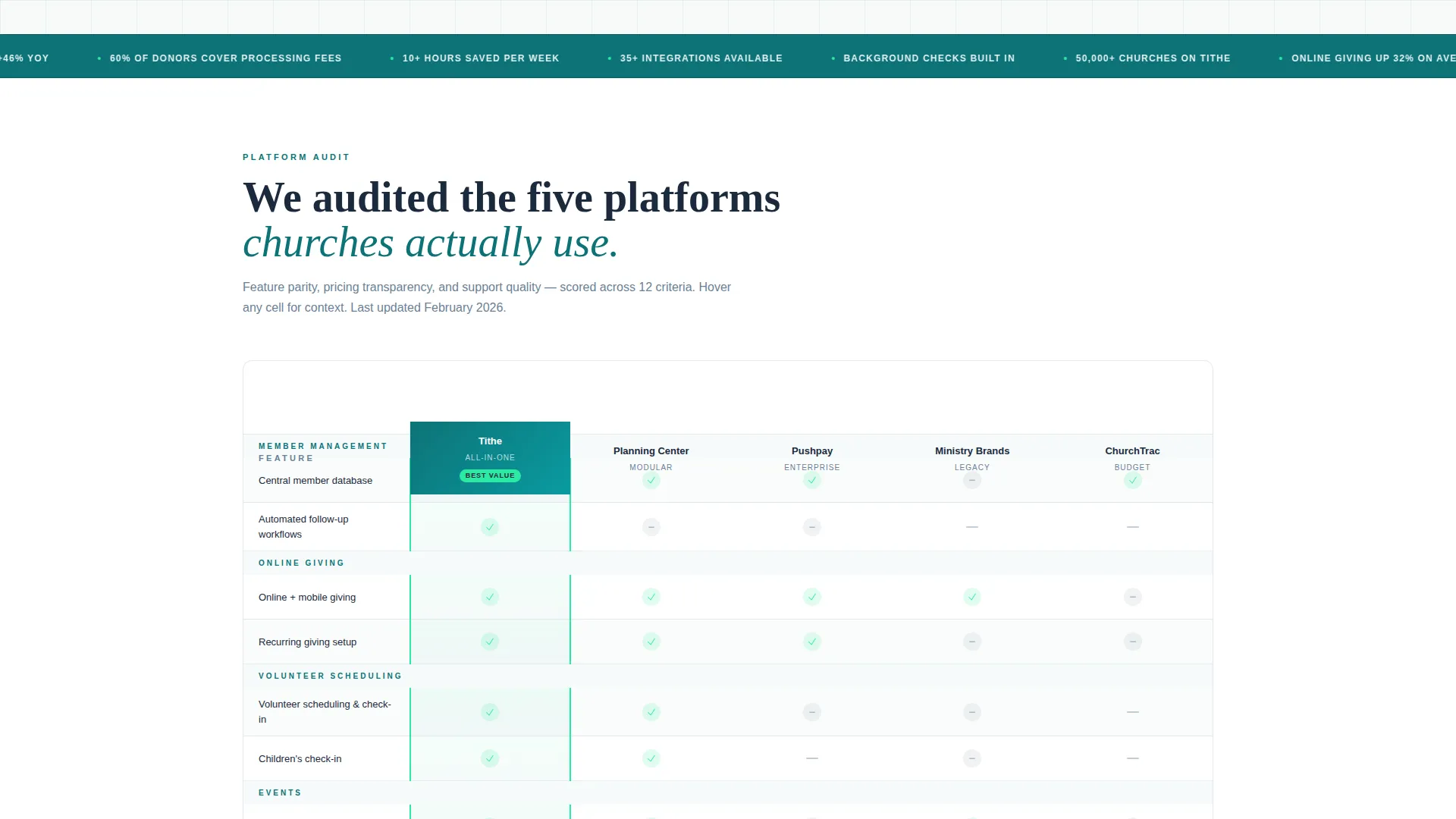
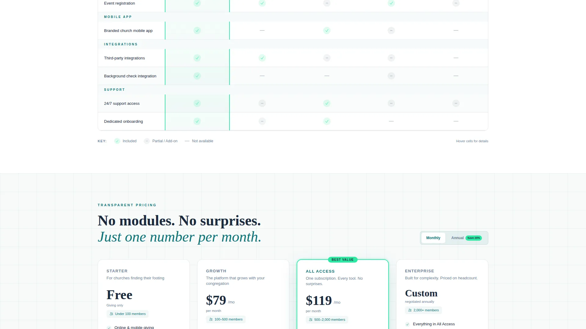
- A modular comparison card grid covering member management, online giving, volunteer scheduling, event registration, mobile app, integrations, and support
- A dual-path conversion section with a quiz-style fit form and an email-gated report download
Feature list
This template is built around a set of components that make a pricing comparison page feel authoritative rather than promotional.
Animated Statistics Header
The header opens with a bold typographic lockup reading "487 churches switched platforms last quarter." Three animated counters sit beneath it, displaying average annual savings, average onboarding time in days, and member satisfaction percentage. There are no stock images of steeples or worship photography. The design is all numbers on sanctuary white, framed by thin teal keylines that feel pulled from an annual report.
Modular Comparison Card Grid
Each column in the grid represents a competitor platform. Each row maps to a feature category: member management, online giving, volunteer scheduling, event registration, mobile app, integrations, and support. Cells use electric mint checkmarks for available features and slate dashes for gaps. Hover states expand each cell into a one-sentence explanation, so visitors never have to guess what a checkmark actually means.
Methodology Transparency Block
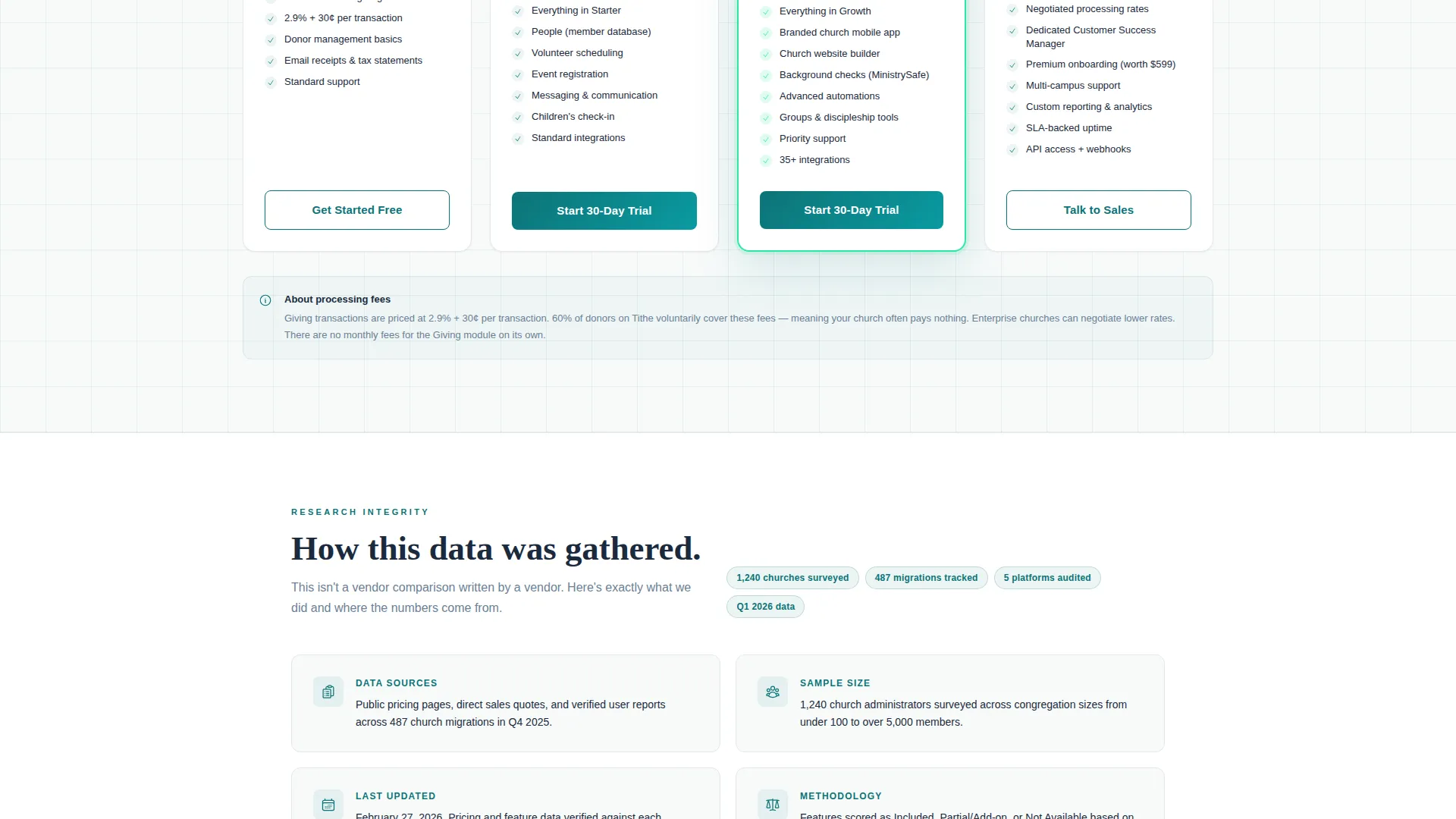
Below the card grid, the page shifts into a methodology section. It explains how the comparison data was gathered, the sample size used, and the date the data was last updated. This section gives the entire page the weight of research rather than the feel of a vendor marketing page.
Quiz-Style Conversion Form
The primary call to action is "See Your Church's Fit." It launches a lightweight form asking three questions: congregation size range, current platform from a dropdown that includes "spreadsheets or nothing," and top priority as a single-select between giving, communication, volunteer coordination, and all-in-one. The form is minimal and fast to complete.
Email-Gated Report Download
A secondary conversion path offers visitors the option to download the full comparison report. This path sits alongside the primary quiz form, giving research-focused visitors a reason to share their contact information without feeling pressured to commit to a platform choice first.
Industry Report Editorial Flow
The scroll sequence follows a state-of-church-tech briefing structure. A single reframe sentence below the stats reads: "We audited the five platforms churches actually use." From there, the page moves through the grid, the methodology, and finally the conversion section. The editorial pacing makes the page feel like a resource worth bookmarking, not a page to skip past.
Page sections overview
| Section | Purpose |
|---|---|
| Stats Header | Opens with animated counters and bold platform-switching data to establish immediate credibility |
| Reframe Statement | Single sentence that sets the research-audit framing before the grid appears |
| Comparison Card Grid | Side-by-side feature matrix across competitor columns and feature-category rows |
| Hover Explanation Layer | Expands each grid cell into a one-sentence feature clarification on hover |
| Methodology Block | Explains data sources, sample size, and last-updated date to reinforce trust |
| Quiz Fit Form | Lightweight three-question form that routes visitors toward a platform recommendation |
| Report Download Gate | Secondary email capture offering the full comparison report as a downloadable resource |
Design & branding system
The visual identity follows a Startup Velocity theme using the Teal Catalyst color system. The palette is intentionally clinical and trustworthy, resembling a fintech dashboard more than a traditional church website.
- Deep mission teal (#0D7377) for primary structural elements and keyline accents pulled from annual report design
- Electric mint (#2CEAA3) for interactive highlights, winning-column indicators, and checkmark icons throughout the grid
- Sermon-slate (#1B2A3D) for body text, card borders, and typographic hierarchy
- Soft sanctuary white (#F7FAFA) across card backgrounds and open breathing space between sections
Mobile & speed optimization
The modular card grid layout is built to adapt across screen sizes without losing the clarity that makes the comparison useful. Visitors arriving on phones or tablets should still be able to read and interact with the grid cleanly.
- Card grid columns are modular and designed to reflow gracefully on smaller viewports
- The quiz-style form is minimal by design, keeping the mobile interaction lightweight and fast to complete
- Thin keyline borders and open white space reduce visual clutter on constrained screen widths
How this template helps you convert
The page is designed around the specific psychology of a ministry decision-maker who has been researching for weeks. Every section earns the next click by being genuinely useful first.
- The animated statistics header creates an immediate anchor of credibility, giving visitors a data point they can quote in a board meeting before they have even scrolled.
- The comparison grid does the research work visitors were already doing manually, reducing the time between arrival and the moment they feel ready to act.
- The dual-path conversion section meets visitors where they are, offering a quick fit assessment for those ready to choose and a report download for those who need more time.
Other information about this template
This template is categorized under church and religious organization website templates, with a specific focus on the pricing page niche. It is built to serve the growing market of ministry teams evaluating dedicated church management platforms as a replacement for general-purpose tools.
- The template style is Card Grid (Modular), making individual sections easy to reorder or extend without breaking the layout
- The creative direction follows an Industry Report framework, which distinguishes this page from typical vendor comparison pages that favor one platform
- The header concept is Stats and Metrics, a deliberate choice to lead with numbers rather than imagery in a category where credibility is built on evidence
- The conversion direction is Comparison and Versus, aligning the page structure with the specific research behavior of ministry administrators actively evaluating software options
- This template fits naturally within broader church management software evaluation campaigns and can be paired with dedicated onboarding or feature-detail pages for a fuller site experience
Theme
Startup Velocity
Creative direction
Industry Report
Color system
Teal Catalyst
Style
Card Grid (Modular)
Direction
Comparison/Versus
Page Sections
Animated Statistics Header
Modular Comparison Card Grid
Methodology Transparency Block
Quiz-style Fit Form
Email-gated Report Download
Industry Report Editorial Scroll
Related questions
Who is this landing page template designed for?
Can I customize the platforms shown in the comparison grid?
What are the two conversion paths included on this page?
Does this template include actual platform comparison data?
What visual style does this template use?



