Complete Micro-SaaS & Developer Tools Pricing & Packages Website Template
Toggle is a modular card-grid landing page template built for feature flag manager products. It combines an animated Stats/Metrics hero with a staggered card layout to showcase kill switches, percentage rollouts, A/B cohorts, and targeting rules. Designed for developer tools and Micro-SaaS products, the template drives visitors toward a free-tier signup with a persistent call-to-action bar.
by Rocket studio
Quick summary
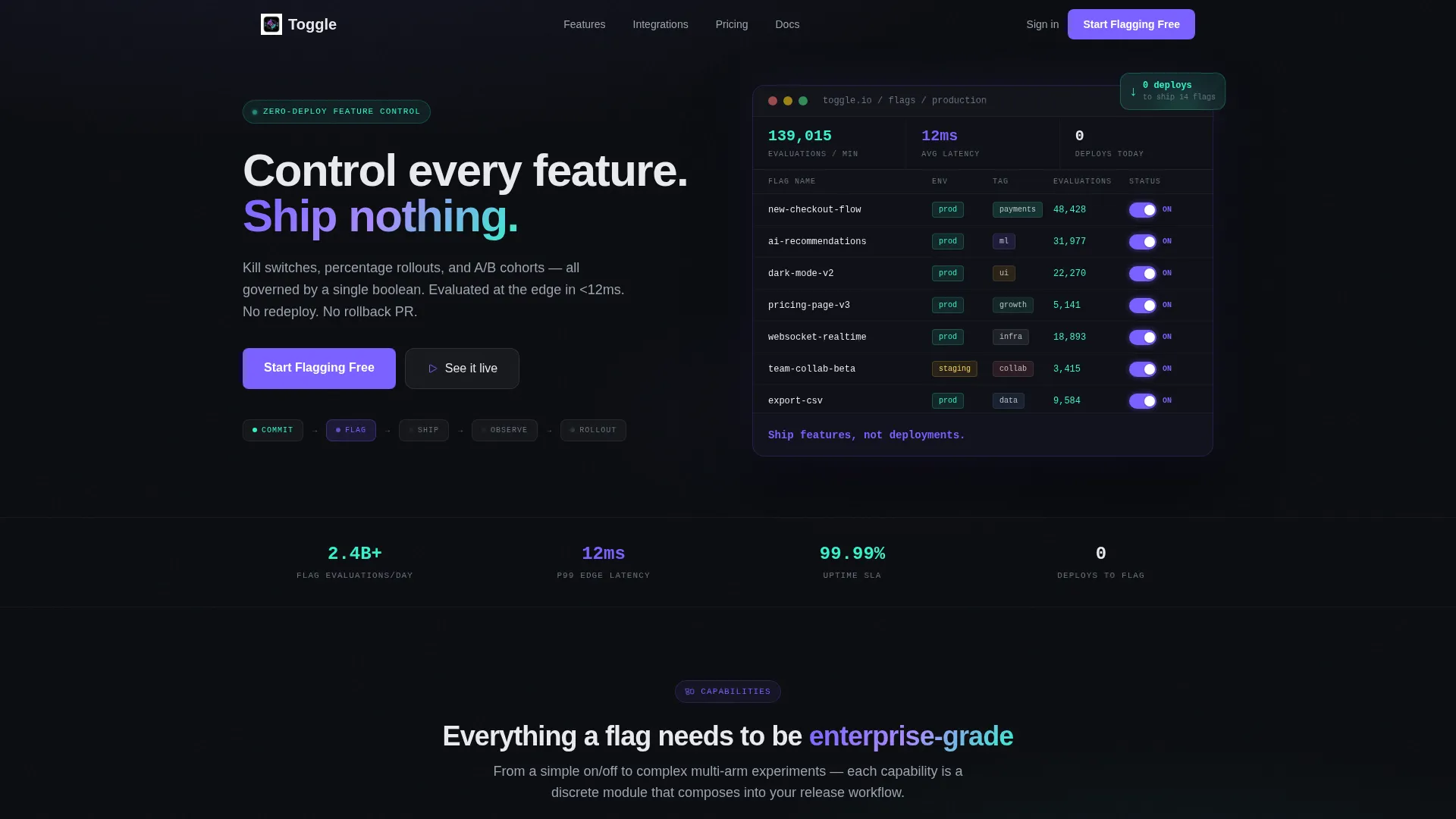
Toggle is a single-page, click-through landing page template for feature flag manager products. It opens with a live-style dashboard hero showing real-time toggle states, latency readings, and deployment counters. Below the hero, a modular card grid builds scope and confidence, closing with a three-tier pricing comparison that removes the final objection before the signup click.
Who this template is for
This template was designed for teams that ship code fast and need a compelling landing page to match. It speaks directly to the people who live inside deployment pipelines and feature rollout workflows.
- Platform engineers at Series B startups who deploy multiple times per day and need a page that demonstrates speed and control
- DevOps leads at enterprise organizations untangling complex monolith releases and looking for a governance-ready presentation
- Product managers who want to communicate the value of soft-launching features to a small percentage of traffic before broader rollout
What problem this template solves
Explaining a feature flag manager to a mixed audience is genuinely hard. The tool is technical, but the business case needs to land with product managers and executives too. Most templates force you to choose between developer credibility and business clarity.
- The animated hero acts as a live product demo, letting the interface speak before a single word is read
- The staggered card layout moves visitors from simple concepts to enterprise-grade capabilities in a single scroll, bridging both audiences
- The sticky call-to-action bar and frictionless click-through structure remove every reason to delay signing up
What you get with this template
You get a complete, ready-to-customize landing page that is already structured around the feature flag manager use case. Every section has a clear job, and the visual system is fully defined so you can adapt it without redesigning from scratch.
- An animated Stats/Metrics hero with a live-style flag table, pulsing toggles, ticking evaluation counts, a latency gauge, and a deployment counter
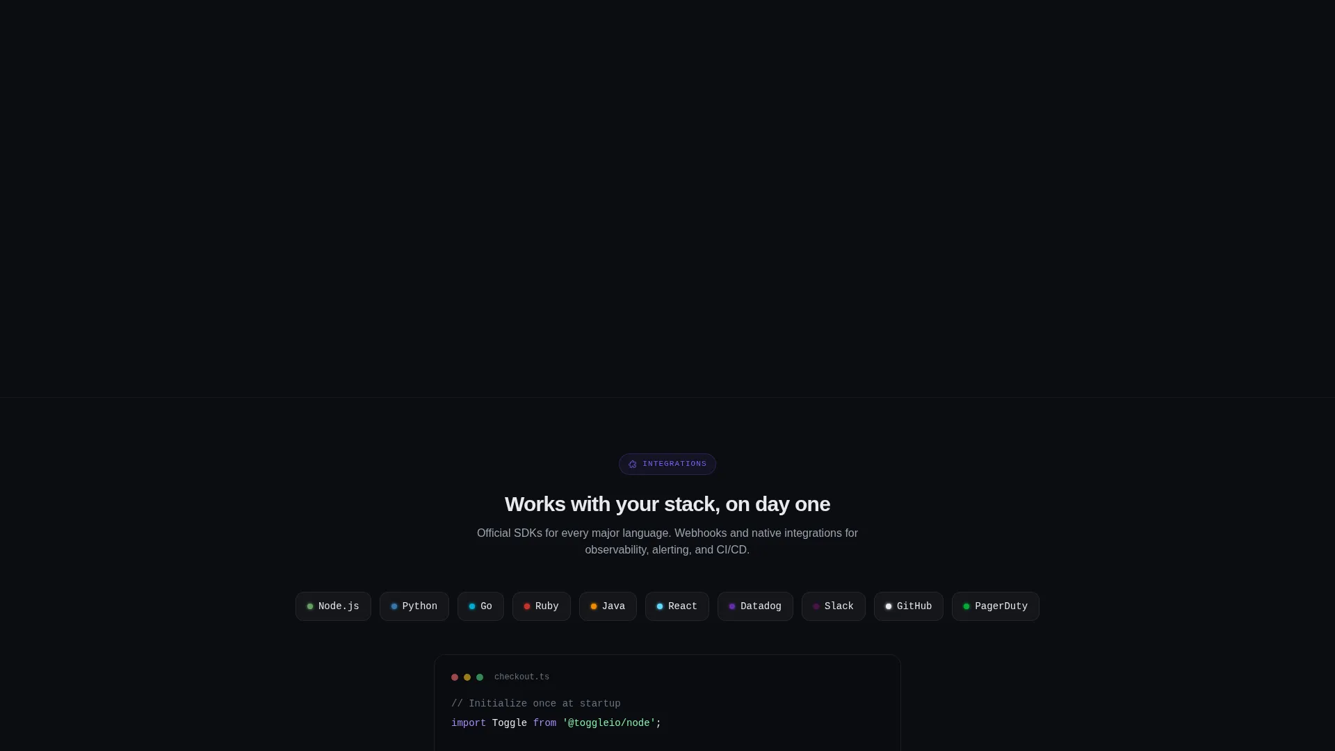
- A modular card grid covering targeting rules, percentage rollouts, audit logs, SDK snippets, kill switches, and analytics capabilities
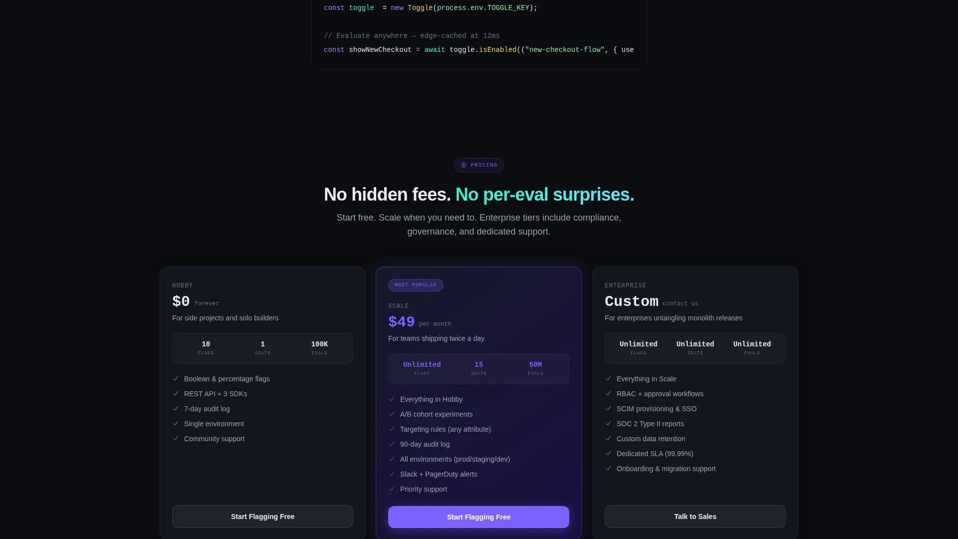
- A sticky bottom call-to-action bar, per-card primary buttons, and a three-tier pricing comparison row to close the page
Feature list
This template delivers a precise set of built-in components. Each one serves a specific role in the conversion flow.
Animated Dashboard Hero
The header is a fully interactive-feeling stats panel, not a static screenshot. It shows 14 feature flags in a compact table: seven toggled on with glowing violet switches and seven off in dim gray. Evaluation counts tick upward, a latency gauge reads 12 milliseconds, and a deployment counter holds at zero. A monospace headline types itself beneath the panel.
Staggered Card Grid Layout
Below the hero, capability cards cascade in as the visitor scrolls. The entrance animation mimics a deployment pipeline lighting up stage by stage. Cards are ordered intentionally: simple on/off toggles appear first, targeting complexity fills the middle rows, and governance features anchor the final row.
Persistent Sticky Call-to-Action Bar
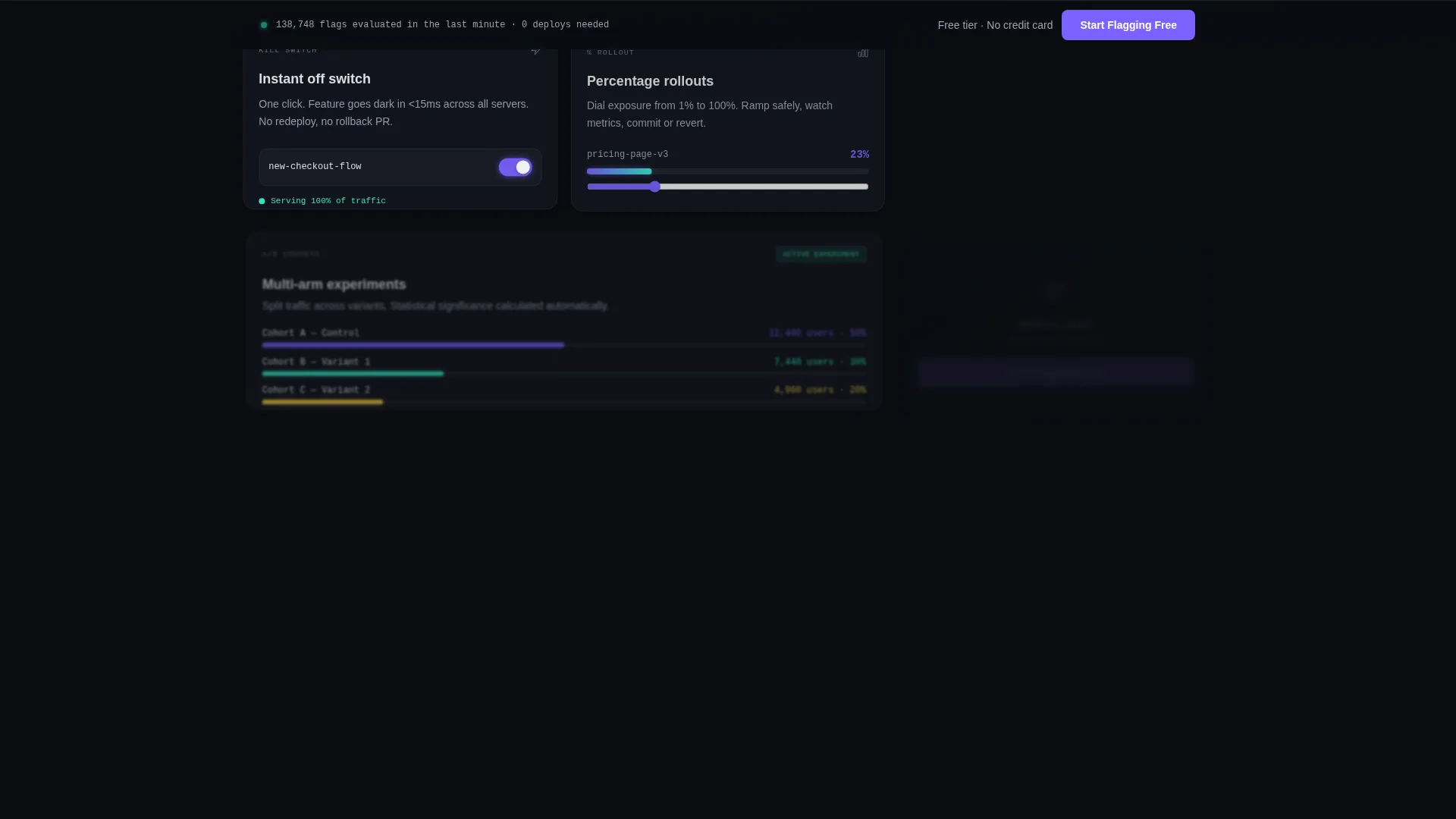
A sticky bottom bar appears after the visitor passes the second scroll depth. It carries the primary call-to-action on every third card and in the bar itself. The page has no form, so every interaction funnels to a single click-through action.
Three-Tier Pricing Comparison Row
The final section presents three pricing tiers with no hidden prices. It is structured to answer the last objection a visitor might have before clicking through to sign up. The layout keeps the free tier visible and prominent.
Kill Switch and Rollout Cards
Dedicated cards cover kill switches, percentage rollouts, and A/B cohort targeting as discrete, scannable modules. Each card is a self-contained capability explanation, making the product scope clear without requiring the visitor to read long paragraphs.
Audit Log and Governance Cards
The final card row communicates enterprise readiness through audit log and compliance-oriented modules. This section completes the scroll arc from approachable simplicity to organizational control.
Page sections overview
| Section | Purpose |
|---|---|
| Animated stats hero | Opens with live-style dashboard showing flags, latency, and counters |
| Monospace headline area | Delivers the core product message in typed, terminal-style text |
| Simple toggle cards | Introduces the on/off concept with the first card row |
| Rollout and targeting cards | Demonstrates percentage rollouts and A/B cohort targeting |
| SDK and integrations cards | Shows developer-facing capabilities and code snippet context |
| Audit and governance cards | Establishes enterprise credibility in the final card row |
| Pricing comparison row | Three-tier layout removes pricing objections before the call to action |
| Sticky call to action bar | Persistent signup prompt appears after second scroll depth |
Design & branding system
The visual identity follows a Dashboard Pro theme using the AI Iridescent color system. The palette is built for dark interfaces that need to feel alive with data rather than static and flat.
- Core colors: void black (#0B0D11) as the background, holographic violet (#7B61FF) for primary actions and toggle-on states, shimmer teal (#36F1CD) for success metrics and positive deltas, and signal white (#E8EAED) for body text on dark surfaces
- Typography uses monospace styling in the hero to reinforce the terminal and developer-tool aesthetic, while card body text stays legible and clean
- Cards are styled to float above the void black background like translucent dashboard widgets, and violet-to-teal color shifts indicate state changes and positive signals throughout the layout
Mobile & speed optimization
The card grid layout is modular by design, which means it adapts naturally to narrower viewports. The staggered entrance animations are scoped to the card components so they do not interfere with the overall page structure on smaller screens.
- Each card module is a self-contained unit that can reflow into a single-column stack on mobile without losing visual hierarchy
- The sticky call-to-action bar is always visible at the bottom of the screen on all device sizes, keeping the signup path available regardless of scroll position
- The hero dashboard panel uses styled, lightweight user interface elements rather than a video or heavy image asset, keeping the animated effect visually impactful without relying on large file formats
How this template helps you convert
This template is structured as a pure click-through page. There is no form to fill out, no friction before the button, and no hidden pricing. Every design decision points toward one outcome: the visitor clicks through to start a free account.
- The animated hero establishes immediate product credibility. Visitors see a working-looking dashboard before reading a single marketing sentence, which builds trust faster than a headline alone.
- The staggered card scroll builds desire progressively. Simple concepts land first, complexity reveals itself naturally, and by the time the visitor reaches the pricing row they already understand the product's full scope.
- The sticky call-to-action bar ensures the signup prompt is never out of reach. After the second scroll depth, the "Start Flagging Free" button stays visible at the bottom of the screen on every subsequent section.
Other information about this template
This template sits at the intersection of the Micro-SaaS and Developer Tools category, making it well-suited for products that need to speak to both technical and non-technical decision-makers on a single page.
- The template style is Card Grid (Modular), which makes it straightforward to add, remove, or reorder capability cards as your product evolves
- The creative direction is Launch Energy, meaning the scroll experience is designed to build momentum rather than present static information blocks
- The click-through landing page direction means the page is intentionally form-free; all conversion happens via direct button clicks to the signup flow
- The AI Iridescent color system and Dashboard Pro theme are available as part of the broader template collection on the platform, so brand consistency across multiple templates is achievable
Theme
Dashboard Pro
Creative direction
Launch Energy
Color system
AI Iridescent
Style
Card Grid (Modular)
Direction
Click-Through
Page Sections
Animated Stats/metrics Hero
Staggered Card Grid with Scroll Animation
Persistent Sticky Call to Action Bar
Kill Switch and Rollout Capability Cards
Three-tier Pricing Comparison Row
Audit Log and Governance Cards
Related questions
Does this template include a signup form?
Can I change the feature flag cards to match my product's actual capabilities?
Is the hero dashboard animation connected to live data?
How does the sticky call-to-action bar behave?
Is this template suitable for a feature flag product targeting enterprise buyers?



