NLP Training Landing Page Template | High Converting
Tokenize is a high-impact NLP training landing page template built for certification programs that need to convert skeptical engineers into enrolled students. It leads with career-outcome data, deploys a modular card grid layout, and uses a dark Tech Glass aesthetic with a Teal Catalyst color system to create a focused, high converting landing page that moves visitors straight to the course catalog.
by Rocket studio
Quick summary
Tokenize is a single-page, card-grid landing page template designed for natural language processing (NLP) training and certification programs. It front-loads salary data, completion rates, and certification metrics before a single course description appears. The result is a high converting landing page that earns the catalog click through proof, not pressure.
Who this template is for
This template speaks directly to any organization running a structured NLP or machine-learning training program that needs to convert visitors who are evaluating real return on investment before committing. The target audience spans three clear groups who each carry distinct pain points.
- Mid-career software engineers with five or more years of experience who are pivoting into machine learning and need outcome data, not just a course overview
- Computational linguistics researchers who want a deployment path and practical pipeline experience rather than more academic theory
- Enterprise data teams that need to demystify BERT, fine-tuning, and prompt engineering ahead of a quarterly product roadmap
What problem this template solves
Selling technical education is hard. Potential customers arrive skeptical. They have seen generic video libraries, vague syllabi, and programs that never explain what happens after certification. This landing page solves that trust deficit by restructuring the entire persuasion sequence.
- It replaces the usual course-description-first format with a stats-first impact structure, so every scroll increment delivers a number before an explanation
- It removes navigation distractions with a minimalist layout, keeping visitors focused entirely on the value being presented and the desired action ahead
- It addresses pain points around ROI, quality, and career outcomes before a visitor ever reaches a course title
What you get with this template
This template gives you a complete, ready-to-customize landing page built around a modular card grid. Every section has a defined job: build trust, deliver proof, and link the visitor to the next step. There is no form friction and no hard sell.
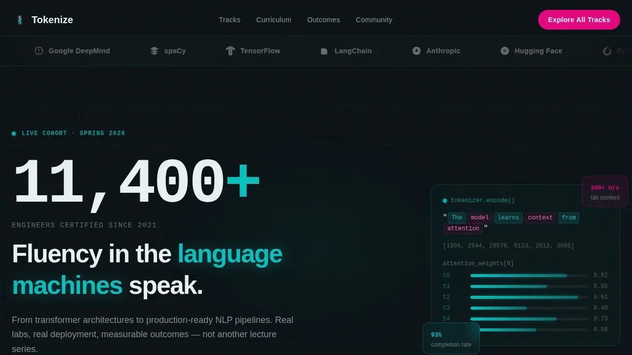
- A hero section with a scrolling logo bar, an animated token visualization, a stat displayed at enormous scale, and a primary call to action placed above the fold
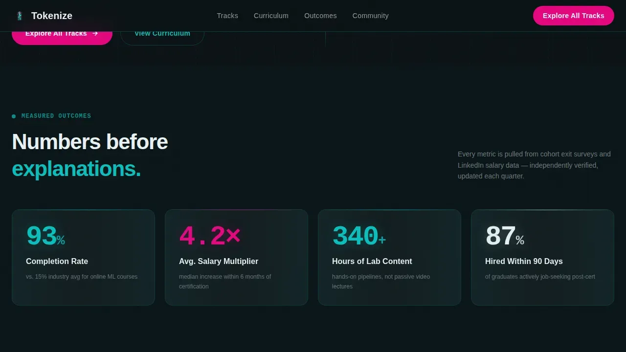
- A Stats Impact Row with four glassmorphic metric cards showing career-outcome proof such as completion rates, salary increase averages, and total lab hours
- A Course Track Card Grid in bento style, a Featured Track Deep-Dive section with asymmetric layout, a Testimonials section with named outcomes, and a clean single-row footer
Feature list
This landing page template is built around six core capabilities that create a high converting landing experience from first scroll to final click.
Stats-First Card Grid Layout
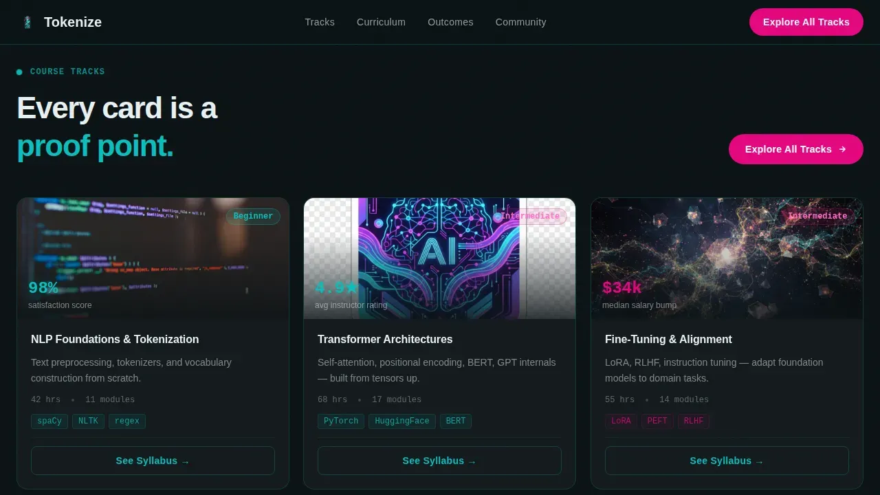
Each frosted glass card opens with a bold metric at the top. A course track title, a difficulty badge, and a one-line scope description follow beneath it. Cards tilt subtly on hover and catch a teal edge glow, making the grid feel alive. This structure lets the page build a cumulative argument through escalating proof as users scroll downward.
Scrolling Logo Bar Header
The header opens with a horizontal ribbon of framework and industry logos scrolling at a deliberate pace against the deep substrate background. Each logo renders in frosted monochrome and floods with teal on hover. This creates immediate authority signals and functions as visual social proof before a single headline is read.
Floating Pill Call to Action
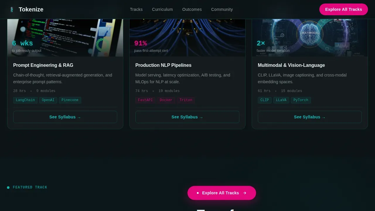
The primary call to action, labeled "Explore All Tracks," appears first inside the hero section and then re-anchors as a floating pill after the second card row. This strong call to action keeps the desired action visible throughout the scroll without interrupting the content rhythm. The magenta color makes every button feel distinct and urgent.
Featured Track Deep-Dive Section
An asymmetric split section places a visual element on the left and curriculum proof on the right. This section gives one course track extended space to explain its model, link to its syllabus detail page, and justify its difficulty level. Curriculum transparency at this point reduces hesitation for visitors who are almost ready to commit.
Testimonials and Outcomes Section
Three named testimonial cards each carry a specific role, a company reference, and a measurable outcome. These are not generic quotes. They are specific, quantifiable student success stories that function as technical social proof. High-performing education landing pages depend on this kind of evidence to convert visitors who are comparing options.
Animated Token Visualization
An animated SVG element traverses the hero section, visually representing how language gets tokenized and processed. This pattern interrupt disrupts visitor expectations and immediately signals that this is not a standard training program landing page. The animation reinforces the NLP training identity at a glance.
Page sections overview
| Section | Purpose |
|---|---|
| Hero with Logo Bar | Opens with scrolling logos, a massive certification stat, an animated token visual, and the primary call to action |
| Stats Impact Row | Four glassmorphic cards deliver career-outcome metrics before any course description appears |
| Course Track Grid | Modular bento-style cards with bold metrics, difficulty badges, and "See Syllabus" links per track |
| Featured Track Deep-Dive | Asymmetric split layout expands one track with visual proof and curriculum detail |
| Testimonials and Outcomes | Three named cards with role, company, and specific measurable outcome per student |
| Single-Row Footer | Clean linear footer closes the page without navigation overload |
Design & branding system
The visual identity follows a Tech Glass theme built on the Teal Catalyst color system. The overall feel is a dark IDE environment at peak focus: cool, electric, and precisely legible. Every color choice serves a function, and no element competes with the call to action.
- Core palette: deep substrate black (#0B1215) as the base, translucent teal (#0ABFBC) for card borders and hover states, frosted glass white (#E8F0F2) for panel surfaces, and catalyst magenta (#E4067E) reserved exclusively for calls to action and live data pulse moments
- Typography: Manrope in bold wide-tracked headings for authority and readability, paired with JetBrains Mono for all code snippets, metrics, and certification data displays
Mobile & speed optimization
This template is desktop-first, designed for engineers evaluating programs at their workstations. It is built with a solid mobile fallback so that visitors on any device can still read every metric, click every link, and submit interest without friction. Mobile optimization matters because over 90% of users browse on mobile devices at some point in their research process.
- Mobile optimized card layout collapses the grid cleanly, preserving metric visibility and the floating call to action pill on smaller screens
- Performance is handled through native CSS smooth scroll, Intersection Observer for scroll reveals, and GPU-accelerated transforms only, keeping speed high and landing page performance consistent across devices
How this template helps you convert
A high converting landing page works because it removes doubt faster than it introduces asks. This template is engineered to move potential customers from skepticism to catalog browse in a single scroll session. It follows the logic of the best landing pages: clarity, focus, and layered trust.
- The stats-first structure means visitors receive measurable outcome data as the first input they process, establishing consumer trust before any course service is described or any form is encountered
- The floating magenta call to action and per-card "See Syllabus" links give visitors a clear desired action at every scroll point, so there is never a moment where they must search for the next step
- Social proof through named testimonials, logo trust badges, and certification volume statistics builds the credibility needed for a high converting landing, turning passive readers into active leads who are ready to explore
Other information about this template
This template is a strong example of what a high-impact NLP training landing page can achieve when storytelling and data work together. A well-structured story on a landing page keeps visitors engaged and leads to higher conversion rates. This page tells a career transformation story using numbers first and narrative second.
- The tokenize high impact nlp training landing page template is suitable for any NLP or machine-learning training business that needs to build landing pages quickly without sacrificing conversion logic or visual quality
- High-performing education landing pages typically achieve conversion rates of 3% to 5%, with top-tier pages exceeding 10%; this template uses a step by step guide structure through its section sequence to move visitors efficiently toward that benchmark
- The good landing page principle of a single focused goal applies fully here: the average landing visitor is guided toward one action, which is browsing the full course catalog, with every element supporting that conversion
- Using bullet points, bold metrics, and a user friendly card structure makes the value proposition scannable for a busy technical audience evaluating multiple programs
- The template supports utilizing video content in the hero or featured track sections, giving teams the option to add a trailer video or module preview to further engage users and explain the course experience
- Case studies and named outcome data can be swapped into the testimonials section to match your own program's results, making comparison between this template and generic alternatives immediately obvious
Theme
Tech Glass
Creative direction
Stats-First Impact
Color system
Teal Catalyst
Style
Card Grid (Modular)
Direction
Click-Through
Page Sections
Stats-first Glassmorphic Card Grid
Scrolling Framework Logo Bar
Floating Magenta Call to Action Pill
Featured Track Deep-dive Layout
Named Testimonials with Measurable Outcomes
Animated Token Visualization in Hero
Related questions
Is this template suitable for a non-NLP training program?
Does this landing page include a registration form?
How does the template handle social proof?
Can I customize the color palette and typography?
What makes this a high converting landing page for NLP training specifically?



