Tollway - Powerful Road Operations Landing Page Template
Tollway is a hub-and-spoke landing page template built for toll road management software. It features an interactive browser-rendered corridor dashboard, a sticky anchor navigation, and modular feature sections with tier-comparison grids. Designed for state turnpike authorities and concession operators, it drives trial signups through a sandbox-first conversion flow backed by a Carbon Fiber visual identity.
by Rocket studio
Quick summary
Tollway is a single-page, anchor-nav landing page template purpose-built for toll road management software. It opens with a live browser-rendered highway dashboard, guides visitors through modular feature spokes, and closes each section with a sandbox trial call to action. The Carbon Fiber color system keeps the interface focused, controlled, and unmistakably operational.
Who this template is for
This template is built for teams selling vertical software to the toll road industry. If your product needs to demonstrate operational depth to technically minded buyers, Tollway communicates that fluency immediately.
- State turnpike authorities managing aging infrastructure and multi-corridor networks
- Concession operators running public-private partnership corridors on long-term contracts
- Back-office and engineering teams evaluating platform replacements for legacy toll systems
What problem this template solves
Toll road software is complex, and generic SaaS landing pages fail to earn trust from specialist buyers. Procurement teams at turnpike authorities and corridor operators need to see capability before they schedule a demo. Static screenshots and feature bullet lists do not move those buyers.
- Visitors cannot feel operational depth from a brochure-style page
- Engineers need interoperability and integration specs before they can recommend a trial
- Multi-stakeholder deals require a page that speaks to both technical evaluators and operations leads
What you get with this template
You get a fully structured hub-and-spoke landing page where the sticky anchor navigation connects every feature spoke back to a single command view. Each section is self-contained, tier-aware, and built to answer procurement questions without a sales call.
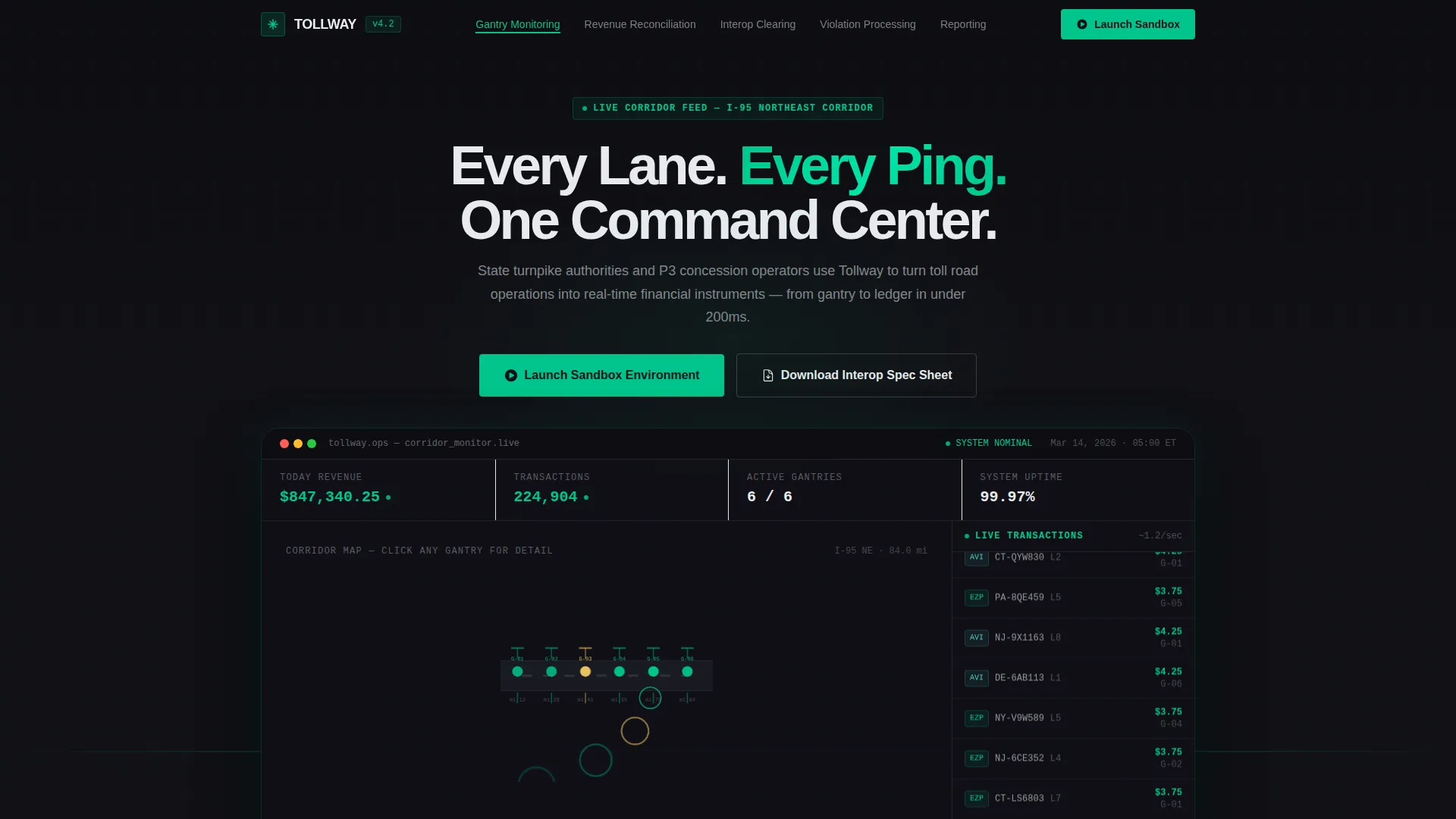
- An interactive header dashboard showing six gantry points, a live transaction ticker, and clickable lane-status panels
- Five anchor-linked feature spokes covering Gantry Monitoring, Revenue Reconciliation, Interoperability Clearing, Violation Processing, and Reporting
- Two conversion paths: a sandbox trial gate and a lighter single-email spec sheet download gate
Feature list
This template ships with purpose-built components that reflect how toll road operations software is actually evaluated and purchased.
Interactive Corridor Dashboard Header
The header renders a functioning toll corridor map directly in the browser. Six gantry nodes pulse in toll-green as simulated transactions stream through a live ticker on the right rail. Clicking any node expands a mini-panel showing lane status, transaction volume, and revenue per hour. Visitors understand the product within five seconds, without a static screenshot.
Sticky Anchor Navigation
After the visitor scrolls past the header, the anchor nav pins to the top of the viewport. It lists every feature spoke as a named tab, letting buyers jump directly to the module that matters to their role. The nav also carries the primary "Launch Sandbox Environment" call to action at all times.
Modular Feature Spoke Sections
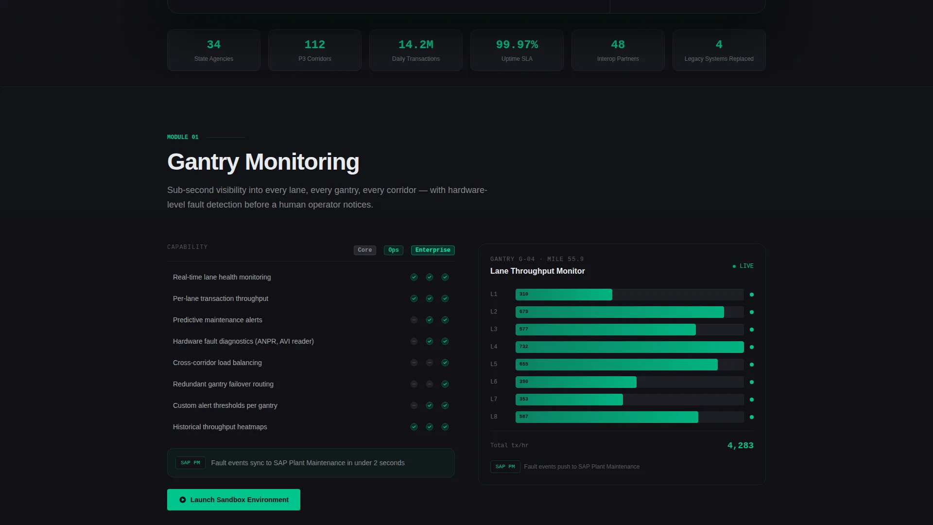
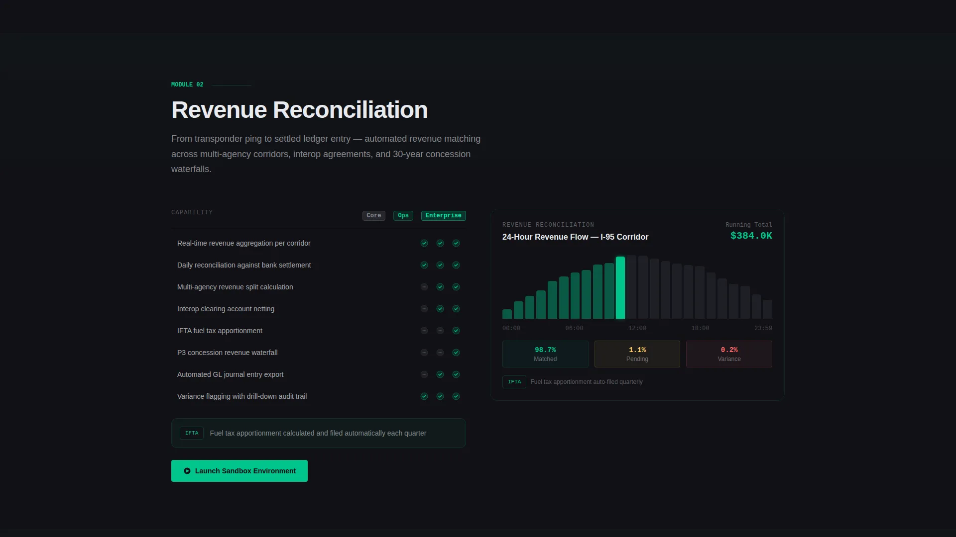
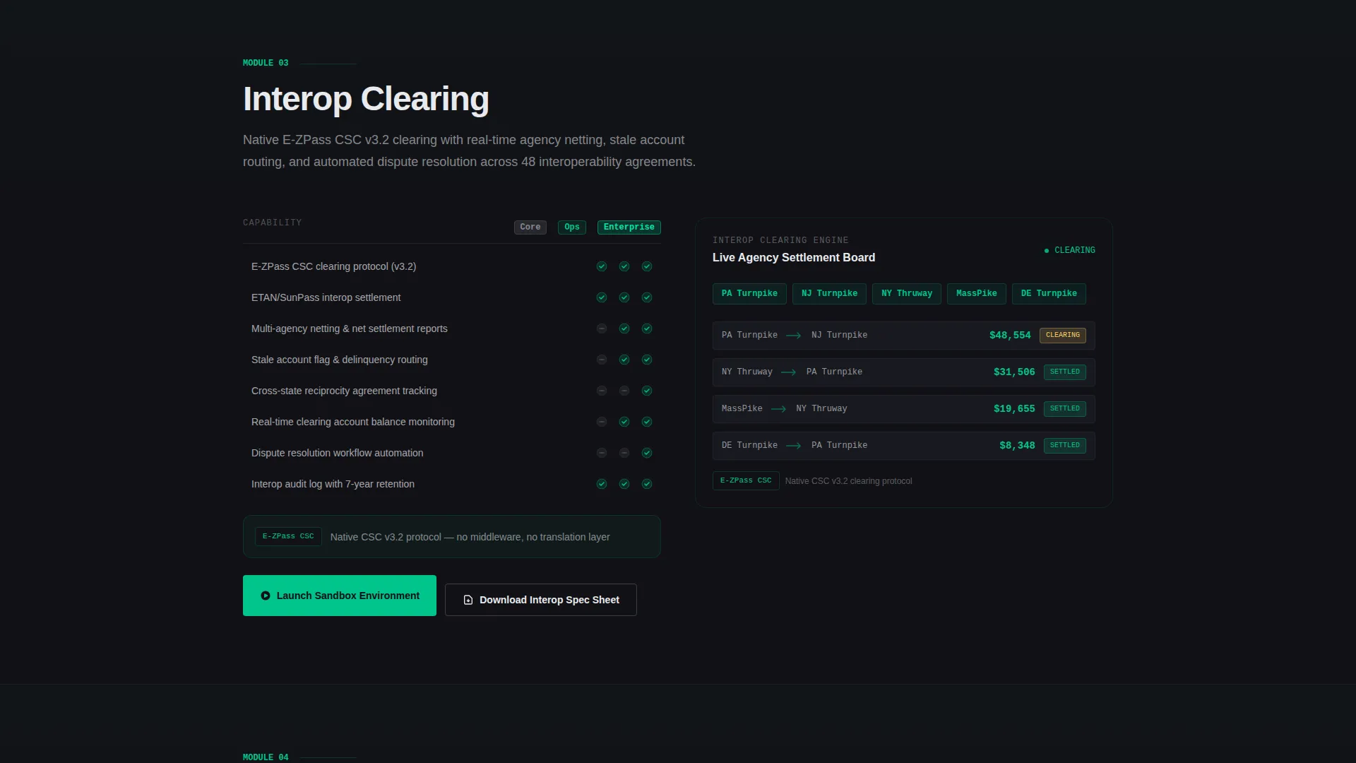
Each of the five feature spokes is a self-contained module view. It includes a capability grid comparing feature tiers, a micro-animation showing that feature in action, and a single integration callout. Each spoke closes with the sandbox trial call to action, reinforcing the conversion path at every natural pause point.
Tiered Capability Comparison Grids
Every feature spoke contains a structured grid that answers three questions: what the module does, how deeply it goes, and which tier unlocks each capability. This format serves procurement teams who need to map platform tiers to operational requirements before involving finance.
Dual Conversion Gate Design
The primary gate asks for work email, agency or operator name, and corridor count range. The secondary gate is a lighter single-email form for engineers downloading the interoperability spec sheet. Both gates are built into the page flow so conversion happens without redirecting visitors away from the content.
Carbon Fiber Instrument Panel Aesthetics
The visual system uses deep cockpit black, woven graphite, signal white, and toll-green. Toll-green appears only on live-state indicators, active nav markers, and primary buttons. Every other element stays in the graphite-to-black range so nothing competes with actionable data.
Page sections overview
| Section | Purpose |
|---|---|
| Corridor Dashboard Header | Renders live gantry map with interactive node panels and transaction ticker |
| Sticky Anchor Nav | Pins feature spoke links and primary sandbox call to action after scroll |
| Gantry Monitoring Spoke | Details real-time lane and gantry status monitoring with tier grid |
| Revenue Reconciliation Spoke | Covers transaction matching and daily revenue lane reporting by tier |
| Interop Clearing Spoke | Explains interoperability agreement clearing with integration callout |
| Violation Processing Spoke | Shows violation detection and workflow depth across platform tiers |
| Reporting Spoke | Displays reporting module capabilities and tier unlock structure |
| Sandbox Trial Gate | Primary freemium signup form with corridor count selector |
| Spec Sheet Download | Secondary lightweight email gate for engineering evaluators |
Design & branding system
The Carbon Fiber color system was built to feel like the instrument panel of a vehicle moving at speed through a dark tunnel. Every color decision has a functional role, and nothing is decorative for its own sake.
- Backgrounds stay within the graphite-to-black range using deep cockpit black (#111116) and woven graphite (#2A2D35) as primary surface colors
- Signal white (#E8EAED) handles all body text and label rendering to keep legibility high against dark surfaces
- Toll-green (#00C48C) is reserved exclusively for live-state indicators, active navigation markers, and primary action buttons
Mobile & speed optimization
The template is structured to remain usable and readable on smaller screens without losing the operational character of the desktop experience. The sticky nav and spoke sections reflow cleanly for narrower viewports.
- The interactive dashboard header adapts its gantry map layout for tablet and mobile breakpoints
- Feature spoke grids and capability comparison tables reformat as stacked views on smaller screens
- The dual conversion gate forms are sized and spaced for comfortable input on touch devices
How this template helps you convert
Tollway is built around a core belief: the sandbox is the sales tool. The page earns the trial click by letting visitors touch live data before they ever fill in a field.
- The interactive header creates immediate product credibility in the first five seconds of a visit, before any form appears
- The sticky anchor nav keeps the "Launch Sandbox Environment" call to action visible at every scroll depth, so the conversion path is never more than one click away
- The secondary spec sheet gate captures engineering evaluators who are not yet authorized to trial, keeping them in the pipeline through a lower-commitment entry point
Other information about this template
This template is part of a broader Directory and Discovery theme family, which uses structured catalog-style navigation to help buyers self-qualify across complex feature sets. The hub-and-spoke layout and Feature Matrix creative direction make it particularly well-suited for vertical SaaS products where buyers arrive with specific module questions rather than general curiosity.
- The template follows the Freemium and Trial landing page conversion model, where the product experience itself is the primary sales argument
- The Interactive Preview header concept is designed for software products that benefit from live demonstration rather than static product imagery
- This template sits in the Toll Road Vertical SaaS subcategory within the broader Technology category, making it a strong fit for niche operator and agency procurement workflows
- The corridor count selector in the trial gate (1 to 5, 6 to 20, and 20 or more) helps your team segment inbound leads before first contact
Theme
Directory & Discovery
Creative direction
Feature Matrix
Color system
Carbon Fiber
Style
Hub & Spoke (Anchor Nav)
Direction
Freemium/Trial
Page Sections
Interactive Corridor Dashboard Header
Sticky Anchor Navigation
Modular Feature Spoke Sections
Tiered Capability Comparison Grids
Dual Conversion Gate Design
Carbon Fiber Instrument Panel Visuals
Related questions
Who is this landing page template designed for?
Can I customize the feature spokes to match my platform's modules?
How does the interactive header dashboard work?
What are the two conversion paths included in the template?
Is this template suitable for a product that integrates with external platforms?



