Toll Road Booking Landing Page Template
Tollway is a single-page landing page template built for toll road booking systems. It uses a Stats-First card grid layout to lead every section with bold numbers, then earn the app download. Built with a Bold Brutalist visual identity in an Acid Digital color system, it targets daily commuters, fleet managers, and road-trippers who want fast, cashless toll passage.
by Rocket studio
Quick summary
Tollway is a modular card grid landing page template designed for toll road booking platforms. It puts live statistics front and center, guides visitors through a route savings calculator, and closes with a clear app download call to action. The design is Bold Brutalist, high-contrast, and built to feel as fast as the service it promotes.
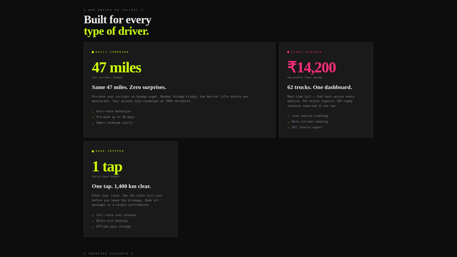
Who this template is for
This template is built for teams launching or marketing a digital toll road booking system. It speaks directly to three audiences at once, without losing clarity for any of them.
- Daily commuters who drive the same corridor every day and want cashless, pre-booked toll passage
- Fleet managers tracking fuel and toll costs across multiple vehicles
- Weekend road-trippers who want a single-tap payment option instead of searching for coins at speed
What problem this template solves
Toll road booking platforms often struggle to communicate speed and savings before asking for a download. Visitors leave before they trust the product. This template fixes that by making the proof visible first.
- Commuters and fleet managers cannot quickly see how much money or time they will save
- A vague install prompt with no context fails to convert visitors into app users
- The page earns each micro-commitment before it asks for the next one
What you get with this template
You get a fully structured, single-page layout built around a modular card grid. Every component is purpose-built for a toll road booking product, from the stat-heavy header to the sticky download bar at the bottom.
- A brutalist card grid that shifts density as users scroll, starting with one full-width card, then splitting into two, then three
- A mid-page savings calculator card where visitors enter their daily route and see projected annual toll savings
- A sticky footer bar and final card both repeating the primary "Download and Drive" call to action, plus an SMS-to-download field with a magenta "Text Me the Link" button
Feature list
This template ships with six purpose-built components that work together to move a visitor from first glance to app install.
Stats-First Logo Bar Header
The header is a concrete-weight brutalist strip pinned to the top. It displays the wordmark in oversized monospaced type alongside a horizontal ticker scrolling live statistics: tolls processed today, average seconds saved per transaction, and total miles booked this hour. There is no hero image. The numbers are the hero.
Accelerating Card Grid Layout
The modular card grid shifts density as the user scrolls. The first row is one full-width stat card, the second row splits into two cards, and the third splits into three. The layout visually mirrors a vehicle picking up speed, making the data feel kinetic and purposeful.
Stats-First Card Design
Every card leads with a massive number before any supporting text. Example callouts include "4.2s" for average gate clearance, "₹0 cash" for zero physical payment required, and "38%" for average monthly savings on fleet accounts. Cards use thick borders and sharp corners, stamped from the design like sheet metal.
Route Savings Calculator Card
A mid-page interactive calculator card lets visitors enter their daily route details and instantly see their projected annual toll savings. The calculator builds trust and personalizes the value proposition before the install prompt appears.
App Download Call to Action System
The primary call to action reads "Download and Drive" in toxic lime on void black. It appears inside the final card and repeats as a sticky footer bar that stays visible throughout the scroll. A secondary SMS field lets visitors enter their phone number and receive a download link via text.
Magenta Micro-Interaction System
Every card fires a magenta flash on hover, mimicking a toll camera burst. This interaction reinforces the brand's Acid Digital identity and gives the page a live, machine-readable energy that matches the product's speed promise.
Page sections overview
| Section | Purpose |
|---|---|
| Logo Bar Header | Displays wordmark, scrolling live stats ticker |
| Lime Headline Line | Single 96px statement sets the tone |
| Full-Width Stat Card | Opens the grid with one bold data point |
| Two-Card Row | Splits the grid, accelerates the rhythm |
| Three-Card Row | Completes the density shift, deepens proof |
| Savings Calculator Card | Lets visitors personalize their projected savings |
| App Download Card | Final call to action card with "Download and Drive" prompt |
| SMS Download Field | Secondary path via phone number input |
| Sticky Footer Bar | Persistent "Download and Drive" call to action throughout scroll |
Design & branding system
The visual identity is Bold Brutalist, executed through an Acid Digital color system. Every design decision reinforces speed, precision, and machine clarity.
- Void black (#0D0D0D) dominates every background slab, toxic lime (#CCFF00) marks all interactive surfaces and live data points, scanner-beam magenta (#FF2D7B) fires on alerts and savings callouts, and signal white (#EAEAEA) handles all body text
- Typography uses oversized monospaced type for the wordmark and 96px lime display type for the opening headline, creating a high-contrast, machine-readable hierarchy
- Cards are thick-bordered, sharp-cornered brutalist slabs designed to feel stamped from sheet metal, with magenta hover flashes that mimic ANPR camera bursts
Mobile & speed optimization
The modular card grid structure is inherently well-suited to responsive layouts. Each card is a self-contained slab, making it straightforward to restack sections for smaller screens without breaking the visual logic.
- The sticky footer bar keeps the primary call to action accessible at every scroll depth on any screen size
- The SMS-to-download field provides a mobile-native conversion path for visitors who encounter the page on a phone
- High-contrast Acid Digital colors maintain readability on any display brightness or screen type
How this template helps you convert
This template is built around a deliberate trust-then-ask sequence. It proves value before requesting any commitment.
- The stats ticker and stat cards establish credibility immediately, showing real numbers before any marketing copy
- The savings calculator personalizes the value proposition mid-page, turning a generic claim into a visitor's own projected savings figure
- The sticky footer call to action and dual download paths (app store prompt plus SMS link) reduce friction at the moment of decision
Other information about this template
Tollway sits within the Technology category and is specifically designed for the Toll Road Vertical SaaS subcategory. It is a focused tool for teams building or promoting toll road booking systems.
- The template style is Card Grid (Modular), making individual sections easy to reorder or replace as a product evolves
- The landing page direction is App Download, meaning every design and copy decision points toward a single measurable outcome
- The Stats-First creative direction and Logo Bar header concept are both defined in the matched intersection context, ensuring the template is consistent with the Statsfirst platform's design standards


Theme
Bold Brutalist
Creative direction
Stats-First Impact
Color system
Acid Digital
Style
Card Grid (Modular)
Direction
App Download
Page Sections
Stats-first Logo Bar Header
Accelerating Card Grid Layout
Stats-first Brutalist Card Design
Route Savings Calculator Card
Dual-path App Download System
Magenta Micro-interaction System
Related questions
Who is this landing page template designed for?
Can I customize the stat numbers and card content?
Does this template include the savings calculator functionality?
What makes the Bold Brutalist design a good fit for a toll road product?
Is this a single-page template or a multi-page website?


