Onboarding & User Guide Cost Calculator Website Template
Tooltip is a brutalist dashboard landing page template built for contextual help widget products. It opens with a live ROI calculator, descends through sourced industry benchmark data cards, and closes with a friction-minimal freemium signup form. The Bold Brutalist design uses oversized monospace type, a Monochrome Steel palette, and a single high-voltage green accent for every call to action.
by Rocket studio
Quick summary
Tooltip is a single-page, dashboard-style landing page template designed to sell a contextual help widget to product teams and developer experience leads. The page leads with a live ROI calculator, builds trust through sourced benchmark stats, and converts visitors with a near-zero-friction freemium trial form. Bold Brutalist visuals make every section feel like a read-out from a live system.
Who this template is for
This template is built for software-as-a-service (SaaS) founders, product managers, and developer experience leads who are launching or repositioning a contextual help or onboarding widget. It also fits customer success teams who need to demonstrate activation impact with hard numbers before asking for a sign-up.
- Product managers who need to convert onboarding ticket volume into a compelling ROI story for prospective users
- Developer experience leads who want to show fast, code-level integration without writing long documentation pages
- Customer success teams tracking activation rates and needing a landing page that speaks the language of metrics
What problem this template solves
Selling a developer tool or help widget is hard when prospects cannot feel the value until they are already inside the product. Most landing pages describe features abstractly. This template flips that pattern by anchoring the pitch in the visitor's own numbers from the first scroll.
- Visitors who never connect product value to their real costs bounce before reaching the call to action
- Teams with no dedicated design resources struggle to build a credible, data-forward page that matches a developer audience's expectations
- A generic hero-image layout undermines trust with a technical audience that expects precision and directness
What you get with this template
You get a fully structured, single-page landing page layout built around five purposeful sections. Each section is designed to earn the next scroll by answering a question raised by the one before it. The visual system, interaction patterns, and copy structure are all defined in the template.
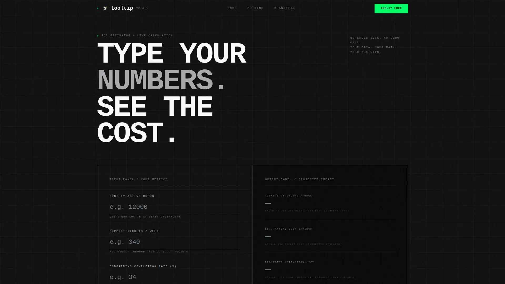
- A live ROI calculator header that outputs ticket deflection estimates, support cost savings, and activation lift in real time
- A data grid of sourced industry benchmark stat cards, a step-by-step "How It Works" section with a three-line code snippet block, a comparison grid, and a bottom conversion section
- A sticky secondary call-to-action bar that appears after 40 percent scroll depth, plus a primary freemium signup form asking only for work email and app URL
Feature list
This template includes purpose-built components that reflect the contextual help widget niche and the data-driven, brutalist creative direction described in the brief.
Live ROI Calculator Header
The header is an interactive input panel where visitors enter their monthly active users, weekly support ticket volume, and current onboarding completion rate. As values are typed, a real-time output column calculates estimated ticket deflection, projected support cost savings, and predicted activation lift. Number values animate into place with a punch-card snap effect, and high-voltage green fires only when a result crosses a meaningful threshold.
Industry Benchmark Data Grid
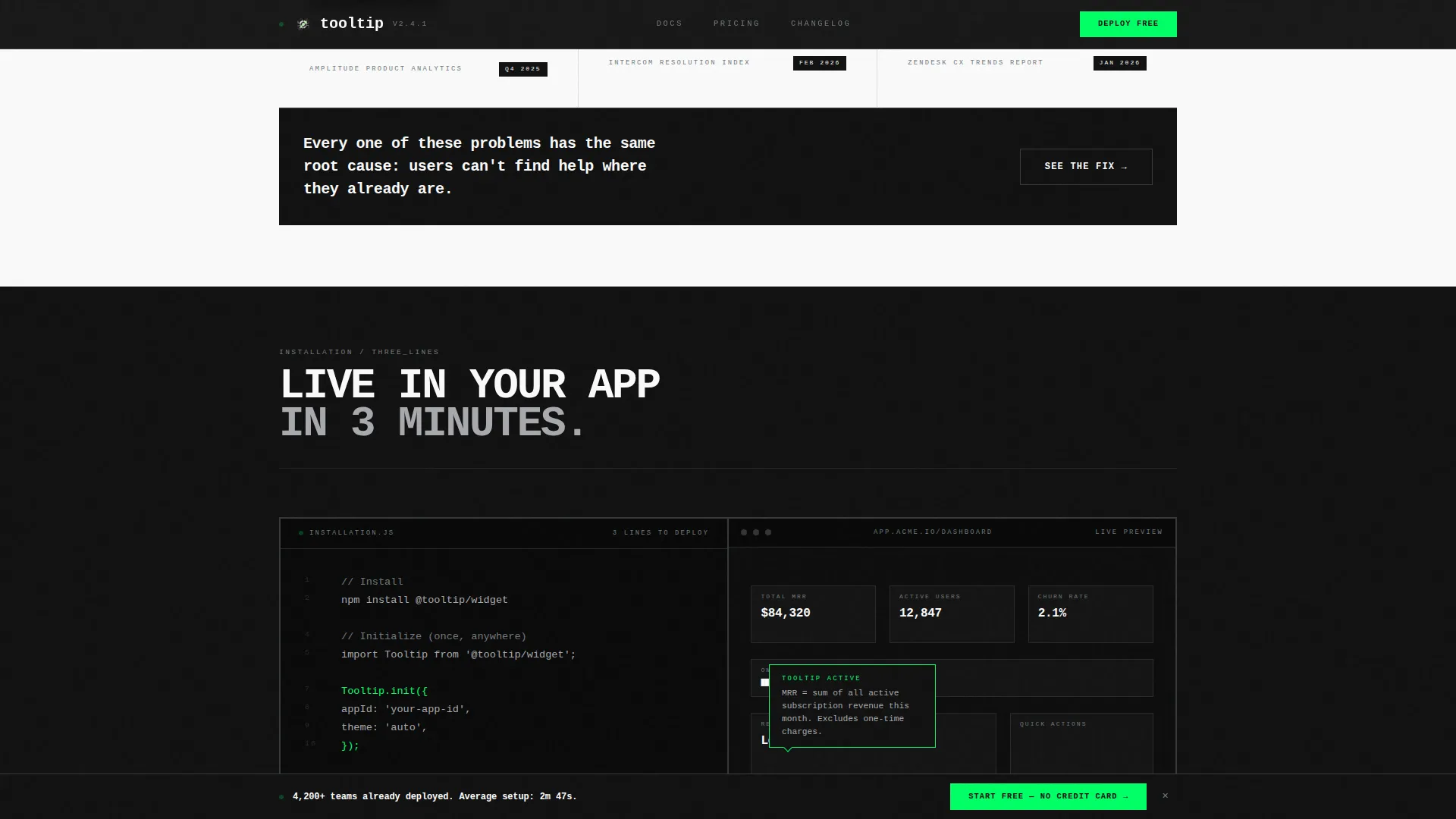
After the calculator, the page scrolls into a brutalist grid of sourced benchmark stat cards. Each card presents a single finding, such as "73% of SaaS users abandon onboarding before step five" or "Contextual help reduces median time-to-value by 41%," formatted with a source citation and timestamp. The grid layout reinforces the industry report creative direction and builds credibility through specificity.
Three-Line Install Code Snippet Block
The "How It Works" section includes an embedded code snippet showing a three-line installation example alongside a mock dashboard screenshot with a live widget preview rendered inside it. This component speaks directly to developer experience leads and removes ambiguity about integration complexity.
Comparison Grid Section
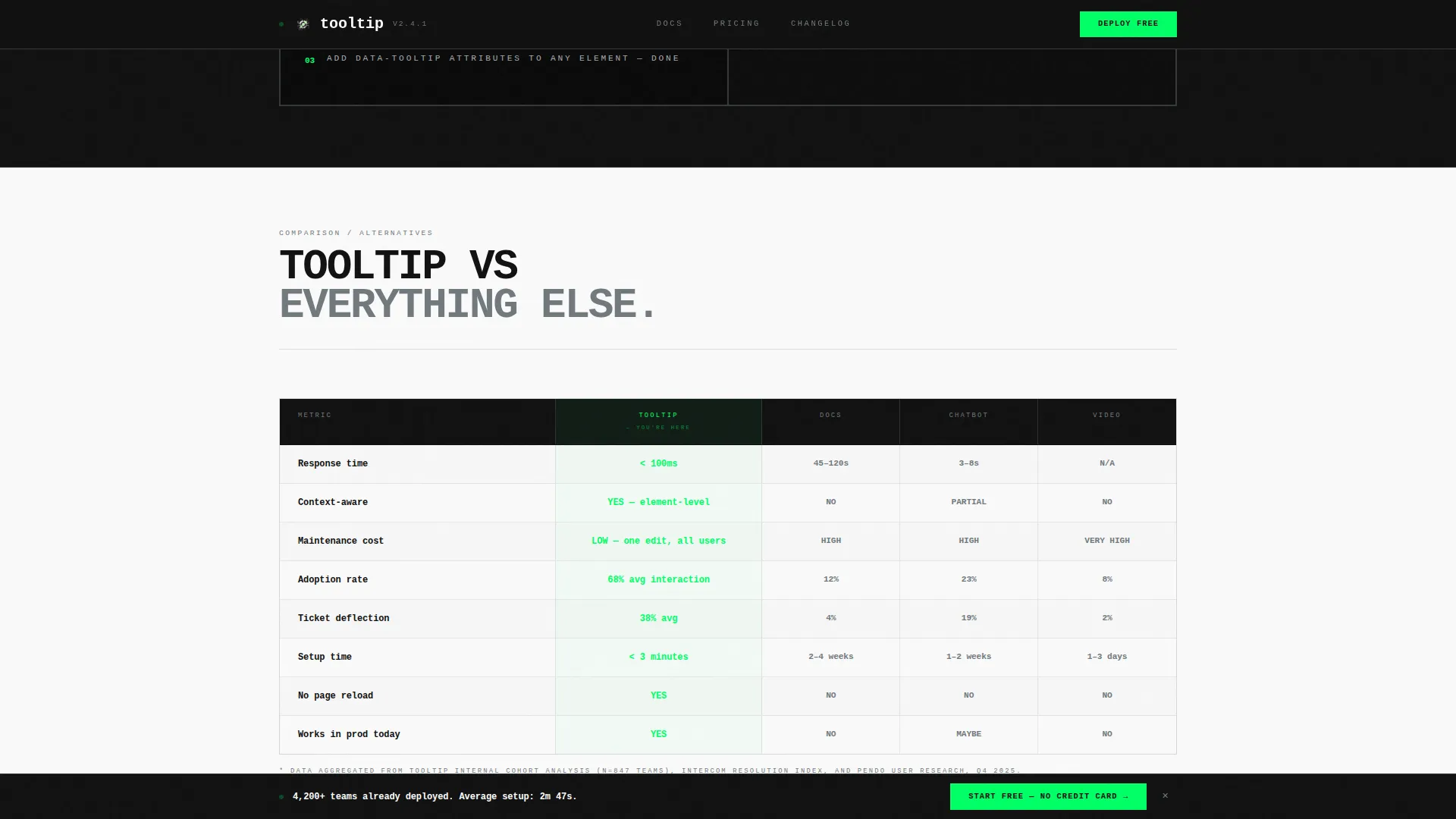
A structured comparison grid pits the contextual help widget against documentation pages, chatbots, and video tutorials across three axes: response time, maintenance cost, and adoption rate. This section handles the most common objections at a glance, using a rigid brutalist table layout with no rounded corners and 1-pixel steel borders.
Sticky Conversion Bar
A secondary sticky bar appears at 40 percent scroll depth with the prompt "Start Free, No Credit Card." It stays visible without interrupting the reading flow and ensures the call to action is always reachable. The primary call-to-action button, "Deploy Your First Tooltip Free," is repeated after the calculator output and again at the bottom of the page.
Minimal Freemium Signup Form
The bottom conversion section contains a signup form that asks only for a work email address and an application URL. On submission, the form drops the user directly into a live sandbox environment with a pre-built tooltip on a sample dashboard. Friction is minimized by design because the calculator has already delivered personalized ROI evidence before the form appears.
Page sections overview
| Section | Purpose |
|---|---|
| Hero Calculator | Capture visitor numbers and output real-time ROI estimates |
| Industry Benchmarks Grid | Build credibility with sourced data cards and benchmark stats |
| How It Works | Show three-line install and live widget preview in mock dashboard |
| Comparison Grid | Objection handling via side-by-side feature comparison table |
| Bottom Call to Action | Freemium signup with minimal form fields and sandbox entry |
| Footer | Developer-minimal footer with essential navigation links |
Design & branding system
The visual identity follows a Bold Brutalist theme built on a Monochrome Steel color system. Backgrounds alternate between slab black (#111111) and bare white (#FAFAFA) in hard cuts with no gradients. A single high-voltage green (#00FF66) is reserved exclusively for interactive states and call-to-action surfaces, creating the effect of a server rack with one blinking status indicator.
- Typography is set in JetBrains Mono, an oversized monospace typeface, flush-left with heavy leading and no decorative styling
- Data cards and grid components use 1-pixel borders in cold-rolled steel (#71797E) with no box shadows and no rounded corners
- Mill-finish aluminum (#A8A9AD) is used for secondary text and supporting labels, keeping the palette tight and industrial
Mobile & speed optimization
The template is built desktop-first, reflecting the target audience of product managers and developer experience leads who evaluate tools at workstations. The layout prioritizes a high-fidelity desktop experience for the calculator and data grid components, which are the core of the conversion flow.
- The calculator and comparison grid are designed for wide viewport rendering, where column-based data layouts read most clearly
- Static page sections use server-side components for fast initial load, while the live calculator runs as a client-side component to support real-time interaction
- Scroll-triggered animations, including number snap effects and the sticky bar trigger at 40 percent depth, are implemented to perform without layout shifts
How this template helps you convert
The conversion strategy in this template is built around eliminating objections before they form. The calculator does not just demonstrate value abstractly; it generates personalized output from the visitor's own inputs, making the ROI argument feel specific and earned.
- The live calculator at the top of the page anchors the value proposition in the visitor's real numbers before any product claims are made, reducing skepticism from the first interaction
- The industry benchmark data grid and comparison section stack additional credibility so that by the time the visitor reaches the signup form, the case has already been made across multiple angles
- The minimal form, which asks only for work email and app URL, combined with the sticky call-to-action bar and the sandbox-first entry experience, removes every remaining practical reason to delay signing up
Other information about this template
This template is categorized under Documentation and Support, with a specific focus on the Onboarding and User Guide subcategory and the contextual help widget niche. It is suited to product-led growth (PLG) go-to-market motions where the product must prove value before asking for commitment.
- The creative direction follows an Industry Report structure, where each section escalates from problem framing to product mechanism to proof, earning every scroll with a new data point
- The header concept is a Calculator and Estimator pattern, which is particularly effective for developer tools and SaaS products where buyers expect quantitative justification
- The landing page direction is Freemium and Trial conversion, meaning all calls to action point toward a no-credit-card free start rather than a sales call or demo request
- The template style is Dashboard and Data Grid, making it well-suited for products in analytics, developer tooling, and productivity software categories beyond just contextual help widgets

Theme
Bold Brutalist
Creative direction
Industry Report
Color system
Monochrome Steel
Style
Dashboard/Data Grid
Direction
Freemium/Trial
Page Sections
Live ROI Calculator with Punch-card Output
Brutalist Industry Benchmark Data Grid
Three-line Install Code Snippet
Head-to-head Comparison Grid
Sticky Secondary Call-to-action Bar
Minimal Freemium Signup Form
Related questions
What kind of product is this template designed to promote?
Can I use the ROI calculator with my own numbers and formulas?
Does the template include actual industry benchmark data?
Who is the primary audience this landing page is designed to reach?
Is this template suitable for a product that is still in early access or beta?



