Dental Digital Presence Comparison Website Template
Molar is a precision-built dental landing page template designed for practices that want a site as clean and trustworthy as the clinic itself. Built on a Tech Glass visual identity with a Monochrome Steel palette, it guides visitors through a Problem-to-Solution scroll experience, complete with an anchor navigation system, live configurator preview, and a sharp comparison section that makes the buying decision easy.
by Rocket studio
Quick summary
Molar is a single-page dental landing page template with anchor navigation and a Problem-to-Solution scroll arc. It targets solo practitioners, dental marketing agencies, and multi-location groups who need a site that feels clinical, credible, and conversion-ready. The Tech Glass aesthetic, real-time configurator, and comparison table work together to earn visitor trust before the pricing section ever appears.
Who this template is for
Molar is built for dental professionals and the teams who support them. Whether you are launching your first practice or managing a roster of sites for multiple clients, this template gives you a polished, consistent starting point.
- Solo practitioners opening a new practice and needing a professional online presence fast
- Dental marketing agencies that reskin sites for multiple dental clients and need a flexible, brandable base
- Multi-location dental service organizations standardizing their digital presence across many locations
What problem this template solves
Most dental websites suffer from the same set of problems: slow load times, outdated clip-art imagery, poor mobile layouts, and zero visual hierarchy. Visitors land on these pages and leave before they ever find a phone number. Molar was designed specifically to replace that experience.
- Dental sites often look untrustworthy, with generic stock photos and cluttered layouts that undermine a practice's credibility
- Visitors comparing multiple practices will leave a slow or visually weak site within seconds
- Building a custom dental site from scratch is expensive and time-consuming for solo practitioners and agencies alike
What you get with this template
You get a fully structured, single-page dental landing page with five anchor-navigated spoke sections. Every section has a defined purpose within the Problem-to-Solution arc, and the visual system is ready to apply to any dental brand.
- A complete anchor-nav hub-and-spoke layout with five clearly labeled sections: "The Problem," "The Template," "versus. Competitors," "Features," and "Get It"
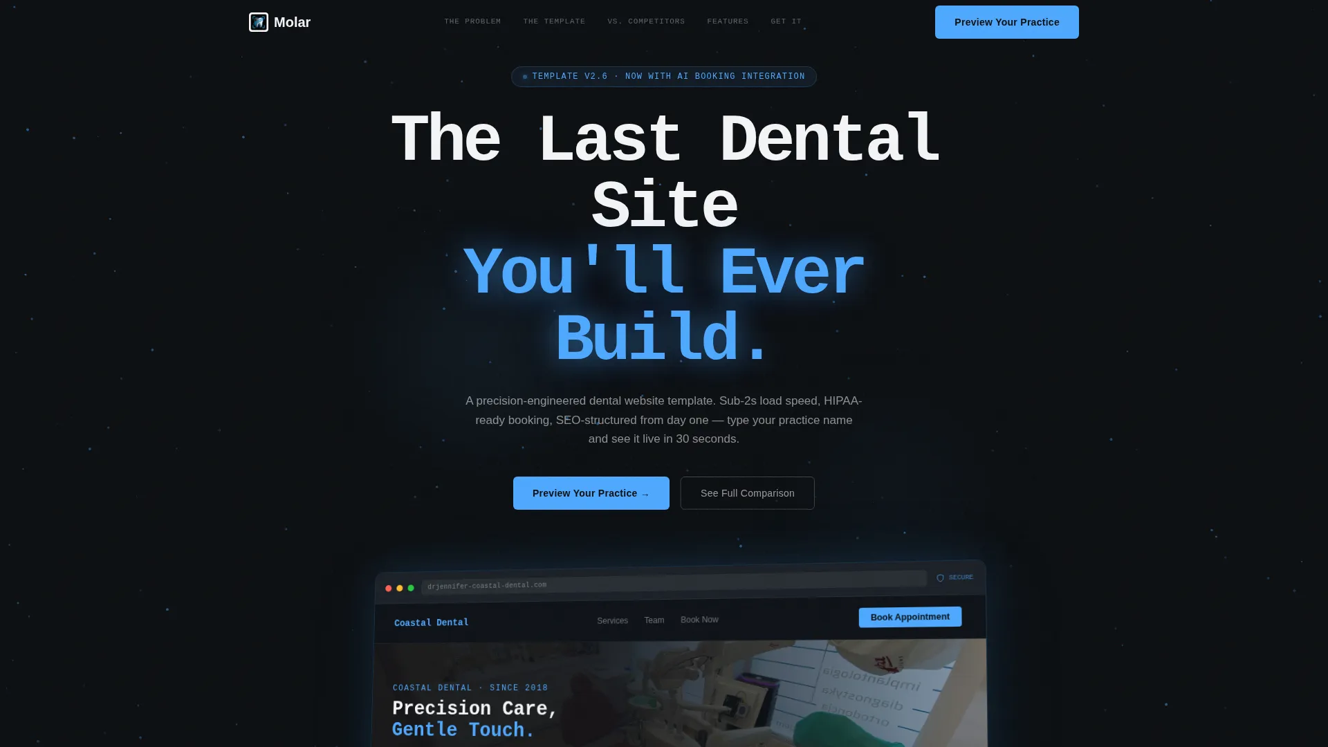
- A dark full-bleed header scene featuring a browser mockup with a blue glow effect, angled in three-quarter perspective
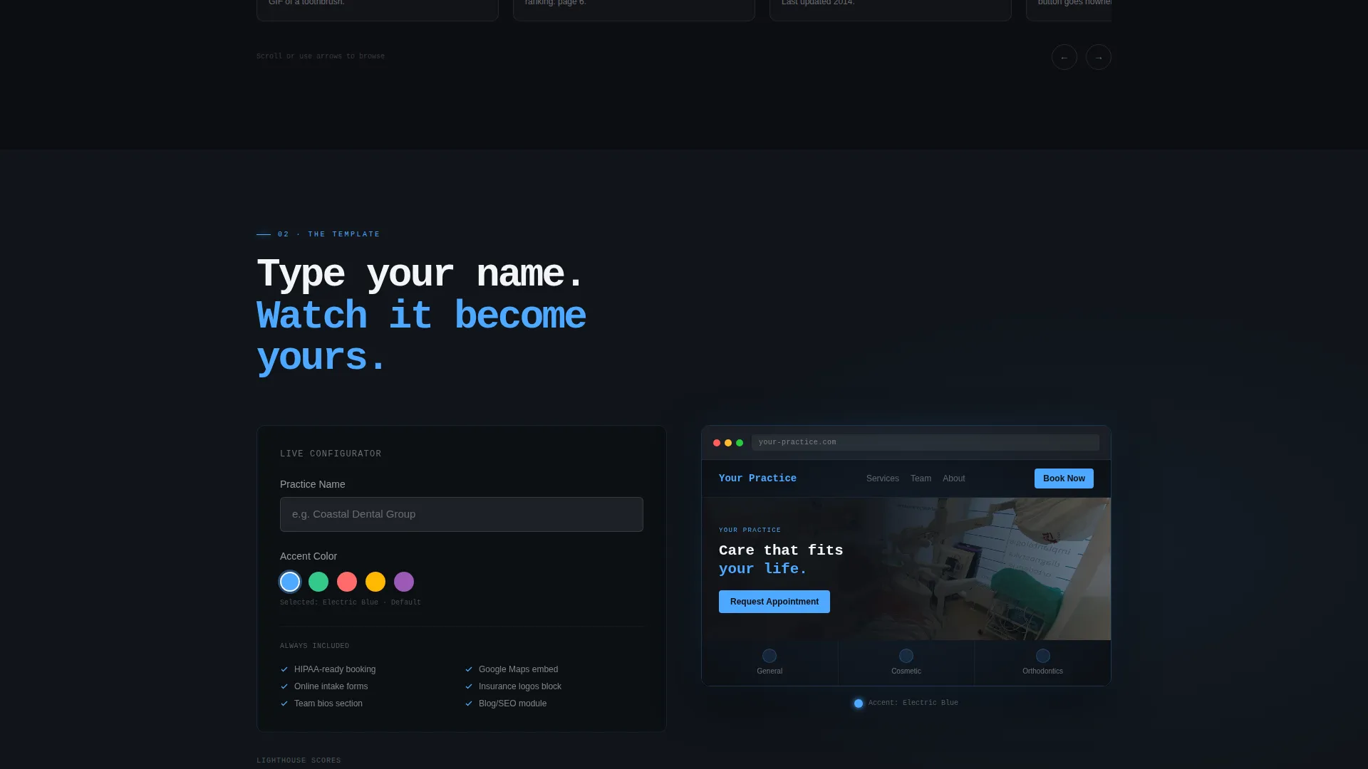
- A live interactive configurator that lets visitors type their practice name and choose a color accent to preview the template in real time
Feature list
Molar ships with a focused set of built-in components. Each one serves a specific role in moving a visitor from skepticism to confidence.
Anchor Navigation Bar
A sticky five-spoke anchor navigation bar pins to the top of the page as visitors scroll. Each link jumps to a named section, keeping orientation clear and reducing friction on a long-form page.
Problem Carousel with Performance Overlays
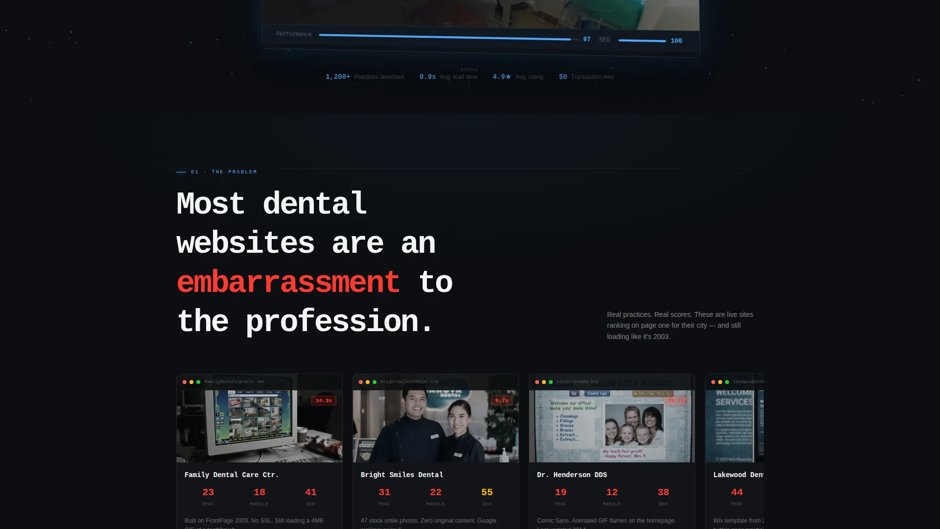
The opening section displays a carousel of poorly designed dental sites, each with a real performance score overlay. Slow load times and failing mobile audit results are shown visually, setting up the template's solution with concrete contrast.
Live Interactive Configurator
The primary call-to-action opens a lightweight configurator. Visitors enter their practice name and select a color accent to see the template re-skin in real time, giving them a personalized preview before they commit.
Comparison Table Section
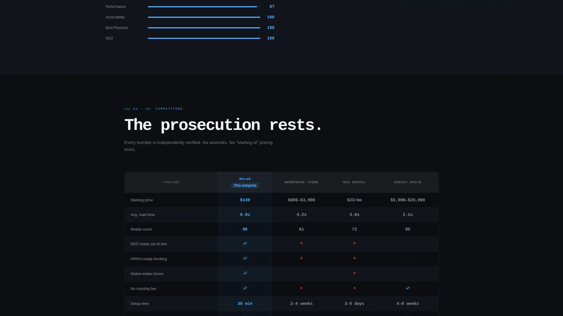
A dedicated side-by-side section compares Molar against other build options across price, load speed, search engine readiness, and booking integration. This gives evaluation-stage visitors a clear, factual decision framework.
Dark Full-Bleed Header with Glow Effect
The header is a cinematic dark scene with a browser mockup floating in pure black. A soft electric-blue glow radiates from behind the device frame, with subtle particle lines tracing the browser edges for visual depth.
Dual Call-to-Action Path
Two calls to action serve different visitor mindsets. "Preview Your Practice" opens the configurator immediately. "See Full Comparison" anchors down to the versus table for visitors who are still researching their options.
Page sections overview
| Section | Purpose |
|---|---|
| Dark Header Scene | Introduces the template with a cinematic browser mockup and headline |
| Anchor Navigation Bar | Pins to top, links visitors to each spoke section instantly |
| The Problem Spoke | Carousel of weak dental sites with performance score overlays |
| The Template Spoke | Live interactive preview showing the template's design and layout |
| versus. Competitors Spoke | Side-by-side comparison table across key decision criteria |
| Features Spoke | Highlights specific built-in components and design capabilities |
| Get It Spoke | Pricing section with primary and secondary call to action paths |
Design & branding system
Molar uses a Tech Glass theme built on a Monochrome Steel color system. The palette feels clinical and intentional, with the electric-blue accent reserved for moments that reward the visitor's attention.
- Four-color palette: surgical black (#0B0E11), instrument-grade steel (#3A3F47), enamel white (#F4F5F7), and electric-blue glow accent (#4DA8FF) for hover states, active navigation indicators, and call to action pulses
- Backgrounds alternate between surgical black and steel sections, with enamel white carrying all body text for maximum contrast
- The blue accent appears sparingly, used only on hover states, active anchor links, and call-to-action buttons to maximize its visual impact
Mobile & speed optimization
The template is structured for clean performance across screen sizes. A lean layout, minimal decorative overhead, and purpose-built sections keep the page fast and readable on any device.
- The anchor navigation bar adapts to mobile viewports, keeping spoke links accessible without crowding the screen
- Section layouts stack vertically on smaller screens, preserving the Problem-to-Solution narrative flow without horizontal scrolling
- The configurator interaction is touch-friendly, so mobile visitors can preview their practice name and color choice without friction
How this template helps you convert
Molar is built around a deliberate conversion architecture. Every section moves the visitor one step closer to clicking "Preview Your Practice" or scrolling to pricing.
- The Problem carousel creates immediate recognition, showing visitors exactly what their current site might look like, and why that matters to their patients.
- The live configurator personalizes the experience before a purchase decision is made, so by the time the visitor reaches the pricing spoke, they have already seen their own practice name on the template.
- The dual call to action system captures both action-ready visitors and researchers, reducing drop-off by meeting each visitor at their current stage of evaluation.
Other information about this template
This section covers additional context about Molar that is useful for buyers making a final decision.
- Molar is categorized under Technology, specifically within the Dental Digital Presence subcategory and the Dental Website Template niche
- The template style is Hub and Spoke with anchor navigation, meaning all sections live on one scrollable page connected by a pinned navigation bar
- The creative direction follows a strict Problem-to-Solution Arc, a layout strategy where contrast between the problem and the solution is built progressively across every spoke
- The lp_direction for this template is Comparison/Versus, meaning the page is specifically structured to help visitors evaluate Molar against alternative build options before deciding
Theme
Tech Glass
Creative direction
Problem→Solution Arc
Color system
Monochrome Steel
Style
Hub & Spoke (Anchor Nav)
Direction
Comparison/Versus
Page Sections
Sticky Anchor Navigation Bar
Problem Carousel with Score Overlays
Live Interactive Configurator
Side-by-side Comparison Table
Dark Full-bleed Header with Glow
Dual Call-to-action Architecture
Related questions
Can I use this template for more than one dental practice?
Do I need design experience to customize this template?
What makes this template visually different from a typical dental website template?
Is this a multi-page website or a single landing page?
What is the primary call to action on this template?



