Welding School Landing Page Template
Torch is a modular card-grid landing page built for welding schools that need to turn skeptical career-changers into enrolled students. The layout follows a Problem-to-Solution arc, opens with employer and certification logo social proof, and drives leads through a friction-minimal three-field form. The dark slate-and-sky color system gives the page a workshop-floor identity that feels earned, not generic.
by Rocket studio
Quick summary
Torch is a high-impact, single-page landing page template designed specifically for welding schools and vocational trade programs. It opens with a scrolling logo bar of employer and certification partners, walks visitors through a Problem-to-Solution card arc, and closes with a low-friction lead form. The result is a page that earns trust visually before it ever asks for a name.
Who this template is for
This template was built for trade school operators, vocational program directors, and welding instructors who need a professional online presence without a large web team. It fits organizations that recruit non-traditional students and need to convert intent fast.
- Welding schools offering MIG, TIG, stick, or flux-core programs
- Vocational and trade training centers targeting career-changers and high school graduates
- Union apprenticeship programs promoting certification pathways and pay-grade advancement
What problem this template solves
Most education landing pages look like every other school's site: a stock photo, a vague headline, and a buried contact form. For a trade school audience, that approach fails immediately. Visitors who have been burned by dead-end paths are quick to leave if a page does not prove its worth in the first scroll.
- Generic school pages do not front-load proof of employment outcomes
- Long enrollment forms cause high dropout rates among trade-focused audiences
- Typical designs fail to match the identity and expectations of hands-on learners
What you get with this template
Torch gives you a complete, single-page layout structured around lead generation. Every section is purposeful, and the design language reinforces the industrial identity of a real welding program. Nothing feels borrowed from a general-purpose education theme.
- A scrolling employer and certification logo bar that builds credibility before the pitch begins
- A modular problem-and-solution card grid with icons, stats, and a progressive color shift from dark to bright
- A persistent mobile bottom bar and a final card cluster call to action, both pointing to the same three-field lead form
Feature list
This section breaks down the core built-in components you receive with the Torch template.
Scrolling Logo Bar Header
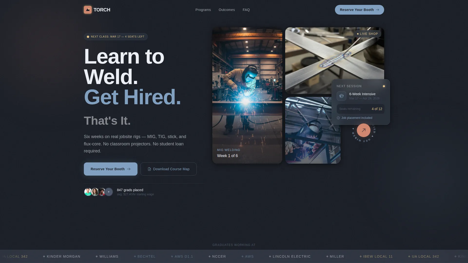
The page opens with a horizontal ribbon of employer partner and certification logos scrolling at a calm, steady pace against a slate background. One oversized headline sits above the bar. A subline naming the next enrollment date and seats remaining appears below it. No hero image competes for attention.
Problem-to-Solution Card Grid
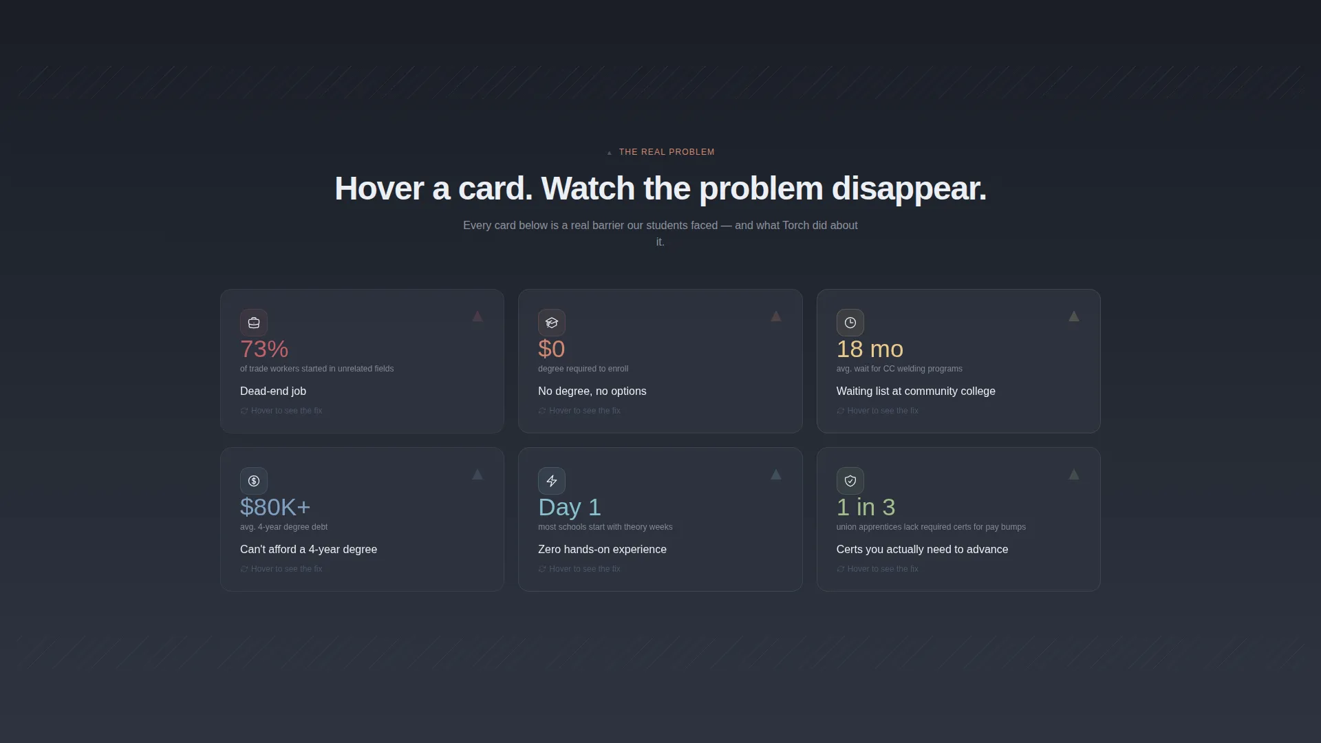
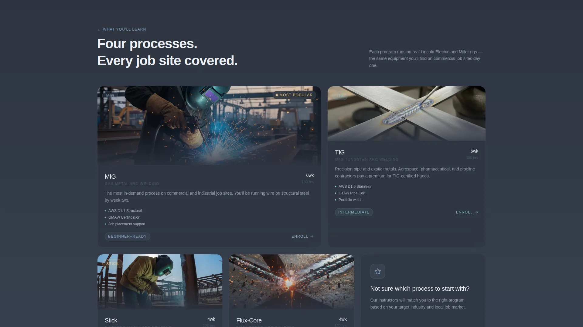
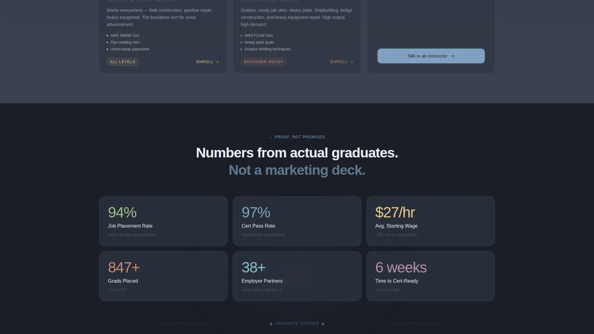
The core layout is a modular card grid that follows a deliberate narrative arc. Early cards surface recognizable pain points with a single icon and one supporting stat each. The grid then pivots to solution cards that match each problem with a program feature, and continues into proof cards showing graduate salary averages, employer partner counts, and certification pass rates.
Progressive Color Shift
As visitors scroll deeper into the page, the color balance shifts. Workshop slate dominates early sections. Open-sky blue bleeds in gradually, section by section, until the lower portion of the page feels noticeably brighter. This visual metaphor reinforces the page's core message without a single word of explanation.
Low-Friction Lead Form
The primary lead capture form contains exactly three fields in sequence: name, phone number, and a single toggle asking whether the visitor is 18 or older. This minimal structure is intentional. The audience targeted by this template abandons longer forms quickly, so reducing friction is a direct conversion strategy built into the layout.
Persistent Mobile call to action Bar
On mobile viewports, a bottom bar carrying the primary call to action, "Reserve Your Booth," stays fixed as visitors scroll. The same call to action repeats inside the final card cluster for desktop users. Both placements point to the same lead form.
Secondary Download Path
A secondary conversion path offers a free downloadable program guide labeled "Download the Course Map." This path captures an email address for follow-up nurture without requiring the full form commitment, giving visitors who are not yet ready to enroll a lower-stakes next step.
Page sections overview
| Section | Purpose |
|---|---|
| Logo Bar Header | Opens with employer and certification partner logos to establish outcome credibility immediately |
| Headline Block | Displays the primary oversized headline, enrollment date, and seats-remaining subline |
| Problem Cards | Introduces pain-point tiles with icons and stats to reflect the visitor's current situation |
| Solution Cards | Answers each problem card with a matching program feature to pivot the narrative |
| Proof Cards | Presents graduate salary averages, employer counts, and certification pass rates |
| Lead Form Cluster | Closes the page with the three-field form and the "Reserve Your Booth" primary call to action |
| Download call to action Block | Offers the secondary "Download the Course Map" path for email capture |
| Mobile Bottom Bar | Keeps the primary call to action persistently visible as visitors scroll on mobile |
Design & branding system
The Torch template uses a Playful Geometric theme built on a Slate and Sky color system. The palette is grounded in workshop realism while staying visually polished. Geometric shapes, including triangles and parallelograms, tile across section dividers at angles that echo bevel plate edges and chamfered joints pulled from blueprint weld symbols.
- Workshop slate (#3B4252) serves as the dominant background, and structural charcoal (#2E3440) fills card surfaces
- Open-sky blue (#81A1C1) activates accent lines and interactive hover states throughout the page
- Arc-flash white (#ECEFF4) is used for headlines and primary body text to maintain strong contrast against dark backgrounds
Mobile & speed optimization
The Torch template is built with a mobile-first audience in mind. The persistent bottom call to action bar ensures that the call to action is never out of reach on a phone screen, which matters for an audience that is likely browsing between shifts or on a job site.
- The three-field lead form is designed to be thumb-friendly and quick to complete on a mobile device
- Card grid modules stack cleanly into a single-column layout on smaller screens without losing visual hierarchy
- The minimal form field count reduces the load placed on visitors arriving through mobile traffic
How this template helps you convert
Torch is structured specifically around the psychology of a skeptical, non-traditional student audience. Every layout decision prioritizes proof and reduces friction before the ask.
- Employer and certification logos appear before any program description, so visitors see the endpoint of enrollment before they read a single feature, and that sequencing builds the trust needed to keep them on the page.
- The problem-card opening validates the visitor's current frustration before pivoting to solutions, which creates a sense that the school understands who it is talking to.
- The two-path conversion system, a quick three-field form for ready visitors and a free course guide download for those who need more time, captures leads at both levels of intent without requiring a separate page.
Other information about this template
Torch was designed to serve the full recruiting funnel for a vocational welding school, from first impression to form submission, within a single focused page. It is well-suited for programs that teach certifications recognized by organizations such as the American Welding Society, as well as programs partnered with trade suppliers like Lincoln Electric or aligned with local union hall apprenticeship pipelines.
- The template style is Card Grid (Modular), making individual sections easy to reorder or swap during customization
- The creative direction, Problem-to-Solution Arc, is baked into the card sequence and works best when left in the intended order
- The header concept, the Logo Bar, is the first visual element a visitor sees and is central to the page's credibility strategy
Theme
Playful Geometric
Creative direction
Problem→Solution Arc
Color system
Slate & Sky
Style
Card Grid (Modular)
Direction
Lead Generation
Page Sections
Scrolling Employer Logo Bar
Problem-to-solution Card Grid
Progressive Section Color Shift
Minimal Three-field Lead Form
Persistent Mobile Call to Action Bar
Secondary Download Conversion Path
Related questions
Can I customize the program details and course names in this template?
Does this template support both desktop and mobile visitors?
How does the two-path lead capture work?
Can other trade programs use this template, or is it only for welding schools?
Why does the logo bar appear before the program description?



