Tower — Network Ops Landing Page Template
Switchboard is a dark-mode telecommunications booking landing page built for telecom ops teams who schedule, provision, and track service installations. The split-screen layout pairs a bold command-center headline with a live-looking dispatch dashboard. It is designed to move visitors from first impression to sign-up with zero friction and maximum operational credibility.
by Rocket studio
Quick summary
Switchboard is a single-page, split-screen landing page template for telecommunications booking software. It combines a dark glass panel header, animated feature sections, and a click-through funnel into one focused layout. The design language is built around a Data Command theme, using electric indigo tones to communicate precision, speed, and technical authority.
Who this template is for
This template is purpose-built for telecom-facing software products that need to earn trust quickly. It speaks directly to operations-heavy teams who make decisions under time pressure.
- Regional telecom operations managers coordinating multiple field technicians across wide service areas
- Enterprise provisioning coordinators managing service-level agreement (SLA) deadlines and circuit activations
- Managed service provider (MSP) dispatchers routing same-day and next-day installation jobs for business clients
What problem this template solves
Telecom scheduling software often gets sold with generic SaaS landing pages that do not reflect the urgency or complexity of the work. A vague or visually bland page loses credibility with experienced ops buyers before they even read the headline.
- Field operations teams need to see the product working before they commit, not just read bullet points about it
- SLA-driven buyers respond to proof of speed and clarity, not marketing promises
- Dispatchers and provisioning coordinators are skeptical audiences who trust what they can observe
What you get with this template
You get a fully structured, single-page landing page layout ready to customize for your telecom scheduling product. Every section is intentional and load-bearing within the conversion funnel.
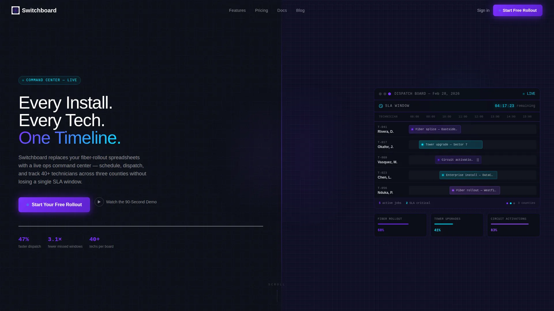
- A split-screen (50/50) header with a bold headline panel and an animated live-dispatch dashboard panel
- A three-column feature strip, a before-and-after comparison section, a rolling metrics band, and a looping product demo video block
- A persistent sticky bottom bar carrying the primary call to action after the metrics section fires
Feature list
This template includes six core layout and interaction components drawn directly from the source brief.
Split-Screen Command Header
The header divides the viewport into two equal glass panels. The left panel holds the primary headline and the main call-to-action button. The right panel shows a color-coded technician scheduling dashboard with an SLA countdown timer rendered in signal cyan. A drag handle mid-animation suggests a live job reassignment in progress.
Simultaneous Three-Column Feature Strip
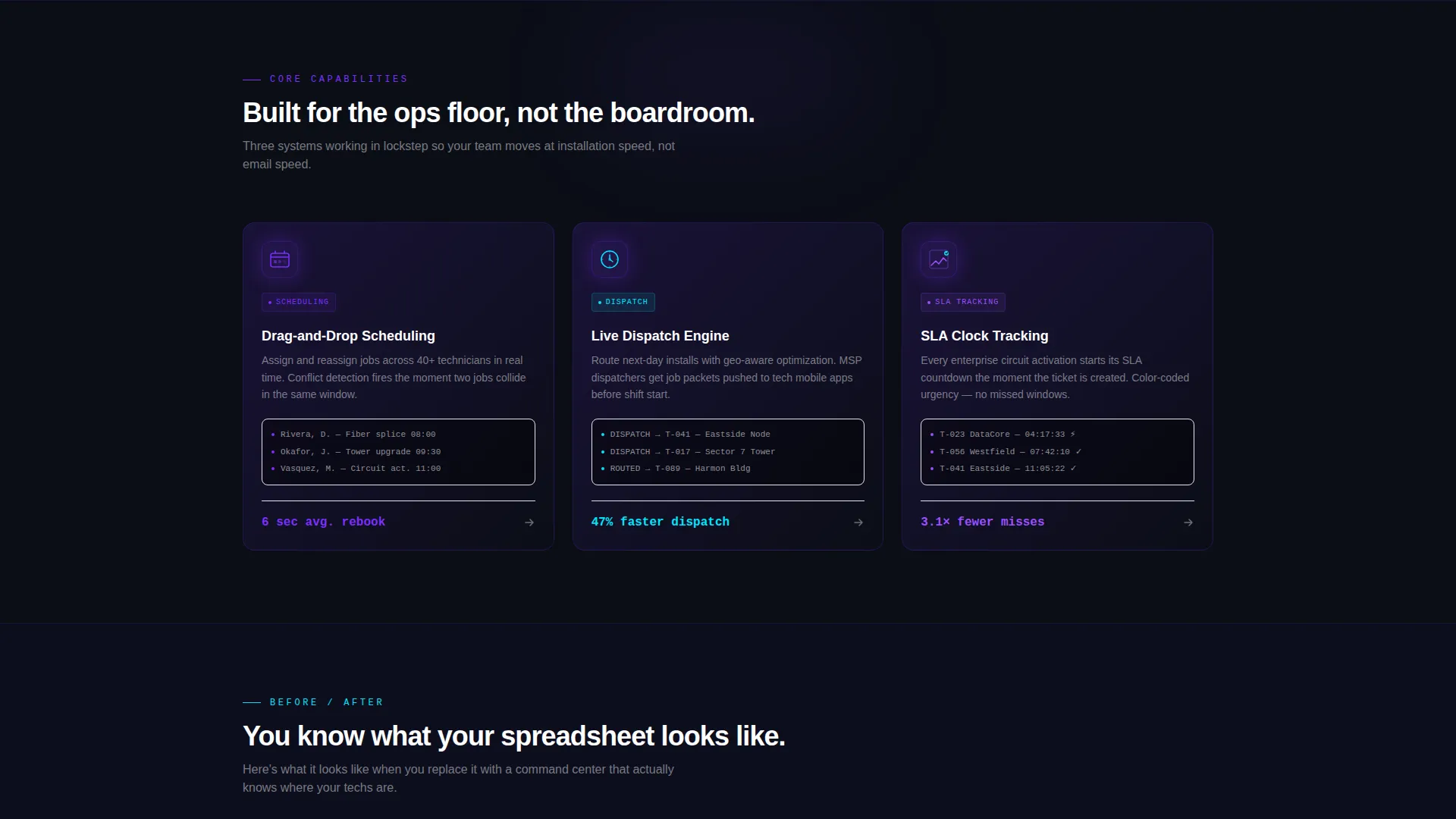
Three feature columns animate into view at the same time, not in sequence. This simultaneous reveal communicates that scheduling, dispatching, and SLA tracking are equally important, not ranked features. The strip maintains visual momentum without asking the visitor to wait.
Before and After Comparison Block
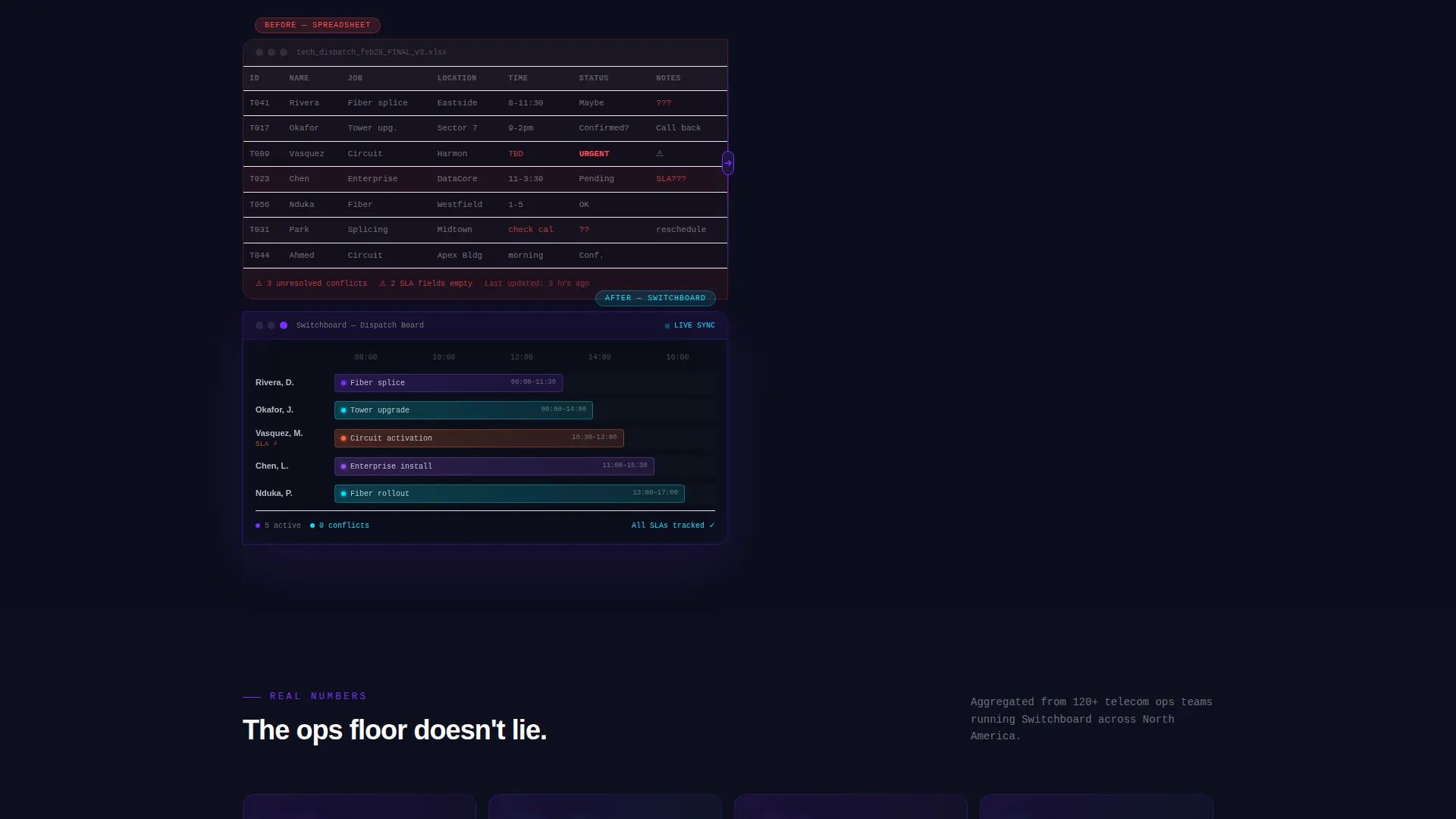
A side-by-side split shows a cluttered spreadsheet on the left against the clean Switchboard calendar view on the right. A "Before / After" label anchors the comparison. This section does the persuasion work without requiring a single line of marketing copy.
Rolling Metrics Band
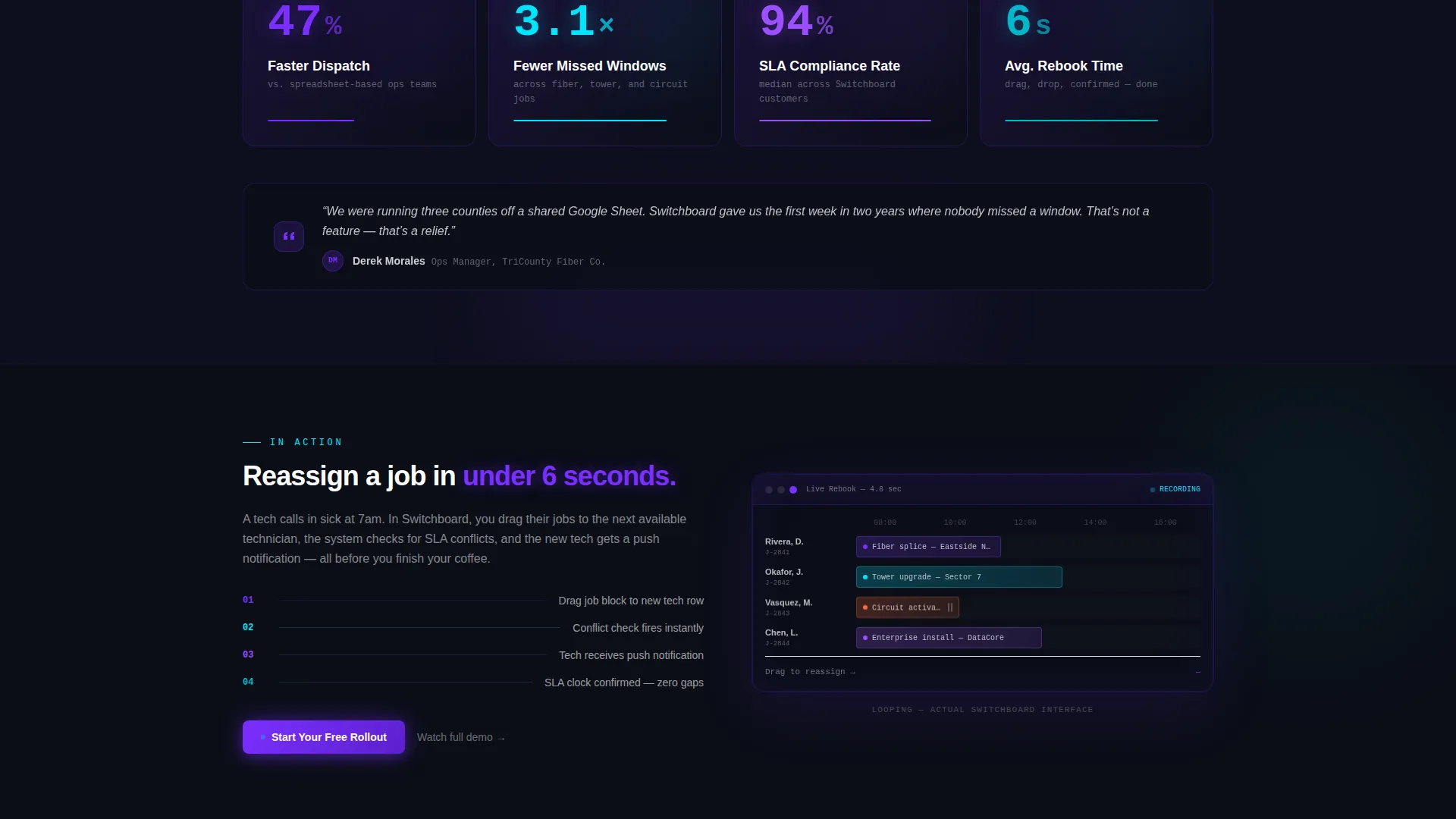
Electric violet counters roll up to display real performance numbers pulled from the brief: 47 percent faster dispatch and 3.1 times fewer missed installation windows. The animated counters reward visitors who scroll and reinforce credibility at a critical decision point in the funnel.
Looping Product Demo Video Block
A short looping video shows a drag-and-drop job rebooking completed in under four seconds. The video runs without user interaction, so the product demonstrates itself passively as the visitor reads surrounding content.
Sticky Click-Through Call-to-Action Bar
After the metrics band, a sticky bottom bar locks the primary call to action in view. The button carries the visitor to a sign-up flow with pre-selected plan context. No form appears on this page, keeping the path to conversion clean and fast.
Page sections overview
| Section | Purpose |
|---|---|
| Dark Glass Header | Splits viewport into headline and live dashboard panels |
| Three-Column Feature Strip | Shows scheduling, dispatch, and SLA tracking simultaneously |
| Before / After Comparison | Contrasts spreadsheet chaos with the clean calendar view |
| Rolling Metrics Band | Displays animated performance counters in electric violet |
| Looping Demo Video | Shows drag-and-drop rebooking completed in four seconds |
| Sticky call to action Bar | Keeps the sign-up action visible after the metrics section |
Design & branding system
The visual identity follows a Data Command theme built entirely around the Electric Indigo color system. Every color choice has a functional purpose, and nothing is included purely for decoration.
- Void black (#0B0E17) fills the primary background; deep indigo (#1E1440) surfaces card layers and section breaks
- Electric violet (#7B2FFF) drives buttons, progress bars, and hover states; signal cyan (#00E5FF) marks live-data accents and confirmation indicators
- Dark glass panels catch faint indigo edge reflections, creating a sense of physical depth on a flat screen without relying on gradients or stock imagery
Mobile & speed optimization
The template is structured with a lean, section-led layout that avoids heavy decorative overhead. Each section is self-contained and loads with directional momentum rather than slow fade-in transitions.
- Animations are designed as simultaneous reveals rather than sequential delays, reducing perceived load time in the browser
- The sticky call to action bar is positioned to remain usable on smaller viewports without obscuring primary content
- The looping video block and animated metrics counters are scoped to defined content containers, keeping layout reflow predictable across screen sizes
How this template helps you convert
Every design and layout decision in this template serves the click-through funnel. Visitors move from intrigue to proof to action without friction.
- The header earns attention immediately by showing the product in use rather than describing it, placing the primary call-to-action button inside the first viewport
- The before-and-after comparison and the rolling metrics band remove the two biggest objections: "does it work better than what I have" and "how much better"
- By the time the sticky call to action bar appears, the visitor has already seen the scheduling dashboard, the comparison proof, the performance numbers, and the live demo video, making the decision feel natural
Other information about this template
This template is built for a specific niche: telecommunications booking software marketed to operations and dispatch professionals. It is not a general-purpose SaaS template.
- The layout style is Split Screen (50/50), a format that divides equal visual weight between the product story and the product itself
- The creative direction is Launch Energy, meaning sections arrive with momentum-driven transitions rather than passive scroll reveals
- The header concept is Dark Glass Panels, a design treatment that uses frosted black-glass surfaces with subtle grid lines suggesting a scheduling matrix
- The landing page direction is Click-Through, with no on-page form; the single goal is to move the visitor to the sign-up flow
- This template is categorized under Technology, within the Telecommunications Software and SaaS subcategory, targeting the telecommunications booking software niche
Theme
Data Command
Creative direction
Launch Energy
Color system
Electric Indigo
Style
Split Screen (50/50)
Direction
Click-Through
Page Sections
Split-screen Dark Glass Header
Simultaneous Feature Strip Animation
Before and After Comparison Section
Animated Rolling Metrics Band
Looping Product Demo Video
Sticky Click-through Call to Action Bar
Related questions
Does this template include an on-page sign-up form?
Can I update the headline, metrics, and feature copy?
Is this template only suitable for telecom products?
What is included in the split-screen header?
How many calls to action does this landing page include?



