Tower — Telecom Infrastructure Landing Page Template
Signal is a hub-and-spoke landing page template built for a telecommunications review management platform. It combines a Data Command visual theme with Dark Glass Panel headers, five anchor-nav spoke sections, and an App Download conversion path. The template gives telecom ops directors, MVNO experience leads, and retail managers a single command center view of customer sentiment across every carrier touchpoint.
by Rocket studio
Quick summary
Signal is a single-page, hub-and-spoke landing page template for a telecom review management platform. It pulls every customer review, from app stores to carrier forums to BBB complaints, into one command center interface. The design runs on an Electric Indigo color system and a Data Command theme. The primary conversion goal is an app download.
Who this template is for
This template is built for teams in the telecommunications industry who live inside churn data and customer sentiment reports. It speaks directly to people who need fast answers, not more noise.
- Regional telecom operations directors who monitor churn signals across multiple markets
- VP-level customer experience leads at MVNOs (Mobile Virtual Network Operators) defending Net Promoter scores to executive boards
- Frontline retail managers at carrier stores who need to know why their location's star rating dropped overnight
What problem this template solves
Telecom teams currently have no single place to watch customer sentiment move in real time. Reviews scatter across app stores, social threads, carrier forums, and complaint boards, and no one connects the dots until churn has already started.
- Visitors arrive without a clear picture of how fragmented their review data really is
- The page builds urgency by showing exactly what gets missed when teams rely on manual monitoring
- Each spoke section moves visitors from feeling blind to feeling in control, step by step
What you get with this template
You get a fully structured hub-and-spoke landing page built around five anchor-navigated spoke sections. The layout is designed to immerse visitors in the product before asking them to download it.
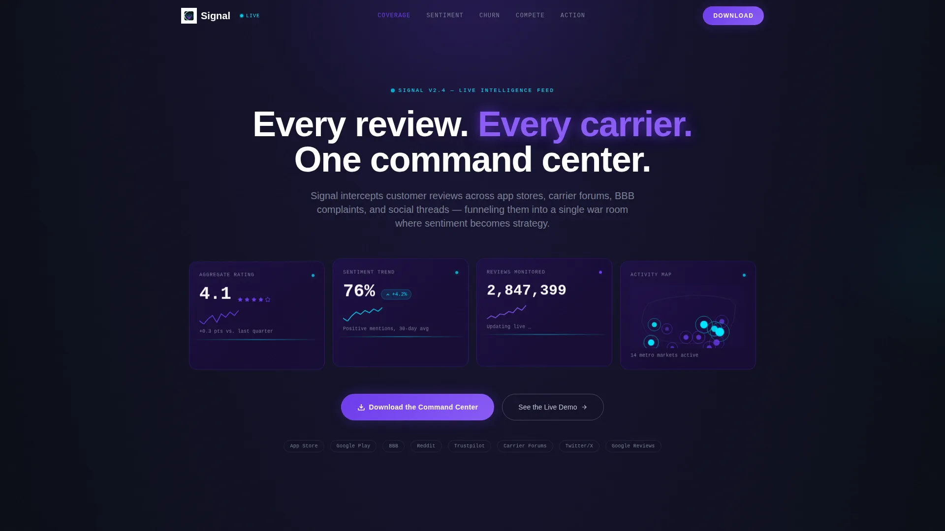
- A Dark Glass Panel header showing four live-style metrics: aggregate star rating, sentiment trend, review volume, and a geographic heat dot map
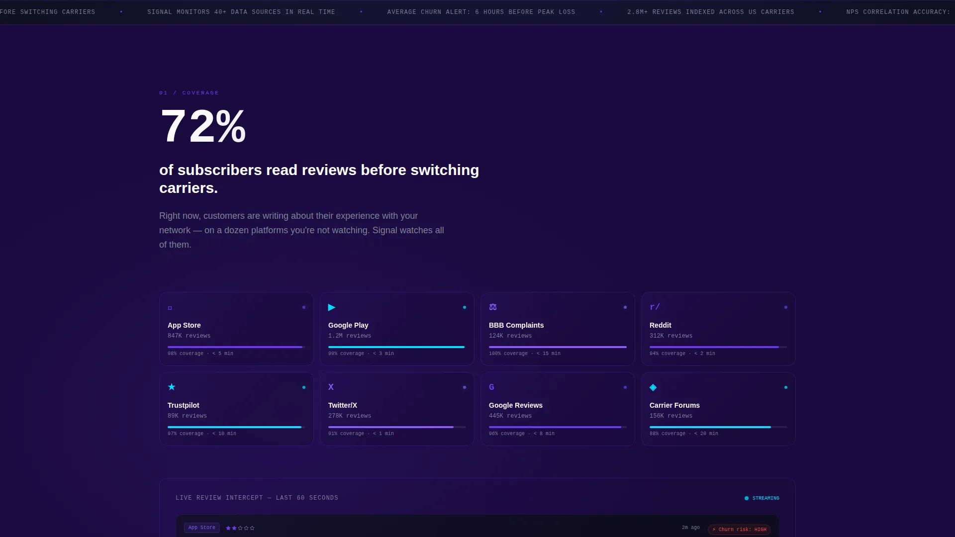
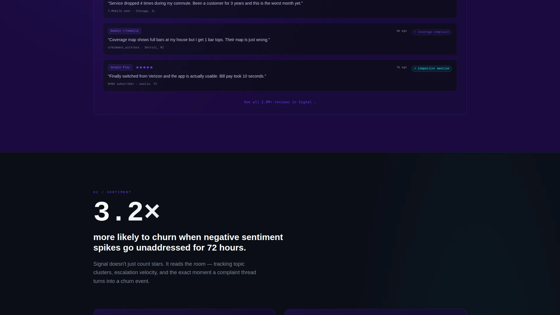
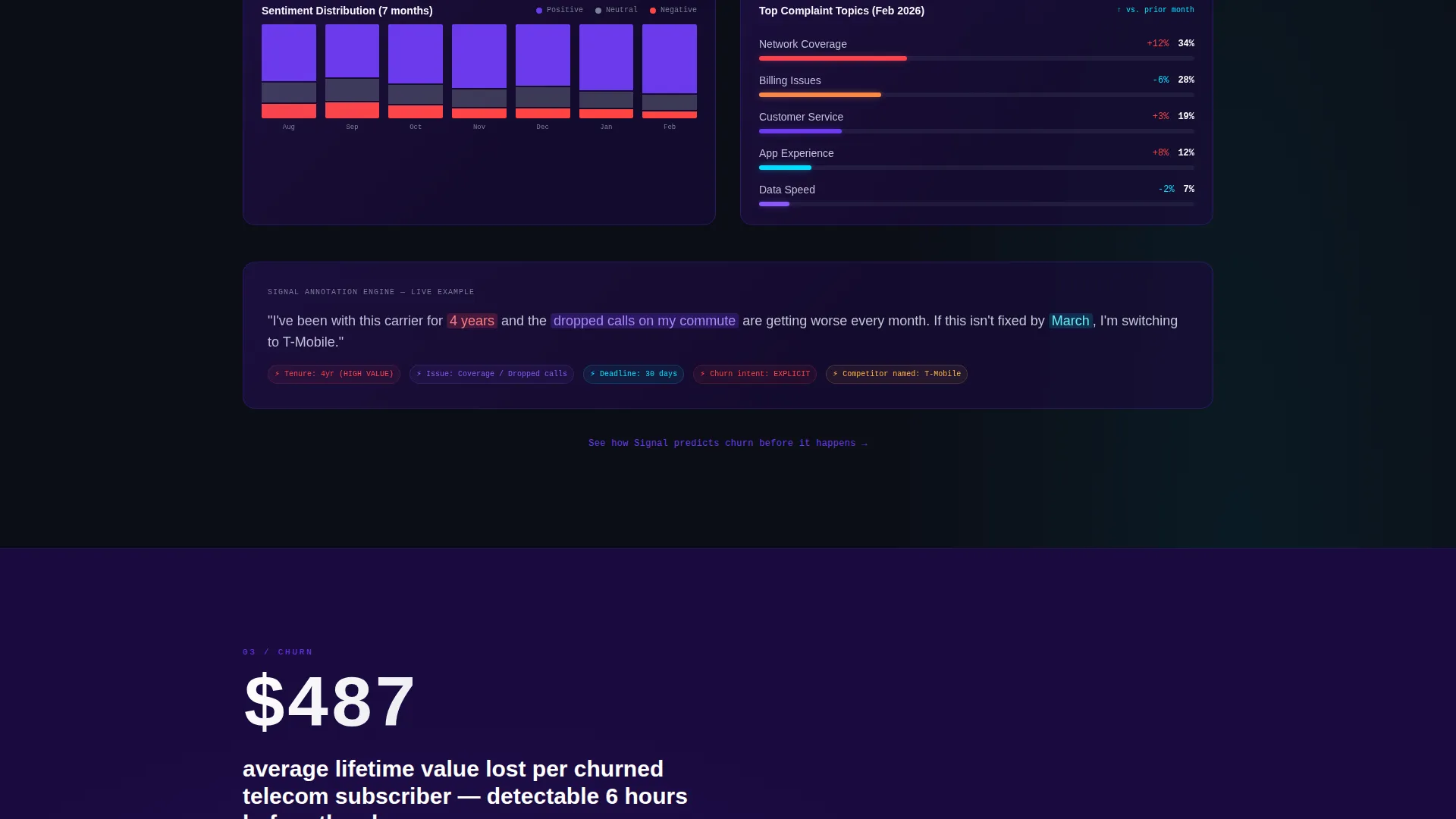
- Five spoke sections (Coverage, Sentiment, Churn, Compete, Action) each opening with a bold industry stat, interactive chart area, annotated review snippets, and a product screenshot
- A primary App Download call-to-action with App Store and Google Play badges, a phone-number field for SMS download, and a secondary "See the Live Demo" path for enterprise evaluators
Feature list
This template ships with purpose-built components that serve a telecom review command center experience from the first scroll to the final conversion.
Dark Glass Panel Metrics Header
Four translucent, frosted-glass panels float over the void-black canvas. Each panel displays a distinct live-style metric: aggregate star rating with a micro-sparkline, sentiment trend arrow, review volume counter, and a continental U.S. geographic heat dot map. No stock photography is used. The product interface is the visual.
Hub-and-Spoke Anchor Navigation
A persistent top navigation bar links to five named spoke sections: Coverage, Sentiment, Churn, Compete, and Action. Visitors can jump directly to the insight most relevant to their role. The anchor nav keeps the page scannable without losing the emotional arc.
Industry Report Spoke Sections
Each spoke section opens with a bold telecom industry statistic to anchor the insight. Sections then unpack the data with an interactive chart area, annotated review snippets, and a product screenshot. The arc moves from awareness to diagnosis to control across the full scroll.
Interactive Sample Data Experience
Visitors can engage with anonymized sample data inside each spoke section before reaching any call-to-action. This lets them experience the platform's interface firsthand. By the time they reach the download prompt, they have already used the product.
Multi-Path App Download Conversion Block
The primary call-to-action is "Download the Command Center" with paired App Store and Google Play badges. A phone-number input field sends a direct SMS download link, reducing friction for mobile-first users. A secondary "See the Live Demo" button serves enterprise evaluators who need proof before committing.
Micro-calls to action per Spoke Section
Each spoke section ends with a micro call-to-action that deepens visitor commitment without interrupting the scroll flow. These incremental prompts build toward the final download conversion naturally. No single section feels like a hard sell.
Page sections overview
| Section | Purpose |
|---|---|
| Dark Glass Header | Display four live-style metrics and headline |
| Anchor Nav Bar | Persistent links to all five spokes |
| Coverage Spoke | Show review source breadth across touchpoints |
| Sentiment Spoke | Visualize sentiment trends and review tone |
| Churn Spoke | Surface churn signals buried in review data |
| Compete Spoke | Benchmark against competitor review performance |
| Action Spoke | Turn insight into prioritized response steps |
| App Download call to action | Drive downloads via badges, SMS, and demo path |
Design & branding system
The Electric Indigo color system creates a dark, high-contrast environment that mirrors the feel of a live network operations center. Every color choice reinforces signal strength and data clarity.
- Core palette: void black (#0B0E17) as the canvas, deep indigo (#1A0A3E) for section backgrounds, electric violet (#6C3AED) for active states and highlights, cool silver (#C4C9D4) for body text, and cyan (#00E5FF) for live data accents and notification badges
- Typography and text rendering use the silver-on-black terminal aesthetic to keep body copy readable against dark backgrounds
- Visual identity relies entirely on interface panels and data visualizations rather than photography or illustration
Mobile & speed optimization
The template is designed with mobile-first telecom managers in mind. The SMS download path exists specifically because many users will hit this page between store shifts on a smartphone.
- The phone-number input field for SMS download reduces friction for visitors who prefer not to navigate app stores manually
- The App Store and Google Play badge pairing ensures download access works regardless of the visitor's device ecosystem
- The persistent anchor navigation keeps long-scroll spoke sections accessible on smaller screens without requiring a return to the top
How this template helps you convert
The conversion strategy is built on earned trust. Visitors do not just read about the platform. They interact with it before they are asked to download anything.
- The interactive sample data in each spoke section lets visitors experience real platform behavior, so the download call to action arrives after the product has already demonstrated its value
- The dual conversion path (direct app download plus "See the Live Demo") matches the two dominant buyer mindsets: mobile-first retail managers who want the app now, and enterprise evaluators who need a guided proof of concept first
Other information about this template
Signal is designed specifically for the telecommunications review management niche. It fits teams inside regional carriers, MVNOs, and carrier retail operations who need a single source of truth for customer sentiment.
- The template style is Hub and Spoke with Anchor Navigation, making it suitable for platforms with multiple distinct data domains that share one unified interface
- The Data Command theme and Industry Report creative direction give the page the credibility weight of a quarterly earnings brief, which aligns with how VP-level buyers evaluate enterprise tools
- The "Every review. Every carrier. One command center." headline captures the core platform promise and doubles as the page's emotional anchor
- Template categories: Technology, Telecommunications Software and SaaS, Telecommunications Review Management
Theme
Data Command
Creative direction
Industry Report
Color system
Electric Indigo
Style
Hub & Spoke (Anchor Nav)
Direction
App Download
Page Sections
Dark Glass Panel Metrics Header
Hub-and-spoke Anchor Navigation
Industry Report Spoke Sections
Interactive Sample Data Experience
Multi-path App Download Conversion Block
Per-section Micro Call-to-actions
Related questions
Who is this landing page template designed for?
What does the hub-and-spoke layout mean for this page?
Can visitors interact with the product before downloading?
What conversion paths does this template include?
Is this template suitable for a dark-themed brand identity?



