Consumer App & Platform Pricing Website Template
Track is a modular card-grid landing page template built for package tracking apps. It showcases a unified carrier dashboard that consolidates shipment data from 900-plus carriers into one real-time timeline. Designed with an Acid Digital color system and an Industry Report creative direction, it drives freemium sign-ups with a single bold input field and a clear trial call to action.
by Rocket studio
Quick summary
Track is a single-page landing page template purpose-built for package tracking platforms. It presents fragmented multi-carrier shipping as a solvable problem, then delivers the solution through a high-contrast modular card grid. The layout moves visitors from awareness to sign-up with minimal friction, using data-backed copy, a live-input header, and a freemium trial flow.
Who this template is for
This template speaks directly to operational roles in e-commerce and logistics. It is built for people who live inside shipping portals every day and need a faster way to present a unified tracking solution to their audience.
- E-commerce operations managers handling multiple Shopify order queues across several carriers
- Third-party logistics coordinators managing less-than-truckload and last-mile shipments across six or more carrier portals
- Direct-to-consumer founders who personally field "where is my package?" questions dozens of times each week
What problem this template solves
Multi-carrier tracking is an operational tax. Most e-commerce teams check four to five separate carrier portals per day, losing time and accuracy with every tab they open. This template makes that pain visible and positions a unified dashboard as the obvious fix.
- Fragmented carrier portals create duplicate work and delay responses to shipping exceptions
- Customer inquiry overload grows when buyers cannot self-serve their shipment status in one place
- No single branded destination exists to communicate carrier coverage, live tracking, and trial access at once
What you get with this template
You get a fully structured, single-page layout ready to represent a package tracking application. Every section is modular, visually independent, and built to move a reader from problem-aware to trial-ready.
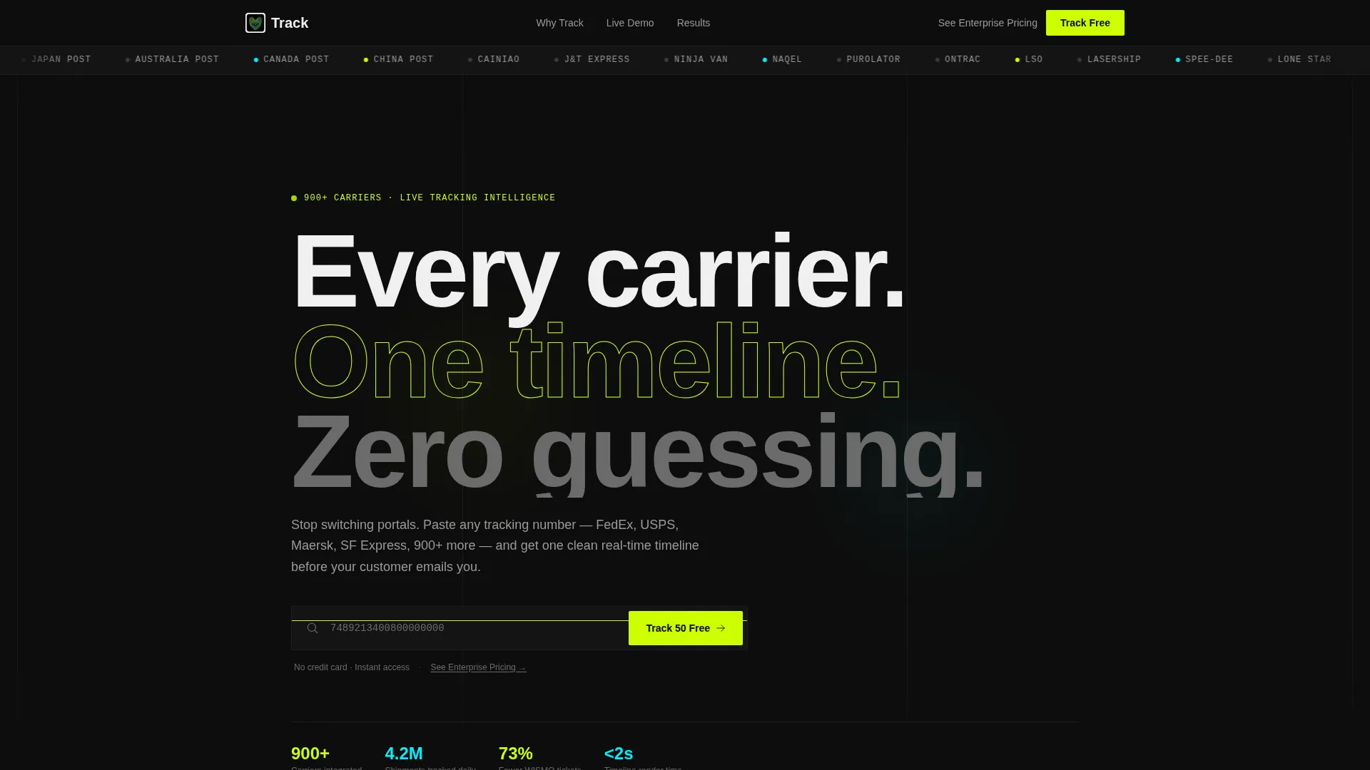
- A continuously scrolling carrier logo bar featuring 40-plus carrier brand marks rendered in monochrome white on void black
- A modular card grid that scales in density as the visitor scrolls, mimicking operational overwhelm before resolving to a clean dashboard screenshot
- Two conversion paths: a primary "Track 50 Packages Free" call to action and a secondary "See Enterprise Pricing" text link, both repeated across the page
Feature list
This section covers the core functional and visual components delivered by the Track template.
Oversized Tracking Input Header
A full-width input field anchors the top of the page. Placeholder text cycles through real tracking number formats to communicate carrier breadth instantly. The submit button reads "Track 50 Packages Free" and serves as the primary freemium entry point.
Continuous Carrier Logo Bar
A horizontal auto-scrolling strip displays 40-plus carrier logos in monochrome white against void black. It functions like a departures board and signals carrier coverage before the visitor reads a single line of copy.
Modular Industry Report Card Grid
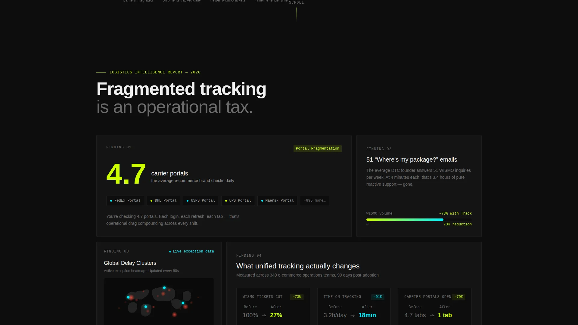
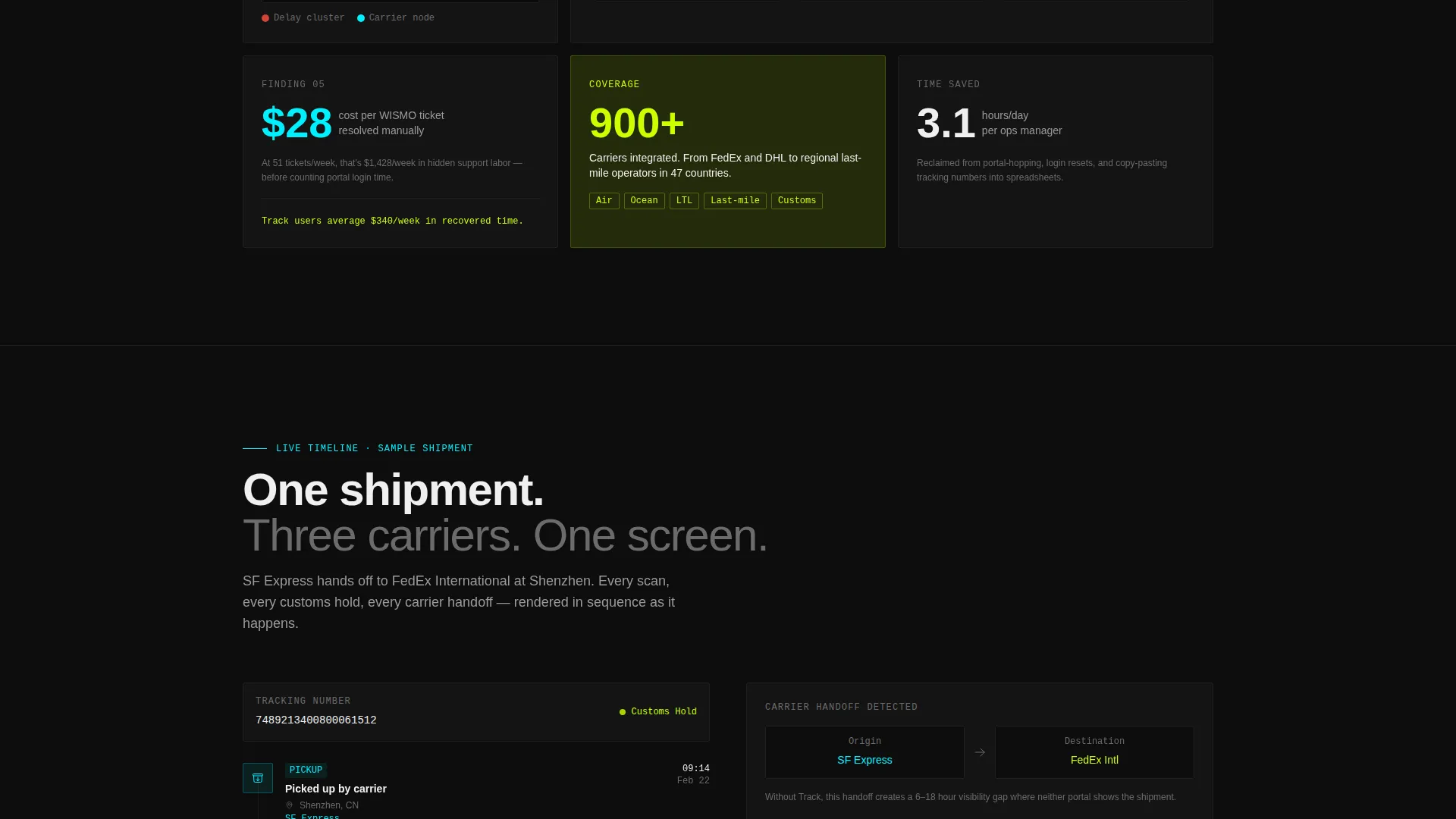
Each card presents a standalone data point about fragmented carrier tracking. Cards include a stat on average carrier usage per brand, a live-rendered delivery exception heatmap, and benchmark figures on customer inquiry reduction. The grid tightens in density as the user scrolls downward.
Sticky Freemium Conversion Bar
After the third card, a sticky bottom bar appears and repeats the primary call to action. It stays visible as the visitor continues scrolling, maintaining conversion pressure without interrupting the content flow.
Full-Width Dashboard Reveal Card
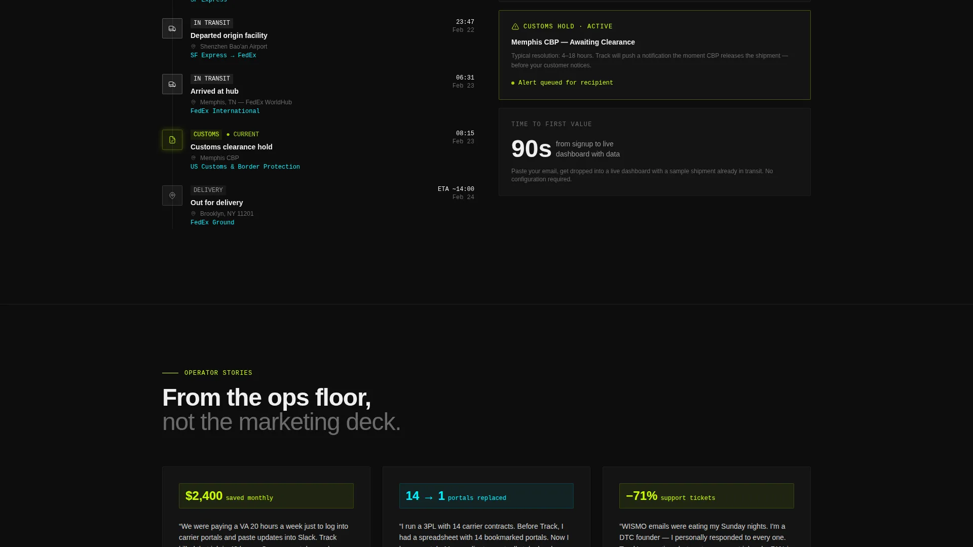
A single full-width card breaks the dense grid pattern near the bottom of the page. It displays a clean dashboard screenshot with generous white space, creating a visual resolution to the scrolling intensity above it.
Dual Call-to-Action Conversion System
Every primary call-to-action placement is paired with a secondary "See Enterprise Pricing" text link. This serves two distinct audience segments: trial users starting with a work email and high-volume enterprise leads who need a pricing conversation first.
Page sections overview
| Section | Purpose |
|---|---|
| Carrier Logo Bar | Communicates 900-plus carrier coverage at a glance through continuous logo scroll |
| Tracking Input Hero | Captures visitor attention and drives immediate freemium trial entry |
| Problem Statement Card | Frames multi-carrier fragmentation as a measurable operational cost |
| Exception Heatmap Card | Shows a live-rendered global delay cluster map to establish product credibility |
| Inquiry Reduction Card | Presents benchmark stats on customer support volume reduction after adoption |
| Sticky Trial Bar | Repeats primary call to action after the third card to recapture scrolling visitors |
| Dashboard Reveal Card | Full-width screenshot with white space that resolves the grid's visual tension |
Design & branding system
The Track template uses an Acid Digital color system built around four specific values. Every color has an assigned function, so the visual hierarchy is self-explanatory and machine-readable at a glance.
- Void black (#0D0D0D) grounds every card and section background, creating a dark fulfillment-center atmosphere
- Electric chartreuse (#CCFF00) dominates all call-to-action elements and live data highlights to demand attention without decoration
- Scanner-laser cyan (#00F0FF) marks carrier nodes, map pins, and timeline connectors throughout the card grid
- Status-bar white (#F0F0F0) carries all body text, headline copy, and timeline connectors for clean legibility on dark fields
Mobile & speed optimization
The modular card grid layout is structurally well-suited for smaller screens. Each card is self-contained, which means the grid reflows naturally without losing its logical reading order on a phone.
- Cards stack vertically on narrow viewports, preserving the density-increase scroll effect on mobile
- The sticky conversion bar remains anchored at the bottom of the viewport across all screen sizes
- The carrier logo scroll strip is horizontally continuous, so it works as an infinite loop regardless of viewport width
How this template helps you convert
The page is engineered around a freemium sign-up model. Every design decision reduces friction between first impression and trial activation.
- The input field is the hero. Visitors interact with the tracking field before they read a headline, which creates behavioral commitment early in the session.
- The card grid builds cumulative evidence. Each self-contained card adds one more reason fragmented tracking is a problem, so the call to action at the bottom feels inevitable rather than pushy.
- The sign-up flow asks only for a work email, then drops the user into a live dashboard with a sample shipment already in transit. Value arrives before any configuration is required.
Other information about this template
This template is part of a Technology category build targeting the Consumer App and Platform subcategory, with a specific focus on the package tracking app niche. It carries an intersection match score of 13, indicating a tight alignment between its design direction and niche intent.
- The Directory and Discovery theme shapes the overall browsing feel, making carrier coverage feel comprehensive and organized rather than overwhelming
- The Industry Report creative direction gives the scroll a briefing-style authority, so each card reads as evidence rather than marketing copy
- The template style is Card Grid (Modular), meaning individual sections can be reordered, removed, or duplicated without breaking the visual system
- The header concept is a Logo Bar, which is a recognized pattern in directory and aggregator products to establish breadth upfront
- The landing page direction is Freemium and Trial, so all copy and layout decisions prioritize low-barrier entry over long-form persuasion
Theme
Directory & Discovery
Creative direction
Industry Report
Color system
Acid Digital
Style
Card Grid (Modular)
Direction
Freemium/Trial
Page Sections
Oversized Tracking Input Hero
Continuous Carrier Logo Bar
Modular Industry Report Cards
Density-escalating Card Grid
Sticky Freemium Conversion Bar
Dual Conversion Path System
Related questions
Who is this landing page template designed for?
Can I change the carrier logos in the scrolling logo bar?
Does the template include a working tracking input field?
How does the card grid density effect work?
What is the secondary conversion path in this template?



