Agriculture Software & SaaS Specialist Reviews Website Template
Cultivar is a bento grid landing page template built for agriculture review management platforms. It pairs a Data Command visual theme with a Comparison/Versus layout to show exactly what fragmented reputation tracking costs, and what a unified command console delivers. The design is bold, data-rich, and built to convert agricultural industry buyers into free audit signups.
by Rocket studio
Quick summary
Cultivar is a single-page bento grid template designed for agriculture reputation and review management platforms. It opens with an interactive dashboard preview loaded with realistic ag-industry data, then walks visitors through a side-by-side comparison of life before and after a unified review command console. Every section builds urgency and ends with a clear call to action.
Who this template is for
This template is built for software and SaaS teams serving the agriculture sector who need to communicate complex data value quickly and credibly. It speaks directly to buyers who understand soil, yield, and supplier relationships, not abstract tech jargon.
- Ag cooperative marketing directors tracking member sentiment across multiple counties
- Precision agriculture consultants whose recommendations depend on verified peer reviews
- Regional equipment dealers managing reputation across multiple review platforms
What problem this template solves
Agriculture businesses lose deals to unmonitored reviews, fragmented rating sources, and manual tracking spreadsheets that never give a complete picture. This template frames that pain visually and immediately, before a single scroll.
- Scattered reviews across Google, equipment dealer directories, and crop input platforms are impossible to monitor manually
- Blind spots in competitor sentiment leave sales teams reacting too late
- A single unanswered low-star review on a high-traffic platform can redirect a purchasing decision
What you get with this template
The template delivers a full single-page layout structured as a Spec Sheet, where every bento section functions like a capability block from a product data sheet. The layout is opinionated, directional, and built to close.
- An interactive header preview tile grid pre-loaded with agriculture review data and hover-responsive animations
- A Comparison/Versus scroll structure with muted "Without" cards on the left and teal-bordered "With" cards on the right
- A sticky bottom bar with the primary call to action that appears after the third scroll section
- A two-step conversion form and a secondary "See How You Compare" lead capture path
Feature list
This section covers the core capability blocks built into the Cultivar template.
Interactive Bento Header Preview
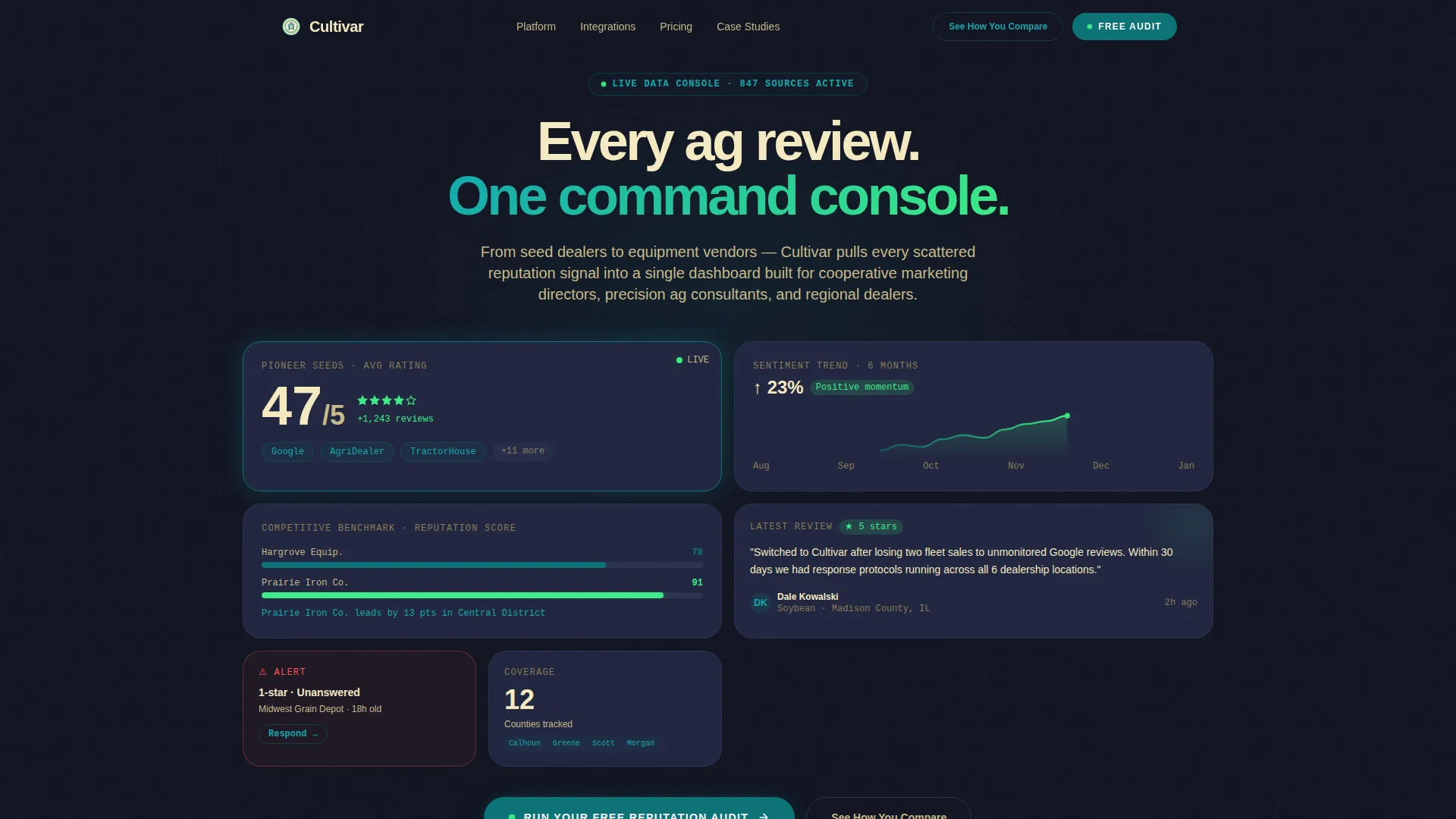
The header is a functioning bento grid mockup of the actual dashboard. It displays a tile showing average rating and total review count for a fictional seed brand, a six-month sentiment trend line, a competitive comparison bar chart between two equipment dealers, and a recent five-star review with county and crop type visible. Cards lift on hover, numbers animate, and the sentiment graph redraws, making the product's value clear before any copy is read.
Comparison/Versus Scroll Layout
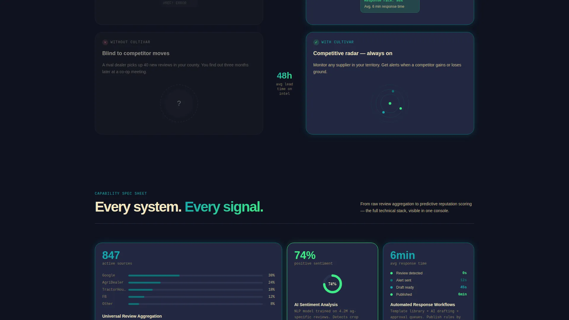
Each scroll section pairs a muted loam-card "Without Cultivar" block on the left against a teal-bordered "With Cultivar" block on the right. The contrast escalates row by row, from basic review aggregation to automated response workflows, competitive benchmarking, and predictive reputation scoring. The gap widens with every section, making the cost of inaction progressively heavier.
Sticky Conversion Bar
After the third scroll section, a sticky bottom bar locks the primary call to action into the viewport. The bar remains visible as visitors scroll deeper into the comparison argument, keeping the signup path accessible at exactly the moment conviction peaks.
Two-Step Lead Capture Form
The primary call-to-action button opens a focused two-step form. Step one collects the business name and primary review platform via a dropdown. Step two asks for number of locations and the visitor's biggest review challenge through a multi-select field. The form is short, specific, and built to reduce friction without sacrificing lead quality.
Secondary Curiosity-Driven call to action
A lighter conversion path labeled "See How You Compare" generates an instant competitive snapshot against one named rival using public review data. This path captures leads through curiosity rather than commitment, giving hesitant visitors a lower-stakes reason to engage.
Spec Sheet Section Structure
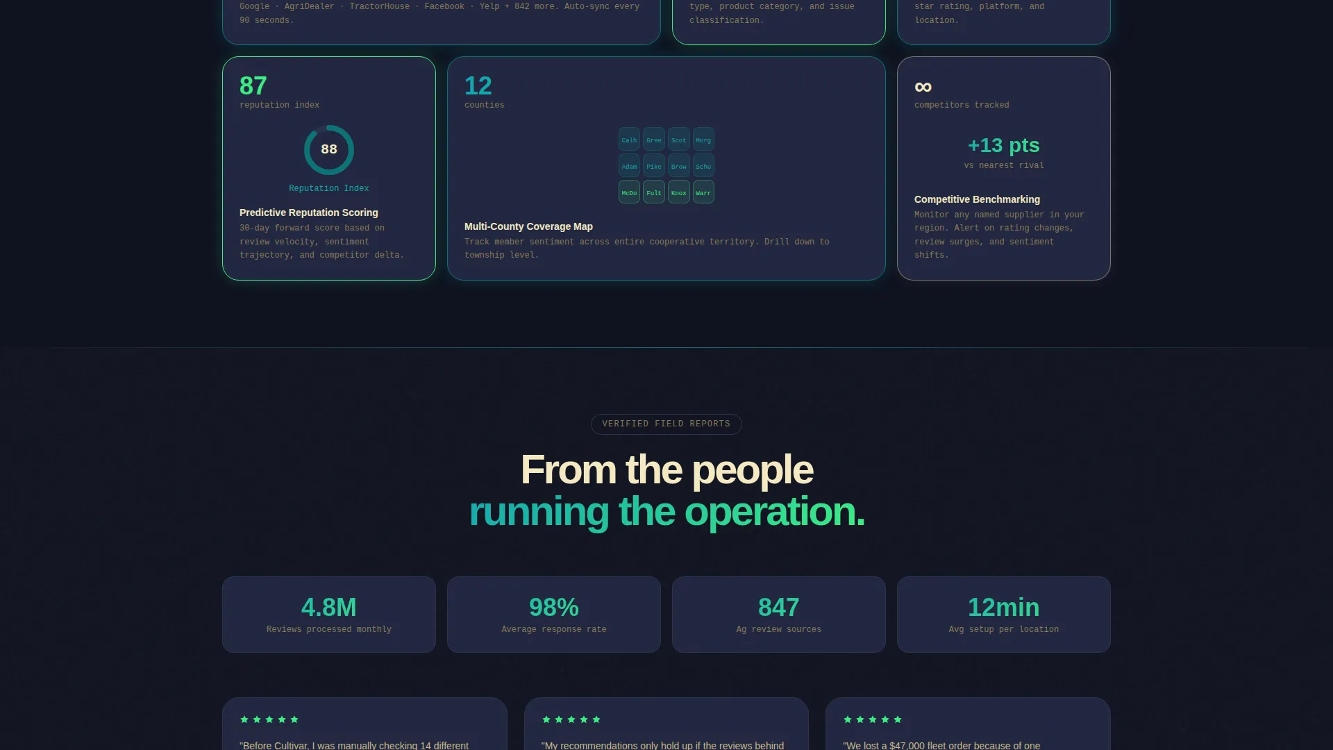
Each bento block below the header follows a product data sheet format: one metric, one micro-visualization, and one spec line. This structure keeps the page scannable and technically credible, matching the decision-making language of ag-industry buyers who already read equipment spec sheets.
Page sections overview
| Section | Purpose |
|---|---|
| Interactive Header Preview | Showcases live-style dashboard tiles with hover animations and the primary audit call to action |
| Review Aggregation Row | Compares fragmented manual tracking against unified review collection |
| Response Workflow Row | Contrasts slow manual replies with structured response capability blocks |
| Competitive Benchmarking Row | Shows blind competitor monitoring versus side-by-side rival comparison tiles |
| Predictive Scoring Row | Escalates the argument with forward-looking reputation score visualization |
| Sticky Bottom Bar | Keeps the primary call to action visible after scroll section three |
| Two-Step Capture Form | Collects business context across two focused form steps |
| Secondary call to action Block | Offers the competitive snapshot path for lower-commitment lead capture |
Design & branding system
The Teal Catalyst color system gives the template a technical, field-ready identity. Every color choice is functional, palette decisions map directly to data states and interaction layers rather than decoration.
- Deep field teal (#0D7377) drives interactive borders, hover states, and primary action buttons; dark loam (#1A1E2C) grounds card backgrounds and data panel tiles
- Harvest wheat (#F4E8C1) warms all headline and key metric typography so dense data never feels clinical
- Catalyst green (#3DEC85) pulses on positive sentiment indicators, upward trend lines, and success states throughout the scroll
Mobile & speed optimization
The bento grid layout is structured so tiles reflow cleanly from a multi-column desktop grid into a single-column mobile stack. The interactive header preview is designed to remain navigable and visually coherent on smaller screens.
- Hover animations on desktop translate to tap interactions on touch devices, preserving the demo-like quality of the header
- The sticky conversion bar maintains its position across screen sizes, keeping the primary call to action reachable at any viewport width
How this template helps you convert
Cultivar is engineered around a comparison-driven urgency model. Every design and layout decision pushes a qualified visitor toward a specific, low-friction action.
- The interactive header preview creates immediate product credibility before any marketing copy appears, so visitors arrive at the first call to action already primed by what they have seen rather than only what they have read.
- The Comparison/Versus structure makes the cost of inaction concrete and visual, each row widens the gap between the fragmented status quo and the platform's unified view, so by the time the visitor reaches the sticky bar, the decision feels self-evident.
Other information about this template
Cultivar is built for teams in the agriculture software and SaaS space who need a landing page that can hold its own against the technical literacy of its audience. The template style is bento grid, the theme is Data Command, and the creative direction follows a Spec Sheet approach borrowed from equipment and input product literature that ag buyers already trust.
- The template is well-suited for agriculture review management platforms, reputation monitoring tools, and supplier sentiment dashboards targeting cooperative marketplaces
- The color system and layout language are designed to evoke a weather radar overlaid on a topographic map, technical and alive, where every element is doing a visible job
- The page direction is Comparison/Versus, which suits competitive SaaS positioning where the cost of the current workflow needs to be visible before the product pitch lands

Theme
Data Command
Creative direction
Spec Sheet
Color system
Teal Catalyst
Style
Bento Grid
Direction
Comparison/Versus
Page Sections
Interactive Bento Header Preview
Comparison/versus Scroll Structure
Sticky Bottom Conversion Bar
Two-step Lead Capture Form
Secondary Curiosity-driven Call to Action Path
Spec Sheet Bento Section Format
Related questions
Who is the Cultivar template designed for?
Can I customize the color system and dashboard preview tiles?
What makes the bento grid layout effective for a review management platform?
How does the two-step form reduce submission drop-off?
Is this template suited for single-location dealers or larger regional operations?



