Entertainment Software & SaaS Reviews Website Template
Transact is a comparison landing page template built for entertainment venue point-of-sale software. It features a venue-type toggle that reshapes a live comparison table, a sticky cost-of-switching calculator, frosted glass hero panels, and inline operator testimonials. Designed for FEC owners, bowling alley managers, and amusement park operators who need hard data before they switch systems.
by Rocket studio
Quick summary
Transact is a single-page comparison template for an entertainment venue point-of-sale (POS) system. Visitors choose their venue type, the table reshapes around their specific operation, and a sticky sidebar tracks switching costs in real time. The design follows a mission-control aesthetic: dark charcoal backgrounds, glowing sky-blue data states, and frosted-glass hero panels that make the active system look unmistakably alive.
Who this template is for
This template is built for B2B software teams and SaaS founders selling POS software to entertainment venues. It works especially well when the product handles multiple revenue streams from a single terminal and the sales argument depends on direct, side-by-side comparison.
- Family entertainment center (FEC) owners managing arcade credits, bar tabs, and party packages at once
- Bowling alley managers reconciling lane rentals, shoe deposits, and pitcher tabs across busy weekends
- Amusement park and bar-arcade hybrid operators who need per-revenue-stream breakdowns before closing
What problem this template solves
Generic landing pages cannot carry a complex sales argument for venue operators. A flat feature list does not show why a system built for entertainment is different from an off-the-shelf cloud POS. This template solves that by letting visitors build the comparison themselves.
- Operators leave generic pages unconvinced because the features listed do not map to their specific venue type
- Hidden competitor fees buried in footnotes are never surfaced, so buyers cannot make an informed cost comparison
- Decision-makers who need to present data to a partner or board have no shareable asset to take away
What you get with this template
You get a fully structured, interactive comparison landing page ready to customize for an entertainment POS product. Every section is purpose-built to move a skeptical venue operator from curiosity to a confirmed demo request.
- A hero section with three frosted dark-glass panels, an animated active-system panel, and a headline fade-in
- An interactive comparison table with a venue-type segmented toggle, animated row transitions, and a sticky cost-of-switching calculator sidebar
- A hidden fees exposure section, inline operator testimonials, a persistent call-to-action bar, and a gated PDF download path
Feature list
This template packs a specific set of interactive and visual components, each one aligned to the conversion goal of a comparison-led sales page.
Venue-Type Segmented Toggle
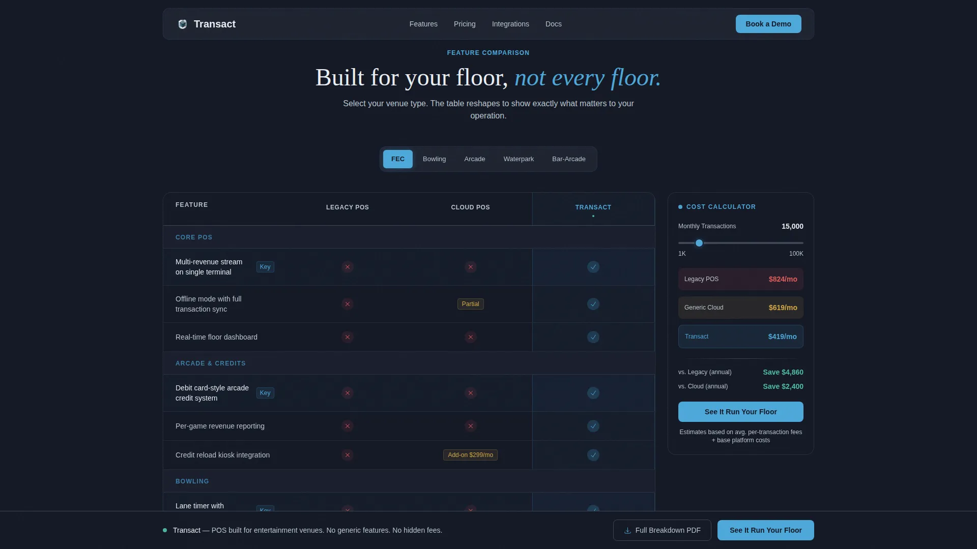
Visitors select their venue category from a horizontal toggle: arcade, bowling center, FEC, waterpark, or bar-arcade hybrid. The comparison table immediately reshapes to surface only the rows relevant to that operation. This keeps the page focused and removes noise for every visitor type.
Animated Comparison Table
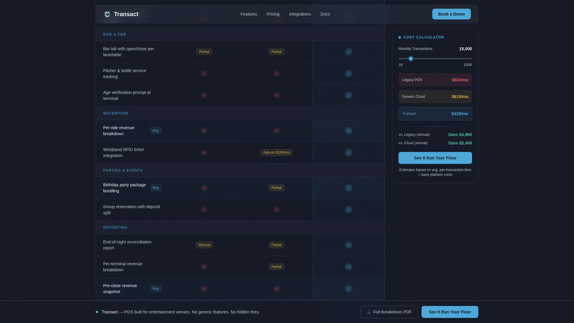
Table rows animate in and out as the venue toggle changes. Checkmarks and cross marks land with micro-transitions, making wins and gaps visually clear at a glance. The animation reinforces the sense that the comparison is built specifically for the visitor, not pre-printed.
Sticky Cost-of-Switching Calculator
A sidebar calculator stays fixed as visitors scroll the comparison table. It updates in real time as visitors move through features, giving them a running estimate of what staying on their current system costs. This grounds the decision in numbers before they reach the call to action.
Dark Glass Hero Panels
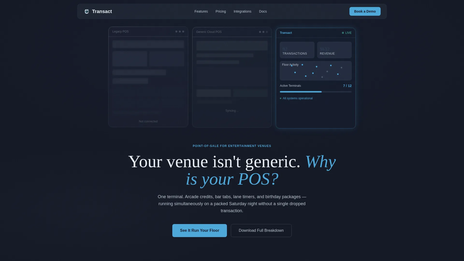
Three translucent frosted-glass rectangles float against a near-black background. The two competitor panels show blurred, grayed-out interfaces labeled generically. The active system panel is sharp and alive, with transaction counters ticking upward and a venue floor map pulsing with lane and terminal activity.
Hidden Fees Exposure Section
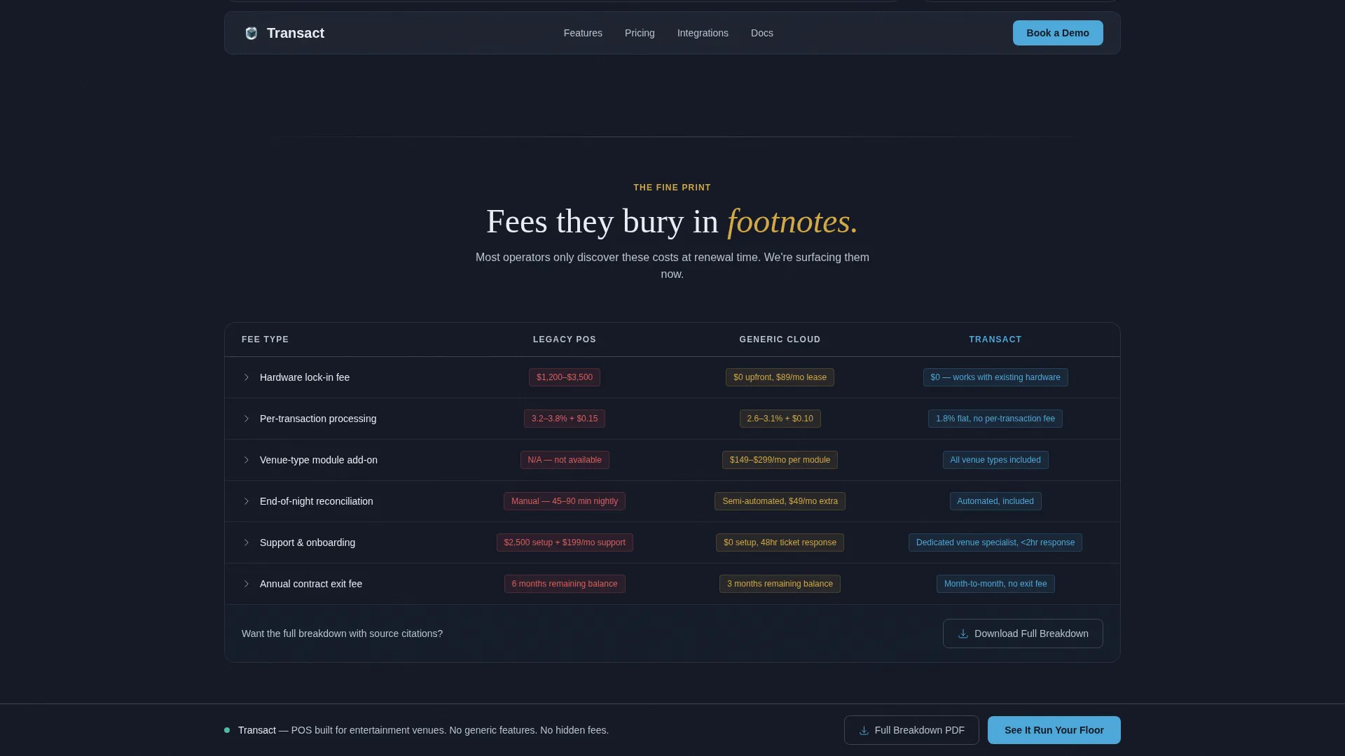
A dedicated section surfaces competitor fees that are typically buried in contract footnotes. Presenting these fees with specificity builds credibility and reframes the cost comparison before visitors reach the call-to-action bar.
Dual Conversion Paths
The primary call to action, "See It Run Your Floor," opens a two-field modal form pre-filled with the visitor's chosen venue type and a transaction-volume slider. A secondary path gates a PDF comparison sheet behind a single email field, giving procurement-minded buyers a shareable asset.
Page sections overview
| Section | Purpose |
|---|---|
| Hero Glass Panels | Establish visual contrast between legacy systems and the active POS |
| Venue Type Toggle | Let visitors filter the comparison table to their specific operation |
| Interactive Comparison Table | Surface feature-by-feature wins with animated rows and live checkmarks |
| Sticky Cost Calculator | Show real-time switching cost estimates as visitors scroll |
| Hidden Fees Exposure | Surface competitor footnote fees with named specificity |
| Operator Testimonials | Place real venue operator quotes inline beside the rows they validate |
| Primary Call-to-Action Bar | Persistent bottom bar with "See It Run Your Floor" and modal form |
| PDF Download Gate | Secondary conversion path for buyers who need a shareable report |
| Footer | Horizontal flow footer pattern closing the page |
Design & branding system
The visual language follows a Data Command theme, modeled on the feel of a mission-control room at dusk. Dark backgrounds keep the interface data-forward. Active states glow rather than compete with the content around them.
- Color system: deep operations-room charcoal (#1B2131) for backgrounds and panel frames, brushed gunmetal (#3D4555) for row separators, clear-altitude sky blue (#4DA8DA) for hover states, toggle switches, and winning checkmarks, and pale horizon white (#E8EEF2) for comparison cells and readable surfaces
- Typography: DM Sans for all interface labels, table data, and body copy; Fraunces for display headlines where weight and editorial presence matter
Mobile & speed optimization
The template is built desktop-first to match the deliberate, desk-based review behavior of venue operators evaluating a system switch. The interactive components are structured to keep the static page shell lean while client-side components handle the table, calculator, and modal.
- Server Components deliver the static page shell so the initial load is fast and stable
- Client Components handle the interactive comparison table, cost calculator slider, and call-to-action modal form independently
How this template helps you convert
Every structural decision in this template is built around one goal: helping a skeptical venue operator arrive at the call to action already convinced.
- The venue-type toggle makes the page feel personalized from the first interaction, so visitors engage with content that maps directly to their own floor rather than skimming generic claims.
- The sticky cost calculator keeps a financial number visible throughout the scroll, so the decision to book a demo has a concrete cost justification attached before the visitor reaches the button.
Other information about this template
This template is part of a broader set of B2B SaaS comparison page templates designed for high-consideration software sales. It is categorized under Technology, specifically Entertainment Software and SaaS, and is optimized for the entertainment POS system niche. The intersection match score for this template's niche alignment is 13, indicating a strong fit between the template style and the target use case.
- The Comparison Table template style is well suited to any POS product where the sales argument depends on proving feature superiority over legacy or generic cloud alternatives
- The Data Command theme and Slate and Sky color system can be adapted to other operations-room or data-intensive software products beyond entertainment venues
- The "Download the Full Breakdown" PDF gate makes this template useful for deals that involve multiple stakeholders, where a buyer needs a shareable document to bring to a partner or board review
Theme
Data Command
Creative direction
Interactive Explorer
Color system
Slate & Sky
Style
Comparison Table
Direction
Comparison/Versus
Page Sections
Venue-type Segmented Toggle
Animated Comparison Table
Sticky Cost-of-switching Calculator
Dark Glass Hero Panels
Hidden Fees Exposure Section
Dual Conversion Paths
Related questions
Can I change the venue types listed in the toggle?
How does the sticky cost-of-switching calculator work?
Is the comparison table data pre-filled or do I supply my own?
Who is this template designed to reach?
Does the PDF download gate require a separate email tool?



