Automotive Payment Processing Landing Page Template
Transact is a high-performance automotive payment processing landing page built for dealership finance teams, service managers, and multi-store controllers. It leads with an interactive savings calculator, flows into live-data dashboard modules, and drives visitors toward an app download. The dark cockpit aesthetic and animated data grid make the product experience feel real before anyone installs a thing.
by Rocket studio
Quick summary
Transact is a single-page, dashboard-style landing page template for automotive payment processing platforms. It opens with three dark glass metric panels, drops visitors straight into an interactive savings calculator, and builds toward a mobile app download. The Data Command visual theme uses void black and electric violet to make every number feel live and purposeful.
Who this template is for
This template is built for automotive fintech and dealership software companies that need a landing page capable of speaking to financially sophisticated buyers. It skips the fluff and leads with operational proof.
- Dealership controllers and CFOs evaluating payment processing costs across multi-store portfolios
- Service managers looking for faster, same-day or next-day funding workflows
- Software vendors and platform teams selling automotive payment tools to dealership decision-makers
What problem this template solves
Dealership finance buyers are skeptical of generic software landing pages. They need to see numbers, not promises. Standard templates cannot convey operational tempo or demonstrate real product logic before a demo call.
- Visitors leave before converting because they cannot quickly calculate whether switching is worth it
- Generic hero layouts fail to communicate the speed and precision that payment processing buyers expect
- No clear mobile app download path means high-intent visitors drop off without a next step
What you get with this template
You get a complete, ready-to-customize landing page layout built around a Data Command theme. Every section is purpose-built for the automotive payment processing niche and designed to move a skeptical finance buyer toward action.
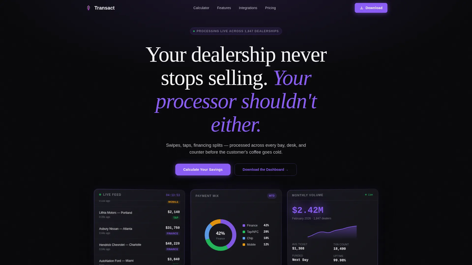
- A three-panel dark glass header with animated metric displays: a live transaction feed, a payment method donut chart, and a monthly volume counter
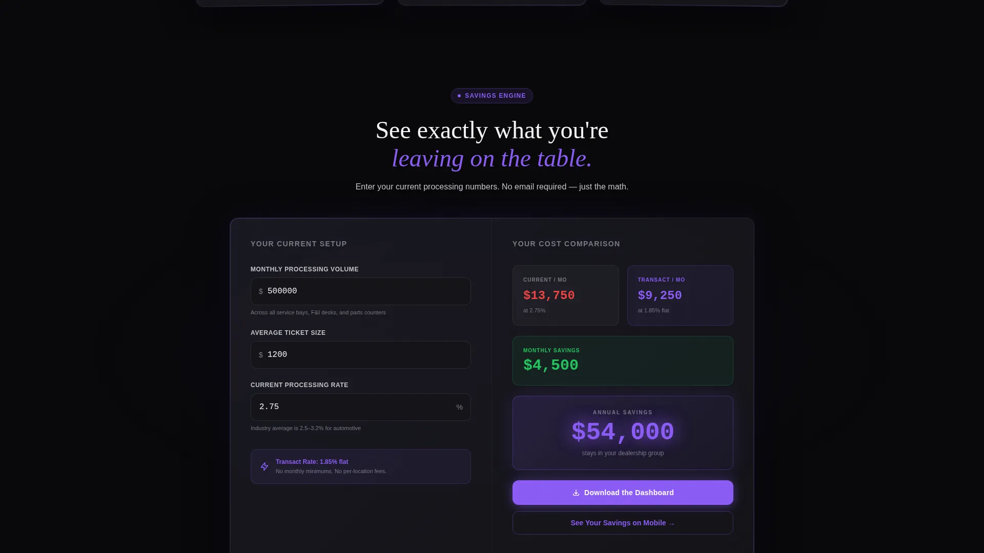
- An embedded interactive savings calculator with real-time cost comparison output and a pulsing annual savings result
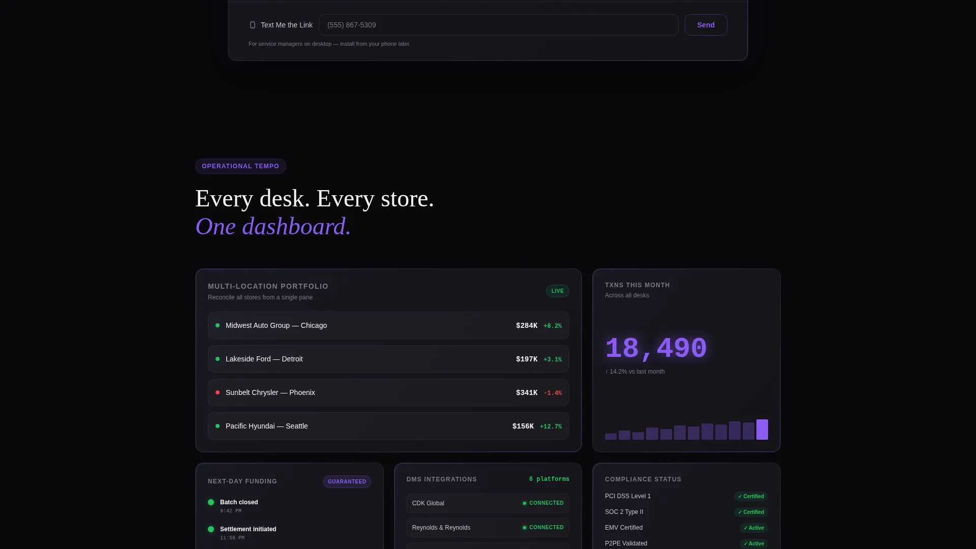
- Animated data grid modules for multi-location dashboards, next-day funding timelines, and integration status displays
- A primary app download section with paired store badges and a secondary mobile deep-link call to action
- A single-field email capture strip offering a text-to-phone link for desktop visitors
Feature list
This template ships with six distinct functional and visual systems, each grounded in the source brief.
Dark Glass Header Panels
Three translucent, frosted-glass metric cards anchor the top of the page. Each panel displays a different live-looking data point: a scrolling transaction feed, a payment method donut chart, and a ticking monthly volume counter. Violet edge-lighting traces each card border against the void black background.
Interactive Savings Calculator
Visitors input their monthly transaction volume, average ticket size, and current processing rate. The tool instantly renders a side-by-side cost comparison card, with the annual savings figure pulsing in electric violet. This earns the scroll by letting visitors experience the product logic before they ever download the app.
Animated Data Grid Modules
Below the calculator, the page shifts into a series of dark glass capability modules. Each module contains a micro-animation: counting numbers, blinking status indicators, or charts drawing in real time. The layout conveys operational tempo rather than static feature lists.
Multi-Location Dashboard Display
A dedicated module visualizes multi-store portfolio management, showing how a controller or CFO might view aggregated payment data across service bays, finance and insurance desks, and parts counters in a single view.
Next-Day Funding Timeline
A visual timeline module communicates the speed of fund settlement. The animated sequence shows the progression from transaction capture to account credit, reinforcing the platform's core speed promise without relying on copy alone.
App Download Section with Deep-Link Logic
The primary call to action is "Download the Dashboard," paired with App Store and Google Play badges styled with violet outlines. The calculator results panel includes a secondary call to action that deep-links to the app with pre-filled parameters. A single-field email strip lets desktop visitors request a link sent to their phone.
Page sections overview
| Section | Purpose |
|---|---|
| Dark Glass Header | Display live-looking payment metrics in three frosted panels |
| Headline Fade-In | Deliver the core positioning statement above the panels |
| Savings Calculator | Let visitors calculate their cost comparison instantly |
| Calculator Results Card | Show current cost versus platform cost with savings callout |
| Data Grid Modules | Demonstrate each core capability with animated dark glass cards |
| Multi-Location Dashboard | Visualize portfolio-wide payment data for controllers and CFOs |
| Funding Timeline | Animate next-day settlement flow for service managers |
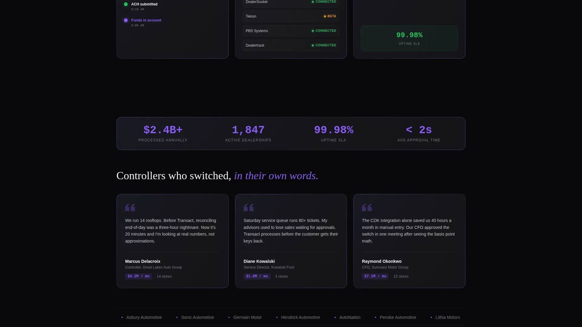
| Integration Status Display | Show named platform compatibility with status badge styling |
| App Download Section | Drive installs with paired store badges and deep-link call to action |
| Email Capture Strip | Capture desktop visitors for a mobile text-to-phone link |
Design & branding system
The visual identity follows a Data Command theme built around a Void and Violet color system. Every design decision reinforces the cockpit-at-night metaphor: information floats forward like a heads-up display projected onto tinted glass.
- Color palette: absolute void black (#09090B) for backgrounds, deep graphite (#141419) for panels, electric violet (#8B5CF6) for live data points and interactive states, and cool silver (#C4C4CC) for secondary text
- Violet is used sparingly and purposefully, appearing only on active totals, status confirmations, and call-to-action edges so each use carries weight
- The frosted dark glass panel style, violet edge-lighting, and micro-animation system work together to make the page feel like a live instrument cluster rather than a static brochure
Mobile & speed optimization
The template is designed with mobile conversion as a primary concern, not an afterthought. The app download flow is the primary goal, so the layout and calls to action are structured to work seamlessly on smaller screens.
- The deep-link call to action in the calculator results panel pre-fills parameters and sends mobile visitors directly into the app experience
- The single-field "Text Me the Link" email strip captures desktop visitors and routes them to a mobile install later
- The dark glass panel layout and data grid modules are structured to remain readable and visually coherent on phone-sized viewports
How this template helps you convert
The conversion architecture is built around earning trust before asking for action. Every section moves a skeptical dealership buyer one step closer to downloading the app.
- The interactive savings calculator creates a personalized, high-value first impression. Visitors see their own numbers, which makes the cost case feel real and specific rather than generic.
- The animated data grid modules replace static feature explanations with live-feeling demonstrations. The page shows operational tempo, which builds credibility with finance and operations buyers.
- The layered call-to-action system gives every visitor a path forward: an immediate app download, a deep-linked mobile shortcut from the calculator, or a deferred install via the email-to-phone strip.
Other information about this template
This template is well-suited for automotive payment processing platforms that compete in a space where dealership software buyers are accustomed to evaluating tools like CDK and Reynolds integrations. The integration status module is designed to display named platform compatibility badges, making it easy to reference specific dealership management system connections your platform supports.
- The template style is Dashboard and Data Grid, making it appropriate for fintech and SaaS products that need to demonstrate data density and operational depth
- The creative direction is Calculator-First, which means the savings tool is the centerpiece of the persuasion architecture rather than a secondary element
- The landing page direction is App Download, so the entire flow is optimized toward mobile install conversions rather than form-fill lead generation
- The theme is Data Command, a design language suited to enterprise and professional buyers who trust data over imagery
Theme
Data Command
Creative direction
Calculator/Tool First
Color system
Void & Violet
Style
Dashboard/Data Grid
Direction
App Download
Page Sections
Dark Glass Header with Live Metrics
Interactive Savings Calculator
Animated Data Grid Capability Modules
Multi-location Portfolio Dashboard
Layered App Download Call-to-action System
Integration Status Badge Display
Related questions
Who is the primary audience for this landing page template?
Can I customize the savings calculator inputs and outputs?
Does the template include the app store badge assets?
What makes this template different from a standard SaaS landing page?
Is this template suitable for a multi-location dealership group?



