Headless Enterprise Software Advanced Cost Calculator Website Template
Transact is a Bold Brutalist headless point-of-sale landing page template built for API-first commerce infrastructure. It features a live transaction cost calculator, an interactive composable architecture explorer, and a progressive lead-capture form. Designed for engineering leads and technical decision-makers, it converts through calculation before it ever asks for a name.
by Rocket studio
Quick summary
Transact is a single-page, split-screen landing page template for headless point-of-sale platforms. It opens with a live cost calculator, guides visitors through interactive system diagrams, and closes with a progressive lead-generation form. The Bold Brutalist design communicates raw infrastructure credibility to the engineers and CTOs who need it most.
Who this template is for
This template is built for technical founders and product teams selling API-first commerce infrastructure. It speaks directly to people who evaluate platforms by reading documentation, not watching demo videos.
- Engineering leads at direct-to-consumer brands building composable commerce stacks
- CTOs at restaurant groups or multi-location retailers escaping legacy point-of-sale vendor lock-in
- Platform teams who need transaction logic decoupled from any display layer
What problem this template solves
Most landing pages for commerce infrastructure fail technical buyers. They lead with marketing language instead of proof. They offer no way to test assumptions before a sales call. They feel built for a marketing manager, not an engineering lead.
- Visitors cannot estimate real costs or latency without booking a demo first
- Legacy monolithic point-of-sale messaging does not speak to engineers who think in modules and APIs
- Generic SaaS templates carry no visual authority for infrastructure products
What you get with this template
You get a fully structured, interaction-driven landing page that moves a technical buyer from curiosity to qualified lead without passive reading. Every scroll position rewards engagement.
- A live transaction cost simulator with toggleable channels, a draggable volume slider, and real-time fee and latency readouts
- An interactive composable architecture map where dragging nodes lights up API call traces between payment, inventory, and loyalty modules
- A latency comparison section and deployment timeline explorer with clickable frontend options
- A sticky progressive lead-capture form pre-filled from calculator inputs
Feature list
This template ships with a purpose-built set of interactive components. Each one is designed to do persuasion work so the form does not have to.
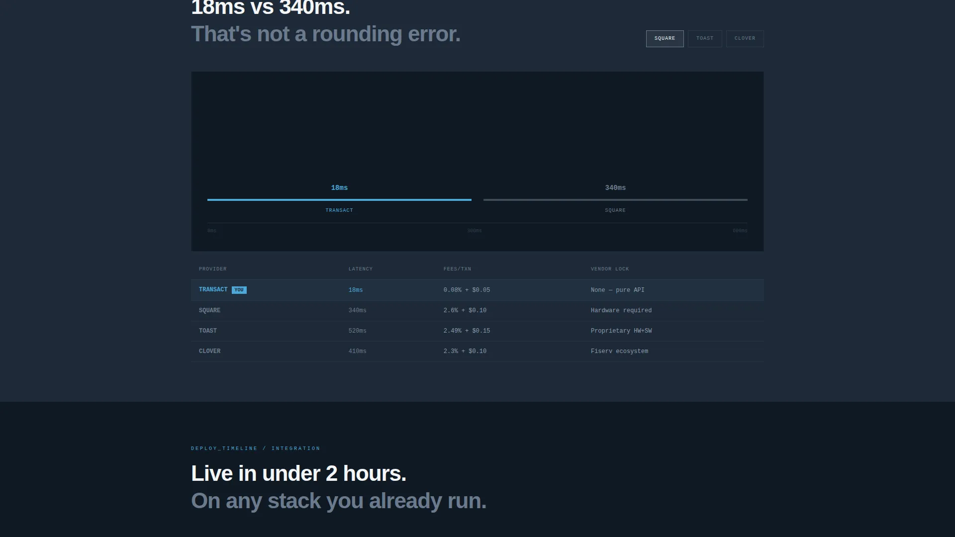
Live Transaction Cost Calculator
The header panel splits 50/50. The left side holds toggles for channel count (in-store, online, mobile, kiosk) and a draggable slider for monthly transaction volume and average order value. The right panel updates in real time, showing processing fees, latency in milliseconds, and annual savings. Numbers animate mechanically in monospaced type, like a departure board flipping digits.
Composable Architecture Map
Below the calculator, visitors encounter a drag-and-drop system diagram. Moving a storefront node triggers animated API call traces in sky blue, visually connecting payment, inventory, and loyalty modules. It makes the headless architecture tangible without a single word of explanation.
Latency Comparison Tool
A dedicated section lets visitors click competitor logos to animate side-by-side response-time bar charts. The comparison is visual and immediate, giving technical buyers the benchmark data they naturally seek before any commitment.
Deployment Timeline Explorer
Visitors click a frontend option and watch integration steps rearrange in sequence. This section makes migration feel concrete and fast rather than vague and risky.
Sticky Progressive Lead Form
A lead-capture bar anchors to the bottom of the viewport after the first calculator interaction. The form is three fields: monthly transaction volume pre-filled from the calculator, current point-of-sale provider from a dropdown, and work email. Friction is minimal because the visitor already did the math.
Dual Conversion Paths
A primary call to action reads "Estimate My Migration" and targets business decision-makers. A secondary path, "Explore the API Docs," gives engineering leads a no-commitment entry point. Both paths coexist without competing.
Page sections overview
| Section | Purpose |
|---|---|
| Calculator Header Panel | Simulate transaction costs and latency in real time |
| Architecture Map Section | Visualize composable API connections interactively |
| Latency Comparison Section | Benchmark response times against competing platforms |
| Deployment Timeline Explorer | Preview integration steps by chosen frontend framework |
| Sticky Lead Capture Bar | Collect qualified leads after calculator engagement |
Design & branding system
The visual identity follows a Bold Brutalist theme. Every design decision is functional. Nothing is decorative. The palette feels like a rooftop server room at dawn: cold steel infrastructure meeting the first light of morning.
- Deep gunmetal (#1E2A38) dominates backgrounds and code block surfaces; exposed concrete gray (#6B7B8D) handles secondary text and dividers
- Open-sky blue (#4DA8DA) activates on every hover state, toggle, interactive trace, and live calculation highlight
- Raw white (#F4F6F8) panels float above the dark ground like terminal windows; all body type is rendered in monospaced fonts for infrastructure credibility
Mobile & speed optimization
The split-screen layout is structured to translate cleanly across viewport sizes. Interactive components are built to remain functional on smaller screens without losing their core persuasion logic.
- The 50/50 split collapses to a single-column stacked layout on mobile, keeping the calculator and readout panel accessible
- Interactive elements including the draggable slider, node map, and sticky form bar are touch-compatible by design intent
How this template helps you convert
The conversion architecture is built around a simple idea: let the visitor calculate their own case for switching before you ask for anything.
- The live calculator creates a personalized cost estimate early in the visit, giving the visitor a concrete number they want to act on before they reach the form
- The sticky "Estimate My Migration" bar appears only after the first calculator interaction, so it surfaces to already-engaged visitors rather than cold readers
- The progressive form pre-fills the monthly transaction volume field from the calculator, reducing the perceived effort of submitting and increasing completion rates
Other information about this template
This template is designed for headless point-of-sale infrastructure platforms that compete with legacy terminal-based systems. It is particularly well-suited for vendors whose buyers compare options carefully before committing.
- The template is built as a single landing page, not a multi-page site, making it fast to deploy and easy to test as a campaign asset
- The "Explore the API Docs" secondary call to action is included specifically to serve engineering leads who research independently before involving a sales team
- No stock photography or illustration is used anywhere in the template; the visual language relies entirely on data, type, and interactive system diagrams
- The Bold Brutalist theme and Slate & Sky color system are designed to feel native to infrastructure and developer tooling contexts


Theme
Bold Brutalist
Creative direction
Interactive Explorer
Color system
Slate & Sky
Style
Split Screen (50/50)
Direction
Lead Generation
Page Sections
Live Transaction Cost Calculator
Composable Architecture Map
Latency Comparison Tool
Deployment Timeline Explorer
Sticky Progressive Lead Form
Dual Conversion Path Design
Related questions
Who is this landing page template designed for?
What interactive features does the template include?
How does the lead generation form work?
Can I customize the color system and typography?
Does this template work for a developer-focused audience?


