Premium IT Services & Consulting Professional Website Template
Transform is a hub-and-spoke landing page template built for digital transformation consultancies. It pairs a dark glass panel header with a feature matrix layout to guide mid-market and enterprise buyers through six capability spokes. Every spoke builds a case, ends with a diagnostic call button, and a persistent nav bar captures leads not yet ready to talk.
by Rocket studio
Quick summary
Transform is a single-page, anchor-navigated landing page template designed for digital transformation consultancies. It opens with six frosted-glass capability panels, moves visitors through structured comparison grids, and closes each spoke on a diagnostic call button. A persistent nav bar also captures early-stage leads via a downloadable playbook offer.
Who this template is for
This template is built for consultancies that help organizations move off legacy systems and onto modern, cloud-native infrastructure. If your pitch involves measurable operational change rather than vague advisory work, this page structure communicates that credibility immediately.
- Mid-market consultancies targeting COOs, IT directors, and founder-CEOs ready to act on technical debt
- Digital transformation practices that need a page that builds a business case, not just a brochure
- Consulting teams who close calls by quantifying the cost of inaction before naming a price
What problem this template solves
Most consultancy landing pages describe services in abstract terms. Buyers who are already managing broken systems need to see the contrast between where they are and where they could be. This template structures that contrast directly, spoke by spoke, metric by metric.
- Legacy-system operators need proof, not promises, before booking a discovery call
- IT directors defending outdated roadmaps need a page that speaks their language: response times, integration points, manual hours eliminated
- Founder-CEOs who inherited fragmented tech stacks need a fast, visual case for why the status quo is the real risk
What you get with this template
You get a complete, anchor-navigated landing page structured around six transformation capabilities. Each spoke is self-contained and builds its own argument, so visitors who care about process automation see a different journey than those focused on data unification.
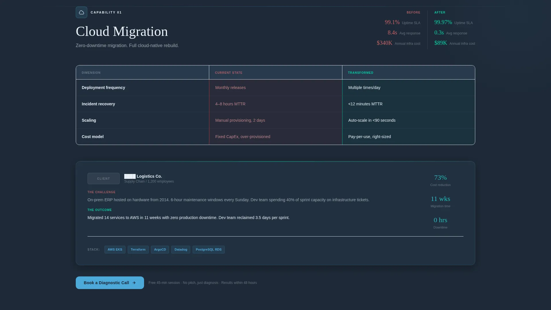
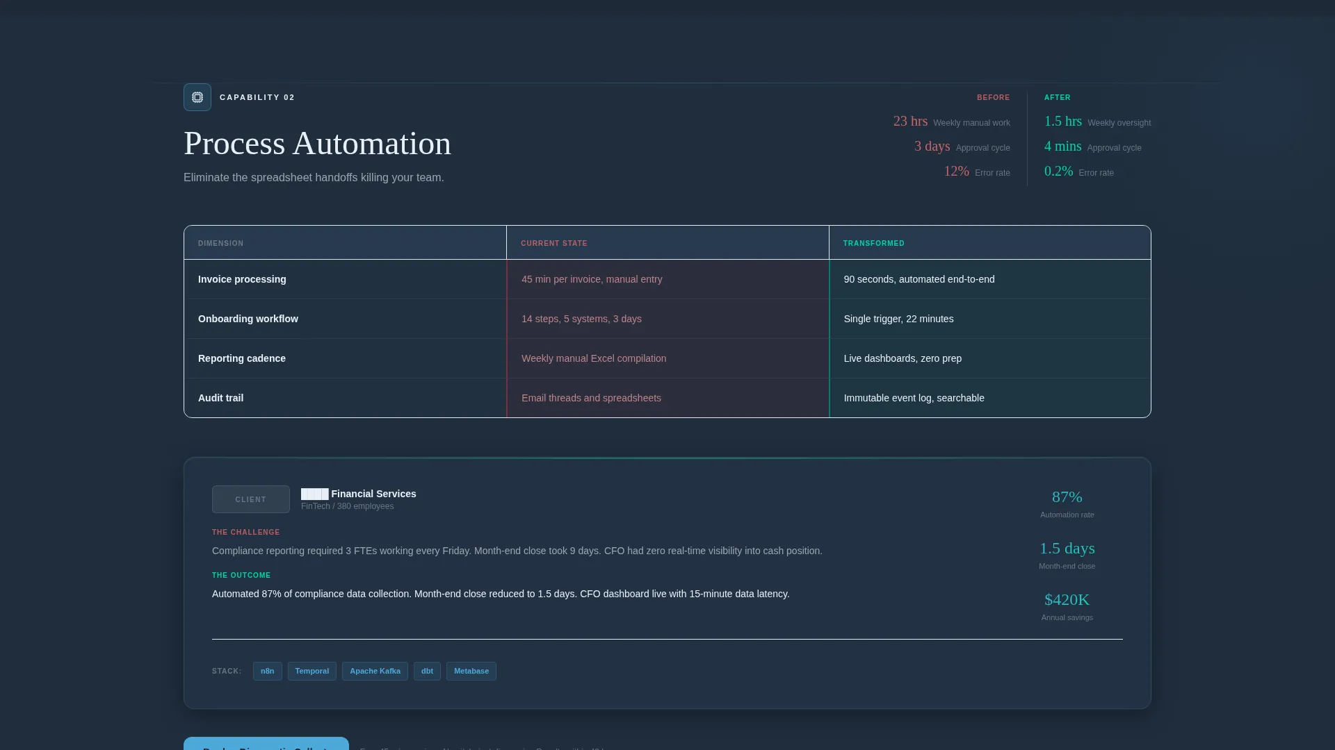
- Six capability spokes, each containing a current-state versus transformed-state comparison grid, a capability breakdown, a mini case study section, and a technology stack diagram area
- A persistent anchor navigation bar with a primary call-to-action button linking to a scheduling page and a secondary email-capture offer for the downloadable playbook
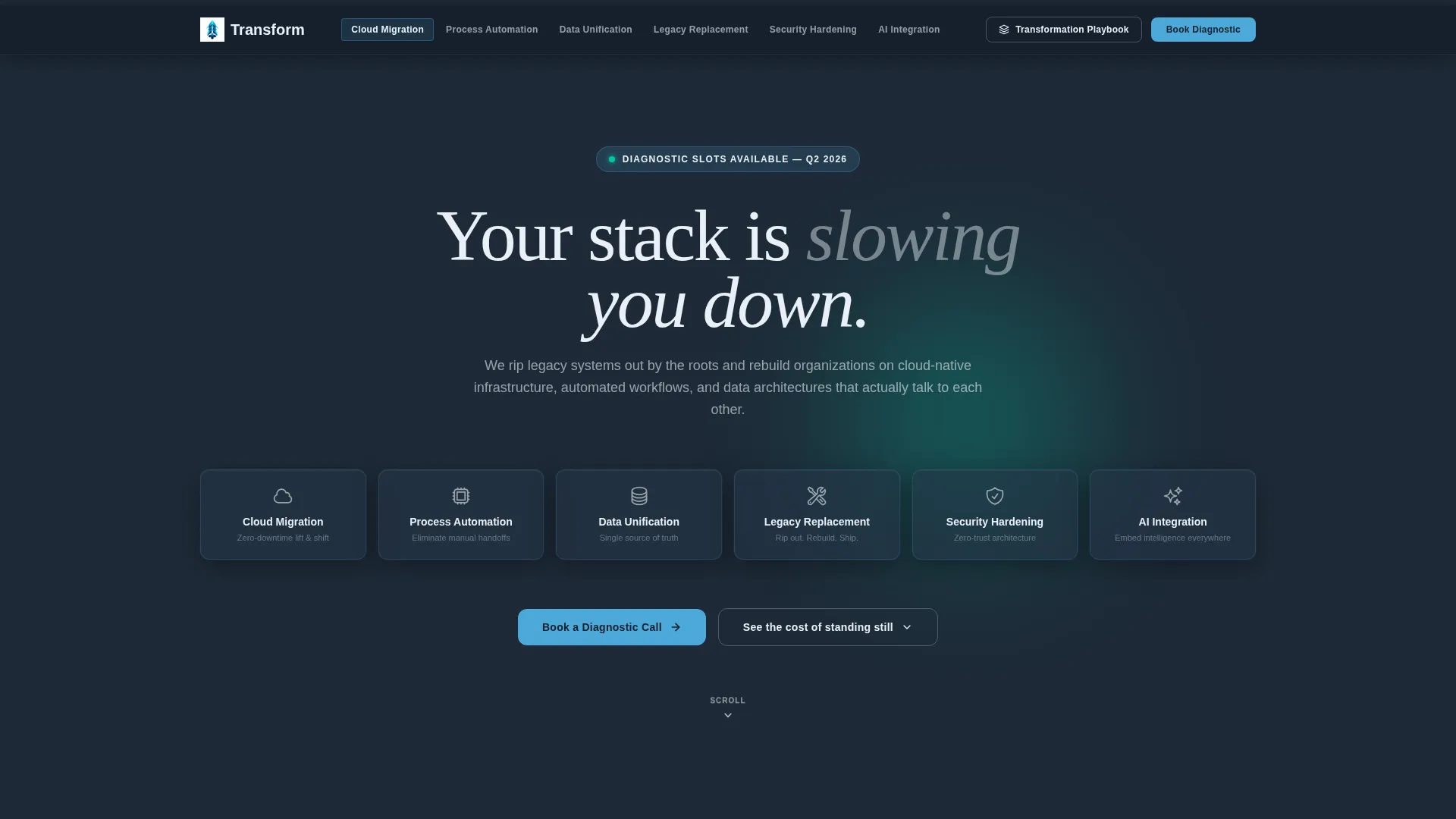
- A header section with six dark glass panels, glowing capability icons, a bold headline, and hover-pulse interaction design
Feature list
This section describes the core design and structural features built into the Transform template, all drawn directly from the source brief.
Six-Spoke Anchor Navigation
The template is organized around six capability areas: Cloud Migration, Process Automation, Data Unification, Legacy Replacement, Security Hardening, and AI Integration. A sticky anchor navigation bar keeps all six accessible as the visitor scrolls, so no section ever feels buried.
Dark Glass Panel Header
The header displays six translucent, frosted-glass rectangles floating against a deep graphite slate background. Each panel holds a single glowing icon and a two-word label. Panels pulse on hover, signaling interactivity and anchoring the visitor to their most relevant spoke immediately.
Feature Matrix Comparison Layout
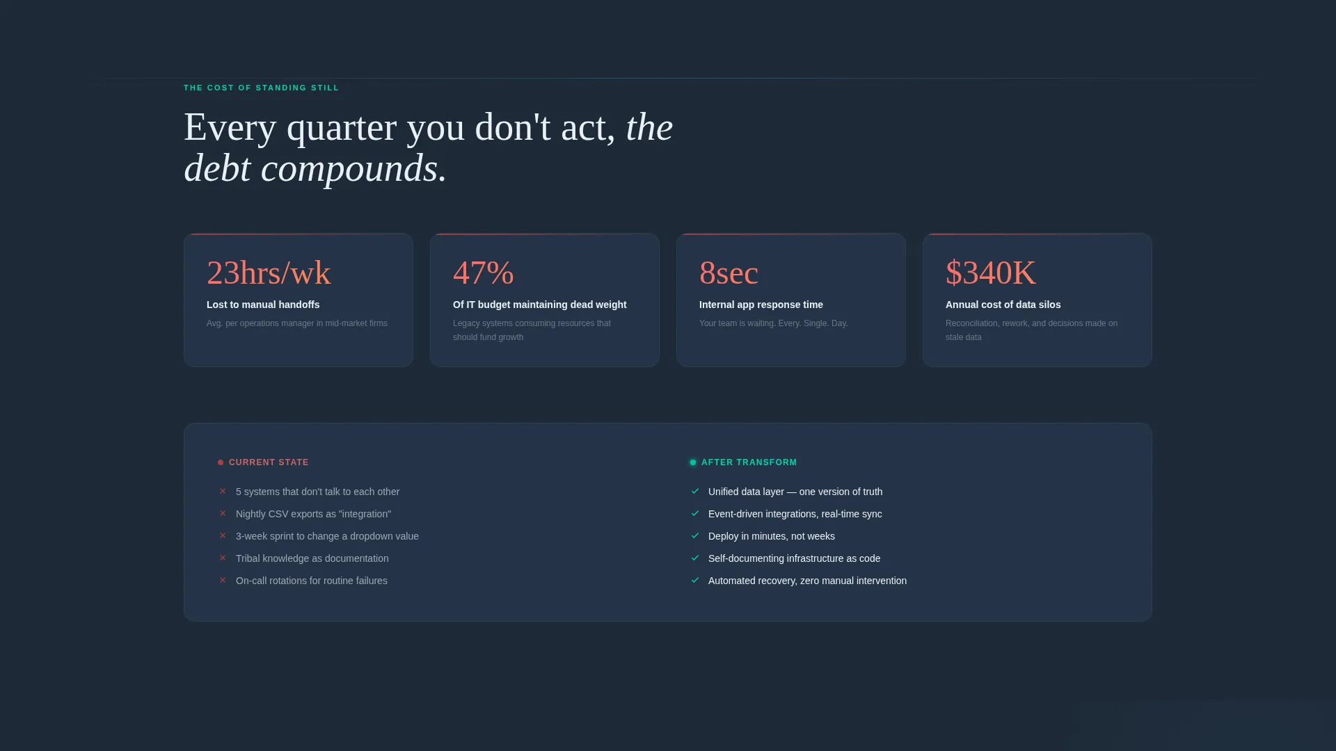
Each spoke uses a structured comparison grid that contrasts current state against transformed state. Specific metrics, including manual hours eliminated, system response times, and integration points consolidated, give the comparison weight and credibility rather than relying on generic benefit statements.
Mini Case Study with Redacted Logos
Scrolling deeper into any spoke surfaces a mini case study section with redacted client logos. Proof is positioned directly before the call-to-action button so the visitor encounters evidence at the moment it matters most.
Dual Call-to-Action Architecture
Every spoke ends with a "Book a Diagnostic Call" button that links through to a separate scheduling page. The persistent nav bar also carries a "Download the Transformation Playbook" secondary offer, capturing email from visitors not yet ready to commit to a call.
Startup Velocity Visual Theme
The design system uses the Slate and Sky color palette and a pre-dawn control room aesthetic. Every bright element, from stratosphere blue on interactive components to signal cyan on progress indicators, carries a specific function. Nothing is decorative.
Page sections overview
| Section | Purpose |
|---|---|
| Header Panel Wall | Introduces six capability spokes via frosted-glass panels and sets the headline hook |
| Anchor Navigation Bar | Keeps all spokes reachable while surfacing both primary and secondary calls to action |
| Cloud Migration Spoke | Comparison grid, capability breakdown, case study, and diagnostic call button |
| Process Automation Spoke | Comparison grid, capability breakdown, case study, and diagnostic call button |
| Data Unification Spoke | Comparison grid, capability breakdown, case study, and diagnostic call button |
| Legacy Replacement Spoke | Comparison grid, capability breakdown, case study, and diagnostic call button |
| Security Hardening Spoke | Comparison grid, capability breakdown, case study, and diagnostic call button |
| AI Integration Spoke | Comparison grid, capability breakdown, case study, and diagnostic call button |
| Playbook Capture Strip | Secondary offer area for visitors who want the downloadable resource before booking |
Design & branding system
The design language is built around a pre-dawn control room aesthetic. Dark surfaces dominate, every lit element carries purpose, and the overall impression is one of precision and forward motion rather than decoration.
- Color system: deep graphite slate (#1E2A38) as the base, stratosphere blue (#4DA8DA) on interactive elements and hover states, cloud-break white (#EAF0F7) for body text and dividers, signal cyan (#00D4AA) for progress indicators and success states
- Visual style: frosted-glass panels with simulated edge lighting and faint downward reflections, subtle hover-pulse animations, and a grid-forward layout that communicates analytical rigor
Mobile & speed optimization
The template is structured for a clean reading experience across screen sizes. The hub-and-spoke layout is inherently scrollable, and the anchor navigation bar remains functional at mobile widths so visitors can jump directly to the capability spoke that matters to them.
- Sticky anchor nav adapts to narrower viewports so the primary and secondary calls to action stay reachable throughout the scroll
- Comparison grids and glass panel headers are designed to reflow without losing the visual hierarchy that makes each spoke scannable on a smaller screen
How this template helps you convert
The conversion architecture in this template is deliberate. It does not ask for commitment before earning it. Every structural decision, from the comparison grid to the case study placement, is sequenced to move a skeptical buyer toward a booked call.
- The feature matrix format quantifies the cost of inaction first, using real operational metrics, so the visitor feels the urgency of change before seeing any offer
- The "Book a Diagnostic Call" button appears immediately after each mini case study, placing the call to action at the precise moment when proof is freshest and resistance is lowest
- The secondary "Download the Transformation Playbook" offer in the persistent nav captures email from visitors who are interested but not yet ready to schedule, keeping them in the funnel without friction
Other information about this template
This template works well for consultancies operating in the digital transformation space who want to present six distinct service lines within a single, cohesive page experience. The hub-and-spoke structure means you can customize or prioritize individual spokes without rebuilding the entire layout.
- The click-through model keeps the landing page lean by routing scheduling to a separate page, such as a Calendly-style booking interface, rather than embedding a form
- The redacted logo convention in the mini case study sections respects client confidentiality while still providing visible social proof
- The template's Startup Velocity theme and Slate and Sky palette are well-suited to technology-forward consultancies that want to signal operational expertise rather than corporate polish
Theme
Startup Velocity
Creative direction
Feature Matrix
Color system
Slate & Sky
Style
Hub & Spoke (Anchor Nav)
Direction
Click-Through
Page Sections
Six-spoke Anchor Navigation
Dark Glass Panel Header
Feature Matrix Comparison Layout
Mini Case Study Sections
Dual Call-to-action Architecture
Startup Velocity Design System
Related questions
Does this template include a built-in contact form?
Can I customize or remove individual capability spokes?
Who is this template best suited for?
How does the secondary call to action work?
Is the comparison grid content customizable?



