Coordinated Public Mobility Landing Page Template
Dispatch is a command-center landing page template built for public transit management software. It uses a Tech Glass visual identity, a Problem-to-Solution scroll arc, and a live-data dashboard design to help transit authority directors, operations managers, and planning organizations evaluate modern bus transportation and fleet solutions at a glance.
by Rocket studio
Quick summary
Dispatch is a dashboard-style landing page template for public transit management software. The design translates control-room intensity into a scrollable, high-converting page. Every section is engineered for agencies comparing vendor solutions, with a Before/After data grid, an interactive comparison matrix, and a Migration Assessment form built directly into the layout.
Who this template is for
This template is built for organizations operating bus transportation networks, light rail corridors, and paratransit services. It speaks directly to people carrying operational weight every day.
- Transit authority directors managing aging infrastructure alongside federal compliance deadlines
- Operations managers currently tracking route adherence across disconnected spreadsheets
- Metropolitan planning organizations that need to evaluate vendor bids against verified capability data
What problem this template solves
Most transit software websites bury their value in generic feature lists. Agencies reviewing new solutions need to see their own pain reflected on the page before they trust any claim.
- Bus transportation operations split across multiple tools make it hard to demonstrate unified system value
- Visitors from agencies land on software pages and cannot quickly understand how the product improves their specific operations
- Comparison shopping is slow when vendors do not offer side-by-side, interactive feature grids
What you get with this template
This landing page gives you a structured, high-information layout purpose-built for transit software sales. Every section earns the scroll.
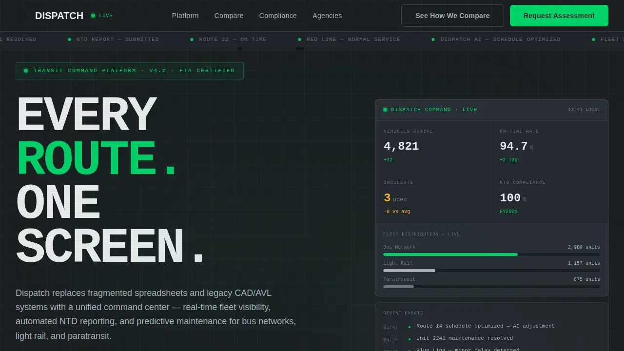
- A hero section with oversized monospaced metrics, pulsing signal-green live indicators, and animated data cards
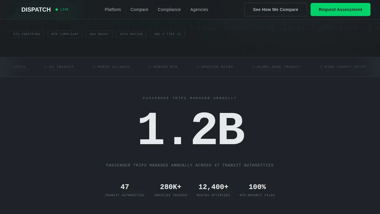
- A scrolling logo bar displaying transit authority wordmarks above a bold stat headline: "1.2B passenger trips managed annually"
- A Before/After comparison grid, an interactive vendor comparison matrix with dropdown selection, and a Migration Assessment form
Feature list
This template includes a focused set of design and structural capabilities drawn directly from the source brief.
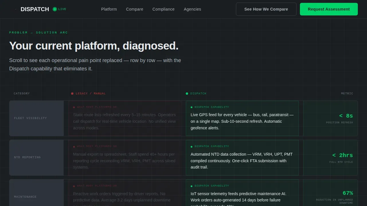
Problem-to-Solution Scroll Arc
The page opens with a simulated legacy dashboard showing red warning icons and grayed-out modules labeled "manual export only." As users scroll, each row transforms row-by-row into a live Dispatch equivalent. The arc moves from fleet visibility through schedule optimization to ridership forecasting, making the capability gap concrete and visible.
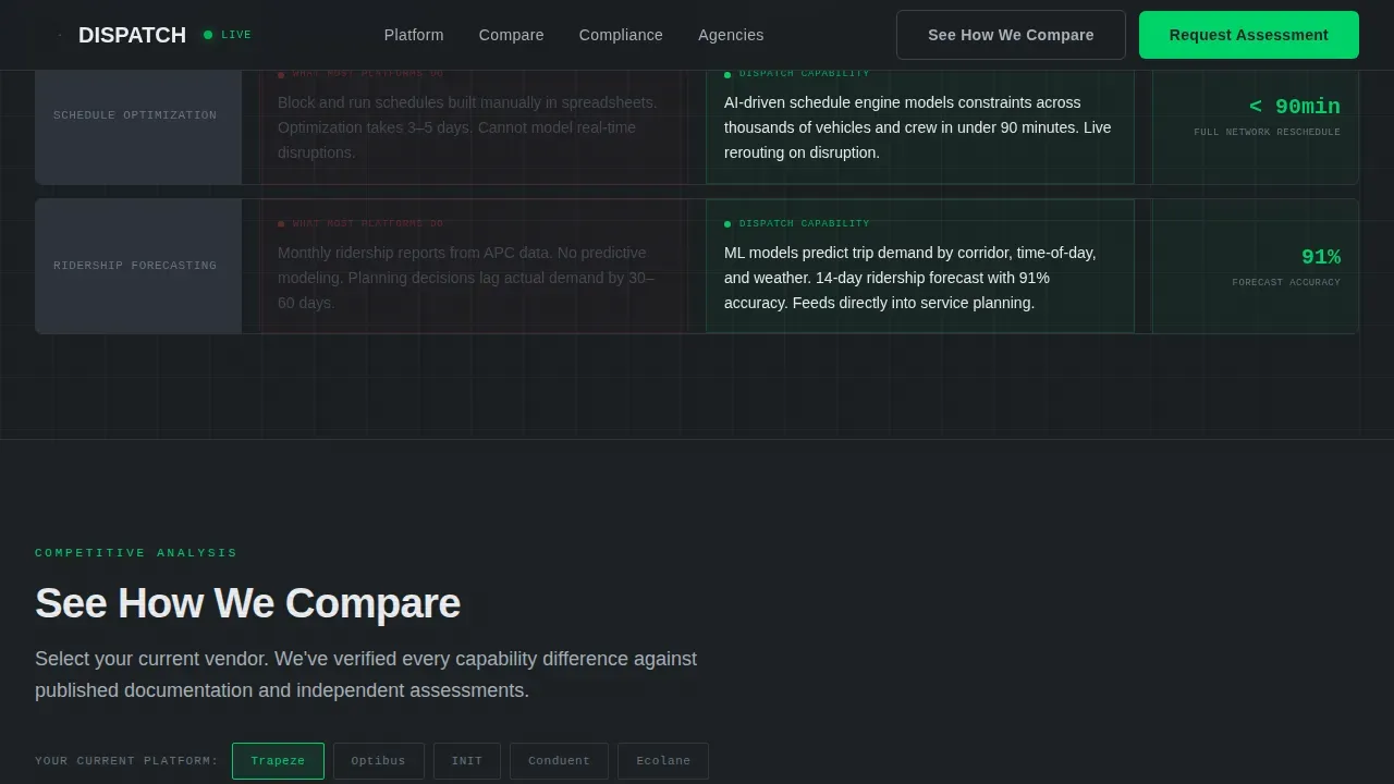
Interactive Vendor Comparison Matrix
Visitors select their current platform from a dropdown. The template renders a side-by-side feature grid auto-populated with verified capability differences. This structure lets agencies evaluate solutions without leaving the landing page, reducing friction at the most important decision point.
Migration Assessment Form
A short embedded form captures agency name, current platform, fleet size via a three-tier dropdown (under 100, 100 to 500, 500-plus vehicles), and a checkbox for Federal Transit Administration (FTA) compliance requirements. The form appears after the comparison table, when the visitor's intent is highest.
Live-Data Hero Dashboard
The hero renders pulsing metrics cards with animated signal-green indicators alongside oversized monospaced typography. This design communicates that the system is alive and running, not a static mockup. Real-time dashboards like this provide live arrival and departure information that improves perceived reliability for both operators and passengers.
Logo Bar with Stat Headline
A horizontal strip of desaturated transit authority logos spans the full viewport width. Below it, a single monospaced stat headline anchors the social proof. The restraint of the design signals confidence: the logos and the number do the persuasion work without competing imagery.
Scroll-Triggered Animation System
Staggered card reveals, row-by-row Before/After transformations, and an animated gradient mesh background are triggered as users scroll. The animation system is built with Server Components handling static content and Client Components managing interactive and animated elements for performance.
Page sections overview
| Section | Purpose |
|---|---|
| Hero Dashboard | Display live pulsing metrics and monospaced stat typography |
| Logo Bar Strip | Show transit authority logos with passenger volume headline |
| Before/After Grid | Transform legacy pain rows into Dispatch capability panels |
| Vendor Comparison Matrix | Let visitors select current platform and view feature differences |
| Migration Assessment Form | Capture agency name, platform, fleet size, and compliance needs |
| Footer Row | Single-row linear footer with navigation and contact links |
Design & branding system
The visual identity follows a Tech Glass theme using a Monochrome Steel color system. The palette references the fascia of a new railcar: matte metallic surfaces, engineered clarity, and zero decorative warmth.
- Colors: deep gunmetal (#1B1F23) for backgrounds, brushed aluminum (#A8B0B8) for surfaces, control-panel white (#EAECEF) for data cards, and signal green (#00D26A) reserved exclusively for live-status indicators and primary calls to action
- Typography: JetBrains Mono for all metrics and data fields; DM Sans for headings and body copy
- Data cards float on white with hairline borders; backgrounds run gunmetal-to-aluminum in subtle gradients
Mobile & speed optimization
The template is designed desktop-first, reflecting how transit authority directors and dispatchers work from control-room workstations. A responsive mobile fallback is included for planning sessions away from the desk.
- Server Components handle static content sections to keep initial load fast even with heavy animation layers
- Client Components manage scroll-triggered transformations and the interactive comparison matrix independently
- The layout adapts across screen sizes so the landing page remains functional for mobile users reviewing information during travel
How this template helps you convert
The page is structured around a Comparison/Versus conversion model. Every section builds toward a primary call to action and a secondary lead capture form.
- The Before/After grid makes the visitor's current operational frustration visible and specific before offering any solution, so the primary "See How We Compare" call to action lands with context already established.
- The Migration Assessment form appears only after the comparison table, capturing high-intent visitors who have already worked through the feature grid and are ready to start a real project conversation.
Other information about this template
This template is fully customizable and serves as design inspiration for teams building an online presence for transit services. It can support multilingual content and accessibility-minded layout choices to serve diverse community needs across any city. The Dispatch synchronized public transit network landing page template is one example of how transportation website templates can address complex, multi-audience software sales pages. Users browsing website template collections will find this layout relevant for any public transit vertical SaaS project where the goal is to protect decision-maker attention and guide it toward a clear next step.
- The design system can be adapted to other smart transit technology products beyond bus transportation, including paratransit and microtransit scheduling solutions
- The landing page structure supports multiple user sessions and repeat visits by making the comparison grid reusable and vendor-agnostic
- Template sections can be reorganized to match different agency sales cycles or to highlight specific operations metrics relevant to a given city network
- The world of transit software sales changes quickly; the modular section design means agencies and vendors can update information, add new vehicles to fleet counts, and refresh the comparison matrix without rebuilding the entire site
Theme
Tech Glass
Creative direction
Problem→Solution Arc
Color system
Monochrome Steel
Direction
Comparison/Versus
Page Sections
Problem-to-solution Scroll Arc
Interactive Vendor Comparison Matrix
Migration Assessment Form
Live-data Hero Dashboard
Logo Bar with Stat Headline
Scroll-triggered Animation System
Related questions
Who is this landing page template designed for?
Does the template include the comparison matrix logic?
Can the Before/After grid be updated for different bus operations pain points?
Is the Migration Assessment form customizable?
What animation and interactivity does this template include?



