Public Transit Vertical SaaS Privacy Policy Website Template
Transit is a hub-and-spoke landing page template built for public transit CRM platforms. It unifies fleet intelligence, rider analytics, maintenance forecasting, and compliance reporting into one scrollable, anchor-navigated page. Designed around a Data Command visual theme, it uses a striking Acid Digital color system to make operational data feel alive and actionable for transit authority decision-makers.
by Rocket studio
Quick summary
Transit is a single-page CRM landing page template built for public transit software platforms. It uses a hub-and-spoke anchor navigation layout to guide visitors through four core spoke sections. The Data Command visual theme and Acid Digital color palette make every section feel like a live operations center, while the Industry Report creative direction builds authority through bold statistics and proof points.
Who this template is for
This template is built for teams selling or showcasing software to public transit organizations. It speaks directly to the people who manage city-scale operations under real pressure.
- Transit authority directors managing aging fleets across multiple bus routes
- Metropolitan planning officers reconciling ridership data with budget constraints
- Operations managers currently toggling between multiple disconnected systems daily
What problem this template solves
Transit agencies often struggle to communicate the value of a unified platform to busy, skeptical decision-makers. A generic software landing page fails to earn trust with this audience. This template solves that by leading with operational stakes and letting the product data do the persuading.
- Decision-makers abandon pages that feel too abstract or sales-heavy
- Transit professionals need to see real operational context before they engage
- Fragmented tool environments make the case for consolidation hard to visualize
What you get with this template
You get a fully structured, single-page lead generation template with everything needed to present a transit CRM platform to a professional audience. Each section earns attention before asking for anything.
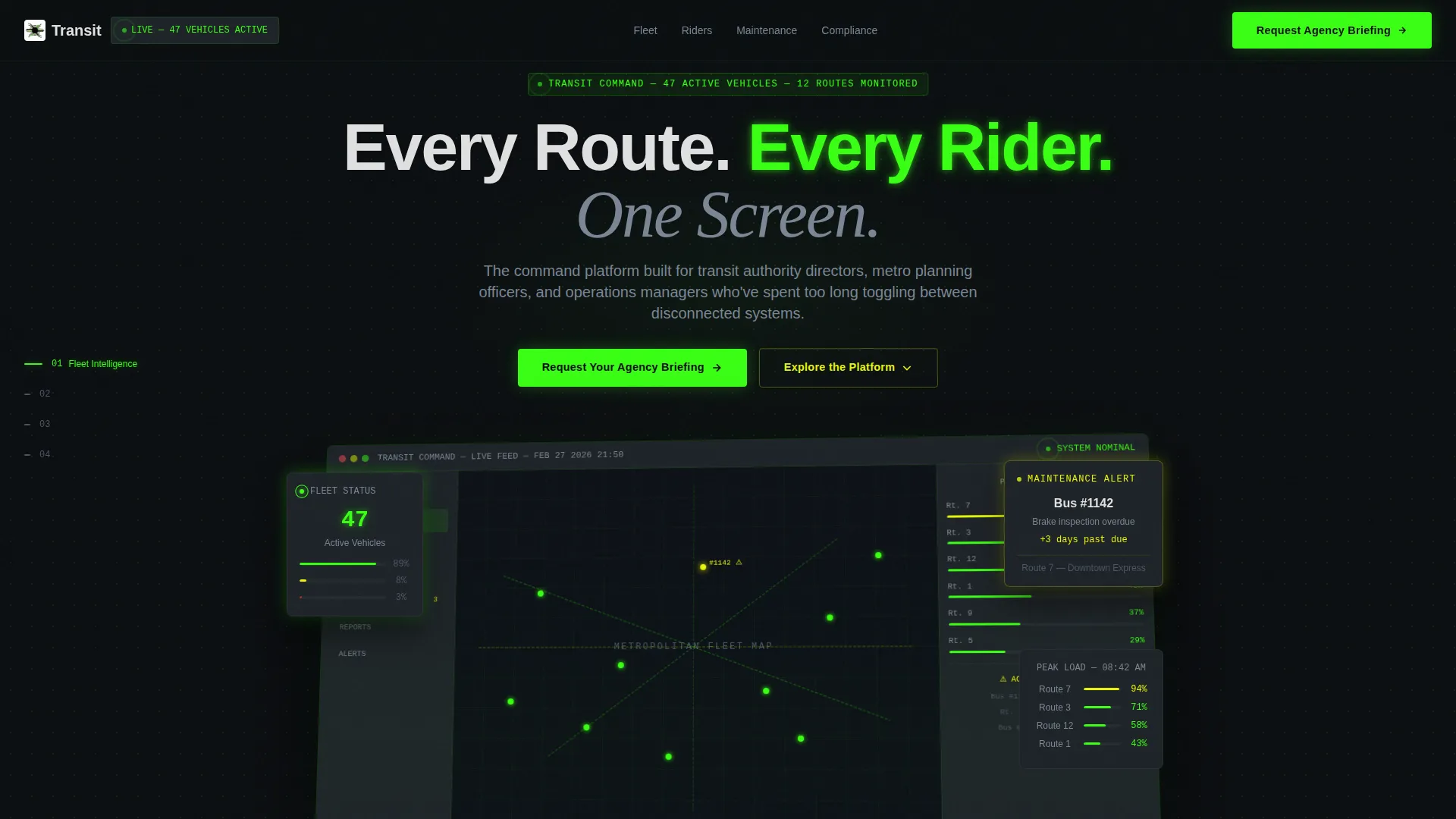
- A full-width product screenshot hero with a specific, data-rich dashboard rendering
- A fixed left-rail anchor navigation with four numbered spoke sections
- A qualification lead form with fleet size, challenge, and work email fields
Feature list
This template is built around a set of purposeful components that work together to move a transit professional from skeptical visitor to qualified lead.
Data-Rich Product Screenshot Hero
The header renders the platform dashboard at actual resolution. It shows 47 active vehicles on a live fleet map, real-time passenger load percentages in a sidebar, and a signal yellow maintenance alert for an overdue brake inspection. The product itself is the hero, and the data visible is specific enough to earn immediate credibility.
Fixed Anchor Navigation Rail
A left-rail table of contents stays visible as the visitor scrolls. Each entry carries a section number and a short label: 01 Fleet Intelligence, 02 Rider Analytics, 03 Maintenance Forecasting, 04 Compliance Reporting. The active section lights up in phosphor green to orient the reader at every scroll depth.
Industry Report Spoke Sections
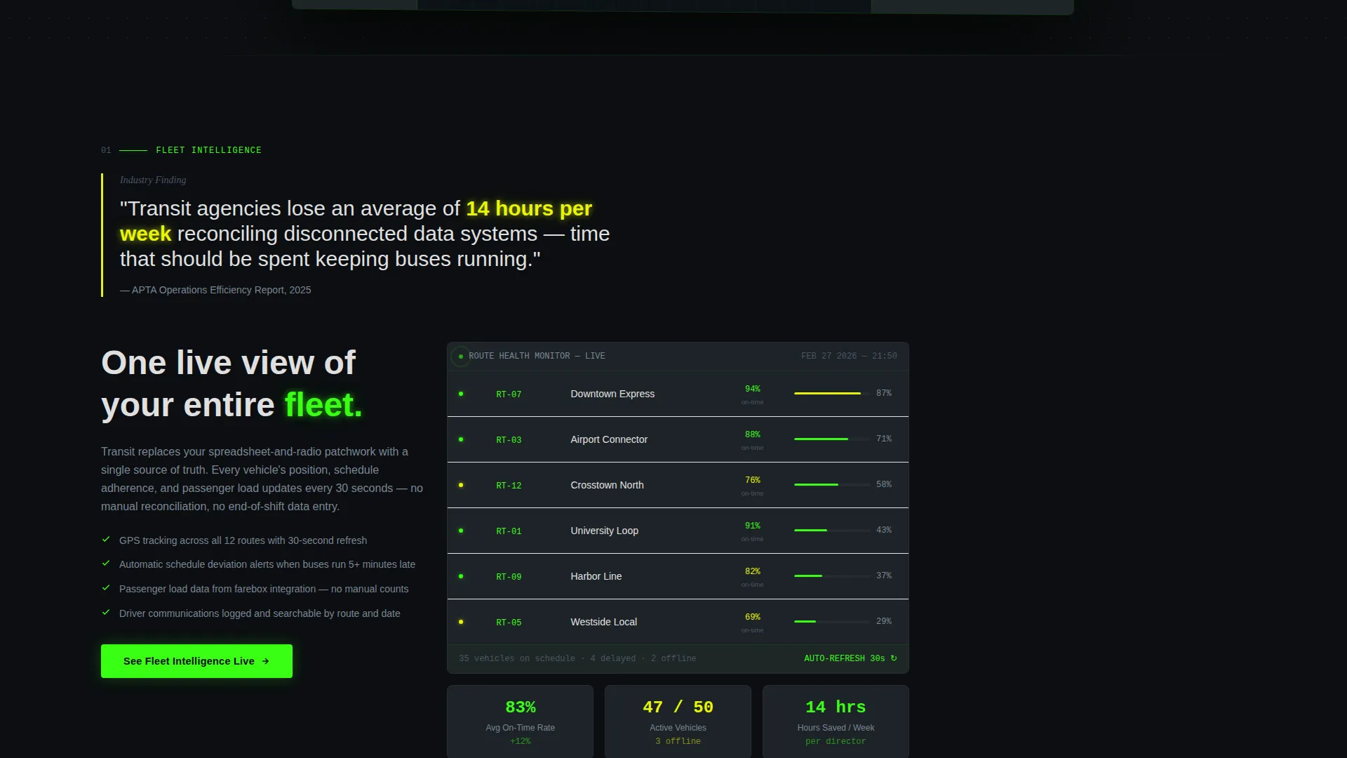
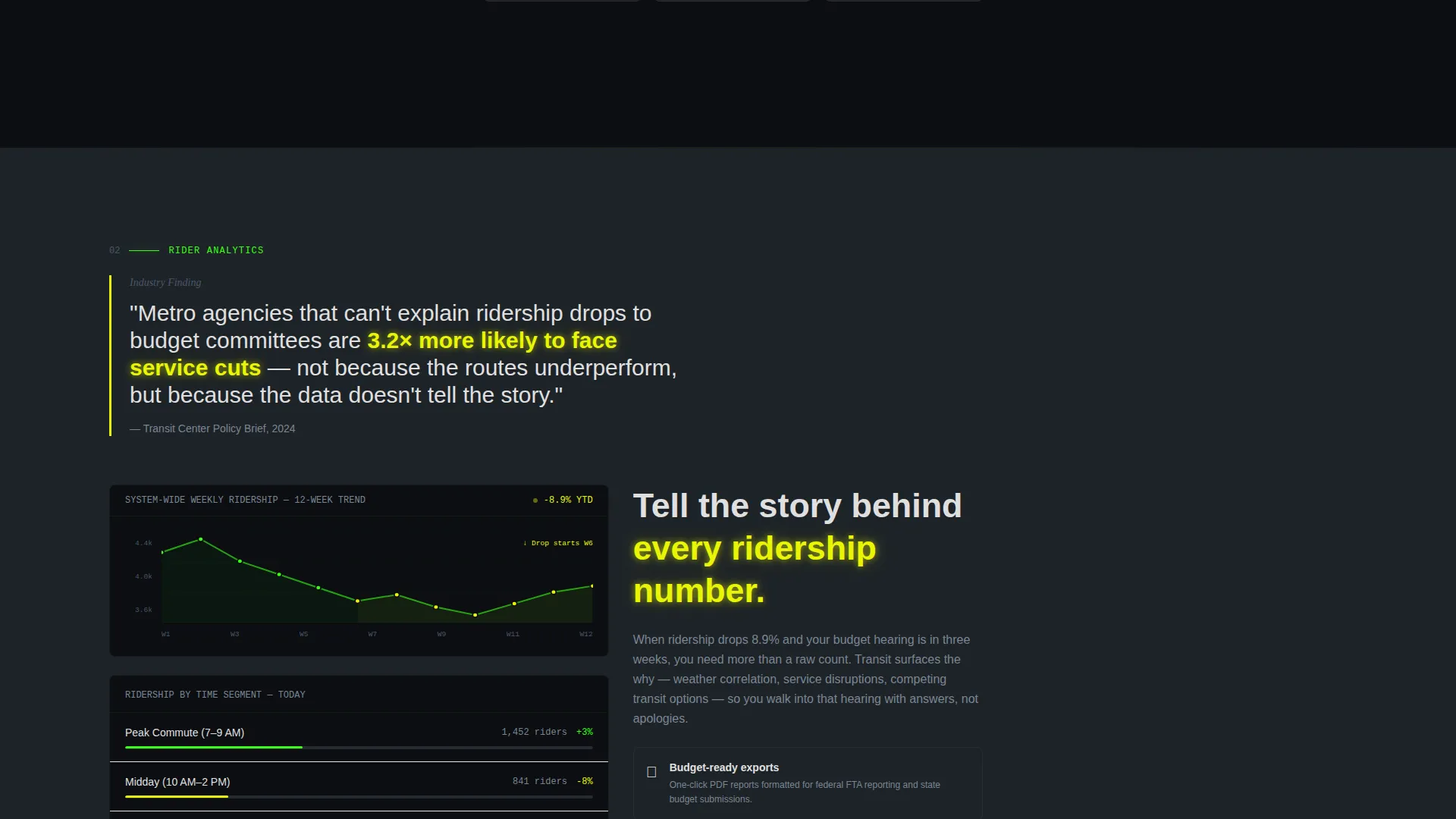
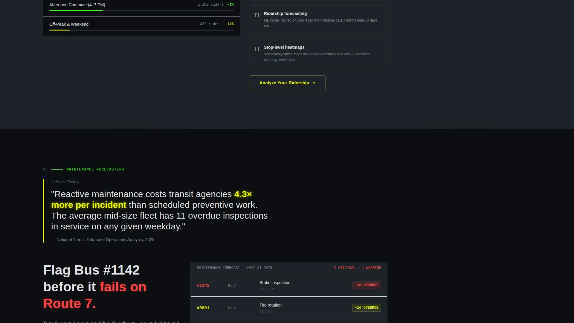
Each of the four spoke sections opens with a bold statistic pulled from real transit pain points. The section then unfolds into how the platform addresses that finding, supported by mini-screenshots and metric visualizations styled like embedded charts in a research brief. Stakes escalate across sections from operational inefficiency to rider attrition to federal compliance risk.
Contextual Repeating call to action
The primary call to action, "Request Your Agency Briefing," appears first in the header. It then resurfaces at the close of each spoke section with a contextual variation specific to that section's topic, such as "See Fleet Intelligence Live" or "Audit Your Compliance Gaps." This keeps conversion pressure relevant without feeling repetitive.
Qualification Lead Form
The final section presents a short form designed to pre-qualify agency leads. Fields include agency name, a fleet size dropdown with four tiers, a free-text field for the biggest operational challenge, and a work email. No gating mechanism precedes the form, so trust is built through content before the ask is made.
Acid Digital Color System
The template applies a precise four-color palette with a clear role for each tone. Phosphor green marks live data, healthy route indicators, and primary calls to action. Signal yellow fires on alerts, hover states, and key performance indicator callouts. Void black dominates backgrounds so content floats forward. Terminal gray separates content blocks like monitor bezels in a multi-screen array.
Page sections overview
| Section | Purpose |
|---|---|
| Full-Width Hero | Establishes platform credibility with a data-specific product screenshot and primary headline |
| Left Rail Nav | Provides fixed anchor navigation with numbered section labels that highlight on scroll |
| Fleet Intelligence Spoke | Opens with a transit data statistic and presents fleet management capabilities with visual proof |
| Rider Analytics Spoke | Connects ridership trends to operational decisions using embedded metric visualizations |
| Maintenance Forecasting Spoke | Escalates stakes around deferred maintenance and shows how the platform surfaces schedule risks |
| Compliance Reporting Spoke | Addresses federal compliance risk with section-specific call to action for auditing gaps |
| Lead Qualification Form | Captures agency name, fleet size, operational challenge, and work email to qualify prospects |
Design & branding system
The visual identity follows a Data Command theme that feels like a transit operations center running a night shift. Every design choice reinforces the idea that information is live, controlled, and meaningful.
- Four-color Acid Digital palette: void black (#0B0E11) for backgrounds, phosphor green (#39FF14) for active states and primary calls to action, signal yellow (#E8F505) for alerts and hover states, and terminal gray (#1E2328) for card surfaces
- White text (#E0E0E0) rendered to appear as though it glows faintly against the dark background, keeping readability high across all data-dense sections
- No decorative imagery anywhere on the page; all visuals are product screenshots or styled metric charts that reinforce the platform's real capabilities
Mobile & speed optimization
The template is built with responsive behavior in mind so it holds up across the devices that transit professionals actually use away from their desks.
- The fixed left-rail anchor navigation collapses gracefully on smaller screens so the reading experience stays clean on tablets and mobile devices
- The product screenshot hero and embedded chart visualizations are structured to scale without breaking the data-specific detail that makes them credible
- Section layouts use terminal gray card surfaces that maintain visual separation even when columns stack on narrow viewports
How this template helps you convert
The entire page is designed as a trust-building sequence, not a sales pitch. Each layer earns credibility before asking the visitor to act.
- The product screenshot hero opens with specific, readable data that gives a transit director an immediate reason to keep scrolling, establishing relevance before a single word of body copy is read.
- The Industry Report structure escalates stakes across four spoke sections, moving the reader from recognizing a problem to understanding the solution, so by the time the qualification form appears, the ask feels earned rather than premature.
Other information about this template
This template is designed specifically for the public transit vertical and the SaaS platforms serving it. It fits naturally within a broader technology product marketing context.
- The template style is Hub and Spoke with Anchor Navigation, making it well-suited for platforms with multiple distinct feature areas that benefit from non-linear browsing
- The creative direction follows an Industry Report format, which is particularly effective for reaching senior agency decision-makers who respond to evidence-based communication
- The lead generation flow is designed for a longer consideration cycle typical of government and municipal procurement, where trust must be built before any form is completed
Theme
Data Command
Creative direction
Industry Report
Color system
Acid Digital
Style
Hub & Spoke (Anchor Nav)
Direction
Lead Generation
Page Sections
Data-rich Product Screenshot Hero
Fixed Anchor Navigation Rail
Industry Report Spoke Sections
Contextual Repeating Call to Action
Qualification Lead Form
Acid Digital Color System
Related questions
Who is this landing page template designed for?
Can I adapt the spoke sections to different feature areas?
What does the qualification form collect?
Does this template include real dashboard screenshots?
Is this template suitable for software outside the transit industry?



