Transit — Smart Travel Landing Page Template
Waypoint is a dashboard-style landing page template built for a voice-first travel AI assistant. It features a live trip cost estimator in the hero, an interactive feature matrix below the fold, and a persistent app download call to action. The design uses a deep cockpit color system to evoke focus and momentum, making it ideal for launching a travel app.
by Rocket studio
Quick summary
Waypoint is a single-page landing page template designed for a voice-first AI travel assistant. The hero embeds a functional trip cost estimator styled like a voice-waveform interface. Below it, an interactive feature matrix maps capabilities to traveler types. The page drives app downloads through a persistent mobile call-to-action bar and an SMS preview itinerary path.
Who this template is for
This template is built for teams and founders launching an AI-powered travel assistant app. It speaks directly to users who know their audience moves fast and decides quickly.
- Solo travelers who rebook flights at odd hours and need instant itinerary answers
- Couples managing shared trip logistics during short breaks in their day
- Remote workers who hop cities monthly and need plans assembled faster than they can type
What problem this template solves
Planning a trip today still feels slow and fragmented. Users bounce between apps, compare prices manually, and lose time before they even pack a bag. This template solves the presentation problem: how do you show a voice-first AI doing all of that in seconds, on a single page, before anyone downloads the app?
- Visitors arrive skeptical; the animated hero estimator shows the AI thinking out loud and builds instant trust
- The feature matrix answers "will this work for me?" without forcing users to read paragraphs of marketing copy
- The SMS preview path converts curiosity into an install by delivering a real itinerary sample before the app is even downloaded
What you get with this template
You get a complete, launch-ready landing page structured around three conversion moments: see it work, understand what it does, and get it on your phone. Every section is purpose-built for a travel AI product audience.
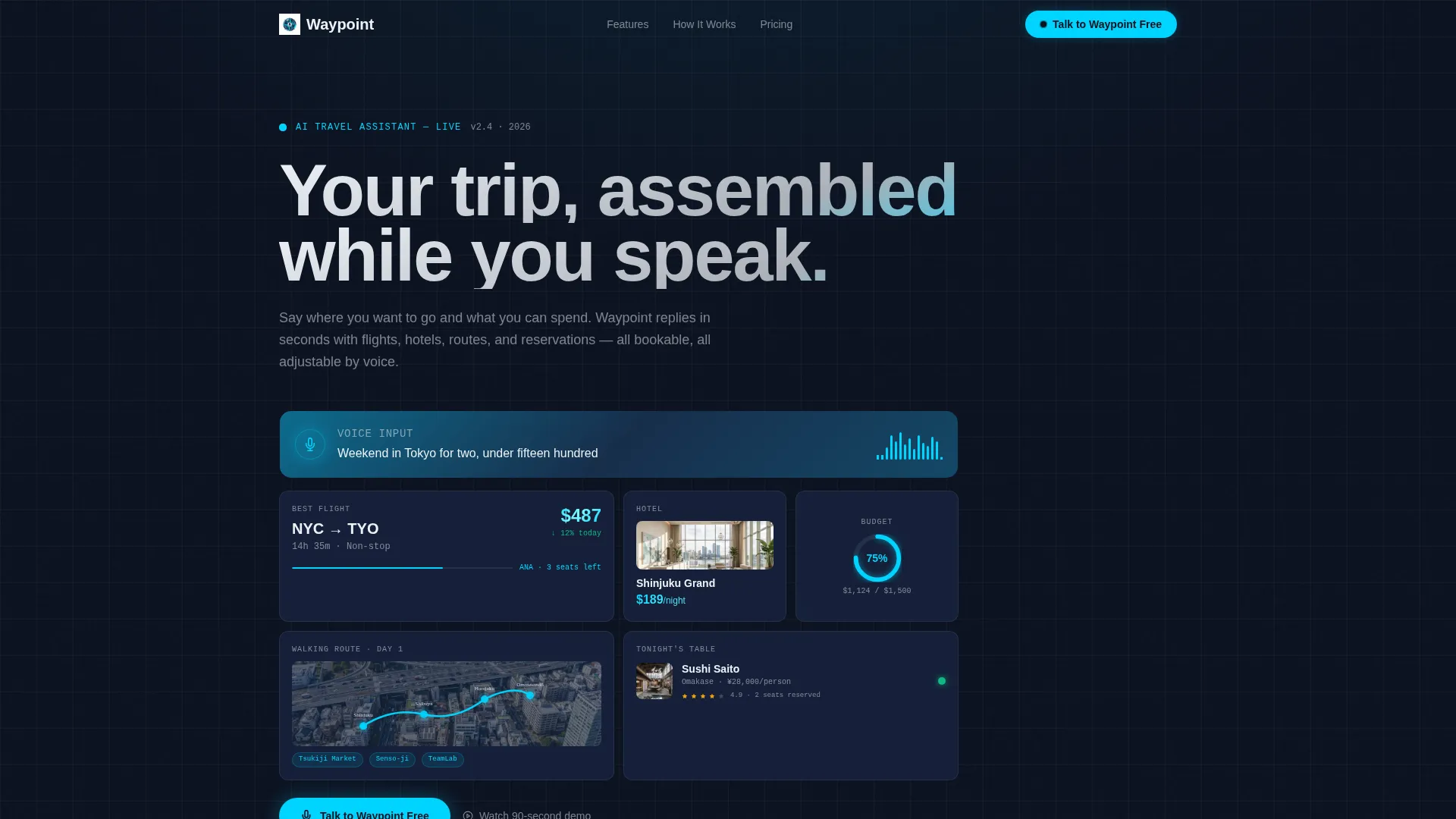
- A hero section with a simulated voice prompt, animated flight and hotel tiles, a daily budget ring chart, and a miniature pinned map
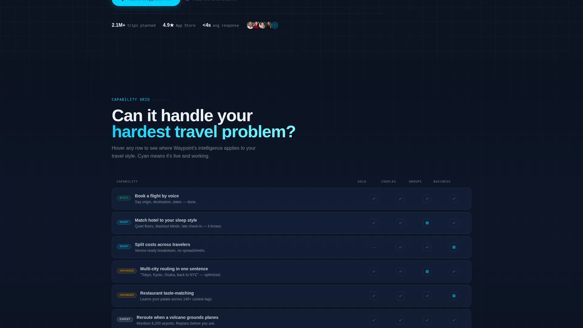
- An interactive feature matrix data grid with cyan hover states mapping capabilities across solo, couples, group, and business travel contexts
- A persistent bottom bar on mobile styled as a voice-input field, a store-select modal with iOS and Android options, a desktop QR code, and an SMS itinerary preview path
Feature list
This template delivers a focused set of interactive and visual components. Each one is grounded in the product story and designed to move a visitor from curious to convinced.
Animated Voice Estimator Hero
The hero embeds a simulated voice prompt reading "Weekend in Tokyo for two, under fifteen hundred." The dashboard animates a response in real time: flight cost tiles, hotel cards, a daily budget ring chart, and a miniature map with pinned stops. A waveform pulses with each spoken result, making the interface feel alive before anyone scrolls.
Interactive Feature Matrix
Below the hero, a data grid lists AI capabilities row by row: voice booking, real-time repricing, multi-city routing, restaurant taste-matching, and offline access. Columns represent traveler contexts. Cells light up in cyan on hover, turning the feature list into a personal relevance map rather than a static checklist.
Persistent App Download Bar
A fixed bottom bar on mobile mirrors a voice-input field and reinforces the product's core interaction model. Tapping it opens a store-select modal with iOS and Android paths. Desktop visitors see a QR code. The bar stays visible throughout the entire scroll, keeping the download action one tap away at all times.
SMS Itinerary Preview Path
A secondary conversion path lets visitors type a sample trip query directly on the page. The template is structured to deliver a preview itinerary via SMS with a download link embedded. This converts passive interest into an active install by delivering real value before the app is on the visitor's phone.
Cockpit-Inspired Dashboard Layout
The page is built as a dashboard and data grid layout. Deep navy backgrounds, glowing cyan data highlights, and instrument-panel card surfaces create a focused, high-contrast visual environment. The aesthetic signals precision and intelligence without relying on decorative elements.
Page sections overview
| Section | Purpose |
|---|---|
| Hero Estimator | Simulates a live voice query with animated flight tiles, hotel cards, budget ring chart, and pinned map |
| Waveform Interface | Pulses with each spoken result to signal that the AI is actively responding |
| Feature Matrix Grid | Maps AI capabilities across traveler types using interactive cyan hover states |
| App Download Bar | Persistent mobile bar styled as a voice-input field driving iOS and Android installs |
| Store Select Modal | Presents iOS, Android, and desktop QR code paths for app download |
| SMS Preview Path | Collects a sample trip query and delivers a preview itinerary with a download link via SMS |
Design & branding system
The visual identity follows a Startup Velocity theme expressed through a Midnight Blue color system. Every color choice is functional: it either signals something live or guides the eye toward action.
- Deep cockpit navy (#0B1120) as the primary background, instrument-panel blue (#1B2A4A) for card surfaces, live-signal cyan (#00D4FF) reserved strictly for active states and data highlights, and contrail white (#EDF2F7) for typography and dividers
- Cyan appears only where something is live, tappable, or updating, never as decoration
- The overall palette feels like a cockpit at cruising altitude: dark, focused, with glowing readouts that direct attention precisely where action is happening
Mobile & speed optimization
The template is designed with a mobile-first interaction model that matches how the target audience actually uses the product: on a phone, often on the move, and usually in a hurry.
- The persistent bottom bar mirrors a native voice-input field, making the primary call to action feel native to the mobile experience
- The store-select modal adapts for both touch-based mobile paths and a desktop QR code flow, covering every device context visitors arrive on
- Layout sections are structured as a dashboard and data grid, keeping information dense but scannable without requiring horizontal scrolling on smaller screens
How this template helps you convert
The page is built around three sequential conversion moments. Each one moves a visitor one step closer to installing the app.
- The animated hero estimator shows the AI working in real time, replacing explanation with demonstration and reducing the time a visitor needs to decide if the product is worth their attention.
- The feature matrix builds specific confidence by letting visitors self-identify their traveler type and see exactly which capabilities apply to them, answering the "is this for me?" question without a single paragraph of prose.
- The SMS itinerary preview path delivers tangible value before the install, turning a passive page visitor into an active user by putting a real trip plan in their hands via text message.
Other information about this template
This template sits at the intersection of the Technology category and the AI for Travel subcategory. It is purpose-built for the travel AI voice assistant niche and carries a high intersection match score of 13, indicating strong alignment between the template style, theme, and niche use case.
- The template style is Dashboard and Data Grid, matching the data-dense, instrument-panel aesthetic of the Waypoint product concept
- The Startup Velocity theme is expressed through motion cues, escalating feature complexity in the matrix, and a persistent action bar that keeps momentum alive throughout the scroll
- The Calculator and Estimator header concept is implemented as a live voice-waveform estimator embedded directly in the hero, not as a separate tool or external widget
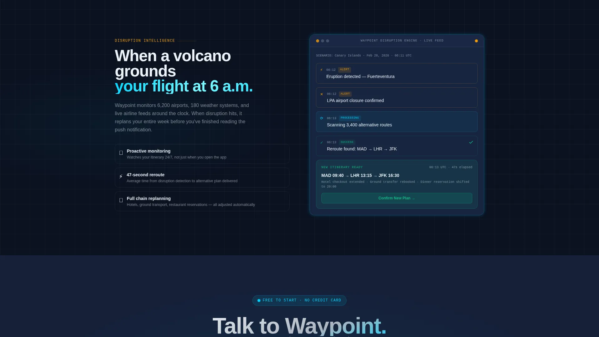
- The Feature Matrix creative direction escalates from basic questions like "Can it book a flight?" to complex ones like "Can it reroute my entire week when a volcano grounds planes?", building proof of intelligence row by row
- The App Download landing page direction is reinforced at every scroll depth through the persistent bar, the modal, and the SMS path, giving visitors three distinct ways to move from the page to the product
Theme
Startup Velocity
Creative direction
Feature Matrix
Color system
Midnight Blue
Style
Dashboard/Data Grid
Direction
App Download
Page Sections
Animated Voice Estimator Hero
Interactive Feature Matrix Data Grid
Persistent App Download Bar
SMS Itinerary Preview Path
Cockpit-inspired Dashboard Layout
Related questions
What type of product is this template designed for?
Can I customize the voice estimator hero to match my app's actual queries?
How does the SMS itinerary preview path work in this template?
Is this template suitable for a team building a travel app for groups, not just solo travelers?
What makes the persistent bottom bar different from a standard call-to-action button?



