Advanced Bag & Luggage Brand Pre-Launch & Coming Soon Website Template
Haul is a bold brutalist backpack brand landing page template built for pre-launch waitlist campaigns. It uses a modular card grid layout, a Merlot and Smoke color system, and forensic product photography to prove durability before asking for a signup. Raw typography, scroll animations, and a live capacity counter create urgency that feels earned.
by Rocket studio
Quick summary
This landing page template is purpose-built for a DTC backpack brand launch. It uses a brutalist design approach, a modular card grid, and a sequential narrative to move visitors from raw product imagery toward a waitlist signup. Every section earns the conversion before the call to action appears.
Who this template is for
This template is designed for founders, creative directors, and gear-brand teams who want a launch page that reflects the honesty of what they make. It suits anyone who believes the product should do the persuading.
- Bike commuters and urban gear brands launching a durable daily-carry pack
- Backcountry and outdoor brands targeting serious day-hikers who need a 28-liter workhorse
- Design-driven founders and art director-level teams who refuse a generic landing page concept
What problem this template solves
Most product launch pages ask for an email before they've proven anything. Visitors arrive skeptical, scan a few hero images, and leave. This template reverses that process entirely.
- It builds trust through narrative moment cards before the waitlist form ever appears
- It uses high contrast visuals and bold typography to hold attention without relying on lifestyle photography
- It shows the pack surviving real, specific moments so users trust the product on its own terms
What you get with this template
You get a complete, single-page landing layout structured around a brutalist aesthetic and a clear waitlist goal. Every section is deliberate, and every design element earns its place.
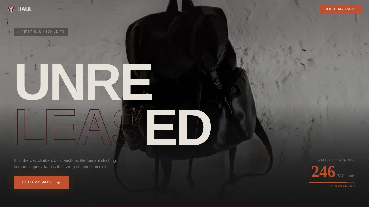
- A full-viewport hero section with a portrait product shot and a brutalist "UNRELEASED" typography stamp
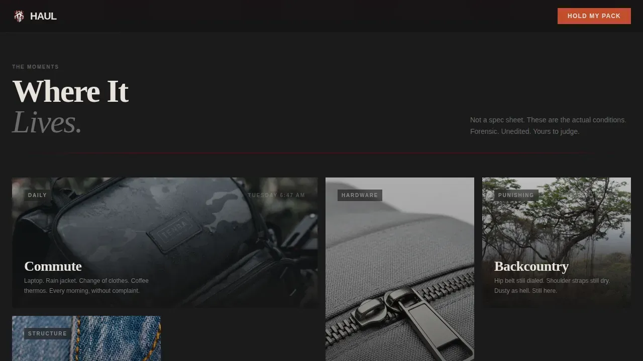
- A six-card modular moment grid with varied sizes, scroll reveals, and hover state animations
- A waitlist call-to-action section with an email form, colorway selector, and a live capacity counter
Feature list
This template delivers a tightly scoped set of features drawn directly from the project brief. Each one supports the core goal: earning the signup through design and narrative, not pressure.
Full-Viewport Portrait Hero
The hero section fills the entire screen with a single side-lit product shot against a dark background. Bold brutalist typography stamps "UNRELEASED" across the lower third. The composition is monumental and still, inspired by the raw concrete weight of brutalist architecture. No model, no lifestyle clutter, just the object.
Modular Forensic Moment Grid
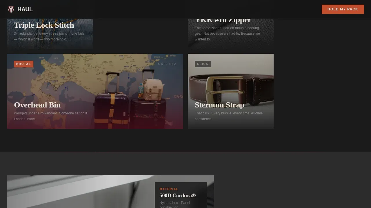
Six cards tell the story of the pack across specific real-world moments. Cards vary between double-width hero moments and tight square hardware details. As users scroll through the grid, the narrative escalates from everyday use to punishing conditions. This scrolling structure is the emotional engine of the page.
Asymmetric Construction Section
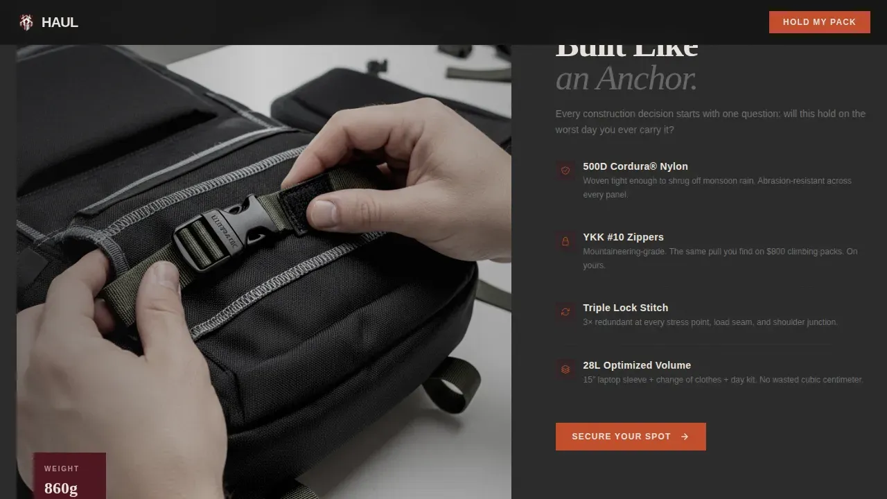
An asymmetric split layout showcases the raw materials, stitching details, and hardware up close. Images are unprocessed and textural. This section gives designers and gear-focused users the tactile proof they need. It reflects the brutalist principle that raw honesty outperforms decoration.
Waitlist Form with Capacity Counter
The call-to-action section features a single email input labeled "Hold My Pack" alongside a live capacity counter shown in smoked paprika. Scarcity is made visible: 247 of 300 spots claimed. The counter uses animated numbers to create urgency without manufactured pressure.
Colorway Preference Selector
Visitors choose between three colorways, Merlot, Smoke, and Ash, before submitting their email. This interactive selector functions as early demand data. It gives users a personal stake in the product before it ships, making the signup feel like a decision rather than a form fill.
Scroll Reveal Animations and Noise Texture
The page uses high-intensity scroll reveals, card hover states, and a subtle noise texture overlay across backgrounds. These interactive elements create a sense of tactile weight consistent with the brutalist style. Animations are purposeful, not decorative.
Page sections overview
| Section | Purpose |
|---|---|
| Hero portrait shot | Establish product presence and brutalist tone with full-viewport imagery and bold typography |
| Moment card grid | Prove pack durability through six narrative moment cards at varied grid sizes |
| Construction detail split | Show raw materials, stitching, and hardware in an asymmetric layout |
| Waitlist call to action | Capture email signups with capacity counter, colorway selector, and "Hold My Pack" form |
| Linear footer | Close the page with a clean, minimal footer strip |
Design & branding system
The visual language of this landing page is built around the Merlot and Smoke color system. It draws from the same design principles that define brutalist architecture: honest materials, no unnecessary decoration, and structure that speaks for itself.
- Colors: deep wine (#4A0E1B), charcoal smoke (#2B2B2B), ash gray (#A0A0A0), and smoked paprika (#C24D2C) reserved for buttons and the capacity counter
- Typography: Fraunces (display and serif headings) paired with Manrope (body and user interface text), both used at heavy weights for bold typographic impact
- Backgrounds alternate between near-black and smoke tones; merlot bleeds through section dividers as a raw canvas stain effect
Mobile & speed optimization
The page is built desktop-first with strong mobile adaptation. Interactive elements scale cleanly across screen sizes without losing the brutalist aesthetic or the tactile weight of the layout.
- Server components handle all static sections, keeping the base page light and fast to render
- Client components are scoped to interactive elements: the capacity counter, colorway selector, and email form
- Scroll reveal animations and hover states are designed to degrade gracefully on smaller screens
How this template helps you convert
The conversion strategy in this template is sequential and deliberate. It mirrors the logic of good brutalist web design: strip away everything that doesn't serve the function, then make that function impossible to miss.
- The hero and moment grid build product trust before any ask is made, so users arrive at the form already convinced
- The capacity counter and colorway selector create personal investment and visible scarcity, raising the motivation to act immediately
Other information about this template
This template embodies the core ideas behind web brutalism: functionality first, honesty over polish, and design that stands on structure rather than ornament. The word brutalism comes from the French term béton brut, meaning raw concrete, and the web design movement drew directly from brutalist architecture's rejection of unnecessary decoration.
Brutalist websites tend to prioritize functionality over aesthetics, which is why this page earns trust through narrative rather than polished lifestyle photography. High-contrast color schemes are a defining feature of brutalist web design, and this template uses that contrast to guide users naturally through the page. Bold typography in brutalist design uses oversized, heavy-weighted fonts to deliver a strong first impression, this template applies that principle from the hero stamp down to the waitlist call to action.
Designers exploring brutalist aesthetic ideas will find this template a practical starting point. It uses repeating shapes in a modular grid, visible layout structure, and minimal decoration to reflect classic brutalist elements. The design is inspired by the same simplicity and rawness that makes sites like Craigslist and Studio Push memorable: personality through structure, not ornament.
- This template suits designers, developers, and brand founders who want to launch with conviction and creative edge
- The card grid layout can serve as inspiration for any product brand that wants to prove quality through real-world storytelling
- The Merlot and Smoke palette and Fraunces typography system create a strong, cohesive web page identity that stands apart from current polished design trends
- The haul bold brutalist backpack brand landing page template is the reference project for this design system and collection
- Portfolio website builders and personal project designers can also adapt this template's grid and typography approach for their own work
Theme
Bold Brutalist
Creative direction
Seasonal/Moment
Color system
Merlot & Smoke
Style
Card Grid (Modular)
Direction
Waitlist/Coming Soon
Page Sections
Full-viewport Brutalist Hero Section
Modular Forensic Moment Card Grid
Asymmetric Construction Detail Section
Waitlist Form with Live Capacity Counter
Interactive Colorway Preference Selector
Scroll Animations and Noise Texture Overlay
Related questions
Is this template suitable for a product that isn't a backpack?
What design style does this landing page use?
Does this template include animations?
Can I change the colorway options in the selector?
Who typically uses a brutalist landing page template like this?



