Trend — Curated Streetwear Collective Landing Page Template
Drip is a neo-retro athleisure subscription box landing page template built for direct-to-consumer fashion brands. It uses an overlap and layered scroll experience, a full-screen video hero, a built-in style quiz, and three-tier pricing cards to turn curious visitors into monthly subscribers. The obsidian and gold visual system makes every section feel like unwrapping something worth keeping.
by Rocket studio
Quick summary
Drip is a single-page, overlap-layered landing page template designed for athleisure subscription box brands. It guides visitors through a tactile unboxing scroll journey, from a full-screen video hero to a personalized style quiz and tiered pricing reveal. Every section layers over the last, building desire before asking for a commitment.
Who this template is for
This template is built for founders, creative directors, and product managers who want to launch or grow a curated athleisure subscription box. If your audience cares about how they look walking to the studio, running trails at golden hour, or working from home in clothes that feel intentional, this template speaks directly to them. It suits direct-to-consumer fashion brands that want a high-end editorial feel without a long production timeline.
- Subscription box founders launching a new athleisure brand in the fashion and lifestyle space
- Independent designers or curators selling boutique sportswear and apparel to style-conscious buyers
- Solopreneurs and product managers who want a polished, conversion-ready landing page without writing code from scratch
What problem this template solves
Most athleisure subscription landing pages feel flat. They list features, show a price, and ask for a sign-up. That approach does not create desire. It does not make someone feel the weight of a perfectly folded pair of pants arriving at their door, or the moment a gold-trimmed card slides out from tissue paper. Visitors leave without a sense of what they are actually buying into.
Drip solves this by making the scroll itself feel like an unboxing. Each section reveals something new beneath something else, so by the time pricing appears, the visitor already wants what is inside.
- Flat, low-energy layouts that fail to communicate the tactile appeal of curated athleisure wear
- No clear personalization path, leaving visitors unsure whether the subscription will match their style or fit preferences
- Pricing shown too early, before visitors have felt the quality and style promise of the brand
What you get with this template
This template gives you a fully structured, single-page layout built around five carefully designed sections. Each one has a distinct visual role in the unboxing narrative. The design details, animation logic, and copy hierarchy are all pre-decided so you can focus on your product photography and subscriber offer rather than layout decisions.
- A full-screen video hero with centered knockout headline and a floating gold call-to-action bar that stays visible as visitors scroll
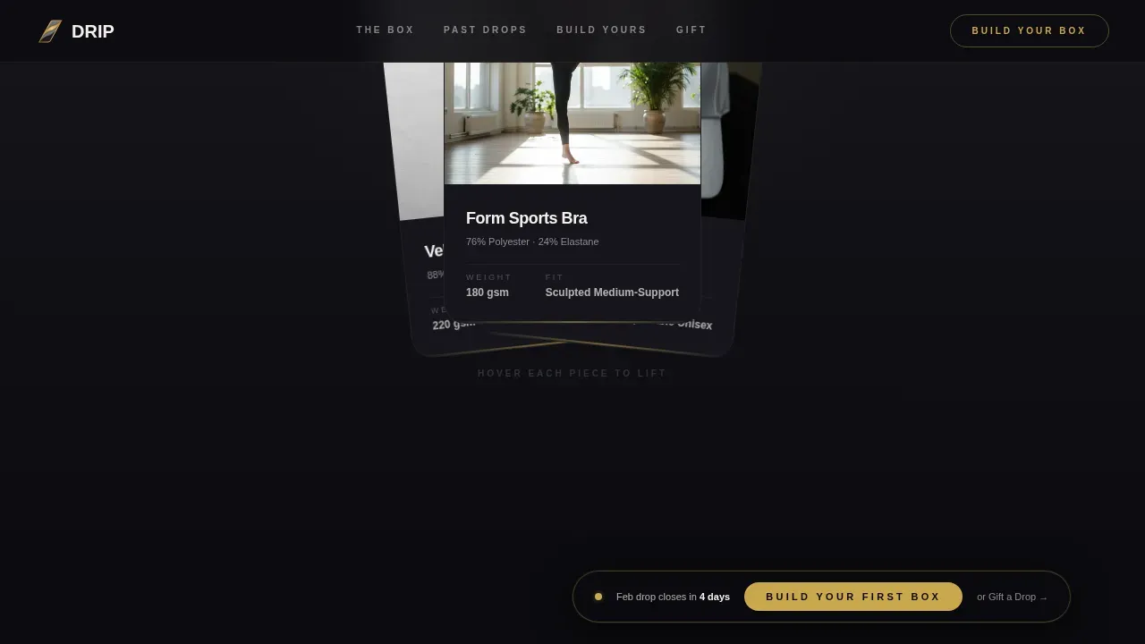
- A garment reveal section with a parallax lid-lift card and three overlapping fan cards that lift on hover to show fit details, fabric weight, and styled-on-body thumbnails
- A past-box gallery with diagonal halftone-grain photo tiles, gold-bordered subscriber pull-quote cards, a style quiz with three fast-tap inputs, and three overlapping pricing tier cards
Feature list
This template includes a set of carefully considered features that work together to create a coherent, high-converting subscription experience. Every feature listed here is grounded in the template structure as described in the source brief.
Full-Screen Video Hero with Floating Call-to-Action Bar
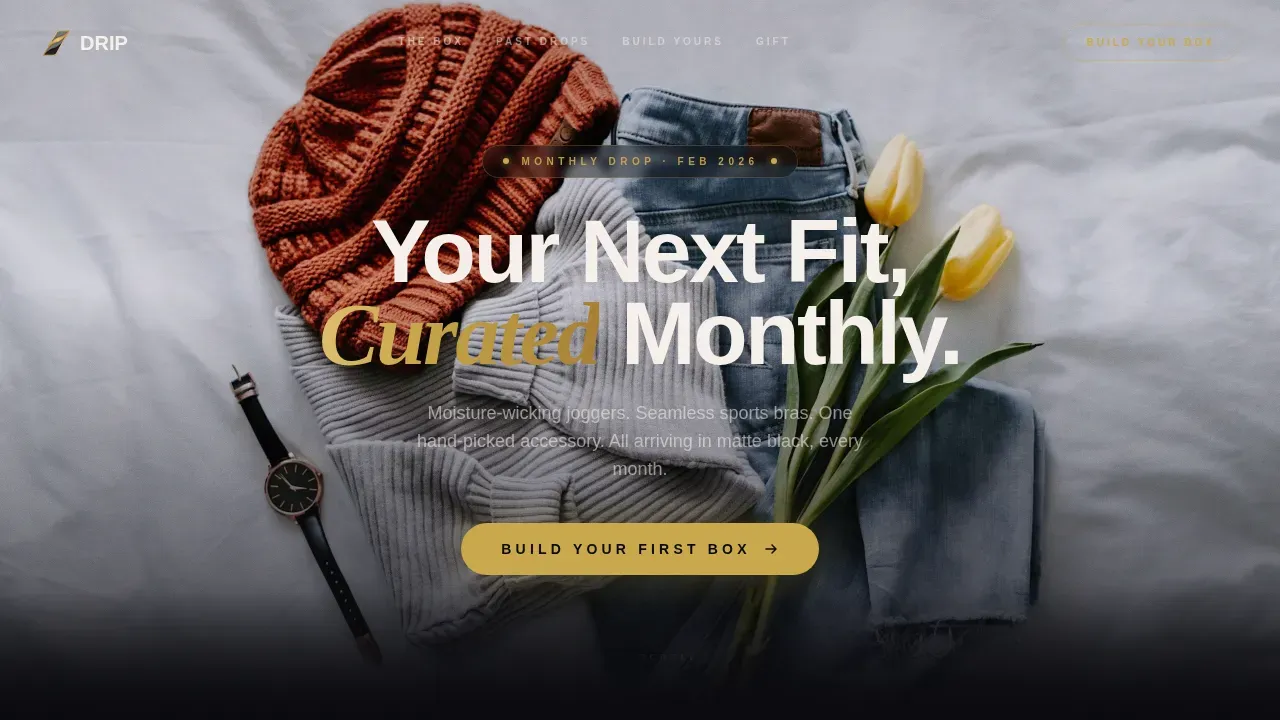
The header uses a full-screen looping video background. The video concept centers on hands opening a matte black box in slow motion, shot overhead on a concrete countertop under directional light. Gold foil catches the lens as tissue parts and fabric unfurls. A single line of chalk white knockout type sits center-frame. After the hero fold, a floating bar pinned in gold on obsidian keeps the primary call-to-action visible throughout the scroll journey, so visitors never have to scroll back up to act.
Parallax Garment Reveal with Hover Fan Cards
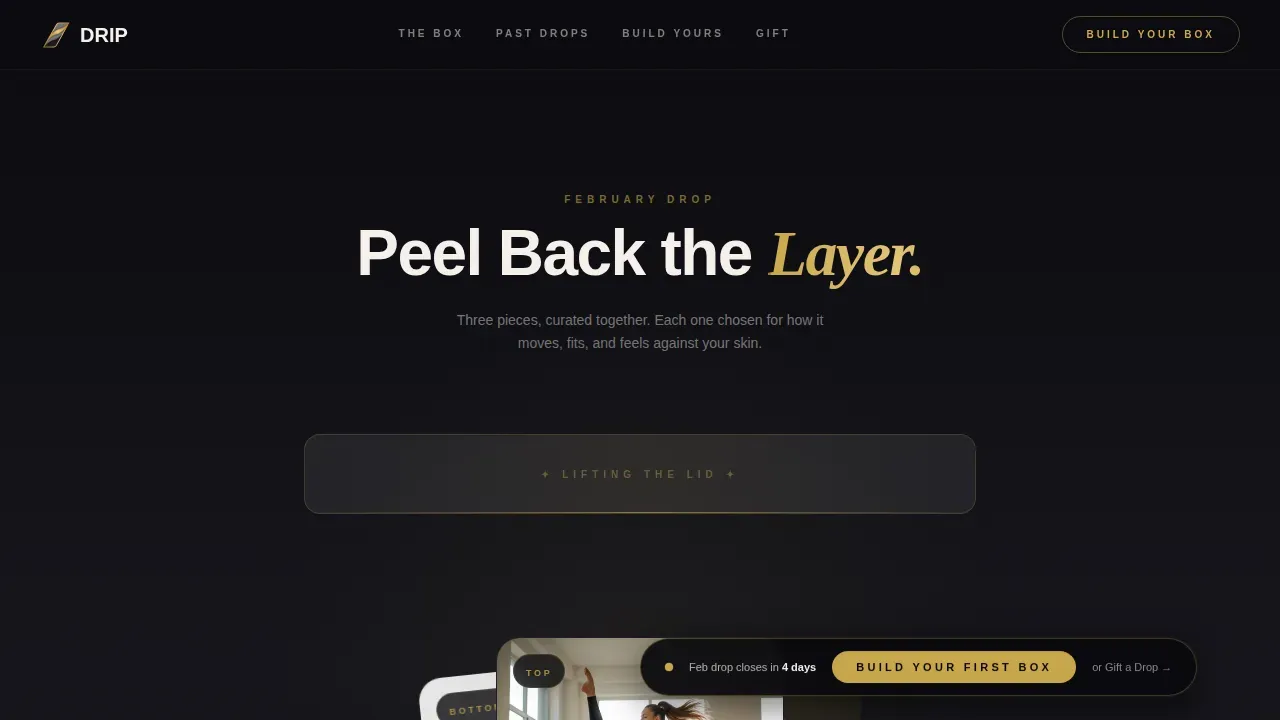
The garment reveal section opens with a parallax card that slides upward like a box lid being lifted. Three overlapping garment cards fan out beneath it, styled like fabric swatches stacked on a fitting room shelf. Each card lifts on hover to reveal fit details, fabric weight, and a styled-on-body thumbnail. This section makes the clothes feel real before a visitor has touched them, which is the core challenge of selling apparel online. Whether the subscriber leans toward a tailored fit, a relaxed silhouette, or an oversized drape, the hover reveal helps them see themselves in the look.
Diagonal Past-Box Gallery with Halftone Grain Filter
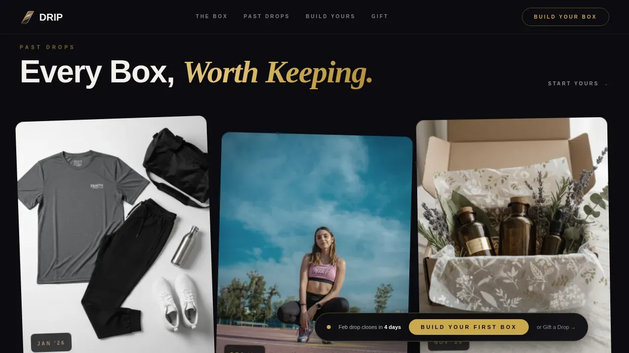
A photo gallery tiles diagonally across the section, each image treated with a retro halftone grain filter that reinforces the neo-retro theme. This section functions as visual evidence, showing past box contents in styled, editorial detail. Subscriber pull-quotes sit on gold-bordered cards that feel like handwritten notes tucked into the packaging. Social proof in this form, drawn from real subscriber voices, is persuasive in fashion and apparel marketing because it demonstrates style, quality, and fit from the perspective of people who actually wear the clothes.
Three-Tap Style Quiz with Personalization Flow
The style quiz is built into the page as an interactive call-to-action. Three fast-tap questions cover preferred fit, activity level, and size. This approach engages visitors and gathers personalization signals before showing pricing. Using a style quiz as a primary call-to-action is a proven method for increasing engagement, because it shifts the experience from browsing to participating. The quiz creates a sense of ownership over the outcome, making the subscription feel curated rather than generic.
Overlapping Three-Tier Pricing Cards
After the quiz, three pricing tiers appear on overlapping cards that echo the layered garment aesthetic of the rest of the page. Pricing is shown immediately after the quiz so the decision follows desire, not the other way around. The overlapping card layout reinforces the template's visual language and keeps the pricing reveal feeling editorial rather than transactional.
Gift Box Secondary Path with Editorial Layout
A dedicated section offers visitors a secondary conversion path: buying a single past box as a gift. This section uses an editorial layout that suits the gift-giving context, separating it visually from the subscription flow while keeping it within the same obsidian and gold design system. This means visitors who are not ready to subscribe still have a lower-commitment way to engage with the brand, and brands gain a gift revenue channel without adding a separate page.
Page sections overview
| Section | Purpose |
|---|---|
| Full-Screen Video Hero | Establishes brand atmosphere and anchors the primary call-to-action above the fold |
| Floating call to action Bar | Keeps the "Build Your First Box" button accessible throughout the entire scroll |
| Parallax Lid-Lift Card | Opens the garment reveal with a tactile parallax animation that mimics unboxing |
| Hover Fan Garment Cards | Showcases three curated pieces with fit details and styled-on-body thumbnails on hover |
| Past Box Gallery | Displays diagonal halftone-filtered past box photos as visual proof of curation quality |
| Subscriber Pull-Quotes | Gold-bordered social proof cards styled like handwritten notes from real subscribers |
| Style Quiz Section | Collects fit, activity, and size preferences through a three-tap interactive flow |
| Tiered Pricing Cards | Reveals three overlapping subscription tier options after the quiz personalizes the offer |
| Gift Box call to action | Provides a single-purchase gift path in an editorial layout for non-subscriber visitors |
| Dark Obsidian Footer | Closes the page with a horizontal footer pattern in deep obsidian black |
Design & branding system
The visual identity follows a neo-retro editorial direction built on four deliberate colors. Obsidian anchors every background layer. Brushed gold traces card edges, hover states, and call-to-action elements. Warm asphalt gray separates stacked sections the way folded garment layers separate in a box. Chalk white keeps the typography breathing and readable across dark backgrounds. The result feels like a vintage trophy case lit by a single pendant bulb: dark, confident, and earned.
- Color system: deep obsidian black (#0B0B0F), brushed gold (#C9A84C), warm asphalt gray (#2E2E34), chalk white (#F5F0EB)
- Typography: DM Sans for headlines (clean, modern, direct) paired with Crimson Text for editorial accents and subscriber pull-quotes (warm, slightly nostalgic, tactile)
- Visual style: neo-retro with overlap and layered layout, halftone grain filter on gallery images, gold-bordered card details, and hover-lift animations throughout
Mobile & speed optimization
This template is built mobile-first, which matters for this audience specifically. Boutique gym regulars and work-from-home creatives browse on their phones post-workout, between meetings, or while scrolling in the evening. The scroll experience needs to feel just as layered and satisfying on a small screen as it does on a desktop editorial layout. Optimizing landing pages for mobile is crucial when your subscribers are most likely to visit the page from their smartphones.
- The video hero includes a poster fallback so the section loads with a styled still image on devices where autoplay is restricted, keeping the atmosphere intact without relying on video playback
- Images use lazy loading so sections below the fold do not slow the initial page load, keeping the first impression fast
- Animations and hover effects are handled through CSS-first logic to keep the page smooth and responsive across device types
How this template helps you convert
A high-converting landing page for a neo-retro athleisure subscription box must combine visual flair with clarity. This template is structured to move visitors through a desire-building sequence before asking for a financial commitment. Every section earns the next one.
- The full-screen video hero creates an immediate atmosphere and emotional pull. The floating call-to-action bar ensures the primary action is never more than a glance away, whether the visitor is at the top of the page or halfway through the past-box gallery. A single primary call-to-action featured prominently above the fold, and repeated lower in the flow, is one of the most reliable ways to lift subscription sign-up rates.
- The style quiz shifts the conversion experience from passive browsing to active participation. When a visitor taps their preferred fit, activity level, and size, they have already mentally stepped into the subscriber role. Pricing revealed after the quiz lands differently than pricing shown cold, because desire has been built first. Subscribers should also be informed that they can pause or cancel at any time, and this template gives you the space to communicate that clearly within the pricing section.
- The gift box section captures visitors who are not ready to subscribe themselves. A secondary purchase path for a single past box keeps those visitors in the funnel and creates a referral opportunity. When someone receives a beautifully packaged box as a gift, there is a strong chance they become the next subscriber.
Other information about this template
This section covers additional context about the template, the athleisure subscription space, and the broader category of no-code tools that make templates like this practically useful for founders building subscription brands.
The athleisure wear market has grown because people want clothes that move with them, from trails and park paths to streets and coffee shops. Comfort and fit are top priorities for consumers choosing athleisure, and bold colors alongside unique patterns have become mainstream ways to express personal style through sportswear. Sustainable fabrics are also a growing expectation, with brands like Vuori earning praise for minimalist designs built on responsible materials. Lululemon is known for high-quality athleisure wear that blends style and performance. Champion is a classic brand recognized for soft sweatshirts and retro-inspired designs. Rhone invests heavily in high-quality fabrics that hold up across gym sessions and casual wear alike. Alo Yoga is celebrated for stylish, functional yoga apparel, especially its leggings and breathable tops. On has gained popularity for its innovative running shoe designs with Cloud cushioning. Hoka is recognized for comfortable running shoes that emphasize fit and functionality. Nike combines athletic performance with fashion-forward design across its athleisure collections. Adidas is known for its iconic three-stripe design and high-quality sportswear. Public Rec focuses on comfort and fit for versatile athleisure pieces suited to various occasions. Reigning Champ builds premium fleece and athletic separates with a focus on construction quality, and Outdoor Voices has built a loyal community around playful, activity-first apparel that makes everyday wear feel like a celebration.
Subscription boxes are one of the most effective ways for fashion brands to deliver curated selections of trendy items directly to consumers. The unboxing moment is a conversion asset in itself, and this template is designed to recreate that moment on screen before the physical box even arrives. User-generated content, such as photos of actual subscribers wearing the gear, is persuasive in fashion marketing. Incorporating testimonials, star ratings, and social proof into a landing page builds trust and encourages potential subscribers to convert. This template provides the structural components for all of those social proof elements.
For founders building this kind of subscription brand, no-code tools and AI-assisted platforms have made it significantly faster to launch. AI-powered no-code tools allow users to build production-ready applications from natural language prompts. No-code platforms can handle backend integrations and deployment, making app development accessible to non-technical founders. These tools are particularly useful for solopreneurs and product managers who want to ship quickly without needing extensive coding knowledge. Subscription-based models for no-code tools often include free trials and tiered pricing plans so founders can test before they commit.
Personalized communication matters beyond the landing page too. Personalized emails deliver six times higher transaction rates than non-personalized ones. Birthday emails earn significantly more revenue and have substantially higher transaction rates than standard promotional emails. Creating a sense of urgency in email campaigns can double transaction rates compared to average marketing messages. Visual content in emails enhances engagement and response rates. Clear, straightforward offers give readers strong incentives to purchase. All of these strategies align naturally with the subscriber relationship this template is designed to initiate.
Here are a few additional details worth noting:
- The template uses a neo-retro visual language that blends 80s and 90s nostalgia with modern performance fabric aesthetics, reflecting current athleisure trends around throwback silhouettes and deliberate design details
- The Drip neo retro athleisure subscription box landing page template is built specifically for the Fashion and Lifestyle category, with a niche focus on subscription box conversion in the athleisure segment
- The floating call-to-action bar, the style quiz flow, and the overlapping pricing card layout are all designed to reduce friction and increase the chance that a first-time visitor becomes a paying subscriber
- Eye candy is built into every layer of the design, from the halftone grain gallery to the gold-bordered pull-quote cards, so the page functions as brand theater as much as a sales tool
- The to do list for any brand launching with this template is short: drop in your video, swap in your product photography, write your pricing tiers, and publish
- A water bottle, a hand-picked accessory, or a curated shoe pair are examples of the kinds of items a subscription brand can highlight using the fan card hover reveal section
- Reigning Champ and Outdoor Voices are examples of brand benchmarks that subscription curators in this space often reference when setting quality and style expectations for their own box
Theme
Neo-Retro
Creative direction
Unboxing Experience
Color system
Obsidian & Gold
Style
Overlap/Layered
Direction
Direct Sales
Page Sections
Full-screen Video Hero with Floating Call to Action Bar
Parallax Lid-lift and Hover Fan Garment Cards
Diagonal Halftone Past-box Gallery with Pull-quotes
Three-tap Style Quiz for Personalized Subscription Matching
Overlapping Three-tier Pricing Cards with Gift Box Path
Related questions
Does this template include the style quiz as a functional interactive element?
Can I use this template to offer a gift box purchase alongside the subscription?
How does the video hero section work if a visitor's device does not support autoplay?
Is this template suitable for a brand launching its subscription box for the first time?
Can I adapt the color system and typography if my brand uses different visual guidelines?



