Brutalist Incident Response Playbook Landing Page
Triage is a bold brutalist landing page built for an incident response playbook app. It compresses a digital war room into a single high-urgency page, with a live comparison table, three pre-built playbook cards, and an app download flow. Everything is designed for SOC analysts, IT directors, and compliance officers who need clarity at 2 a.m.
by Rocket studio
Quick summary
Triage is a single-page brutalist landing page template for an incident response playbook app. It leads with a product screenshot mid-incident, drives urgency through a phase-by-phase comparison table, and closes with app download calls to action. The design uses hard edges, monospaced type, and an amber-on-black palette engineered for zero distraction.
Who this template is for
This template is built for teams and founders shipping security or operations tooling that needs to earn trust fast. The page speaks directly to the people who get paged at midnight and need answers immediately.
- SOC analysts and IT directors managing active security incidents
- Compliance officers who must document incident timelines before board reviews
- Product teams launching incident response or operations apps to technical buyers
What problem this template solves
Security tools often sell themselves with generic feature lists and soft marketing language. That approach fails with technical buyers who are already under pressure. Triage solves the credibility gap by showing exactly what the app does during the worst five minutes of a responder's shift.
- No clear before-and-after story leaves buyers guessing whether the tool fits their workflow
- Buried download prompts lose high-intent visitors who arrive ready to act
- Vague product screenshots fail to communicate urgency or real incident context
What you get with this template
You get a complete, single-page layout that simulates the urgency of a live incident and moves visitors toward an app download. Every section has a job, and nothing is decorative.
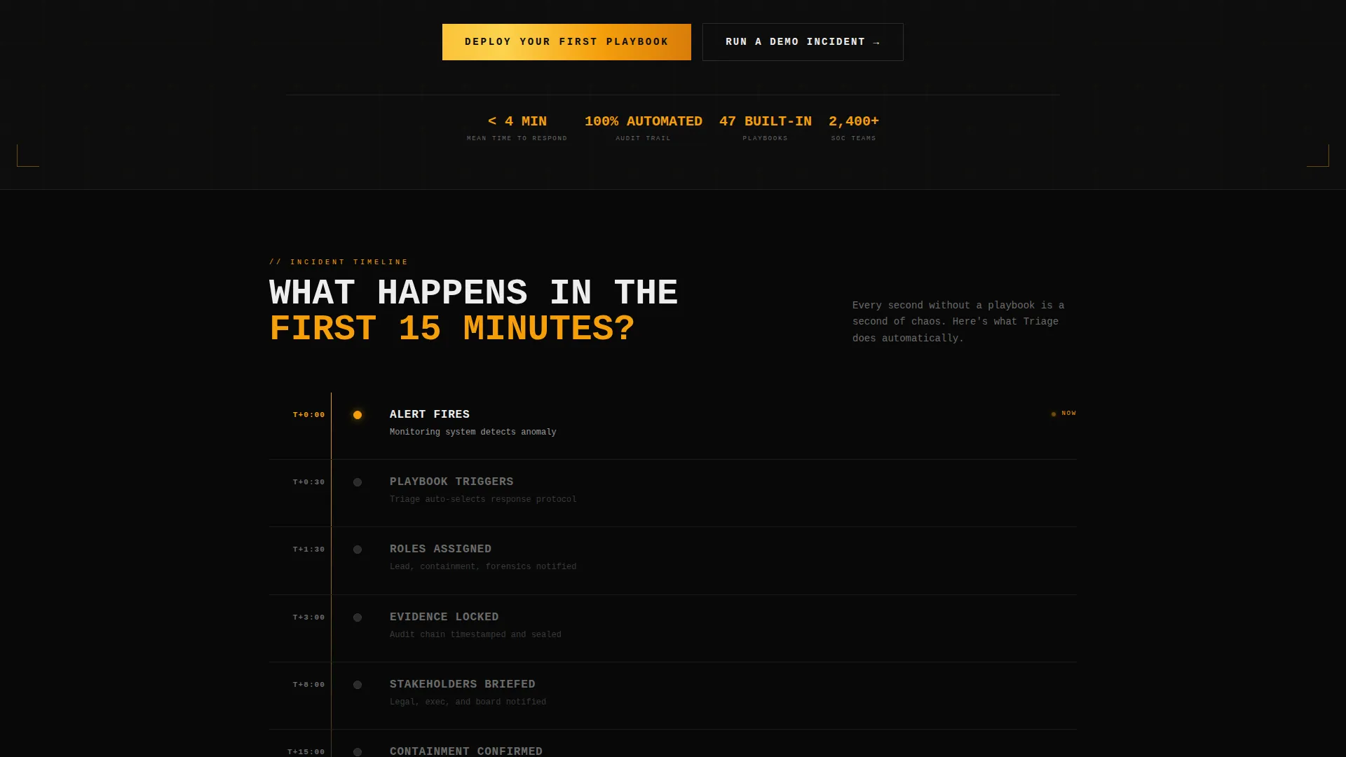
- A brutalist hero section with a product screenshot showing a live playbook, SEV-1 severity badge, and countdown timer
- A phase-by-phase comparison table contrasting "Without Triage" chaos against "With Triage" structured response
- Three playbook template cards for Ransomware, Data Breach, and Insider Threat, each showing step counts and average resolution times
- A primary download call to action with a platform selector for iOS, Android, and Desktop Agent, plus an email field for cross-device setup
- A secondary "Run a Demo Incident" path that walks visitors through a 60-second phishing response simulation before the download prompt
Feature list
This section covers the core built-in components that make the Triage landing page function as a high-conversion app download page.
Live Incident Hero Section
The header places a product screenshot front and center. It shows the app mid-incident: a live playbook with task assignments, a countdown timer reading 00:47:12, a SEV-1 severity badge, and three team member avatars with active-status rings. A single amber notification pulse is frozen mid-animation above a pure black background.
Phase-by-Phase Comparison Table
The comparison table is the page's core persuasion engine. Each row maps to a real incident phase: Detection, Containment, Eradication, Recovery, and Post-Mortem. The left column shows what happens without the app (missed escalations, Slack chaos, no audit trail). The right column shows the structured outcome the app delivers.
Playbook Template Cards
Three cards fan out below the comparison table, one for each scenario: Ransomware, Data Breach, and Insider Threat. Each card displays real step counts and average resolution times, giving technical buyers concrete evidence rather than marketing claims.
App Download Flow with Platform Selector
The primary call to action opens a platform selector covering iOS, Android, and Desktop Agent. A single email field lets users receive a cross-device setup link. This flow is pinned as a sticky bottom bar on mobile so it is always reachable.
Interactive Demo Incident Path
The secondary conversion path invites visitors to run a 60-second phishing response simulation directly in-browser. The simulation walks through a real playbook sequence and ends at the download prompt, letting analysts experience the workflow before committing to an install.
Sticky Mobile Bottom Bar
On mobile, the primary call-to-action bar is pinned to the bottom of the screen at all times. Visitors never have to scroll back up to find the download entry point, which keeps the conversion path uninterrupted throughout the session.
Page sections overview
| Section | Purpose |
|---|---|
| Hero Header | Product screenshot with live incident context and headline |
| First 15 Minutes | Countdown-style urgency block framing the comparison |
| Comparison Table | Phase-by-phase contrast of unmanaged versus. structured response |
| Playbook Cards | Three scenario cards with step counts and resolution times |
| Primary call to action Block | App download prompt with platform selector and email field |
| Demo Incident Path | 60-second in-browser simulation leading to install prompt |
| Sticky Mobile Bar | Pinned download call to action for mobile visitors |
Design & branding system
The visual identity is Bold Brutalist, built on a Carbon Fiber color system. Every design decision reinforces the feeling of an industrial tool engineered under pressure, not a polished consumer product.
- Color palette: deep carbon black (#0D0D0D) dominates every surface; Kevlar gray (#2A2A2A) provides structural contrast; warning amber (#F59E0B) marks every action point; critical white (#EDEDED) carries all body text
- Typography is monospaced and uppercase for headlines, evoking terminal output and printed operational binders rather than web marketing norms
- Zero gradients, zero rounded corners, zero decorative elements, every edge is hard, every surface is flat, and amber appears only where the eye must go
Mobile & speed optimization
The template is built with mobile-first responders in mind. A SOC analyst or IT director tapping through an alert at 2 a.m. needs the page to load clean and deliver the download path without friction.
- Sticky bottom bar keeps the primary app download call to action pinned on all mobile screen sizes throughout the full scroll
- The layout compresses cleanly into a single-column stack on small screens, preserving the comparison table's readability without horizontal scrolling
- The platform selector and email field are thumb-friendly and require minimal input to complete the download setup flow
How this template helps you convert
The page is structured as a pressure sequence, not a feature tour. Each section earns the next scroll and moves the visitor closer to a committed install.
- The hero screenshot opens with a live incident already in progress, establishing credibility before a single word is read and creating immediate identification for technical buyers
- The comparison table makes the cost of not using the app visceral and specific, moving visitors from awareness to urgency across five defined incident phases
- The demo incident path lowers commitment friction by letting analysts feel the workflow in 60 seconds, converting skeptical visitors who would otherwise bounce before downloading
Other information about this template
This template sits at the intersection of the Documentation and Support category and the Internal Knowledge Base subcategory, with a specific niche focus on incident response playbook tooling. It is a strong fit for teams building or marketing apps in the security operations space.
- Template style is a Comparison Table layout, making it well-suited for products that need a clear before-and-after narrative
- Creative direction follows a Launch Energy approach, meaning the page is structured to accelerate urgency rather than explain features at a steady pace
- The header concept is a Product Screenshot, which is a high-trust format for technical buyers who want to see the tool working before they read about it
- The landing page direction is App Download, so every section and call to action routes toward an install rather than a form submission or sales call


Theme
Bold Brutalist
Creative direction
Launch Energy
Color system
Carbon Fiber
Style
Comparison Table
Direction
App Download
Page Sections
Live Incident Hero Section
Phase-by-phase Comparison Table
Playbook Scenario Cards
App Download Flow
Interactive Demo Incident Path
Sticky Mobile Bottom Bar
Related questions
Who is this landing page template designed for?
What does the comparison table show?
What is the Run a Demo Incident feature?
Can I adapt the playbook scenario cards for my own scenarios?
Does the template work well on mobile devices?


