AI for Healthcare Specialist Professional Website Template
Triage is a bold brutalist healthcare AI landing page template built for platforms that resolve patient calls, billing disputes, and care navigation questions in seconds. Designed with a glassmorphic dark interface and hub-and-spoke anchor navigation, it guides hospital COOs, health-plan experience leads, and clinic managers toward downloading an AI-powered patient service app.
by Rocket studio
Quick summary
Triage is a single-page, anchor-navigated landing page template for healthcare AI customer service platforms. It pairs a void-black glassmorphic visual system with brutalist typography to communicate speed, clinical credibility, and resolution power. The page is built to earn an app download by letting visitors interact with a simulated AI chat before they ever reach a call-to-action button.
Who this template is for
This template speaks directly to the operators running healthcare organizations at scale. It is designed for buyers who measure success in call deflection rates, front-desk retention, and patient satisfaction scores, not generic SaaS metrics.
- Hospital network chief operating officers managing call-center attrition and staffing costs
- Health-plan member experience leads watching patient satisfaction scores decline
- Multi-site clinic managers losing front-desk staff faster than they can hire replacements
What problem this template solves
Healthcare organizations field thousands of after-hours calls that no one is available to answer. Billing disputes, prescription refill requests, and care navigation questions create friction that drives patients away and burns out staff. This template gives AI healthcare platforms a page that makes the resolution story immediate and believable.
- No clear way to show enterprise buyers that AI can handle clinical-grade conversations at speed
- Visitors leave before trusting an AI platform enough to download or request a demo
- Generic SaaS landing pages fail to convey the urgency and precision that healthcare buyers require
What you get with this template
You get a fully structured hub-and-spoke landing page with five named anchor sections, each designed to carry a distinct part of the conversion story. The layout escalates from problem to proof to deployment, matching the mental journey of a procurement-focused healthcare buyer.
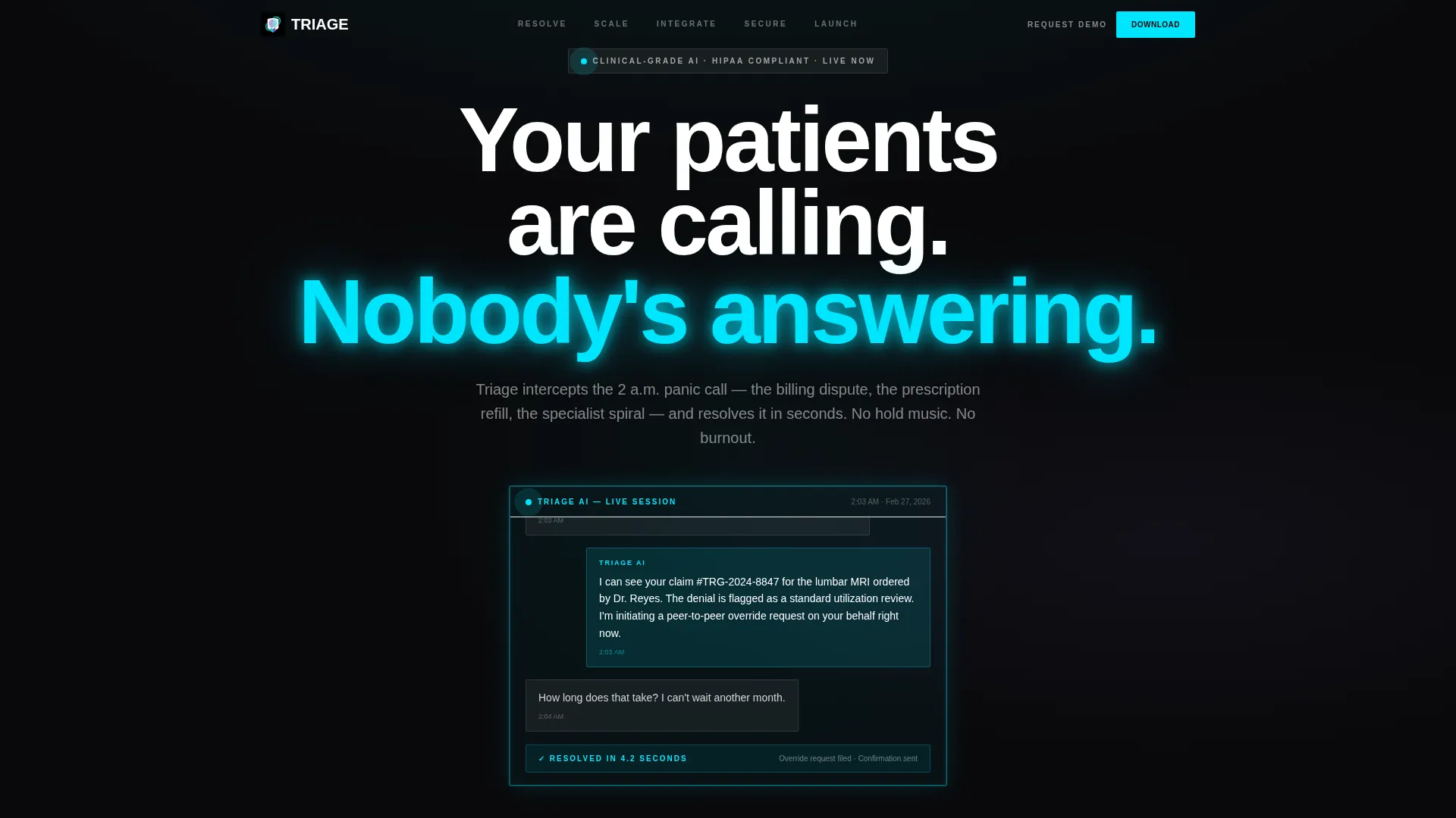
- A full-bleed brutalist header with a live-simulated AI chat transcript and a single-heartbeat glow animation on load
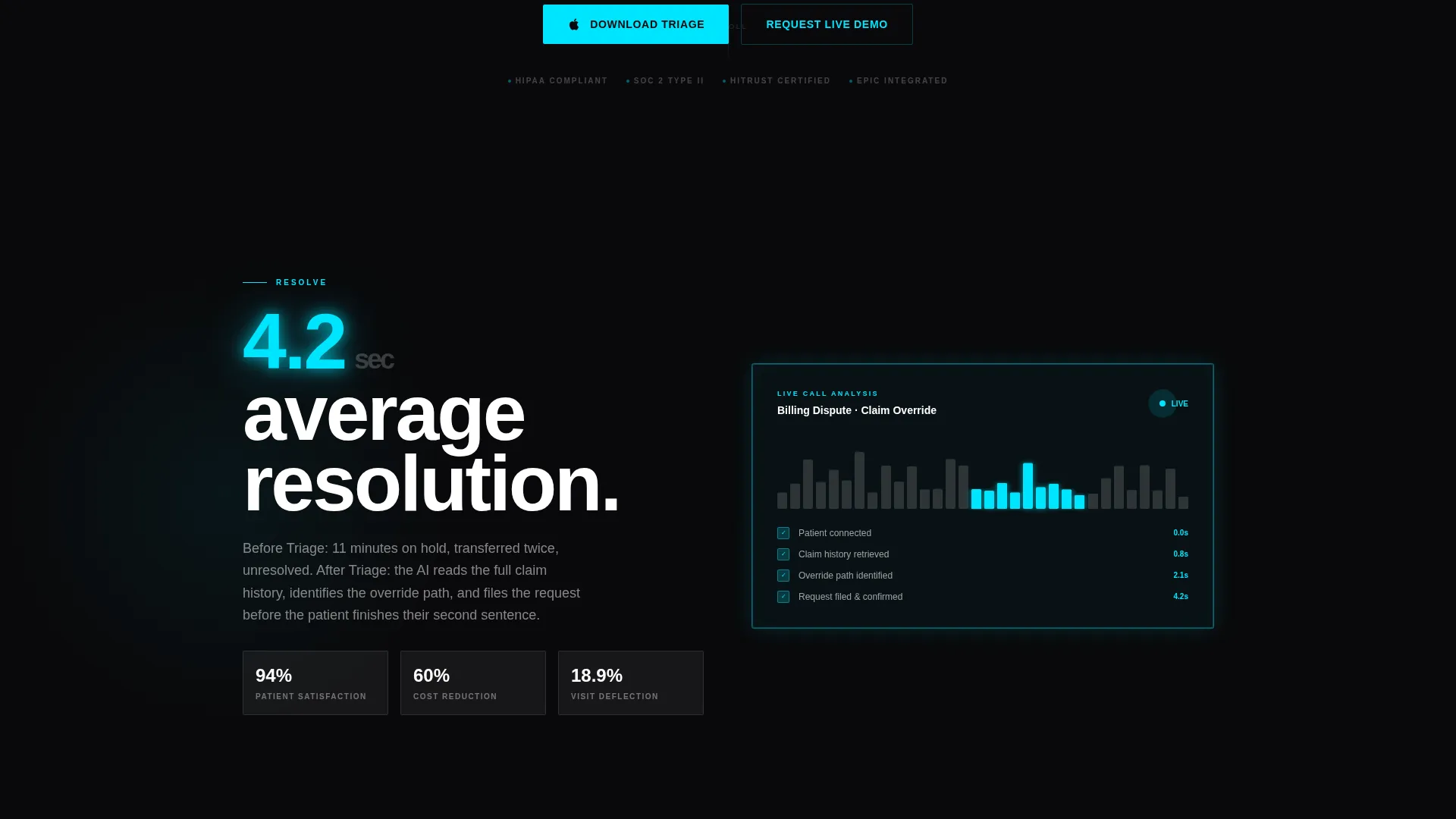
- Five spoke sections (RESOLVE, SCALE, INTEGRATE, SECURE, LAUNCH) each containing one oversized metric, one short paragraph, and one looping micro-animation
- Persistent app download calls-to-action with App Store and Google Play badge pairs, plus a secondary "Request a Live Demo" path for enterprise buyers
Feature list
This template is built around a set of deliberate design and structural decisions. Each feature serves the core goal: converting a skeptical healthcare buyer into a confident installer.
Simulated AI Chat Transcript in Header
The header contains a live-simulated chat sequence showing a patient resolving a denied insurance claim across four AI messages. Timestamps tick in real time, giving visitors immediate proof of resolution speed before they scroll.
Hub and Spoke Anchor Navigation
A sticky top navigation pins five single-word section labels (RESOLVE, SCALE, INTEGRATE, SECURE, LAUNCH) to the viewport. Visitors can jump to any spoke at any time, keeping complex enterprise buyers in control of their own discovery path.
Per-Spoke Metric Cards with Micro-Animations
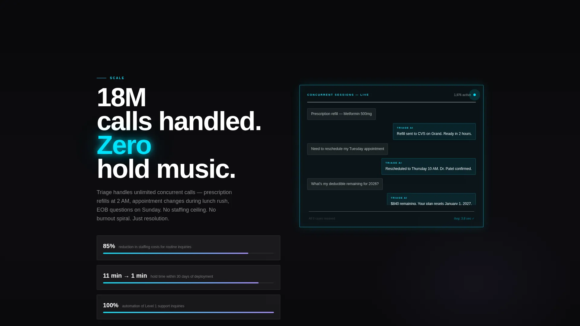
Every spoke section leads with one large frosted-glass panel showing a single oversized metric. Each card pairs with a looping micro-animation, waveform, chat bubble cascade, compliance shield lock-click, to maintain scroll momentum and reinforce each proof point.
Persistent App Download Call-to-Action
The primary download call-to-action with App Store and Google Play badges reappears at the close of every spoke section. On mobile, it locks to the bottom of the viewport so the conversion path is never more than a thumb-tap away.
Hard-Cut Brutalist Scroll Transitions
Section transitions use hard cuts rather than fades. This brutalist conviction in the pacing matches the "something competent has taken over" emotional tone the template is designed to create.
Dual Conversion Path Design
The page supports two buyer journeys simultaneously. Direct app installers follow the download path. Enterprise buyers who require internal approval or vendor evaluation follow the "Request a Live Demo" secondary path, with no friction between the two flows.
Page sections overview
| Section | Purpose |
|---|---|
| Full-Bleed Header | Establishes the problem and delivers immediate AI proof via simulated chat |
| RESOLVE Spoke | States the core patient service problem with one anchor metric |
| SCALE Spoke | Demonstrates resolution speed and volume capacity |
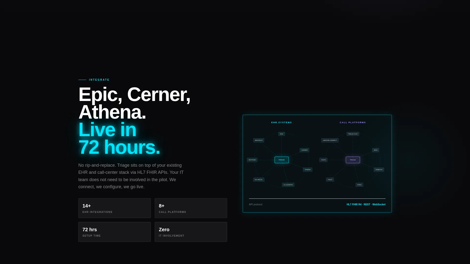
| INTEGRATE Spoke | Presents the clinical system integration map |
| SECURE Spoke | Displays the HIPAA architecture diagram behind glass |
| LAUNCH Spoke | Shows a live deployment timeline to close the enterprise case |
| Mobile call to action Bar | Locks the app download action to the bottom of the viewport on mobile |
Design & branding system
The visual identity filters bold brutalism through a glassmorphic color system, creating a palette that feels like a diagnostic monitor in a darkened radiology suite. Heavy knockout type sits on pure black while frosted panels float above like translucent instrument trays catching cyan light.
- Void black (#09090B) as the dominant background, electric clinical cyan (#00E5FF) as the primary glow accent, and soft violet (#A78BFA) on hover states and active indicators
- Frosted-panel white (#FFFFFF at 8% opacity) used for every card, nav element, and spoke panel to create the floating glass effect
- 120-pixel-plus brutalist headline type stamped heavy and unapologetic, with cyan glow bleeding from behind letterforms as if the text is a backlit screen
Mobile & speed optimization
The template is structured for mobile-first healthcare buyers who may be reviewing vendor options between meetings or on a clinical floor. The layout adapts the hub-and-spoke flow to smaller screens without losing the visual intensity of the brutalist identity.
- The sticky anchor navigation remains accessible on mobile, allowing quick jumps between spoke sections
- The app download call-to-action card locks to the bottom of the mobile viewport, keeping the primary conversion action visible at all times
- Micro-animations are looping and lightweight by design, contained within frosted-glass card boundaries to avoid visual clutter on smaller displays
How this template helps you convert
The conversion strategy is built into the page architecture itself. Every structural choice moves a skeptical healthcare buyer one step closer to downloading the app or booking a demo.
- The interactive simulated chat in the header lets visitors experience AI resolution before any marketing copy asks them to believe it, reducing the trust gap that kills most healthcare tech conversions.
- The escalating spoke structure mirrors the procurement decision sequence, problem, speed, integration, compliance, deployment, so enterprise buyers feel the page was written for their specific evaluation criteria.
- The persistent dual call-to-action design captures both immediate app installers and enterprise buyers in a longer sales cycle, without forcing either group through a path that does not fit their timeline.
Other information about this template
This template is a strong fit for teams building go-to-market pages for healthcare AI customer service platforms, whether the core product handles automated patient intake, billing resolution, or care navigation at scale. The brutalist visual system and clinical color palette are intentional differentiators in a category where most competitor pages default to soft gradients and stock photography of smiling nurses.
- The template style is Hub and Spoke with Anchor Navigation, suited for platforms with multiple distinct proof points that benefit from non-linear exploration
- The creative direction is Launch Energy, meaning the page escalates in confidence and specificity as the visitor scrolls, not the other way around
- The header concept is Dark Full-Bleed with Glow, a rare choice in healthcare tech that signals the platform is built for operators, not patients
- The primary landing page direction is App Download, with a secondary enterprise demo request path built in from the start
Theme
Bold Brutalist
Creative direction
Launch Energy
Color system
Glassmorphic
Style
Hub & Spoke (Anchor Nav)
Direction
App Download
Page Sections
Simulated AI Chat Transcript
Hub and Spoke Anchor Navigation
Per-spoke Metric and Animation Cards
Persistent App Download Call-to-action
Dual Conversion Path Design
Hard-cut Brutalist Scroll Transitions
Related questions
Who is the primary audience for this template?
Does the template include a live AI chat integration?
Can the template support both app download and demo request goals?
What makes this visual design suited to healthcare enterprise buyers?
How does the anchor navigation work across the five spoke sections?



