AI for Healthcare Professional Website Template
Triage is a bento grid landing page template built for healthcare AI scheduling products. It leads with hard stats, glass-panel cards, and a neon-lit visual system that communicates precision and speed. Designed to push clinic operations managers, hospital CMOs, and multi-site practice administrators into a live product demo, it skips forms entirely and converts through momentum.
by Rocket studio
Quick summary
Triage is a single-page, stats-first landing page template for healthcare AI scheduling tools. Built on a bento grid layout, it opens with a scrolling logo bar and a bold metric, then moves visitors through animated data cards toward one primary action: launching a live product demo. The design is clinical, fast, and built for decision-makers who trust numbers.
Who this template is for
This template is built for teams selling AI-powered scheduling software to healthcare operations leaders. If your product solves real scheduling pain at scale, this page makes that case immediately.
- Clinic operations managers who need to justify a switch from legacy systems
- Hospital chief medical officers watching revenue disappear through unfilled appointment slots
- Multi-site practice administrators managing fragmented, disconnected scheduling tools
What problem this template solves
Healthcare scheduling tools are often sold with dense feature lists and long explainer copy. Decision-makers in clinical operations do not have time to read paragraphs. They need to see proof at a glance and get to a demo fast.
- Visitors bounce before they understand the product's real value
- Long forms and gated content create friction before trust is established
- No single page communicates urgency, credibility, and a clear next step together
What you get with this template
You get a complete, click-through optimized landing page layout designed to move healthcare buyers from skepticism to action without a single form field. Every section is ready to customize with your own stats, logos, and demo link.
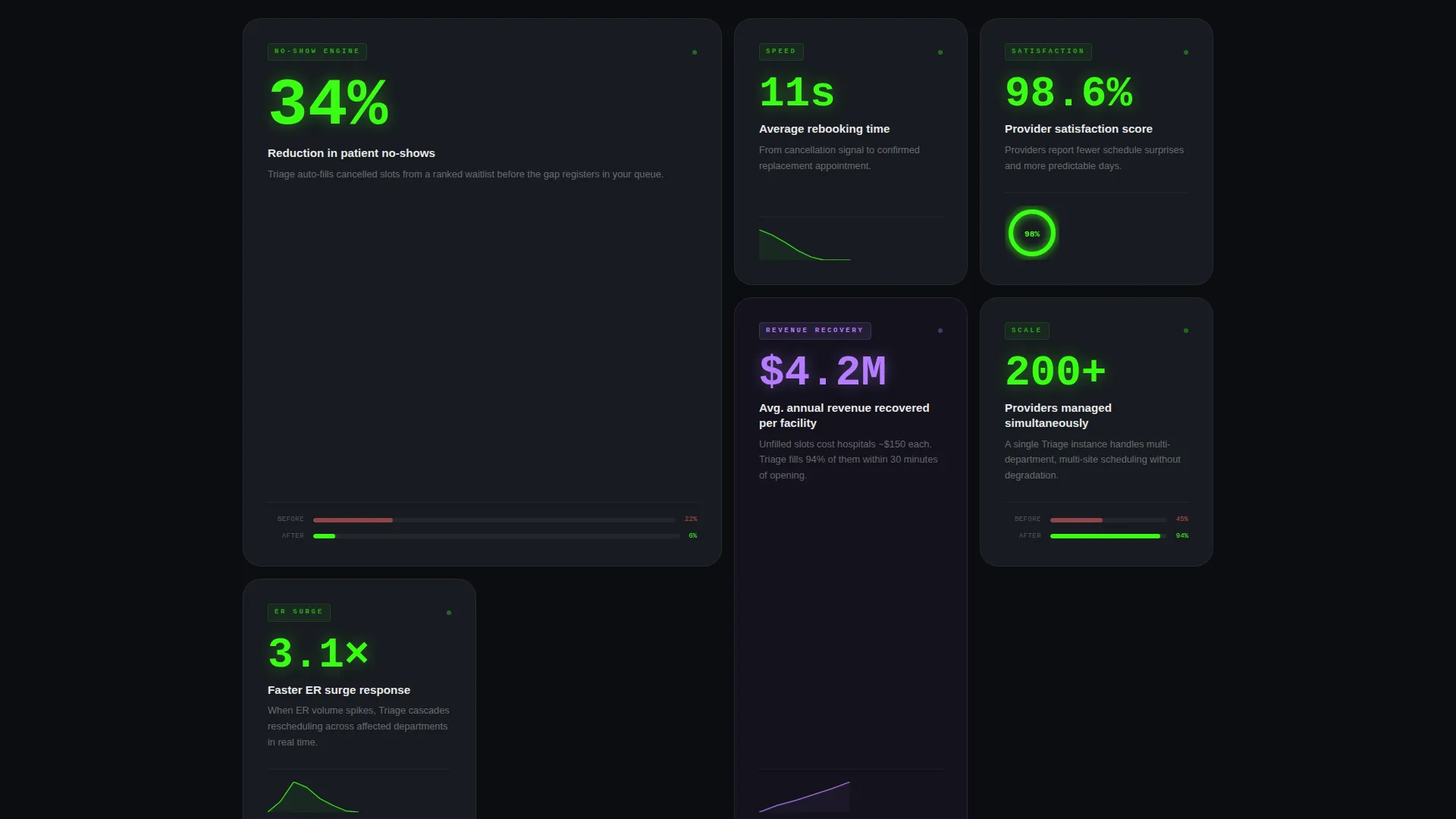
- A bento grid layout with animated stat cards, sparklines, donut charts, and before/after bar visuals
- A scrolling logo bar header, an oversized metric display, and a persistent floating call-to-action button
- A secondary proof link at the bottom for buyers who need a narrative case study before they click
Feature list
This template is built around a tightly coordinated set of visual and structural features. Each one serves the core goal of building trust fast and removing friction from the path to a demo.
Stats-First Bento Grid Cards
Each bento cell opens with a bold metric: "34% reduction in patient no-shows," "11 seconds average rebooking time," or "98.6% provider satisfaction score." One sentence of context sits below each stat, followed by a micro-visualization to make the data feel tangible and real.
Scrolling Logo Bar Header
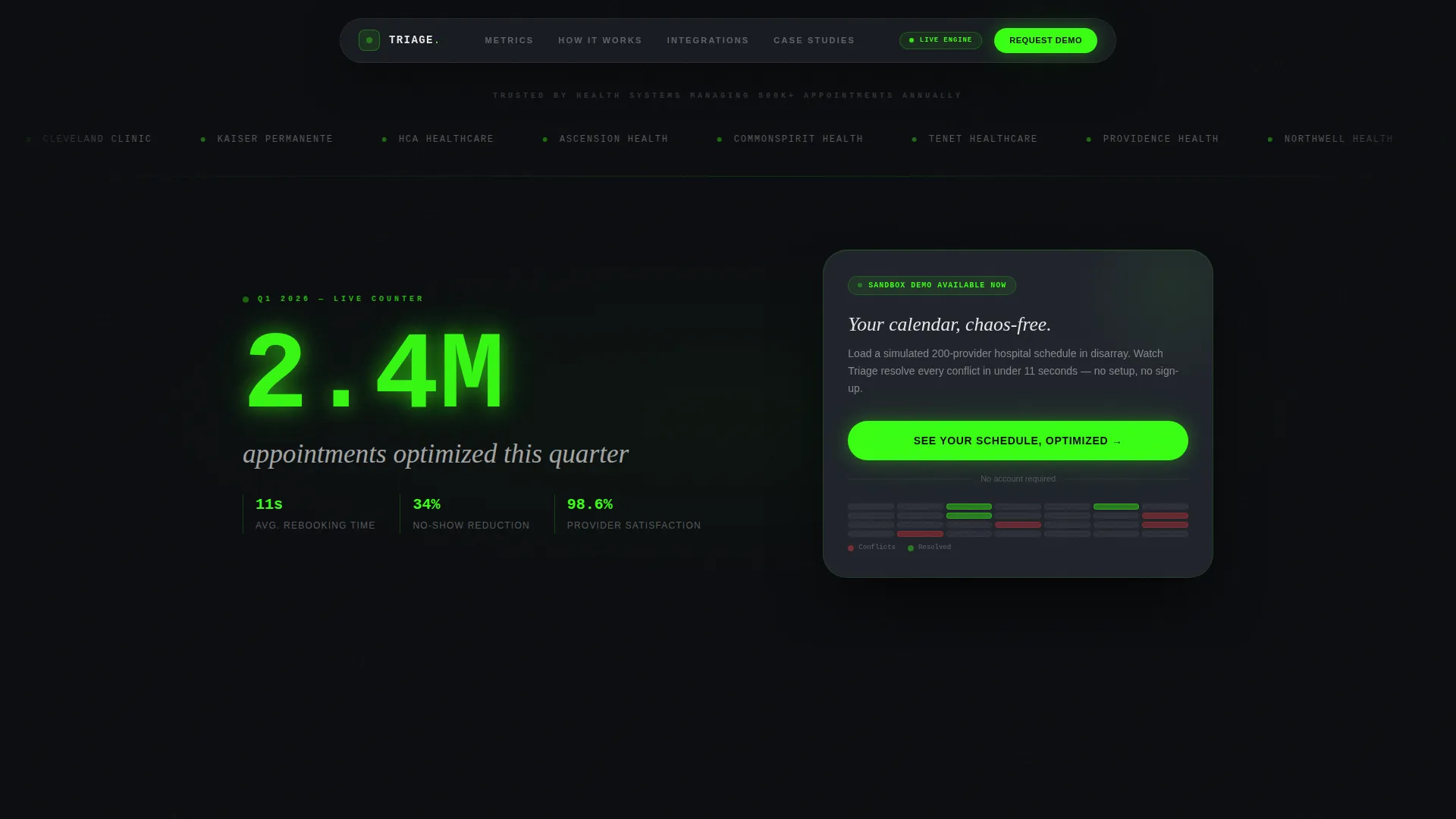
The header is a horizontal strip of hospital system logos and health network emblems scrolling in a slow, infinite loop against a void-black background. No hero image, no illustration. The logos build trust before a single word of copy is read.
Oversized Metric Display
Directly beneath the logo bar, a single stat renders in oversized neon green type: "2.4M appointments optimized this quarter." It communicates scale instantly and eliminates the visitor's first objection within the first three seconds of the page load.
Persistent Floating Call-to-Action
The primary call-to-action, "See Your Schedule, Optimized," appears first inside the header stat card. After the visitor's second scroll, it reappears as a persistent floating button in neon green. The button stays visible throughout the rest of the page.
Staggered Scroll Animation
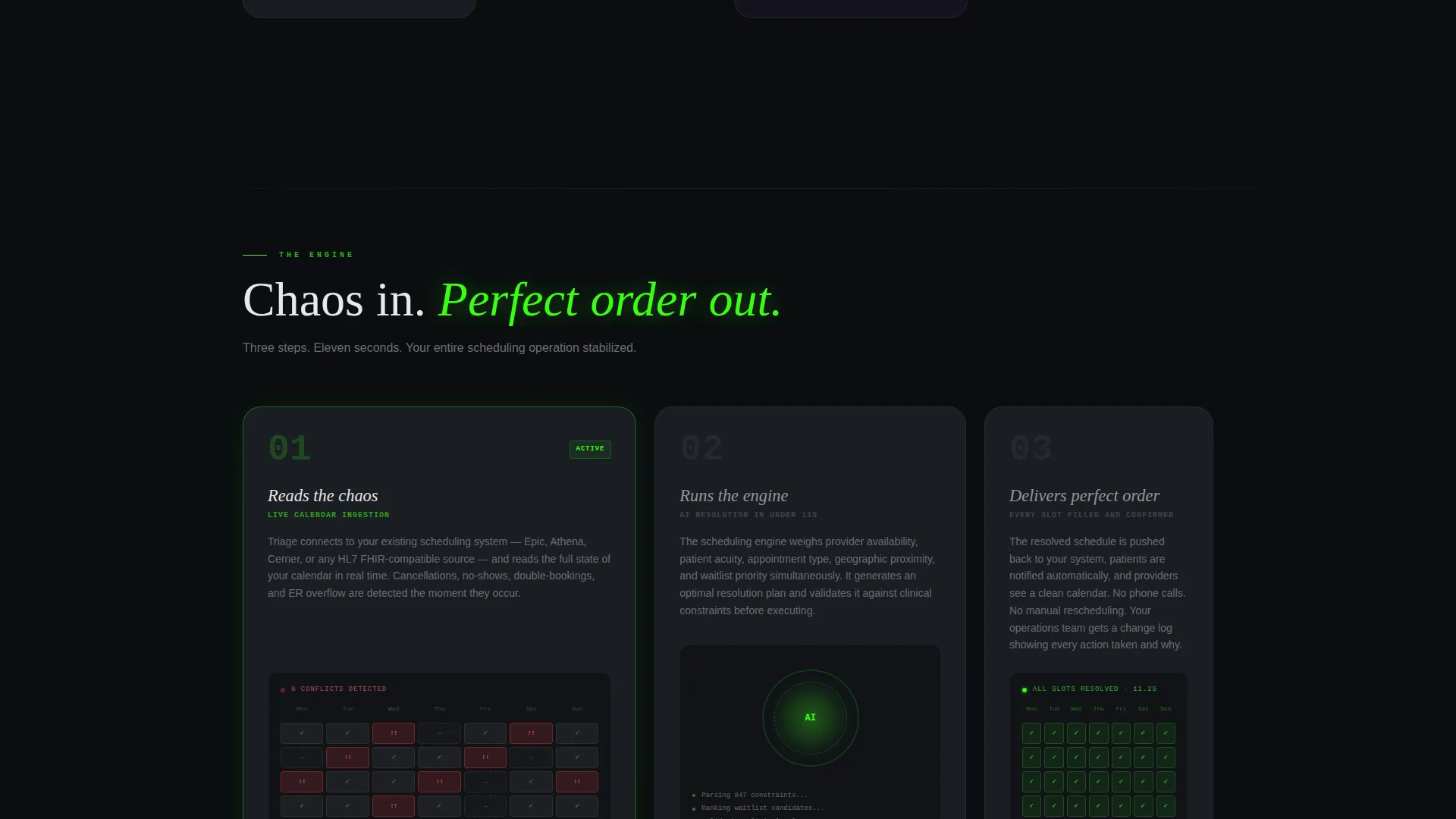
As the visitor scrolls, stat cards reveal themselves in staggered animation, like vitals appearing on a patient monitor one reading at a time. The grid tightens as scrolling continues, cards growing smaller and denser to mimic zooming into a complex live system.
Secondary Proof Link
A text link, "Read the Mayo Clinic case study," sits beneath the final bento row. It serves visitors who need narrative evidence before they will commit to a demo click, providing a low-friction secondary conversion path.
Page sections overview
| Section | Purpose |
|---|---|
| Logo Bar Header | Establish trust through hospital and health network brand recognition |
| Oversized Metric Display | Communicate product scale instantly with a single bold stat |
| Primary Stat Cards | Deliver proof through animated bento grid cells with micro-visualizations |
| Floating call to action Button | Keep the demo action visible and accessible throughout the scroll |
| Secondary Proof Link | Offer a case study exit for buyers who need deeper narrative evidence |
Design & branding system
The visual identity is built on a Tech Glass theme using an Acid Digital color system. The palette references the atmosphere of a dark operating theater lit only by monitoring screens: clinical, alive, and slightly futuristic.
- Core colors: void black (#0B0D10) for backgrounds, surgical neon green (#39FF14) for live metrics and primary actions, glass-panel translucent gray (#1A1D23) for card surfaces, and electric lilac (#B57BFF) reserved for hover states and active data points
- Typography uses crisp white (#E8E8E8) for body text, with neon green used sparingly on stat figures that need to read like headlines
- Interactive feedback is built into the palette: lilac appears only on interaction, rewarding every hover or touch with a flicker of energy
Mobile & speed optimization
The bento grid layout is structured to reflow cleanly across screen sizes. Cards stack and resize so that stat-first impact is preserved on smaller viewports, not buried under navigation or wide-format visuals.
- The logo bar scrolls horizontally and adapts to narrower screens without breaking the infinite loop effect
- The persistent floating call-to-action button remains anchored and visible on mobile throughout the scroll experience
- Micro-visualizations inside cards are compact by design, keeping visual weight low and page feel fast even on data-rich sections
How this template helps you convert
This landing page is built as a click-through page. There is no form to fill out. Every design decision removes a reason to leave and adds a reason to click.
- The logo bar and oversized metric handle first-impression trust and scale in under five seconds, before any scroll happens
- Staggered stat card animations create a rhythm that keeps visitors engaged and moving downward through the page
- The persistent floating button and the secondary case study link together cover two types of buyers: those ready to act and those who still need proof
Other information about this template
This template is designed for use by SaaS teams, healthcare technology agencies, and product marketers building landing pages for AI-driven scheduling platforms. It is part of a broader library of niche-specific templates built for high-stakes B2B (business-to-business) conversion scenarios.
- The demo sandbox concept described in the template, a simulated 200-provider hospital calendar resolved in real time, is a structural placeholder you replace with your own product demo environment
- The secondary link referencing the Mayo Clinic case study is a placeholder text element included to show placement and intent; you replace it with your own case study or proof asset
- The template style is Bento Grid, the theme is Tech Glass, the creative direction is Stats-First Impact, and the header concept is Logo Bar, all part of the Acid Digital color system category
Theme
Tech Glass
Creative direction
Stats-First Impact
Color system
Acid Digital
Style
Bento Grid
Direction
Click-Through
Page Sections
Stats-first Bento Grid Layout
Scrolling Logo Bar Header
Oversized Metric Hero Stat
Persistent Floating Call to Action Button
Staggered Scroll Animation
Secondary Proof Text Link
Related questions
Does this template include a lead capture form?
Can I replace the stats and logos with my own data?
Is this template a good fit for a healthcare SaaS product launch?
What does the bento grid layout mean for how visitors read the page?
Can the color palette be changed to match a different brand?



