Restaurant Scheduling Platform Landing Page Template
Triage is a comparison-table landing page template built for a restaurant scheduling and waitlist platform. It uses a glassmorphic Tech Glass visual identity, a live code snippet header, and a dual feature matrix to convert high-volume restaurant operators into qualified leads. The layout speaks directly to general managers, operations directors, and front-of-house teams running demanding services.
by Rocket studio
Quick summary
Triage is a single-page lead generation template for a restaurant scheduling and waitlist platform. It leads with a styled terminal code snippet, walks visitors through two detailed comparison tables, and closes with a sticky lead capture form. The design uses deep charcoal, frosted glass panels, and electric teal to signal precision and control.
Who this template is for
This template is built for operators who manage high-volume dining services and need a credible, technically confident landing page to present their platform.
- General managers running 400 or more covers a night who need a smarter floor management tool
- Hospitality group operations directors overseeing multiple restaurant concepts across a city
- Front-of-house managers looking to replace manual host-stand systems with a real-time queue platform
What problem this template solves
High-volume restaurants lose revenue and guest goodwill when reservations, walk-ins, and table routing are managed by disconnected or generic tools. This template gives the platform a page that speaks to that pain directly and specifically.
- Generic reservation software comparison pages fail to address real operational complexity like server load or kitchen pacing
- Operators need to self-qualify by scale before talking to sales, and a tiered matrix lets them do exactly that
- Technical buyers want to verify integration depth before committing, and a secondary API documentation path serves that need
What you get with this template
You get a fully structured, single-page lead generation layout designed around the restaurant operations software buyer journey. Every section has a clear job to do.
- A live-style code snippet header that signals technical credibility from the first scroll position
- Two animated comparison tables: one positioning Triage against generic tools, one breaking down Triage's own pricing tiers
- A sticky lead capture form with a targeted short-form field set including restaurant name, nightly covers, current tool, and work email
Feature list
This template includes purpose-built sections and interactive patterns designed specifically for a restaurant operations platform audience.
Animated Competitor Comparison Table
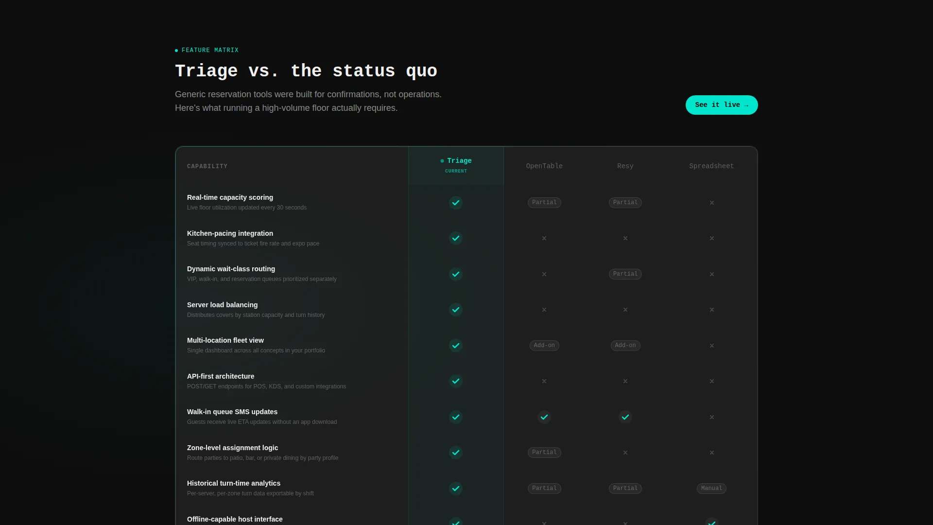
The first matrix compares Triage against generic reservation tools across rows covering real-time capacity scoring, kitchen-pacing integration, dynamic wait-class routing, and multi-location fleet view. Each row animates on scroll entry. The Triage column fills with teal checkmarks and live micro-interactions while competitor columns remain static and grayed.
Tiered Self-Selection Matrix
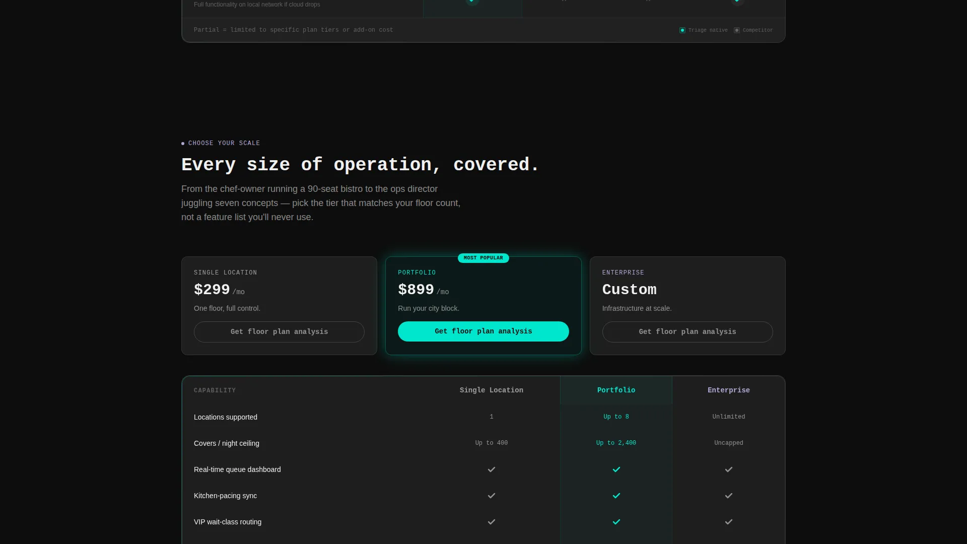
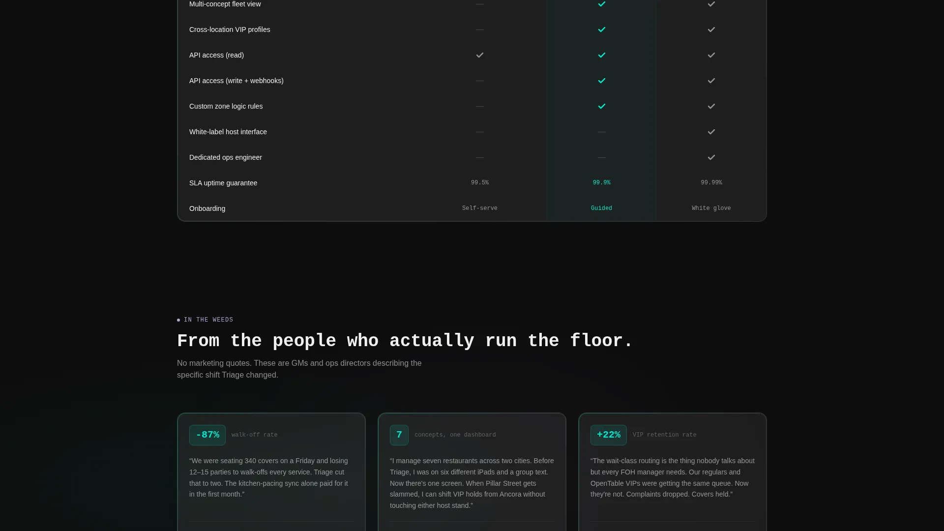
A second comparison table breaks Triage's own tiers into Single Location, Portfolio, and Enterprise columns. Visitors identify their scale as they read. Every row tightens the message around their specific operational context, reducing friction before the lead form.
Terminal Code Snippet Header
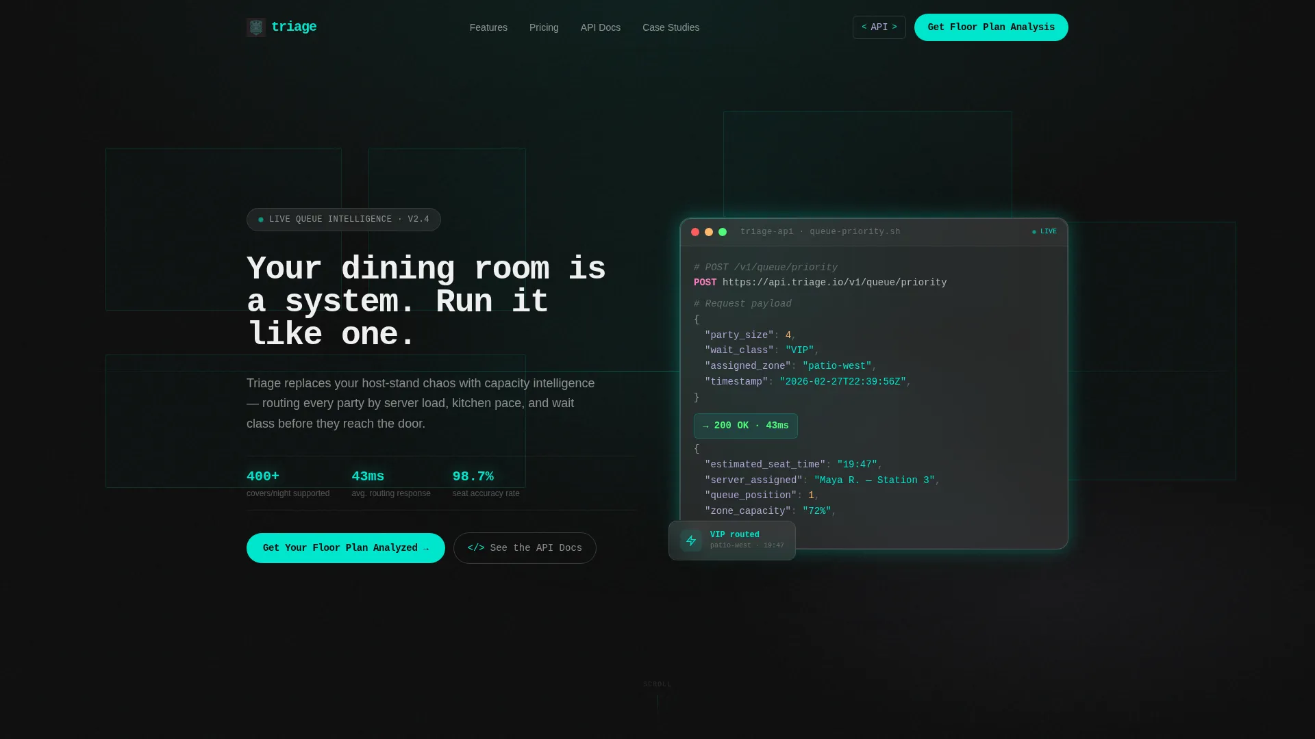
The header opens with a styled terminal window displaying a live API call: POST /v1/queue/priority with a JSON payload and a 200 OK response showing estimated seat time and server assignment. The snippet floats on a frosted glass card over a blurred restaurant floor plan. A monospace headline types itself below.
Sticky Lead Capture Form
The primary call to action, "Get Your Floor Plan Analyzed," uses a short form asking for restaurant name, average nightly covers, current reservation tool, and work email. The form card stays pinned to the right column after the visitor scrolls past the first comparison table. It remains visible throughout the scroll without blocking content.
Secondary API Documentation Path
A second call to action, "See the API Docs," gives technically minded operators a lower-commitment path. It acknowledges integration depth as a real purchase consideration and keeps technical buyers engaged before they talk to sales.
Glassmorphic Visual System
Every section uses frosted glass panel cards, a deep charcoal substrate, electric teal active states, and surgical lilac secondary labels. The visual language reinforces the platform's positioning as precise, modern, and purpose-built for operations.
Page sections overview
| Section | Purpose |
|---|---|
| Terminal Code Header | Establishes technical credibility and sets platform tone |
| Competitor Comparison Table | Positions Triage against generic reservation tools |
| Tier Self-Selection Matrix | Helps visitors identify the right plan by scale |
| Sticky Lead Form | Captures qualified leads with a targeted short form |
| API Docs call to action | Provides a path for technical buyers pre-sales |
Design & branding system
The visual identity uses a Tech Glass theme built on a glassmorphic color system. The palette feels like looking through the smoked glass of a chef's counter into a screen-lit kitchen.
- Deep charcoal substrate at #0D0D0D, frosted glass panel white at 12% opacity (#FFFFFF1F), electric teal accent at #00E5CC for active states and data pulses
- Muted surgical lilac at #B4A7D6 for secondary labels and hover states, creating depth without visual noise
- Translucent card layers float over darkness with every element backlit, giving the page a calm, controlled energy that matches the platform's operational promise
Mobile & speed optimization
The layout is structured for clarity across screen sizes. The sticky form column and animated table rows are designed with a scroll-first reading pattern in mind.
- The sticky right-column form adapts to remain accessible without blocking table content during scroll
- Animated table rows trigger on scroll entry, keeping interactions purposeful rather than distracting on smaller viewports
- The terminal header card and frosted glass layers use contained visual depth that translates to mobile without overwhelming the screen
How this template helps you convert
The page is built around a clear operator decision journey. Every visual and structural choice moves the right visitor toward the lead form or the API documentation path.
- The terminal code snippet header earns technical trust in the first few seconds, qualifying visitors who care about integration before they read a single feature row.
- The dual comparison table structure lets visitors self-select by problem type and scale, so the lead form feels like a natural next step rather than an interruption.
- The sticky form placement ensures the primary call to action stays visible throughout the scroll without requiring the visitor to hunt for it after they finish reading.
Other information about this template
This template is designed as a single-page lead generation layout and works well as a standalone campaign page or a product marketing surface for a restaurant operations platform.
- The page type is a comparison table landing page, making it well-suited for paid traffic campaigns targeting high-volume restaurant operators
- The dual-call to action structure serves both business decision-makers and technical evaluators, broadening the conversion surface without adding page complexity
- Template style is Comparison Table with a Feature Matrix creative direction, built inside a Tech Glass theme using a glassmorphic color system
Theme
Tech Glass
Creative direction
Feature Matrix
Color system
Glassmorphic
Style
Comparison Table
Direction
Lead Generation
Page Sections
Animated Competitor Comparison Table
Tiered Self-selection Matrix
Terminal Code Snippet Header
Sticky Lead Capture Form
Secondary API Documentation Path
Glassmorphic Visual Identity
Related questions
Who is this landing page template designed for?
What does the lead capture form collect?
Can the comparison tables be customized for different competitors or tiers?
What is the secondary call to action for?
Does the template include the animated table behavior out of the box?



