Triage - Intelligent Scheduling Landing Page Template
Triage is a hub-and-spoke healthcare appointment scheduling landing page built for clinic operations teams, dental front desks, and telehealth startups. It uses an interactive explorer format so visitors can manipulate features before signing up. The dark Dashboard Pro design, anchor navigation, and freemium conversion flow make it a focused, high-trust entry point for scheduling platforms.
by Rocket studio
Quick summary
Triage is a single-page, anchor-nav landing page template for healthcare appointment scheduling platforms. It combines a command-center visual style with interactive feature demonstrations, letting visitors drag, toggle, and click their way through the product before committing. The primary conversion path is a three-field free signup. A secondary video path captures undecided visitors.
Who this template is for
This template is built for teams who run patient scheduling at real operational scale. If you are launching or marketing a healthcare scheduling platform, this page speaks directly to your buyers.
- Clinic operations managers overseeing multiple providers across several locations
- Dental office front-desk staff dealing with phone queues, holds, and no-show volume
- Telehealth startups wiring up their first patient booking and confirmation flow
What problem this template solves
Healthcare scheduling is still broken in many practices. Patients wait on hold, providers sit with gaps, and no-shows quietly drain revenue. A generic software landing page does not earn trust from clinical buyers who have seen dozens of tools fail them.
- Prospects do not trust a feature list; they need to feel the product working before they sign up
- Operations managers need proof that the system handles multi-location, multi-provider complexity
- Front-desk staff need to see speed and clarity, not abstract claims about automation
What you get with this template
This template delivers a complete, conversion-focused landing page structured around five interactive feature spokes. Every section is designed to demonstrate capability, not just describe it.
- A sticky anchor navigation rail linking five spoke sections: Smart Routing, Multi-Location Sync, Patient Self-Book, No-Show Shield, and EHR Handshake
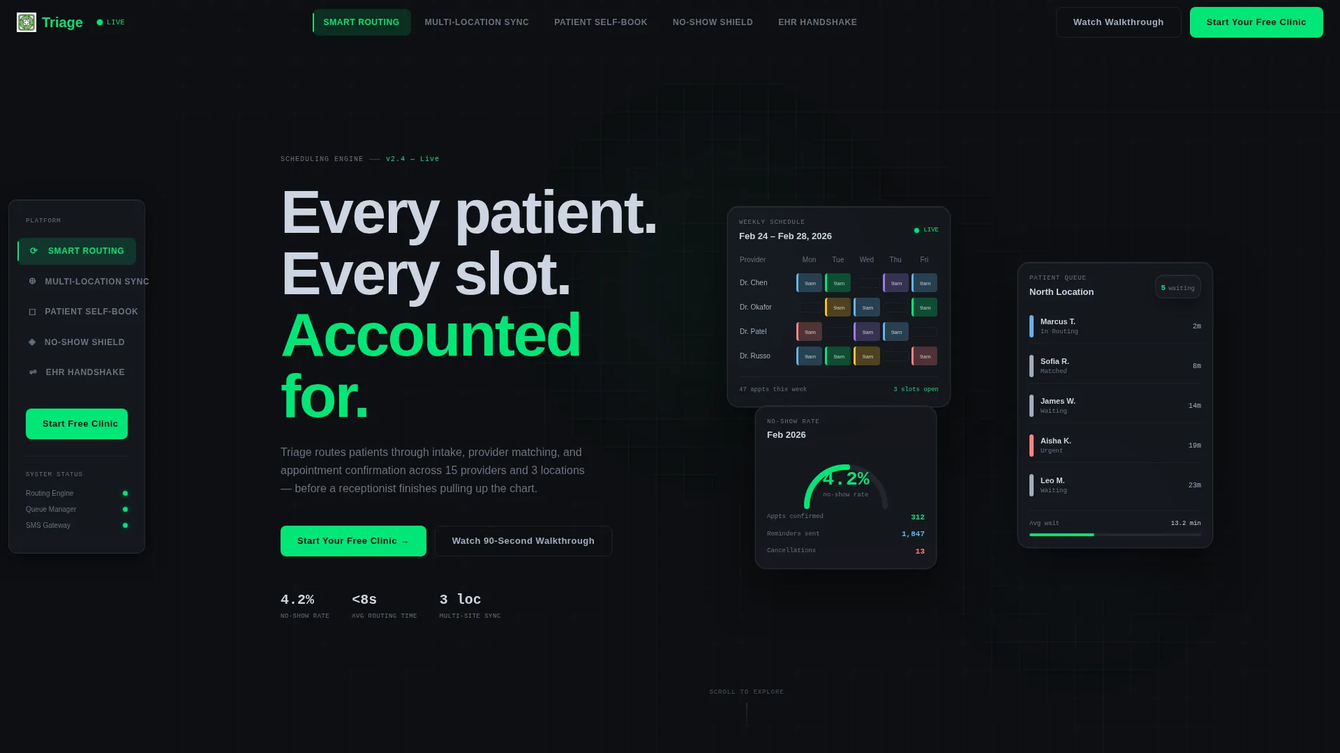
- An animated Dark Glass Panels header showcasing a live provider calendar, a patient queue, and a no-show analytics gauge
- A freemium signup form with three fields and a secondary video capture path for undecided visitors
Feature list
This template is built around five interactive spoke sections, each letting the visitor operate a miniature version of a real platform feature. Together they build progressive confidence that the product handles edge cases before the visitor reaches the call to action.
Smart Routing Explorer
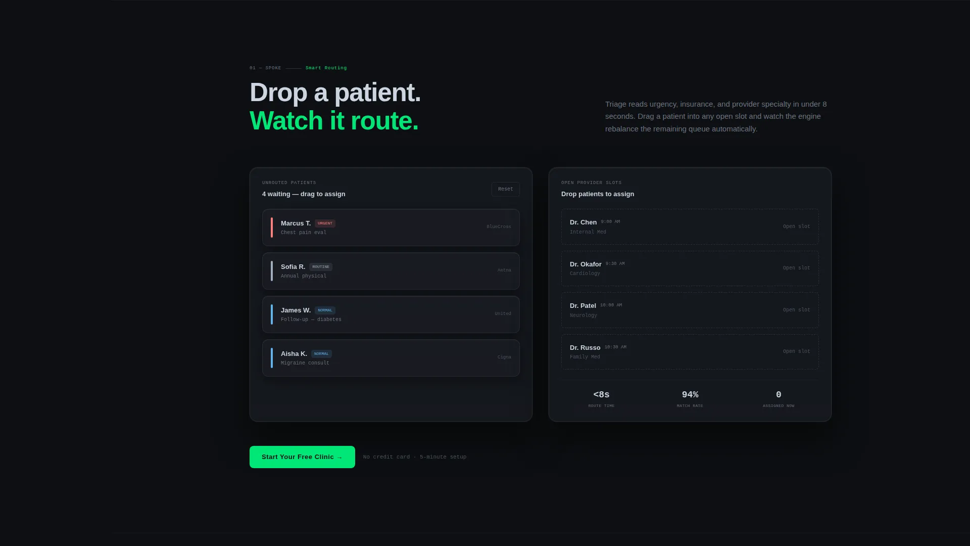
Visitors can drag a patient into an open slot and watch the calendar rebalance in real time. This spoke demonstrates automated intake routing and provider matching without a single word of explanation.
Multi-Location Sync Toggle
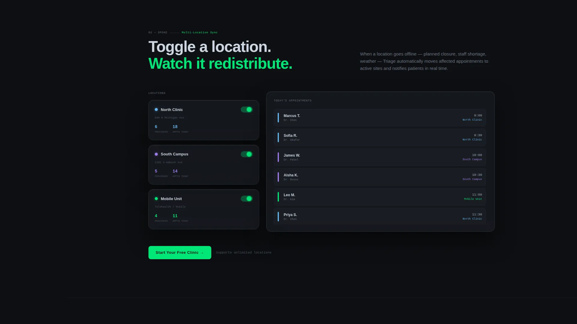
A location toggle lets visitors switch a clinic off and watch appointments redistribute across remaining sites. It makes multi-location scheduling logic immediately visible to operations managers evaluating the platform.
Patient Self-Book Interaction
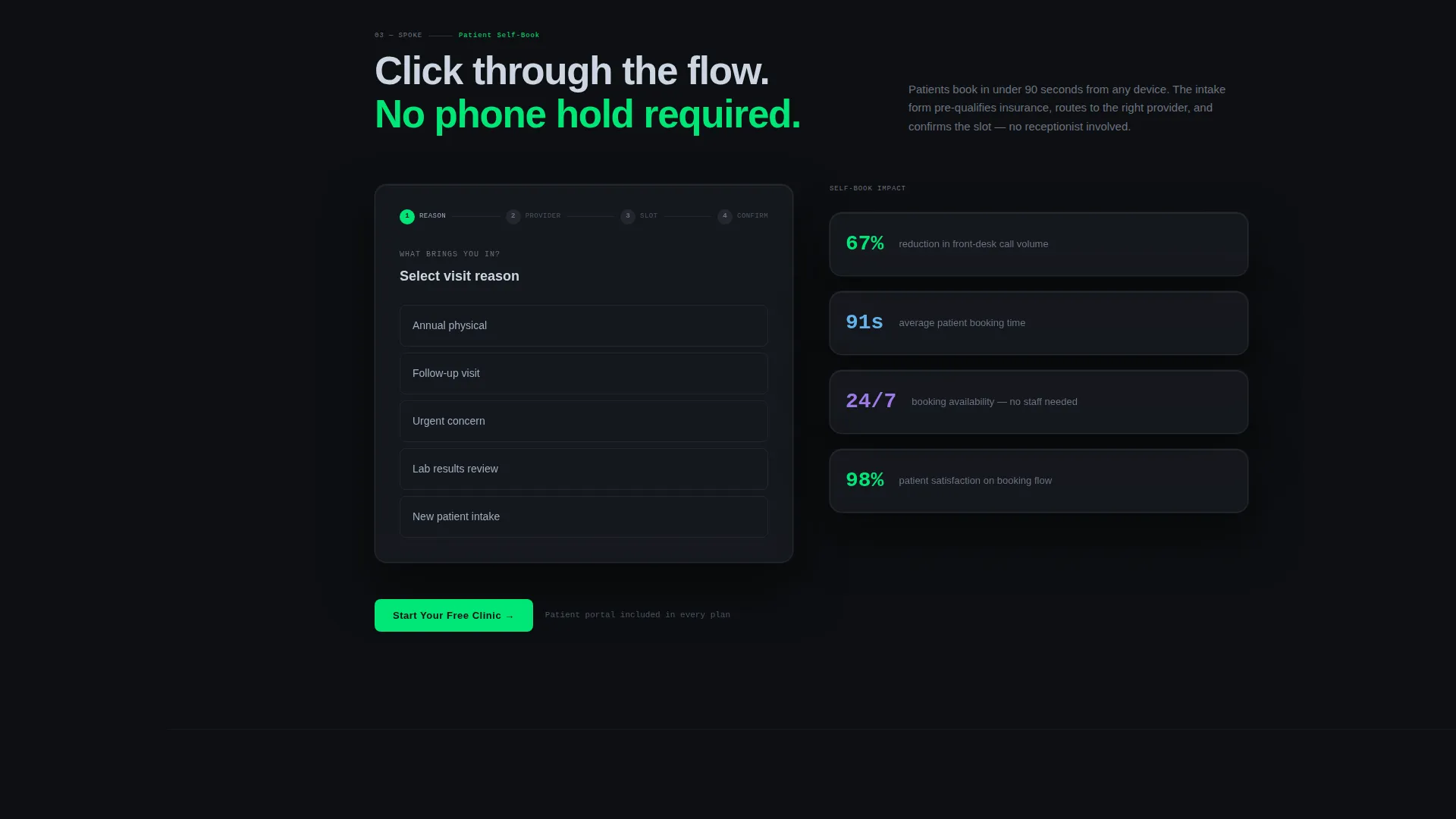
Visitors experience the patient-facing booking flow directly inside the page. Clicking through the self-booking sequence shows how confirmation reaches the patient faster than a phone call ever could.
No-Show Shield Animator
Clicking a reminder sequence triggers an animated SMS chain, showing the cadence of outreach that reduces appointment gaps. The no-show analytics gauge in the header reinforces this with a live-style reading of 4.2%.
EHR Handshake Section
The final spoke introduces the electronic health record connection point. It positions the platform as a system that fits into existing clinical workflows rather than replacing them.
Dual Conversion Path
The primary call to action, "Start Your Free Clinic," is pinned in the nav and repeated at the base of every spoke. A secondary path, "Watch the 90-Second Walkthrough," captures email on video play for visitors who are not yet ready to commit.
Page sections overview
| Section | Purpose |
|---|---|
| Dark Glass Header | Displays live-style provider calendar, patient queue, and no-show gauge |
| Anchor Nav Rail | Persistent left-rail navigation linking all five spoke sections |
| Smart Routing Spoke | Interactive patient-drag demo showing calendar rebalancing |
| Multi-Location Sync Spoke | Toggle demo redistributing appointments across clinic locations |
| Patient Self-Book Spoke | Clickable booking flow showing confirmation speed |
| No-Show Shield Spoke | Animated SMS reminder chain with analytics gauge |
| EHR Handshake Spoke | Positions platform within existing clinical record workflows |
| Freemium Signup Form | Three-field form collecting clinic name, provider count, and work email |
| Video Capture Path | Secondary call to action capturing email before the 90-second walkthrough plays |
Design & branding system
The visual identity follows a Dashboard Pro theme built on the Carbon Fiber color system. Every color decision is deliberate: dark backgrounds reduce eye fatigue for clinical staff, and the single accent color only appears when something requires action.
- Base backgrounds use cockpit black (#0D0F12) and instrument-panel charcoal (#1A1D23) to create depth without distraction
- Body text and user interface labels sit in surgical steel (#A0AEC0) for legibility against dark surfaces
- Pulse-green (#00E676) is reserved exclusively for active states, confirmations, and call-to-action elements, giving every actionable element immediate visual authority
Mobile & speed optimization
The template is designed to translate the command-center experience across screen sizes without losing the interactive quality that makes the spokes effective.
- The anchor navigation rail adapts so spoke links remain reachable on smaller screens throughout the scroll
- Interactive spoke components are built to function at touch scale, keeping drag and toggle interactions usable on mobile devices
- The lean three-field signup form stays prominent and accessible regardless of viewport size
How this template helps you convert
Every structural decision in this template is pointed at one outcome: getting a qualified clinic operator to start a free account before leaving the page.
- Visitors interact with the product inside the page itself, arriving at the call to action having already used the tool rather than just read about it
- The freemium signup removes friction by asking for only three fields and no credit card, lowering the barrier for operations managers and startup founders evaluating options
- The secondary video path captures email from undecided visitors, turning a non-conversion into a warm lead rather than a lost session
Other information about this template
This template is part of a broader healthcare software category and is built specifically around the healthcare appointment scheduling niche. It suits platforms targeting outpatient clinics, multi-site dental groups, and telehealth booking products.
- The template style is Hub and Spoke with Anchor Navigation, making it well-suited to platforms with several distinct feature areas that each need their own demonstration space
- The Interactive Explorer creative direction means the page earns trust through hands-on engagement rather than passive reading
- The Freemium and Trial landing page direction aligns the design and copy hierarchy toward low-friction signup rather than contact-form lead generation
- The Dashboard Pro theme and Carbon Fiber color system give the page a medical-grade monitor aesthetic that clinical buyers recognize as credible
- Dark Glass Panels in the header create an immediate product-first impression with no stock photography or staged imagery
Theme
Dashboard Pro
Creative direction
Interactive Explorer
Color system
Carbon Fiber
Style
Hub & Spoke (Anchor Nav)
Direction
Freemium/Trial
Page Sections
Dark Glass Panel Header
Sticky Anchor Navigation Rail
Interactive Spoke Sections
No-show Analytics Gauge
Freemium Signup Form
Secondary Video Capture Path
Related questions
Who is this landing page template designed for?
Can I adapt this template if my platform has fewer than five features?
Does the signup form ask for a credit card?
What makes the header different from a standard hero section?
Is the anchor navigation fixed throughout the page scroll?



