Triage - Powerful Automotive Landing Page Template
Triage is a modular card-grid landing page template built for automotive service management software. It uses a dark Data Command visual theme, stat-driven hero sections, and a Comparison/Versus layout to show exactly how chaotic shop workflows become precise repair timelines. The design speaks directly to service managers, shop owners, and fleet coordinators who need clarity at a glance.
by Rocket studio
Quick summary
Triage is a single-page landing page template designed for automotive service management platforms. It opens with a live dashboard preview, escalates through bold metrics and side-by-side comparisons, and closes with an interactive return on investment calculator. The deep-black, teal-lit design feels like premium diagnostic tooling, precise, functional, and built to convert.
Who this template is for
This template was built for software founders, product marketers, and agencies promoting automotive service platforms. It speaks the language of the shop floor, not the boardroom.
- Service managers at multi-bay dealerships who need to show stakeholders a better way to track repair orders
- Independent shop owners looking to replace whiteboards and phone tags with a credible digital solution
- Fleet coordinators responsible for preventive maintenance cycles across large vehicle pools
What problem this template solves
Running a service bay without proper tooling means lost repair orders, missed appointments, and slow vehicle turnaround. Visitors arrive on this page already feeling that pain. The template channels it into a clear, urgent case for change.
- Paper-based repair tracking leads to advisor bottlenecks and delayed customer handoffs
- Whiteboards and disconnected systems make it impossible to see all active jobs in one place
- Fleet operators risk missed service intervals when there is no centralized vehicle status view
What you get with this template
You get a complete, production-ready landing page built around the Triage visual system and conversion architecture. Every section is designed as a modular card, so the layout stays flexible while the messaging stays precise.
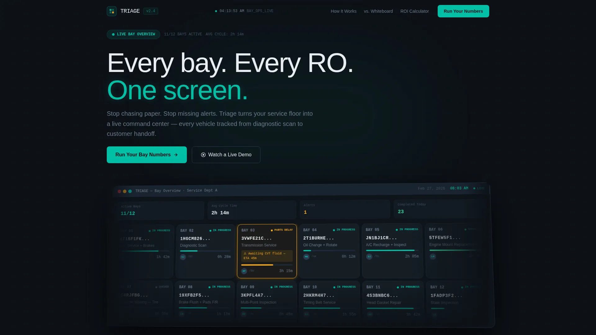
- A full-screen dashboard preview header showing 12 active vehicle cards with teal progress indicators and amber alert states
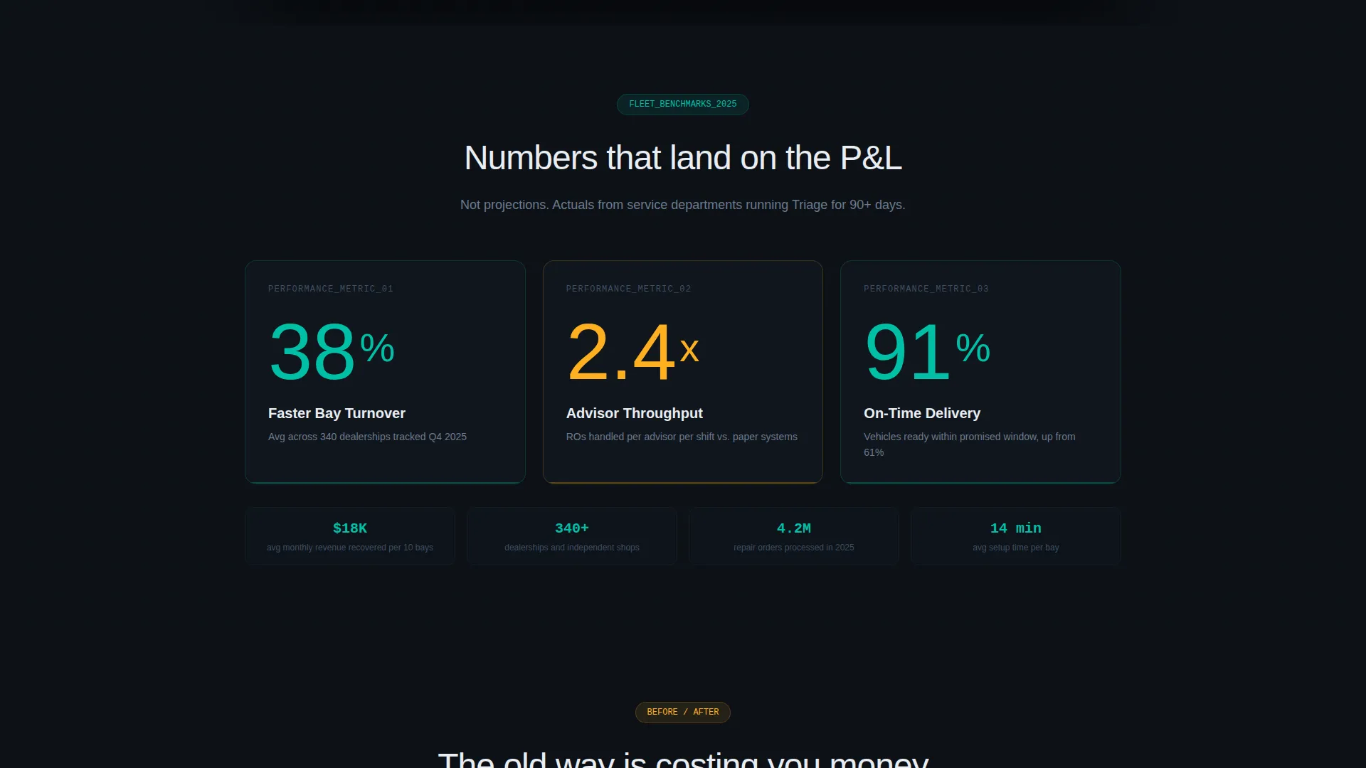
- Three animated hero stat cards displaying bay turnover, advisor throughput, and on-time delivery rates
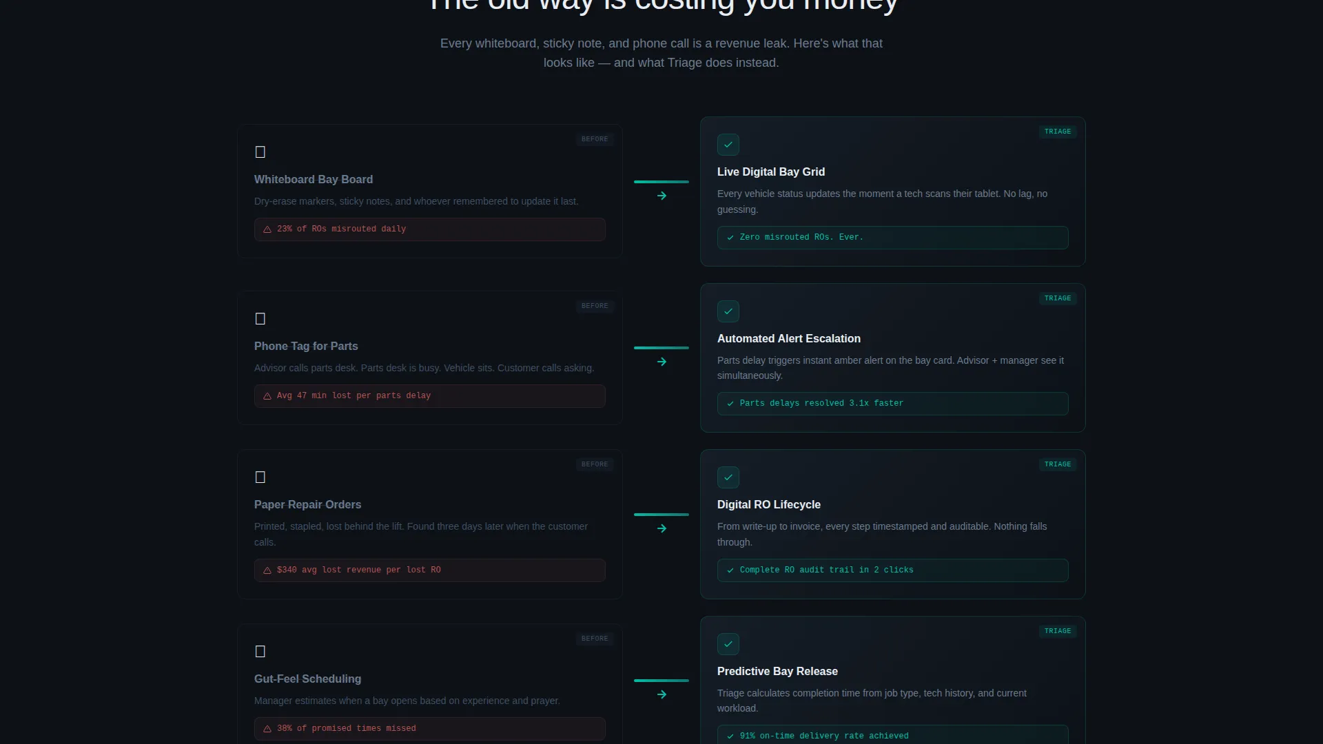
- A Comparison/Versus grid pairing old-way chaos cards against Triage solution cards, each linked by a scroll-triggered teal arrow
- A primary call-to-action path leading to an return on investment calculator and a secondary "Watch a Live Demo" path for softer leads
Feature list
This template ships with a focused set of design and layout features drawn directly from the Triage creative brief.
Live Dashboard Preview Header
The header renders a pixel-accurate mockup of the platform's bay overview screen. It shows 12 active vehicle cards, each carrying a vehicle identification number snippet, service advisor initials, elapsed time, and a teal progress bar. One card pulses amber to represent a parts-delay alert, giving visitors an immediate sense of real platform behavior.
Animated Stats Entry Block
Three oversized metric cards open the scroll experience. The figures, 38 percent faster bay turnover, 2.4 times advisor throughput, and 91 percent on-time delivery, animate into view on entry. Each stat lives in its own modular card, so the numbers hit with visual weight before a single line of body copy is read.
Comparison/Versus Card Grid
Two parallel card columns run side by side throughout the page. The left column shows familiar pain points: whiteboard chaos, phone-tag coordination, and lost repair orders. The right column shows the Triage resolution for each. A horizontal arrow connecting each pair fills with teal as the visitor scrolls, making the before-and-after relationship impossible to miss.
Return on Investment Calculator Section
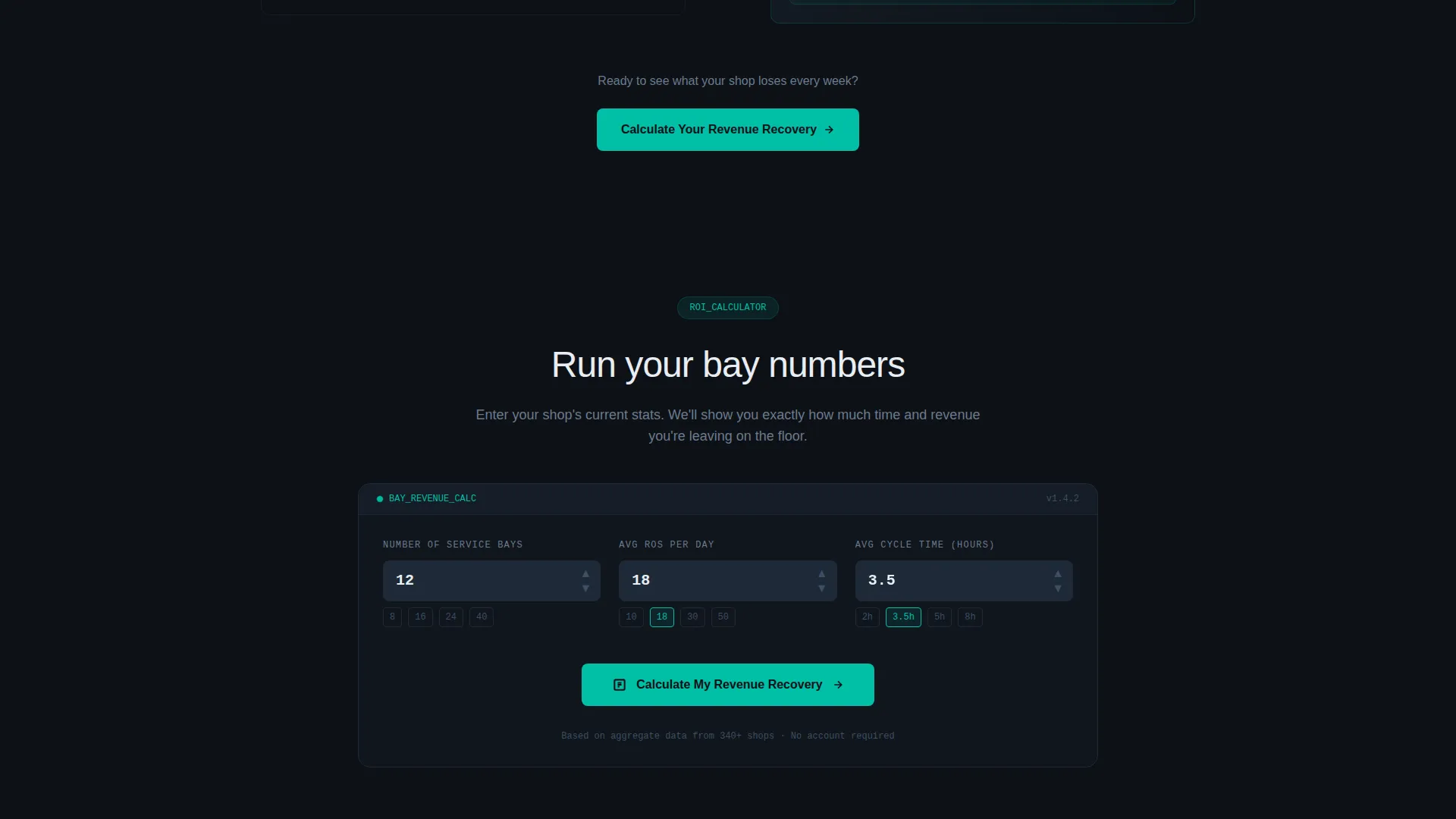
The primary call-to-action anchors to an calculator where visitors enter their bay count, average repair orders per day, and current cycle time. The tool reflects projected time and revenue gains back in teal figures. This section does the persuasion work before the final "Schedule Implementation Call" button appears.
Modular Card Grid Layout
Every section of the page is built from self-contained cards. The grid system allows individual cards to be repositioned, replaced, or extended without breaking the layout. This makes the template practical for teams who want to adapt the structure to their own platform messaging.
Data Command Color System
The Teal Catalyst palette is applied at the component level throughout the template. Deep garage black forms the background. Diagnostic teal highlights interactive card borders and live data points. Alert amber appears exclusively on status indicators and hover states. The result is a layout where every color carries meaning.
Page sections overview
| Section | Purpose |
|---|---|
| Dashboard Preview Header | Opens with a live bay overview mockup to establish platform credibility instantly |
| Hero Stats Cards | Three animated metric cards create immediate, numbers-first impact |
| Problem versus. Solution Grid | Side-by-side card columns show old-way pain and Triage's resolution |
| ROI Calculator Section | Primary call-to-action lets visitors calculate projected gains with their own data |
| Secondary Demo Path | Softer conversion path for visitors not ready to engage the calculator |
| Final Conversion Block | "Schedule Implementation Call" button closes the page after the calculator delivers results |
Design & branding system
The visual identity follows a Data Command theme built around the Teal Catalyst color system. Every design decision reinforces the feeling of a premium diagnostic tool running at full capacity.
- Color palette: deep garage black (#0D1117) as the base, diagnostic teal (#00BFA6) for active elements, steel panel gray (#1E2A38) for card surfaces, and alert amber (#FFB020) for status indicators and hover states
- The header composition is slightly angled, simulating the perspective of leaning toward a widescreen monitor, with depth-of-field blur at the edges that pulls focus to the center card cluster
- Teal dominates interactive borders and data points; amber fires only when attention is required, keeping the signal-to-noise ratio tight
Mobile & speed optimization
The modular card grid is structured to reflow cleanly at smaller screen sizes. Individual cards stack vertically on mobile without losing the visual hierarchy that makes each stat and comparison readable.
- Card-based layout means each content block scales and stacks independently
- The angled header composition adapts so the central vehicle card cluster remains the focal point on narrower viewports
- Amber alert states and teal progress indicators retain their visual contrast at all sizes, keeping status information readable without zooming
How this template helps you convert
This template converts because it earns trust before it asks for anything. The page architecture is built around progressive commitment, pulling visitors deeper before presenting the call-to-action.
- The dashboard preview header puts the product's interface front and center within the first scroll, reducing the gap between curiosity and confidence
- The animated stats block and Comparison/Versus grid systematically convert operational pain into financial language, moving visitors from recognition to urgency before they reach the calculator
- The return on investment calculator closes the loop by reflecting each visitor's own numbers back at them, making the "Schedule Implementation Call" button the natural conclusion rather than a cold ask
Other information about this template
This template is part of the broader card-grid modular template category, designed for software products that need to communicate complex operational value on a single page. It is well-suited for teams building in the automotive software and automotive patient management space.
- The template style is Card Grid (Modular), making individual sections easy to reorder or swap out during customization
- The creative direction is Stats-First Impact, meaning the page leads with proof before narrative
- The landing page direction is Comparison/Versus, a format proven to work well when the target buyer already knows the problem but has not yet committed to a specific solution
- The header concept is Dashboard Preview, which is particularly effective for software platforms where showing the actual interface builds faster trust than describing it
Theme
Data Command
Creative direction
Stats-First Impact
Color system
Teal Catalyst
Style
Card Grid (Modular)
Direction
Comparison/Versus
Page Sections
Live Dashboard Preview Header
Animated Hero Stats Block
Comparison/versus Card Grid
Return on Investment Calculator
Modular Card Grid Layout
Data Command Color System
Related questions
Who is the Triage landing page template built for?
Can I adapt the card grid layout to match my own platform messaging?
What makes the return on investment calculator section effective?
Does the template include the amber alert animation on the dashboard header?
What conversion paths does this landing page template support?



