Local Directory & Marketplace Platforms Appointment Booking Website Template
Triage is a bento grid landing page template built for doctor and specialist finder platforms. It pairs a cockpit-style dashboard aesthetic with a freemium conversion flow, showcasing real-time provider search, insurance cross-referencing, and open appointment visibility. The design uses a Carbon Fiber color system to keep data front and center while guiding visitors toward a free trial sign-up.
by Rocket studio
Quick summary
Triage is a single-page bento grid landing page template designed for doctor and specialist finder platforms. It presents a dense, data-forward layout styled like a flight instrument panel. The page moves visitors from a full-width product screenshot through a progressive feature matrix and closes with a frictionless 14-day free trial offer.
Who this template is for
This template is built for teams launching or promoting a platform that helps people find medical specialists, verify insurance coverage, and book appointments. It speaks to the business layer as clearly as it speaks to the end user.
- HR benefits managers vetting provider networks during open enrollment cycles
- Parents and patients searching for in-network specialists with open appointment slots
- Clinic administrators and platform builders benchmarking referral patterns across metro areas
What problem this template solves
Finding the right specialist quickly is hard. Insurance compatibility, appointment availability, and geographic range are three separate searches on most platforms. Triage packages the promise of solving all three into a single, convincing landing page.
- Visitors arrive with different levels of urgency and context, and the page must immediately communicate what the platform does
- A slow or vague landing page loses HR managers comparing vendor options and parents searching at midnight
- Generic SaaS templates do not carry the clinical precision that a medical directory platform needs to earn trust
What you get with this template
You get a fully structured, single-page layout that is ready to adapt to your doctor and specialist finder platform. Every section has a defined role in the conversion journey.
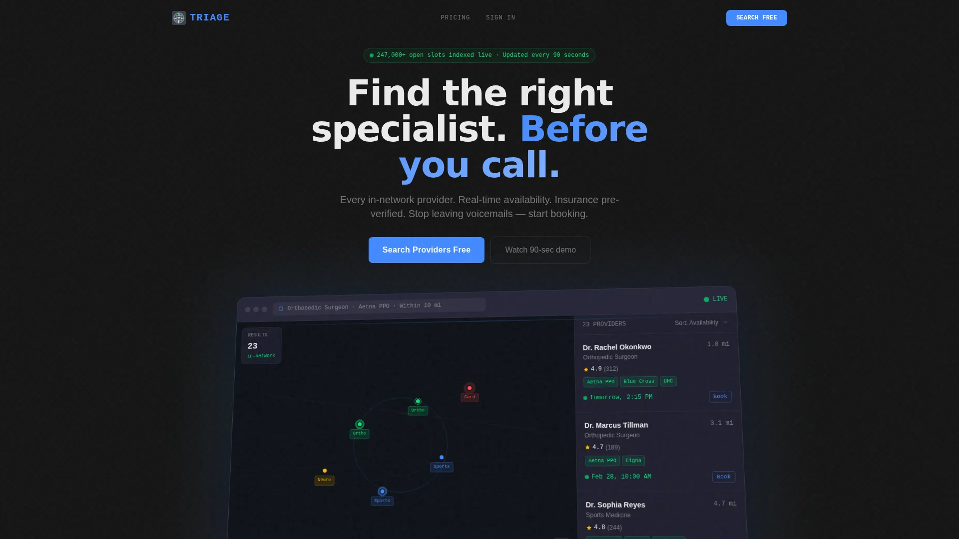
- A full-width product screenshot header with a 3D-tilted dashboard view showing map pins, provider cards, and live appointment slots
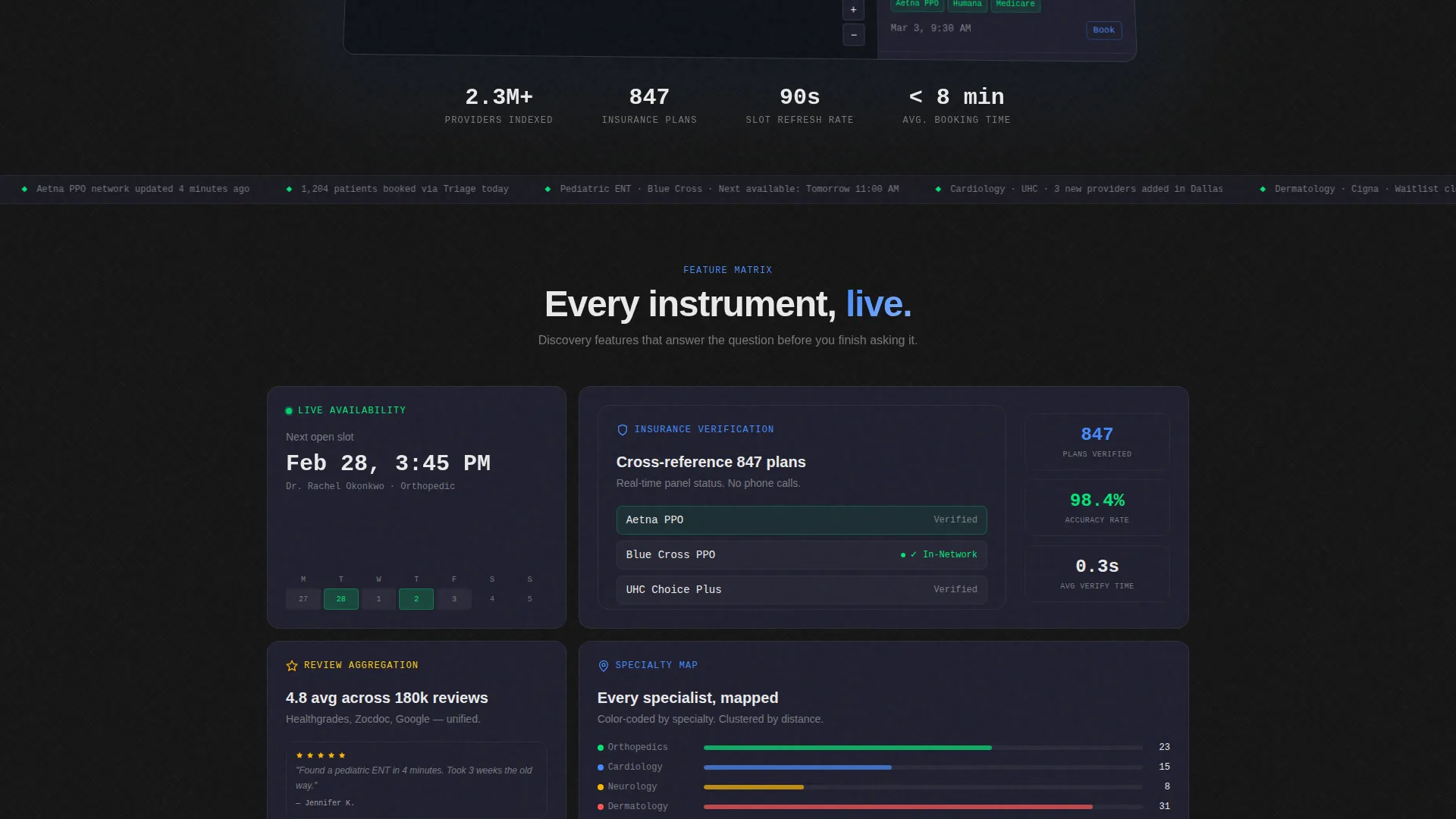
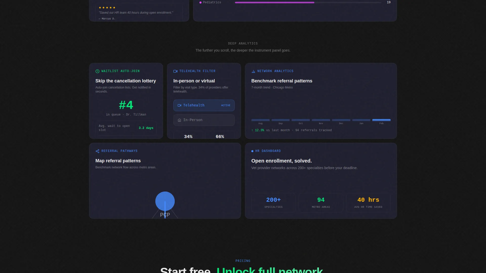
- A scrollable bento grid feature matrix with animated and static capability tiles covering insurance verification, slot availability, waitlist auto-join, referral mapping, telehealth filtering, and review aggregation
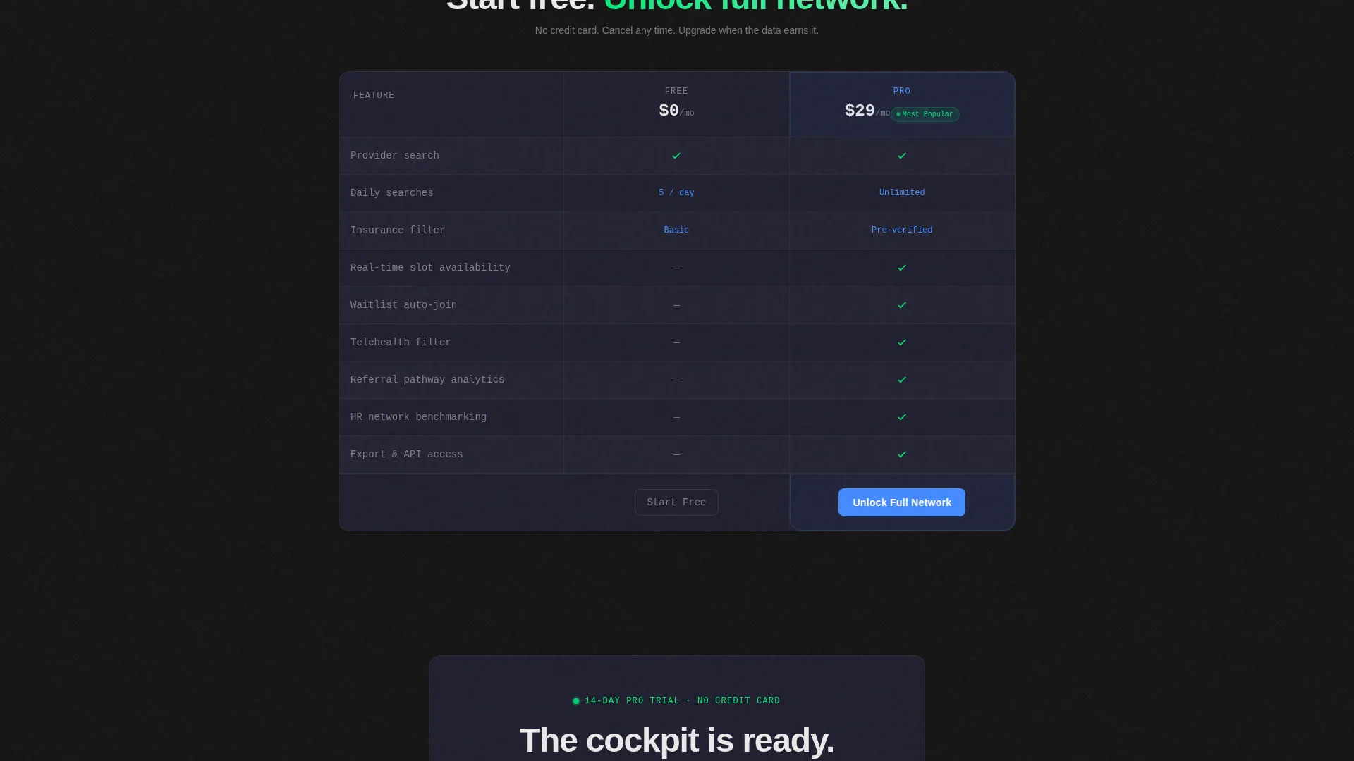
- A complete freemium conversion flow including a pinned top-bar call to action, a mid-page Free versus Pro comparison strip, and a no-credit-card trial sign-up section
Feature list
This template delivers a focused set of design and structural capabilities drawn directly from its brief.
Full-Width Product Screenshot Header
The header renders a pixel-perfect dashboard screenshot slightly rotated on a 3D plane, floating above the carbon background with a soft ambient shadow. A visible search query reading "Orthopedic Surgeon · Aetna PPO · Within 10 mi" tells visitors exactly what the platform does before they read a single line of copy.
Bento Grid Feature Matrix
The page body is organized as a progressive bento grid where each cell isolates one platform capability. Tiles alternate between micro-animations such as a slot calendar flipping or a coverage badge lighting green, and static data snapshots, creating rhythm and density as the visitor scrolls.
Pinned Freemium Conversion Bar
A slim top bar activates after the first scroll and pins the primary call to action "Search Providers Free" in view at all times. This keeps the conversion path visible without interrupting the feature narrative below.
Free versus. Pro Comparison Strip
A mid-page comparison tile presents Free tier limits (5 searches per day, basic filters) against Pro tier capabilities (unlimited searches, insurance pre-verification, waitlist priority). The contrast is clear and specific, making the upgrade decision easy.
No-Friction Trial Close Section
The final section presents a single email input field paired with a "Start Your 14-Day Pro Trial" button. No credit card and no phone number are required. The stripped-down close follows the page's evidence-first approach.
Carbon Fiber Dashboard Theme
The visual identity uses a four-color Carbon Fiber system: deep cockpit black for backgrounds, instrument-panel charcoal for card edges, status-green for live availability indicators, and cold data-blue for interactive tiles and hover states. Clinical white handles all body text.
Page sections overview
| Section | Purpose |
|---|---|
| Product Screenshot Header | Demonstrates platform interface and search capability immediately |
| Pinned call to action Bar | Keeps primary conversion action visible after first scroll |
| Discovery Feature Tiles | Introduces broad search and insurance-matching capabilities |
| Micro-Animation Tiles | Shows real-time slot, calendar, and coverage badge interactions |
| Free versus. Pro Strip | Clarifies tier differences and motivates upgrade consideration |
| Deep Analytics Tiles | Reveals referral mapping and network benchmarking depth |
| Trial Sign-Up Section | Closes with a single email field and no-barrier trial offer |
Design & branding system
The design system is built around the Dashboard Pro theme with a Carbon Fiber color palette. Every color choice has a specific data role rather than a decorative one.
- Deep cockpit black (#121212) dominates all backgrounds; instrument-panel charcoal (#1E1E2E) defines card and tile borders; status-green (#00E676) pulses only on live availability indicators; cold data-blue (#448AFF) marks all interactive tiles and hover states; clinical white (#EAEAEA) carries all body and label text
- The palette is engineered to disappear behind the data, giving the interface a technical and weightless feel consistent with a carbon fiber material texture
- Micro-animations are scoped to meaningful state changes only, such as a slot calendar flipping or a coverage badge turning green, keeping motion purposeful rather than decorative
Mobile & speed optimization
The bento grid layout is structured to reflow naturally across screen sizes, keeping the dense data presentation readable on smaller viewports without losing the cockpit aesthetic.
- Bento grid cells stack vertically on narrow screens, preserving the tile-by-tile reveal sequence that builds feature confidence as the visitor scrolls
- The pinned call to action bar and trial close section maintain their full visual weight on mobile, so the conversion path stays intact regardless of device
How this template helps you convert
The page is built around a specific evidence-first sequence. Visitors see capability before they see a pitch, which reduces hesitation and builds the case for signing up organically.
- The product screenshot header delivers immediate platform comprehension, removing the need for introductory copy and placing the visitor inside the product experience before the first scroll
- The progressive bento grid builds layered confidence, moving from broad discovery features at the top to deep analytics at the bottom, so each tile answers a question the previous tile raised
- The three-stage conversion architecture (pinned bar, mid-page comparison, final email close) meets visitors at each decision point without pressuring them before they are ready
Other information about this template
This template is categorized under Technology, specifically within the Directory and Marketplace Platforms subcategory, with a niche focus on Doctor and Specialist Finder use cases. It is well-suited for product teams, founders, and designers who need a landing page that communicates technical depth without sacrificing conversion clarity.
- Template style: Bento Grid
- Theme: Dashboard Pro
- Color system: Carbon Fiber
- Header concept: Product Screenshot
- Creative direction: Feature Matrix
- Conversion model: Freemium and Trial
- Intersection Match Score: 13, indicating strong alignment between the template style and the niche use case
Theme
Dashboard Pro
Creative direction
Feature Matrix
Color system
Carbon Fiber
Style
Bento Grid
Direction
Freemium/Trial
Page Sections
Product Screenshot Header with 3D Tilt
Progressive Bento Grid Feature Matrix
Micro-animations on Key Tiles
Pinned Top-bar Call to Action
Free Versus. Pro Comparison Strip
No-barrier Trial Close Section
Related questions
Who is this landing page template designed for?
Can I replace the header screenshot with my own platform image?
Does this template include real search or booking functionality?
How does the Free versus. Pro comparison section work?
Is the trial sign-up section connected to a payment system?



