Triage - Powerful Franchise Management Landing Page Template
Triage is a dark-mode bento grid landing page template built for multi-location healthcare franchise platforms. It pairs a void-black command center aesthetic with animated stat tiles, a before-and-after comparison grid, and a two-step diagnostic qualifier flow. Franchise directors, regional ops managers, and private-equity-backed healthcare groups get a single high-impact page designed to turn portfolio-wide patient data into a convincing sales story.
by Rocket studio
Quick summary
Triage is a bento grid landing page template for franchise patient management platforms. It opens with a dark full-bleed viewport and a blooming violet glow, then moves through animated KPI tiles, a before-and-after comparison grid, and a two-step qualifier form. The design is built to overwhelm visitors with evidence before asking them to act.
Who this template is for
This template is built for healthcare software companies and platform teams targeting multi-location franchise operators. If your product helps franchise groups manage patient data at scale, this page is designed to speak their language from the first scroll.
- Franchise directors managing fifteen to two hundred clinic locations
- Regional operations managers dealing with disconnected patient data exports
- Private-equity-backed dental and chiropractic groups that need reconciled portfolio-wide metrics
What problem this template solves
Multi-location healthcare franchise operators rarely lack data. What they lack is a single view that makes that data usable. This template is built to show exactly that gap, and position your platform as the solution that closes it.
- Per-location reporting chaos that costs hours of manual reconciliation each week
- No visibility into no-show patterns, reactivation windows, or intake completion rates across locations
- No credible single-screen proof point to bring to a private-equity partner or regional board meeting
What you get with this template
You get a fully structured, single-page bento grid layout designed for a franchise patient management platform. Every section is built and sequenced to move a skeptical ops buyer from awareness to action.
- A dark full-bleed header with animated dashboard mosaic and glowing KPI counters
- A stats-first comparison grid with animated before-and-after metrics
- A two-step diagnostic qualifier form and a gated PDF secondary conversion path
Feature list
This template delivers a focused set of visual and structural components, each grounded in the source brief. No speculative features are included.
Animated Dark Header with Violet Glow
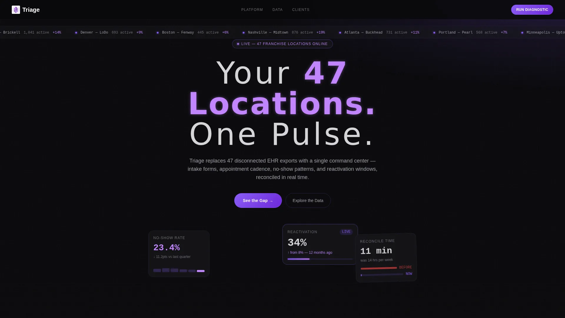
The header fills the full viewport in void black. A soft violet glow blooms from the center and illuminates a live-style dashboard mosaic showing patient volume tickers, a no-show heat map, and a reactivation funnel. The headline materializes in thin, wide-tracked silver type. The glow breathes continuously, keeping the visitor's eye anchored.
Before-and-After Comparison Grid
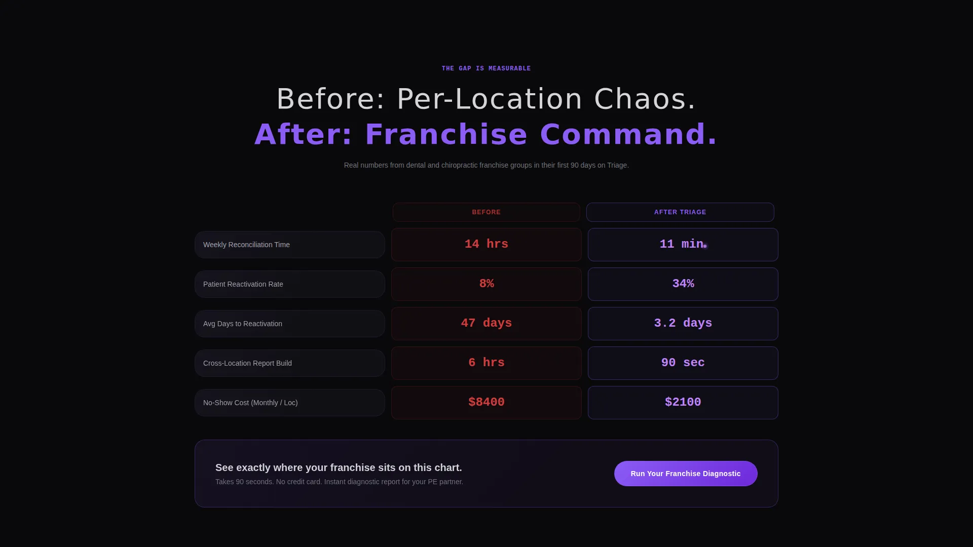
The scroll opens on a full-width comparison layout. The left column is labeled "Before: Per-Location Chaos" and the right is labeled "After: Franchise Command." Animated counters show reconciliation time dropping from 14 hours to 11 minutes, patient reactivation rates climbing from 8% to 34%, and no-show costs collapsing. This is the primary conversion context for the main call to action.
Stats-First Bento Tile System
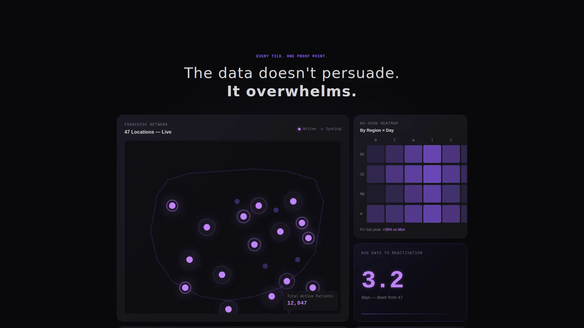
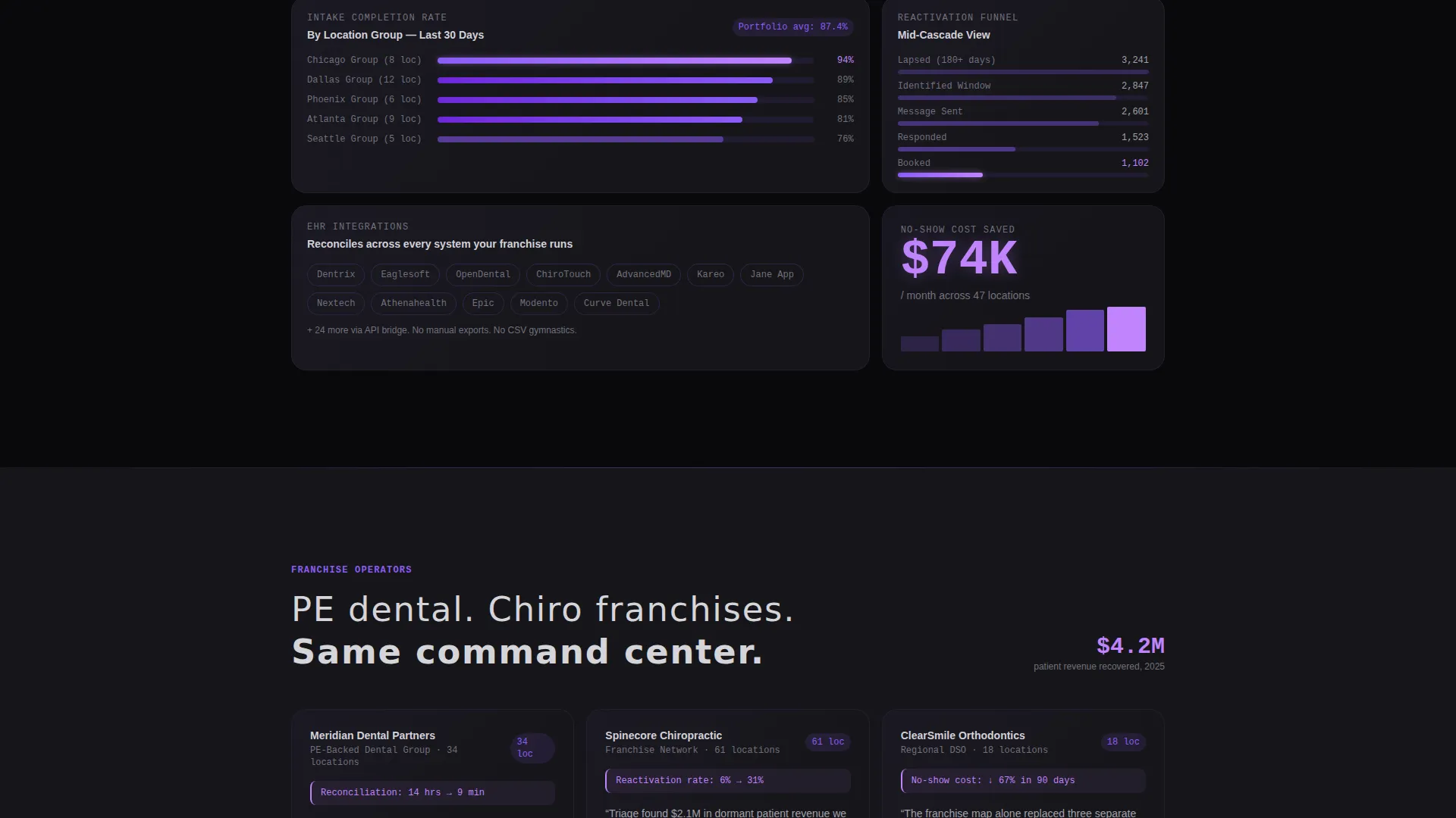
Every bento cell leads with a number before any explanatory text appears. Tiles include a franchise map with violet location markers, a stacked bar chart of intake completion rates, and isolated oversized metrics like "Average Days to Reactivation: 3.2." Each tile snaps into the grid independently, functioning as its own proof point.
Two-Step Diagnostic Qualifier Form
The primary call to action, "Run Your Franchise Diagnostic," opens a two-step qualifier. Step one collects the number of locations and current EHR system via dropdowns. Step two asks the visitor to choose the single metric they most want to fix, covering no-shows, reactivation, intake completion, or cross-location reporting.
Gated PDF Secondary Conversion Path
A secondary conversion option, "See the Full Comparison Sheet," lets visitors download a gated PDF. It requires only a work email address. This gives operations managers something concrete to forward to a private-equity partner before a demo call, adding a low-friction path alongside the primary qualifier.
Sticky Mobile Call-to-Action Bar
On mobile viewports, the primary call to action reappears as a persistent sticky bar at the bottom of the screen. This keeps the conversion prompt visible throughout the entire scroll without interrupting the content experience on desktop.
Page sections overview
| Section | Purpose |
|---|---|
| Dark Header Viewport | Establishes command-center tone with animated glow and headline |
| Before/After Grid | Shows the gap between fragmented ops and unified franchise command |
| Bento KPI Tiles | Delivers stat-first proof points across patient management metrics |
| Franchise Map Tile | Visualizes multi-location coverage with pulsing violet location markers |
| Reactivation Funnel Tile | Highlights reactivation rate improvement as a standalone metric |
| Intake Completion Chart | Displays stacked bar chart of intake rates across locations |
| Primary call to action Block | Triggers the two-step diagnostic qualifier form |
| Gated PDF Offer | Captures work emails via comparison sheet download |
| Sticky Mobile Bar | Keeps primary call to action accessible throughout mobile scroll |
Design & branding system
The visual identity follows a Data Command theme. Every color choice reinforces the idea that the data itself is the light source, glowing against a recessed dark surface.
- Void black (#09090B) and deep graphite (#16161A) form the base surfaces, giving the page a spacecraft instrument panel feel
- Electric violet (#8B5CF6) drives live-data accents, interactive glows, and location markers, while amethyst (#C084FC) pulses on KPI deltas and hover states
- Cool silver (#A1A1AA) handles secondary text and labels, keeping hierarchy clear without breaking the dark atmosphere
Mobile & speed optimization
The template is structured with mobile conversion firmly in mind. The sticky call-to-action bar ensures the primary prompt is never out of reach, regardless of how far a visitor has scrolled.
- The bento grid layout adapts to narrower viewports without losing the tile-by-tile proof point structure
- The sticky bottom bar surfaces the "Run Your Franchise Diagnostic" call to action persistently on mobile screens
- The two-step qualifier form is kept lean with dropdown inputs, reducing friction on touch devices
How this template helps you convert
The page is built around a Comparison/Versus conversion strategy. Every structural decision is designed to widen the perceived gap between the visitor's current pain and your platform's solution, then close it with a low-friction action.
- The before-and-after comparison grid places the primary call to action at the exact moment a visitor has absorbed the contrast between chaos and command, creating maximum contextual pull.
- The two-step qualifier form segments visitors by scale and priority, so follow-up conversations start with context already established rather than from scratch.
- The gated PDF path gives cautious buyers a low-commitment next step, increasing the total number of leads captured without cannibalizing the primary diagnostic flow.
Other information about this template
This template is built on a bento grid structure, making it straightforward to rearrange, add, or remove tiles as your platform's feature set evolves. The page is designed as a single-section-led landing page, not a multi-page site, so every conversion path stays within one focused scroll.
- The template style and theme are well suited to franchise software platforms where buyers respond to data density and operational specificity over narrative-led copy
- The color system and visual language can be applied consistently across pitch decks, demo environments, or other sales materials that need to match the landing page's command-center identity
- The Comparison/Versus layout direction is particularly effective for franchise patient management platforms competing against fragmented per-location tools or legacy EHR export workflows
Theme
Data Command
Creative direction
Stats-First Impact
Color system
Void & Violet
Style
Bento Grid
Direction
Comparison/Versus
Page Sections
Animated Dark Header with Violet Glow
Before-and-after Comparison Grid
Stats-first Bento Tile System
Two-step Diagnostic Qualifier Form
Gated PDF Secondary Conversion
Sticky Mobile Call-to-action Bar
Related questions
Who is this template designed for?
What conversion paths does this template include?
Can the bento grid tiles be rearranged or customized?
Is this a single landing page or a full website template?
What makes the comparison grid effective for franchise software buyers?



